

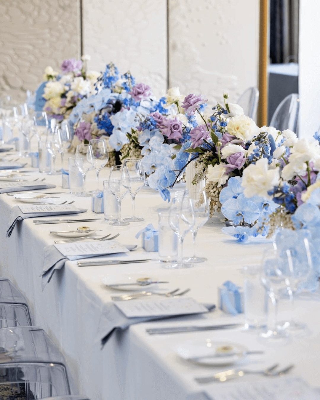
Wedding planning is hard enough already. Trying to efficiently tick through that massive checklist without a color palette locked in makes everything ten times harder.
That’s why figuring out how to choose wedding colors early changes the whole game. Getting this task sorted upfront brings every other decision into sharp focus.
Once you have your colors dialed in, you suddenly know what dress direction to pursue, how to style your venues, which stationery to pick, and how to weave the whole theme together. Colors send unspoken messages and set the entire mood for the celebration, so getting them right matters deeply.
But the pressing question remains: do you actually know how to choose your wedding colors? Just in case the answer is a hesitant no, here’s a complete “how to choose a wedding color guide” tailor made for you.
This post answers every lingering question and lights the path forward.
Main things to consider when choosing wedding colors
Understanding how to choose colors for the wedding palette means making thoughtful, intentional considerations. Here are the key things you need to weigh before settling on your final color choices.
Following a trend is completely optional if it doesn’t speak to your heart. But certain colors naturally amplify the beauty of each season, as you’re about to see.
Popular fall color combinations
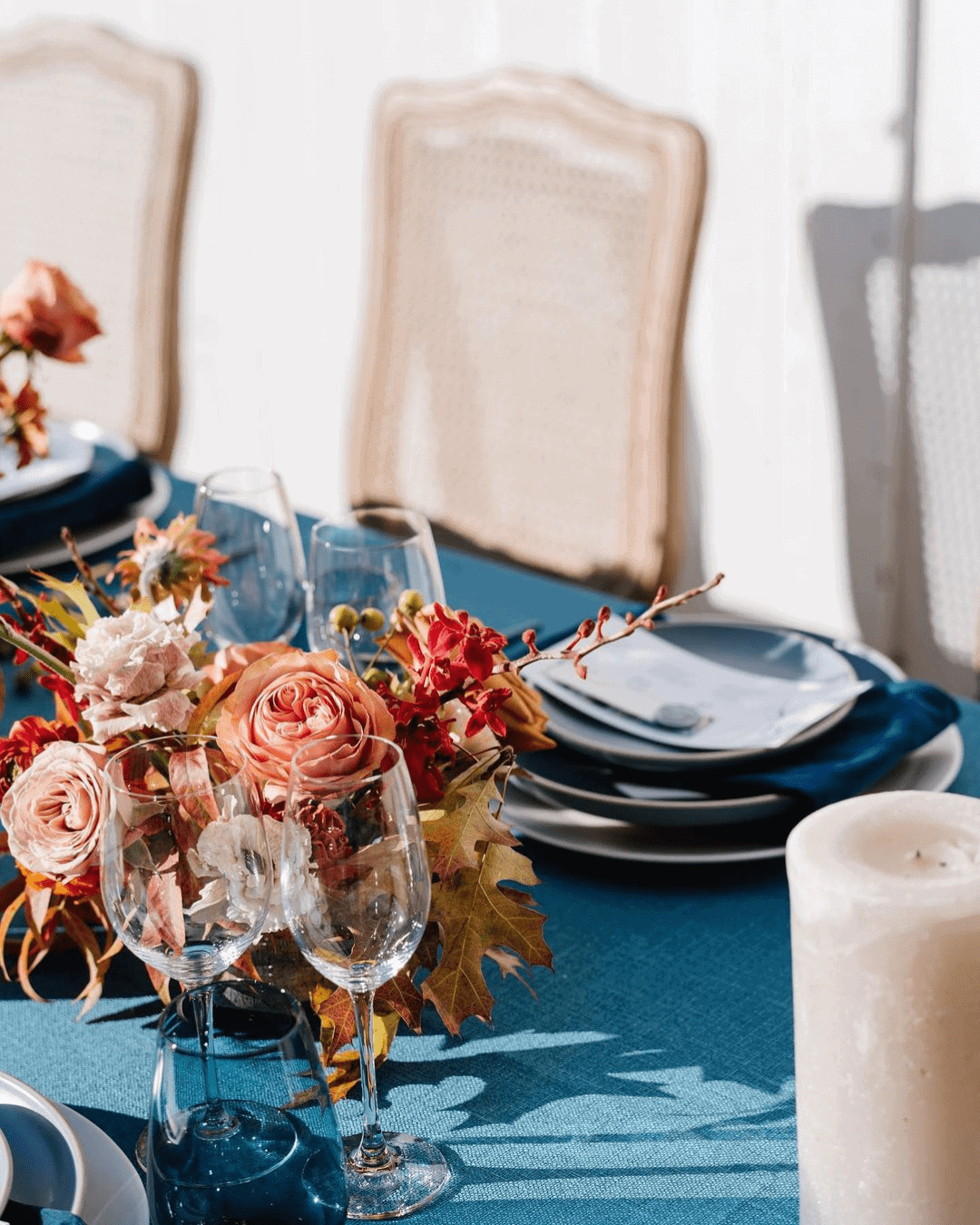
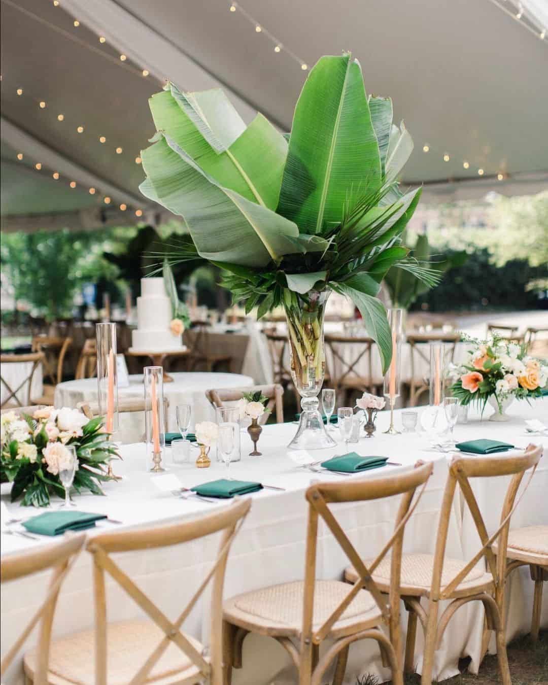
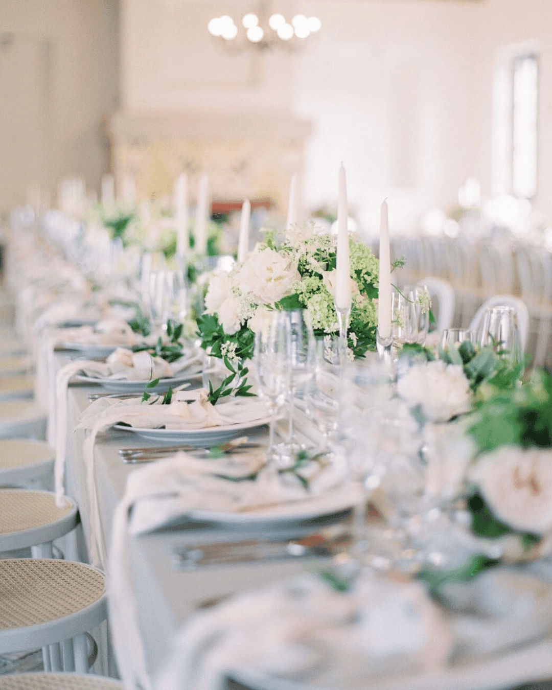
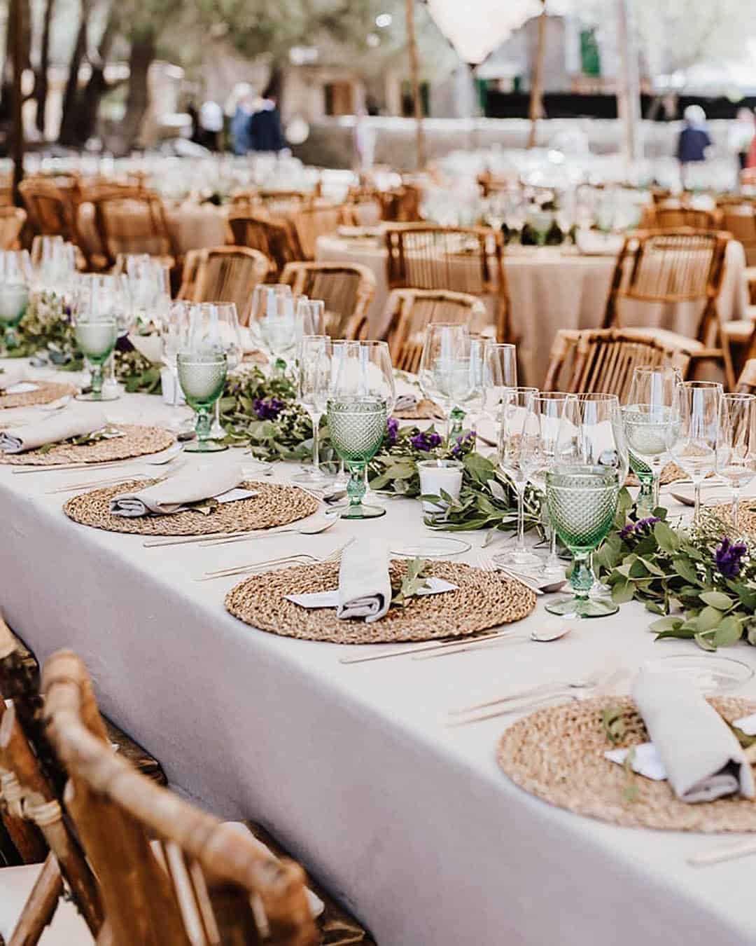
Blush, frost, and boysenberry bring a calm, romantic energy with rich fall depth perfect for Bohemian weddings. Pineapple, charcoal grey, and Cardinal red deliver a bubbly yet laid back combo that suits industrial chic celebrations beautifully. Hunter green, orange, and brown feel luxurious, lush, and full of energy for a country wedding theme. For a nautical or beachy setting, hot maroon, cameo pink, and Aegean blue create the perfect pairing. Silver, beige, and dove gray offer a whimsical combination ideal for the quintessential fall wedding.
Nature inspiration examples for choosing fall colors
Fall might just be the most stunning season of the entire year. When picking colors, let the red, orange, and yellow changing leaves inspire you directly.
Study the warm, vibrant colors blooming across the environment.
Contemplate the rich jewel tones painted across the landscape. Think about ripe, tastier fruits and foods, plus the lively countryside scenery around you.
Popular Winter Color Combinations
The winter season carries a calm, cold stillness. But you can spark serious fire with a Marsala, Aubergine, and bright red combination.
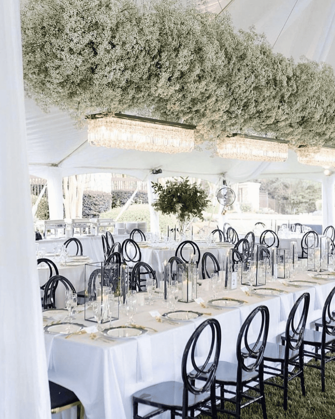
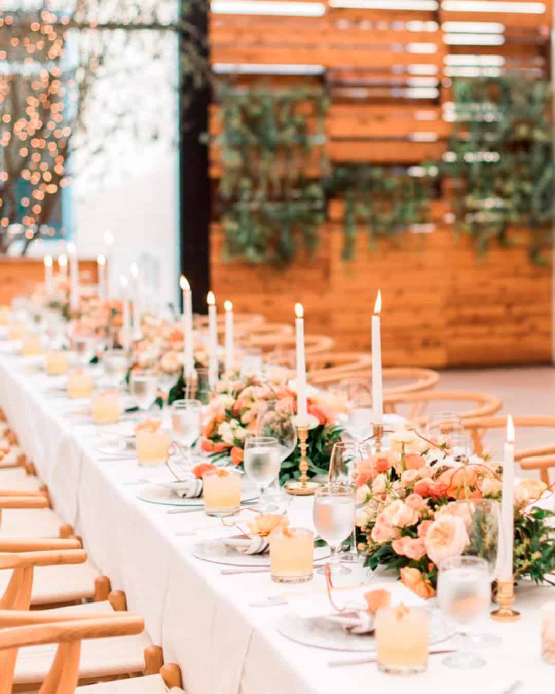
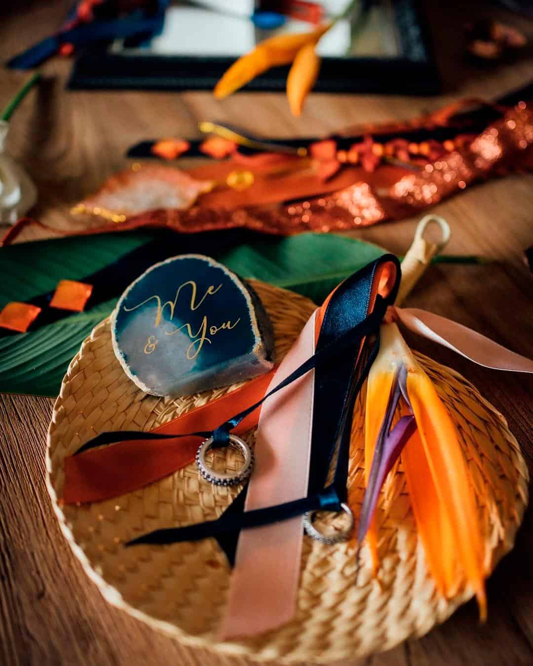
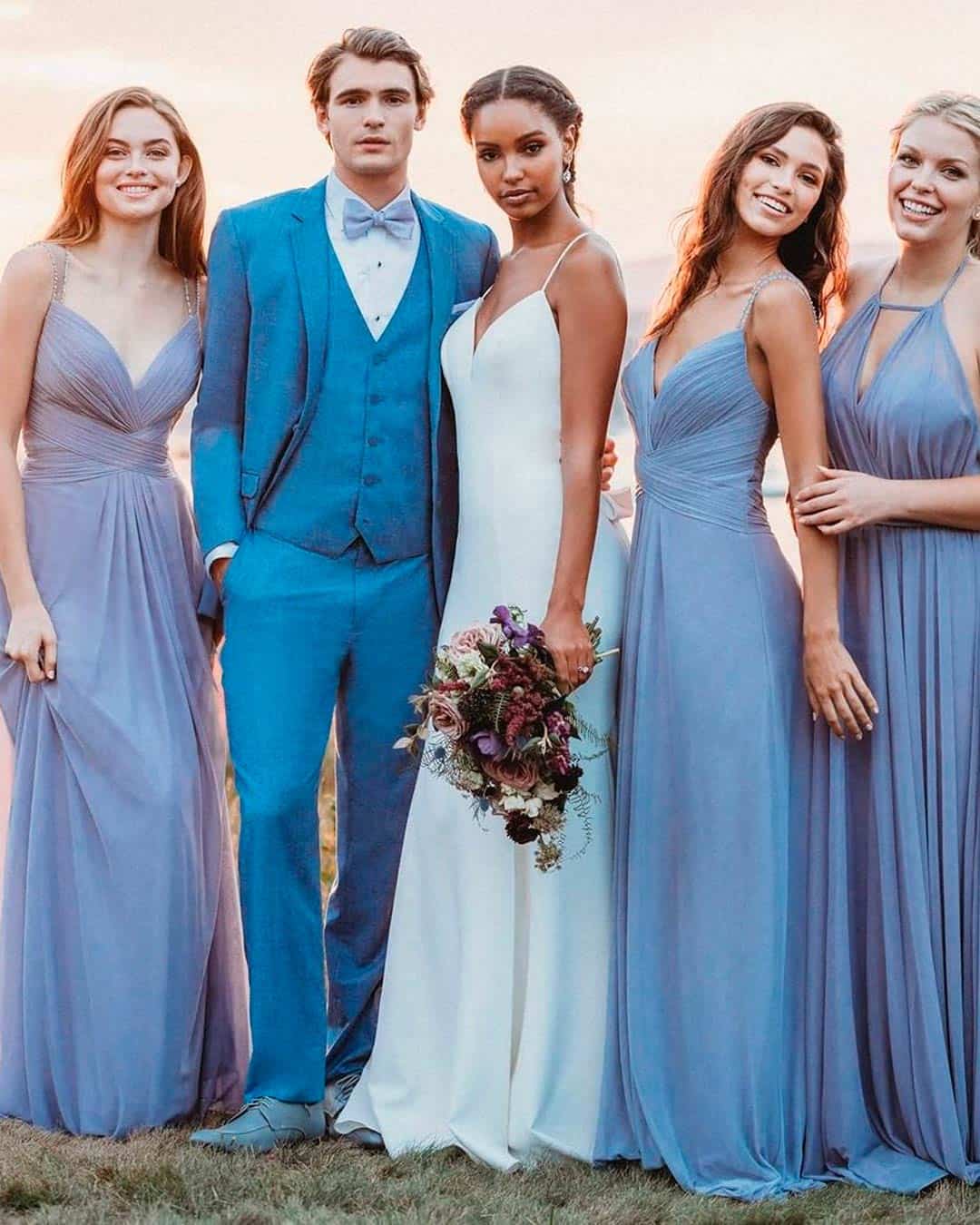
For a classic wedding theme, black, gold, and ivory make a flawless blend. Peach and forest green paired with a metallic accent perfectly suit a rustic chic theme. Marigold, cream, and turquoise create a serene yet powerful palette fit for whimsical weddings. And for boho or waterside weddings, white paired with dusty blue or indigo and orchid combos feel absolutely right.
Nature inspiration examples for choosing winter colors
Winter is cold yet absolutely stunning in its own way. Natural elements like a fluffy white blanket of snow transform the world into a panoramic picturesque scene.
The blazing orange, red, and blue tones of cozy fires plus colorful winter veggies and fruits keep your imagination buzzing. You can also pull inspiration from winter blooms like roses, orchids, French tulips, mini gerberas, gardenias, Casablanca lilies, and more.
Popular spring color combinations
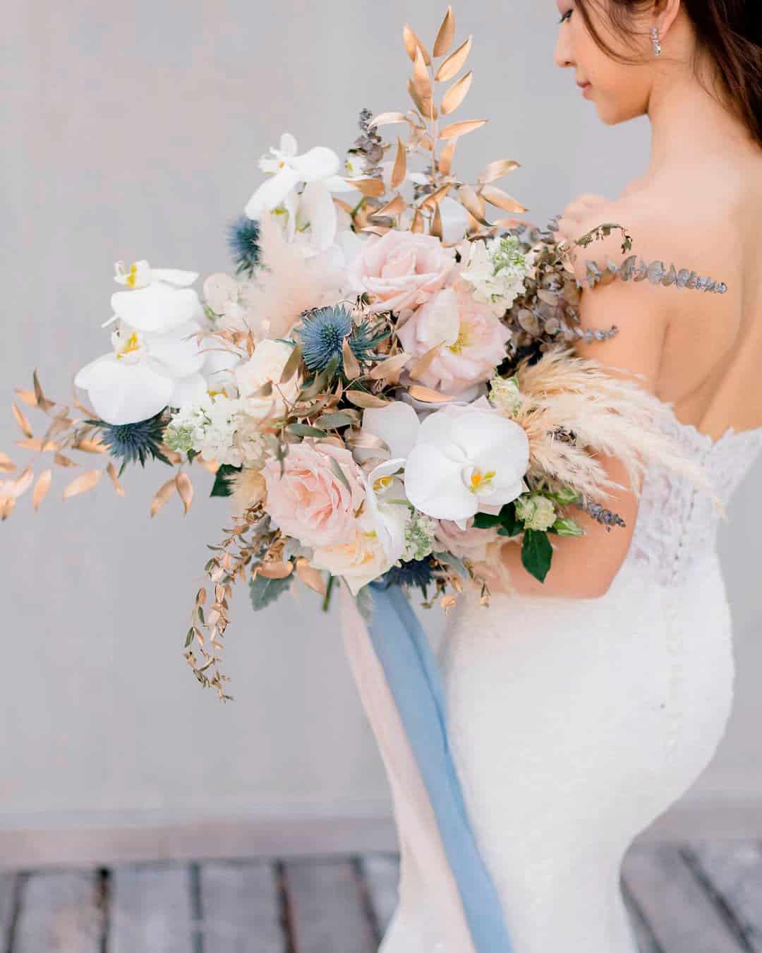
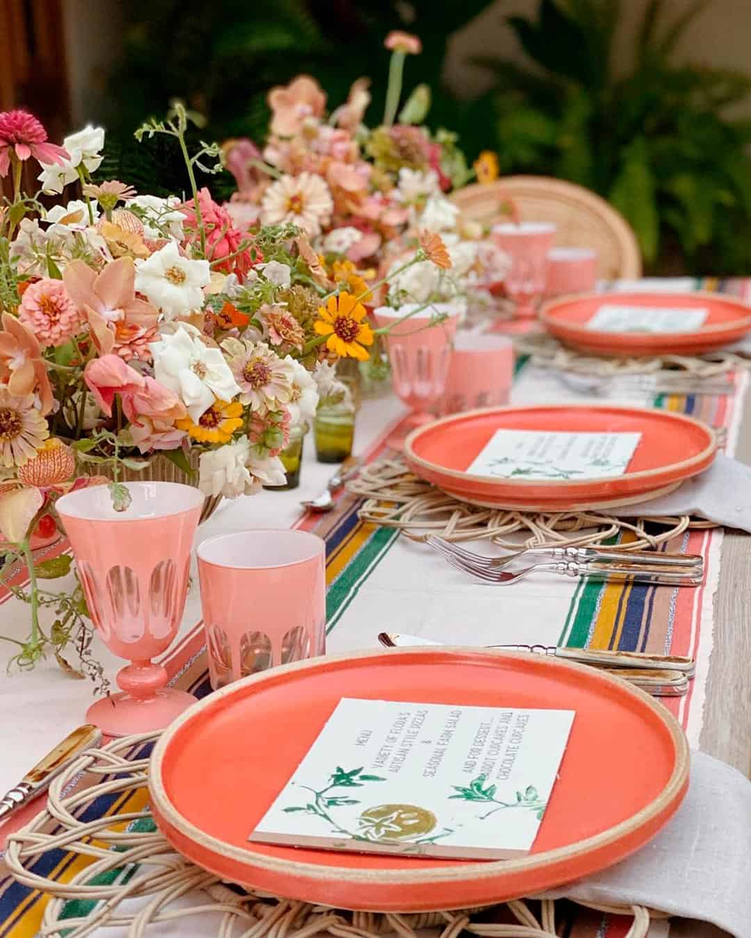
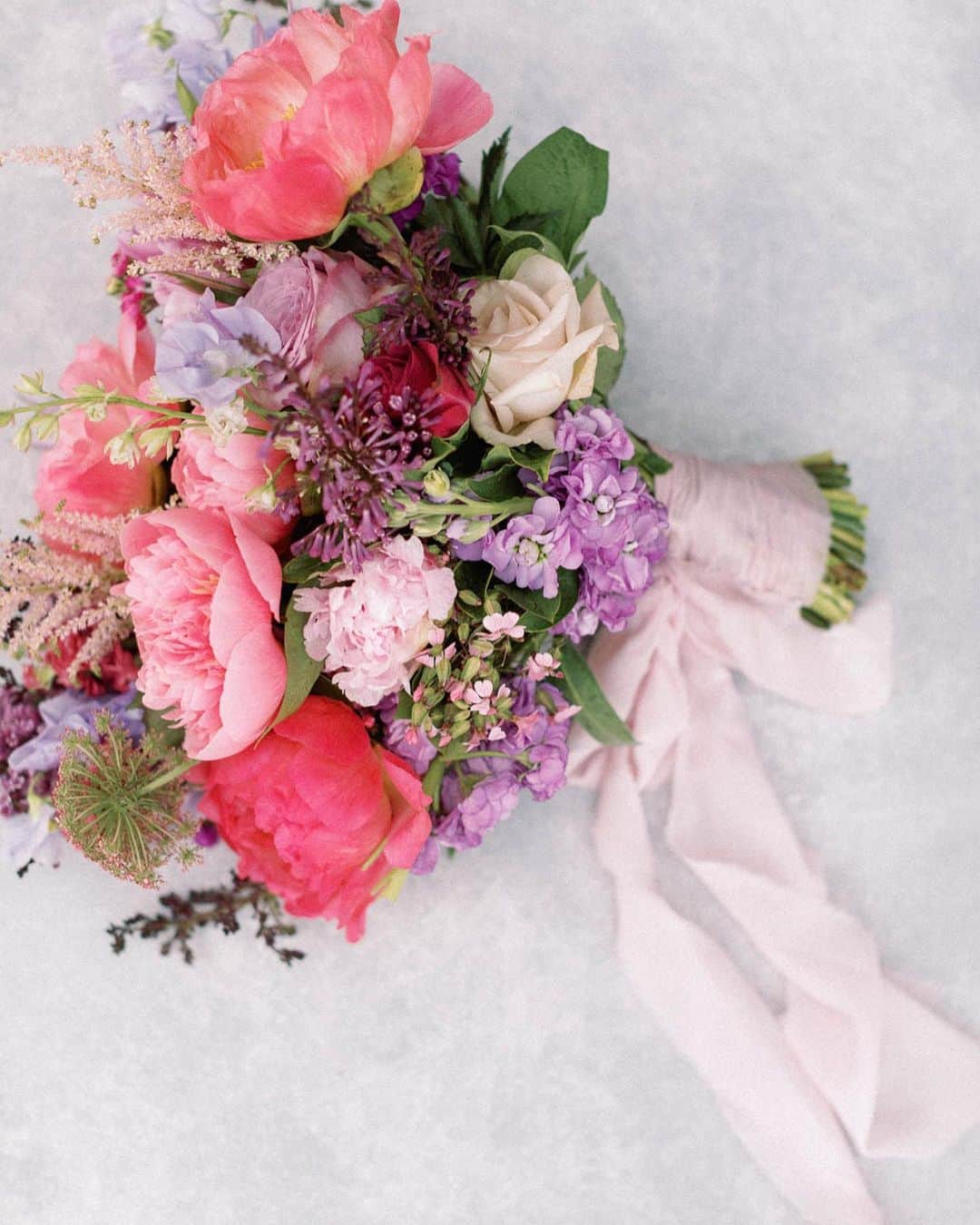
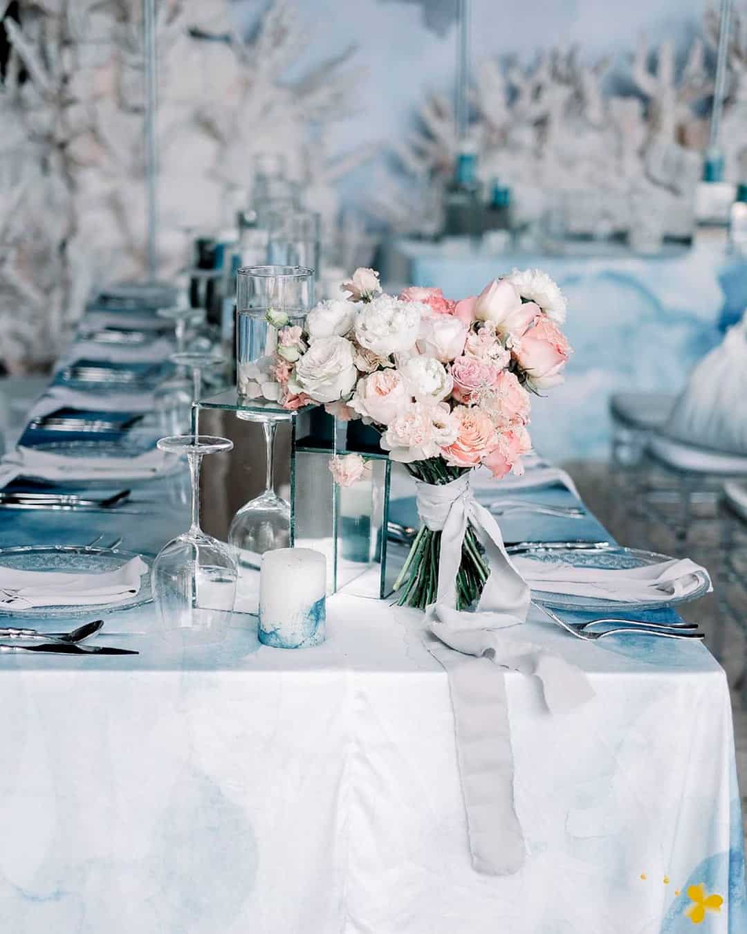
For a magical, elegant wedding touched with rustic quality, build your vision around a dusty blue and white color palette. The light pink, white, and ice blue combination works brilliantly for rustic, vintage, and modern elegant themes alike. Green and coral bring a refreshing, vibrant energy perfect for country chic and outdoor wedding styles. Delicate gold paired with mint stands as a classic and refined choice for the timeless couple.
Nature inspiration examples for choosing spring colors Spring is hands down the best season for outdoor weddings. You can pull color inspiration straight from the clear blue skies above.
Think about those bright, sun soaked days, bulbs bursting into bloom, and tree leaves budding all around. The earth also reveals rich tones as it thrives, creating ethereal natural palettes everywhere you look.
Popular summer color combinations
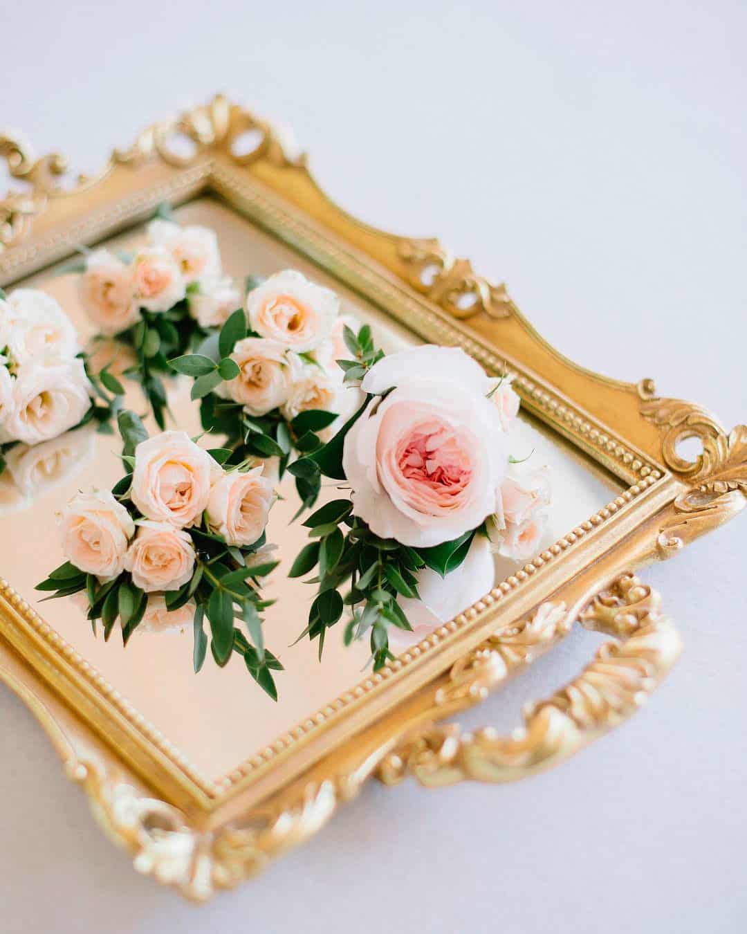
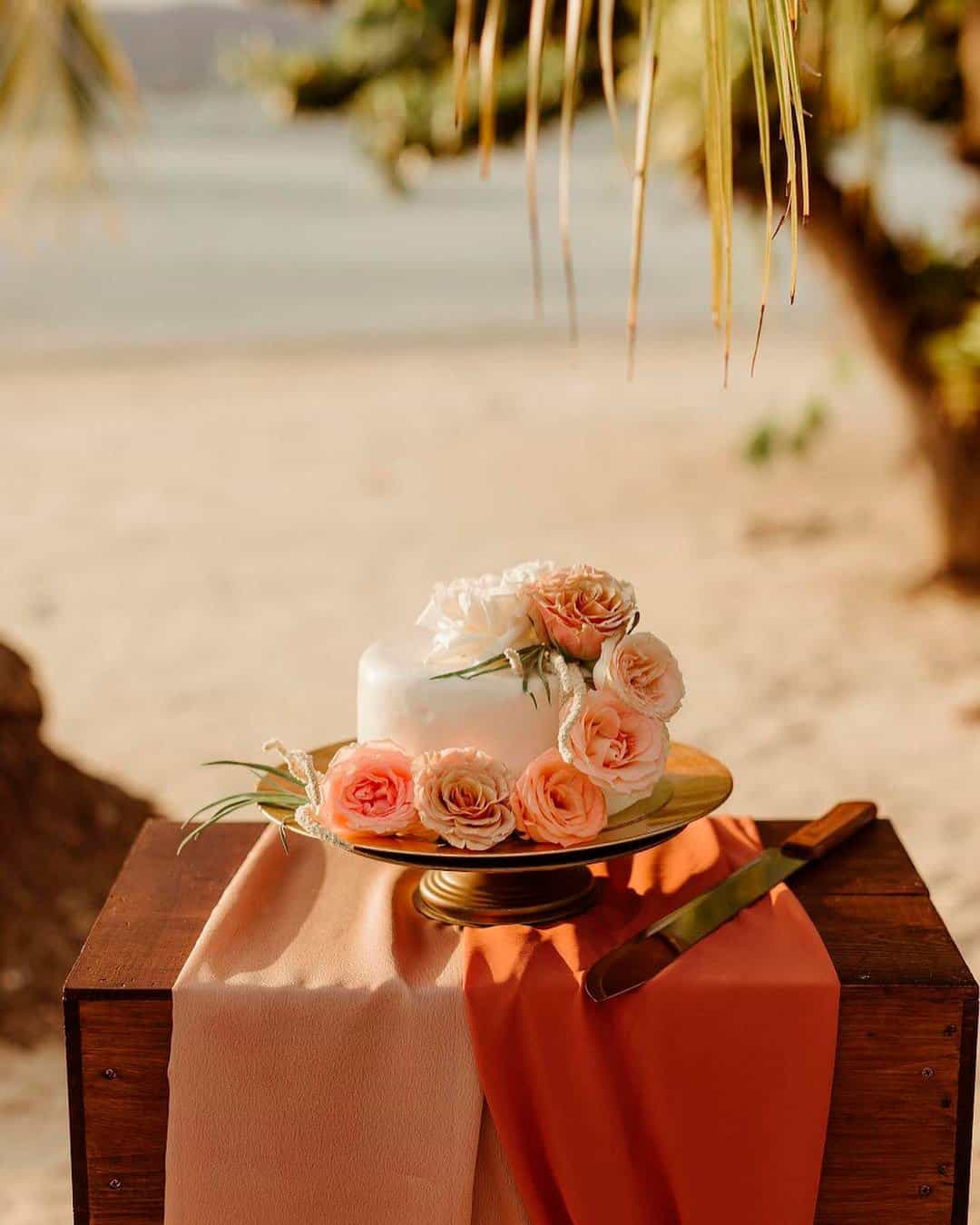
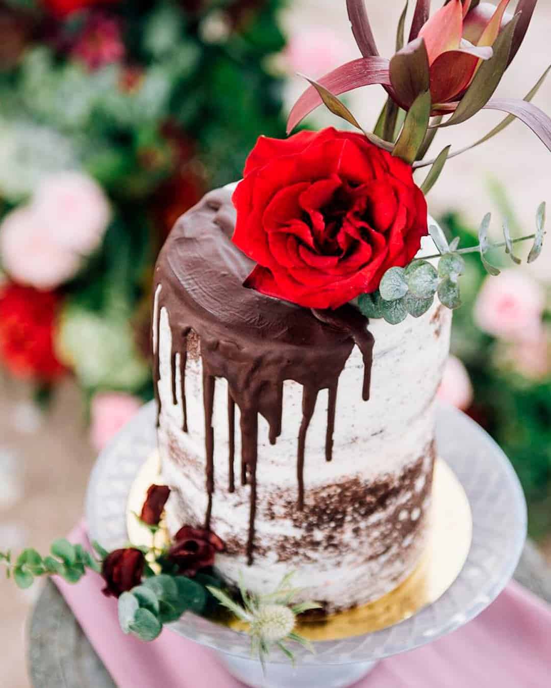
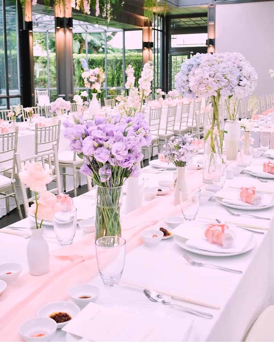
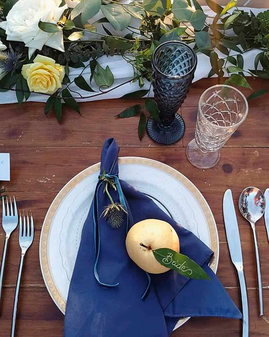
Sage and poppy creates a warm yet serene combo that leans beautifully into tropical tones and leafy motifs. Green, white, and gold stands as a summer color match up for the classy, neutral, glam loving soul. Cream, classic blue, and grey feels both romantic and hypnotic at the same time. Orange, pineapple, and pale pink delivers a vibrant, sorbet sweet combination fit for playful or bohemian themes. And for every kind of outdoor wedding theme, wrap your arms around a lilac and lavender combination.
Nature inspiration examples for choosing summer colors
The fiery, vibrant sunshine blazing during the day and those Tetrazzini sunsets offer glorious color inspiration. The sun transfers its energy into everything around you, bringing the whole world to life.
Also, observe calm waters, budding flowers, and sun bleached leaves. Summer nature offers an endless buffet of beauty to tickle your fancy.
How do I choose a color scheme for my wedding? I want something that’s unique and will stand out to my guests.
We are here for this! We are PANTONE addicted and constantly renovate our style following the latest seasonal color palette and proposing innovative ideas for a unique wedding design.
Our trends research and development are done partially “live” traveling and discovering the world, partially online with a press review of the most famous Wedding and fashion Blogs worldwide. Then we use Pinterest to collect the ideas and give the choices to our couples.
– Ilaire, Phuket Wedding Planner
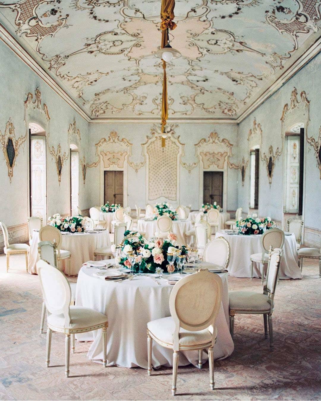
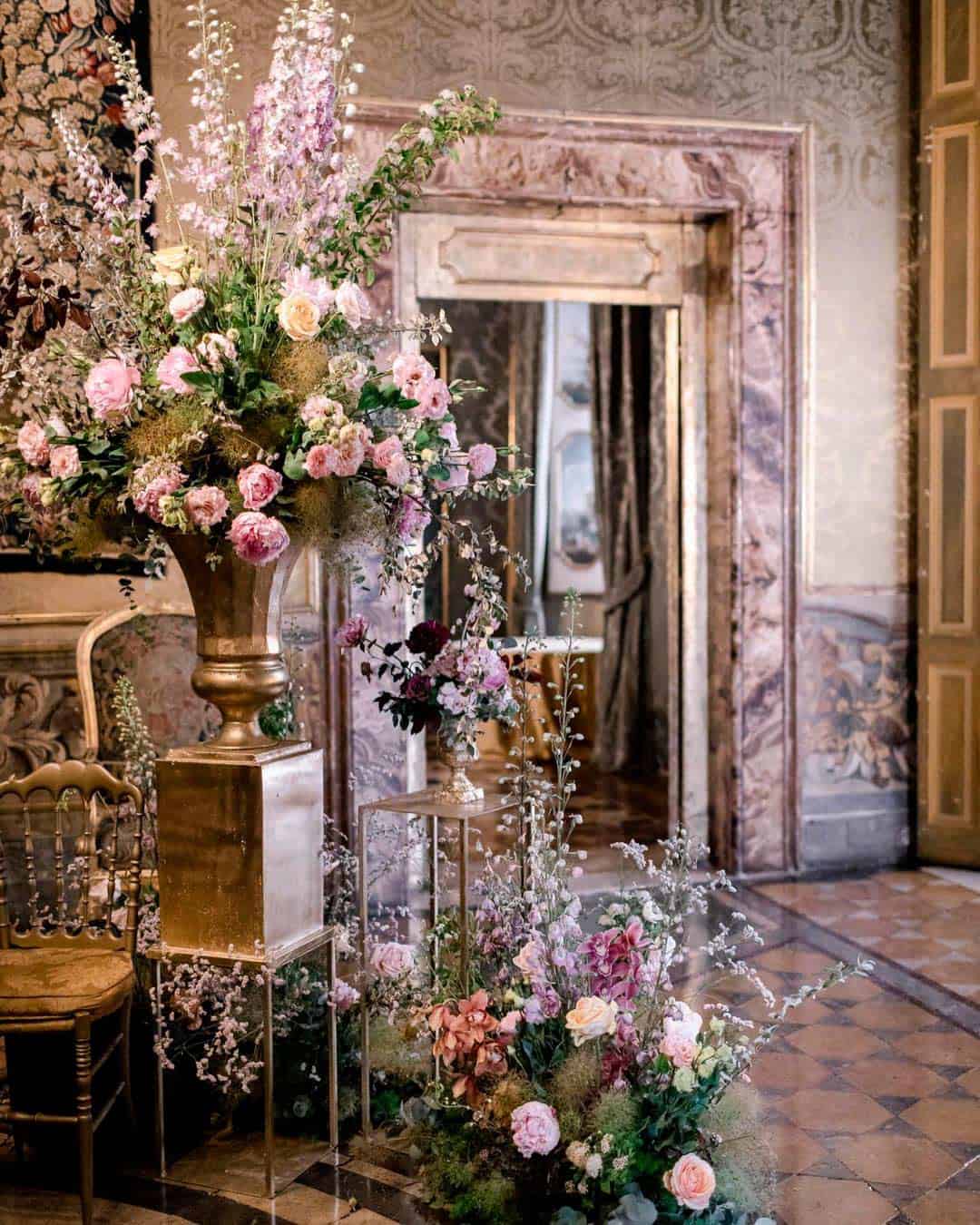
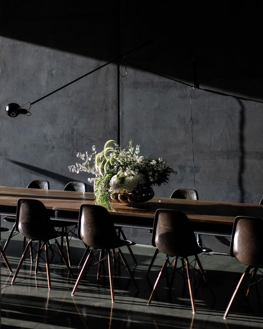
The layout of your wedding venue helps determine the kind of colors you should pick. Is your wedding outdoors or set in nature?
Then choose colors that seamlessly blend into the surroundings rather than competing against them.
Reach for earthy tones, bold hues, or bright palettes. If you’re working with an ornate indoor venue, embrace neutrals and pastels instead.
These tones enhance the aesthetic presentation beautifully. But when the venue is mostly bare, you get to work your magic by assembling your colors completely from scratch.
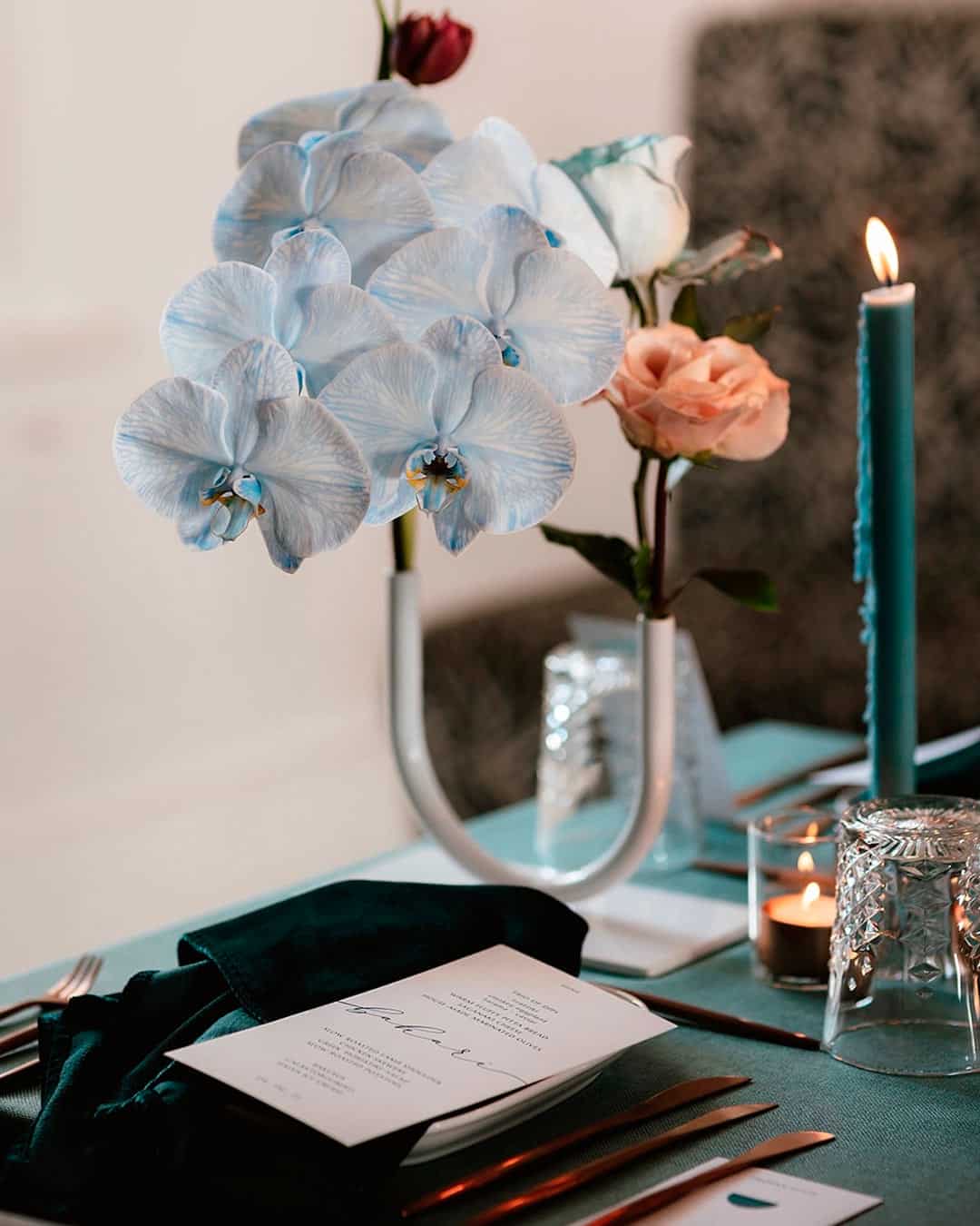
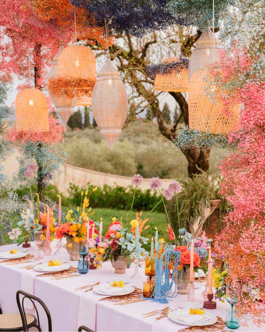
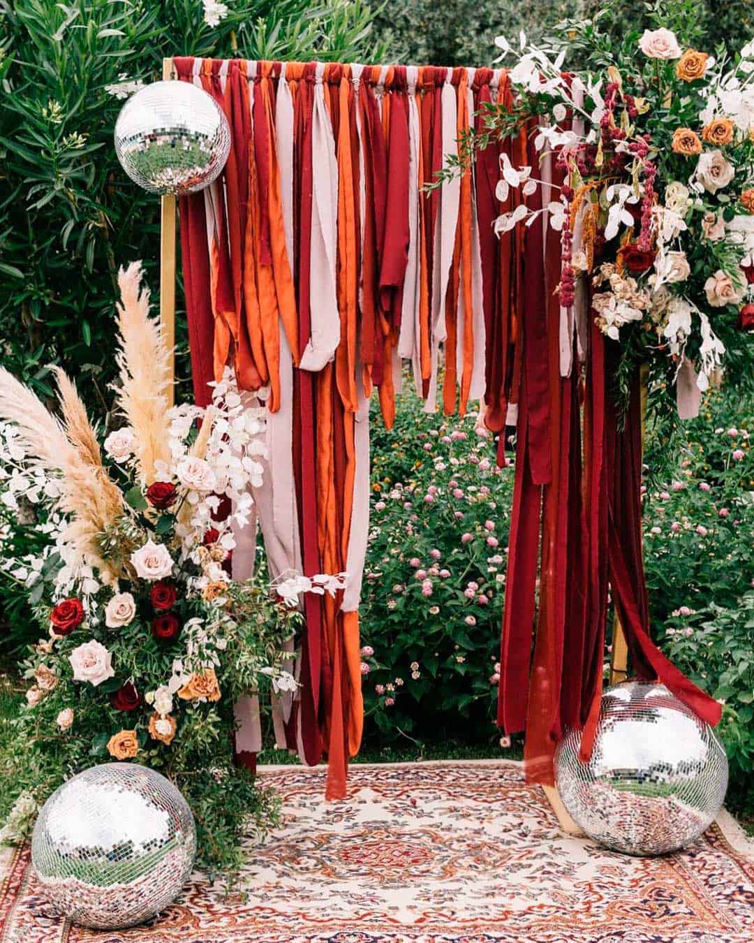
Before you commit to your final color palette, a bit of research goes a long way. Some of your favorite hues may not be easy to source.
So you need to examine your chosen flowers to confirm your colors are actually available.
Get familiar with how to choose linen colors for curtains and tables by checking textile swatches. Look into the hues available for stationery card stock, decorative accents, and accessories.
Also, browse real weddings and study color combos that grab your attention. Judge them based on cohesion, how they photograph, accessibility, and alignment with your personal style.
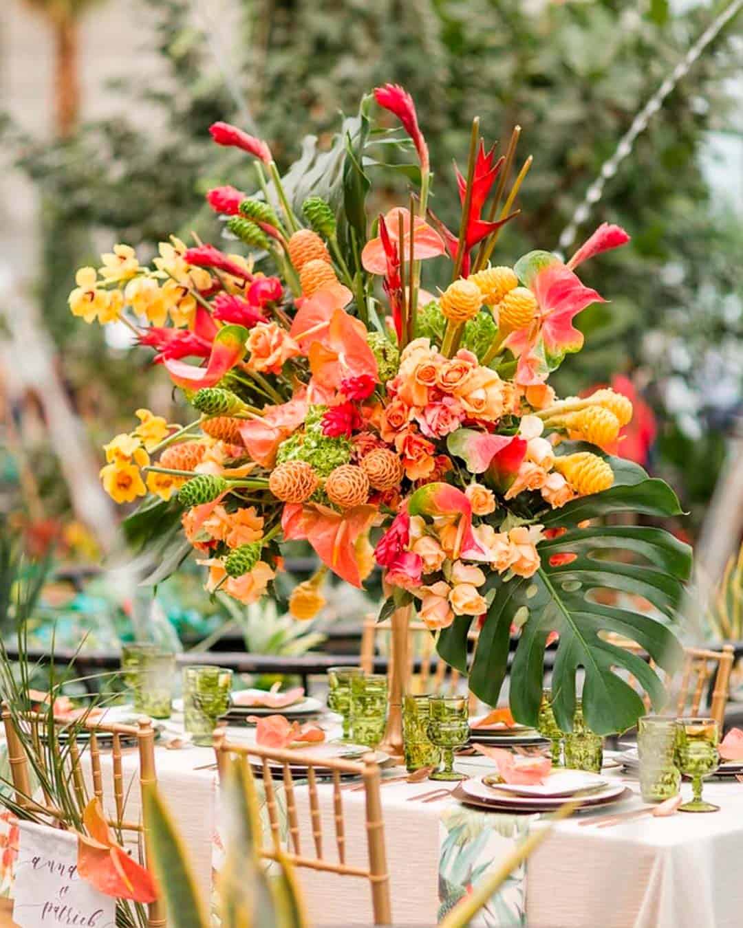
As you select colors, remember that they should flow naturally as expressions of your personalities. Choosing your colors really shouldn’t revolve around trends, but around what you genuinely love.
What’s your signature color?
Peek inside your dress closets, makeup box, shoe collections, and even your kitchenware. Chances are high that you repeatedly buy the colors you love most.
Bring those into your wedding because, as the mantra goes, it’s all about you.
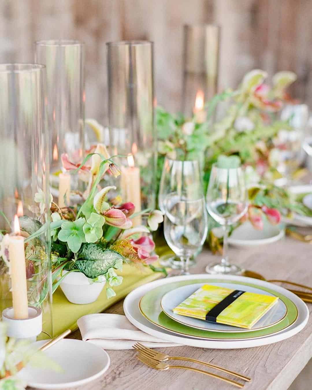
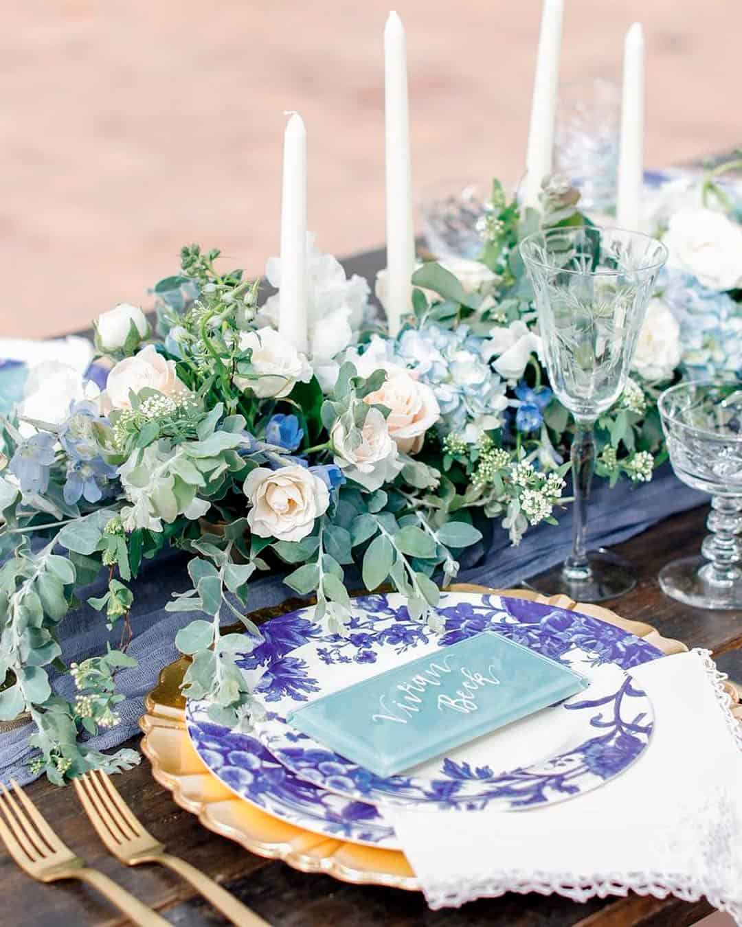
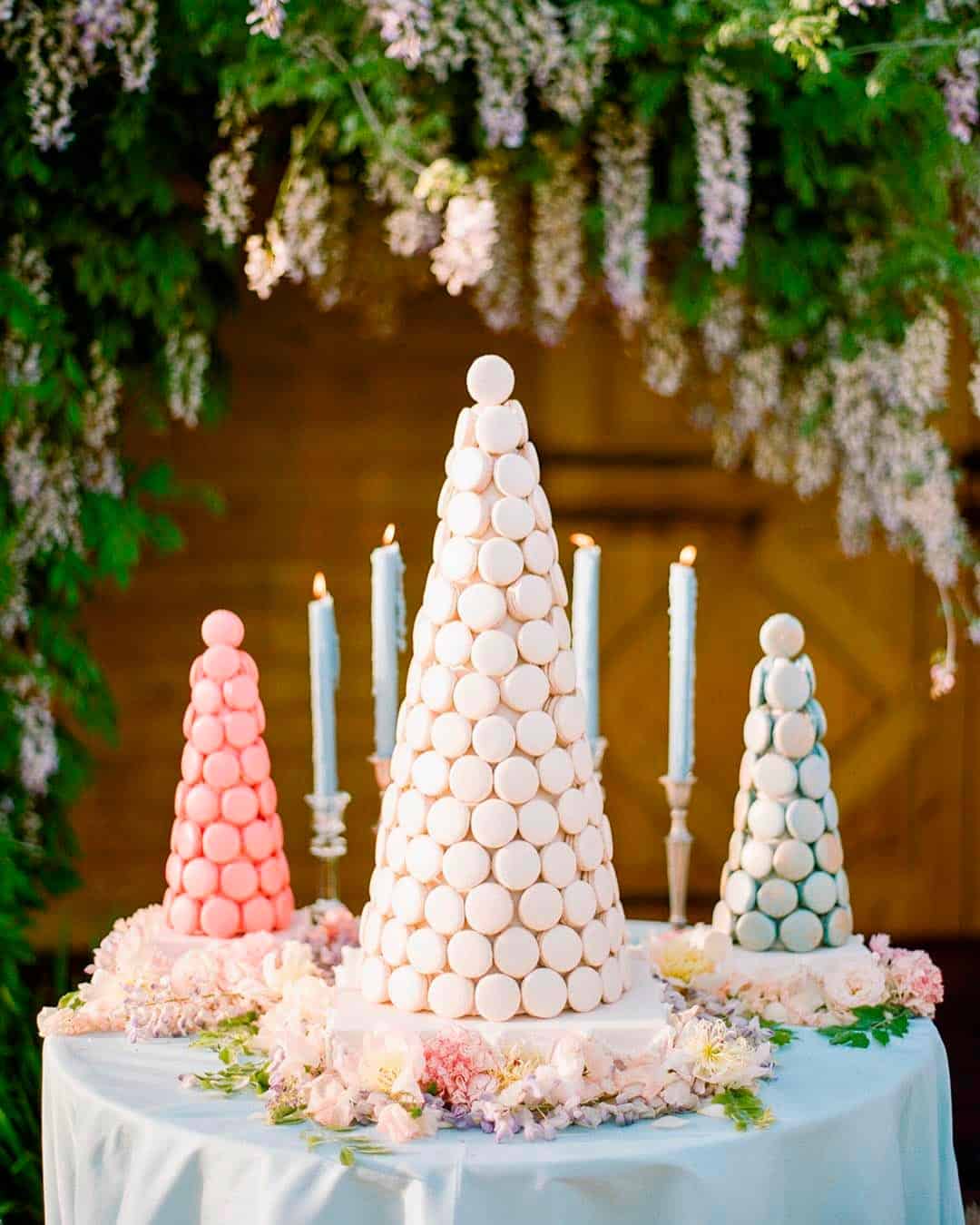
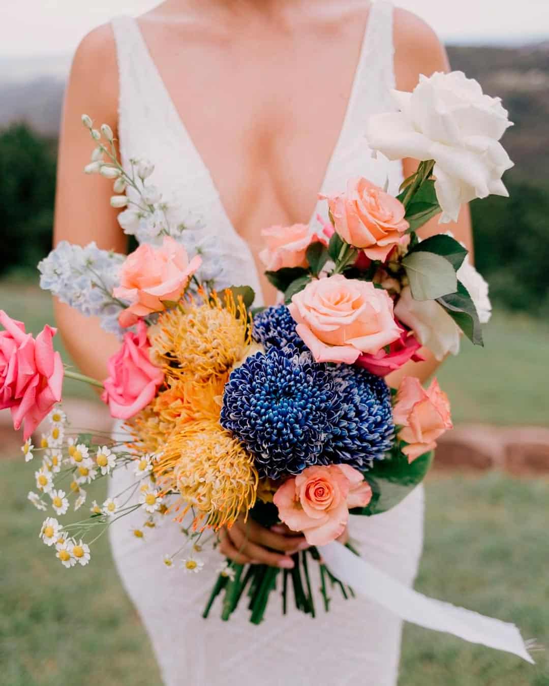
We’ve witnessed many stunning wedding color trends. But if trends leave you cold, the real goal is to stay classic and timeless.
Shades of green like pistachio, avocado, and matcha will be the toast of nature inspired weddings. Light blue tones including cornflower, periwinkle, French blue, and powder blue make great additions to modern and romantic themes. Elegant pastels like mint green, lavender, lilac, and bubblegum pink embody everything whimsical. We’ll also enjoy throwback brights, think yellow, fuchsia, teal, cobalt, and bright red for glamorous, classic looks.
However, rather than wrestling with trends that don’t speak to you, go personal. What do you love doing?
Which destination calls to you for your wedding?
Who’s your dream designer? What are your absolute favorite flowers and music?
What time of day do you picture your wedding unfolding? Once you figure these pieces out, your wedding is already halfway planned.
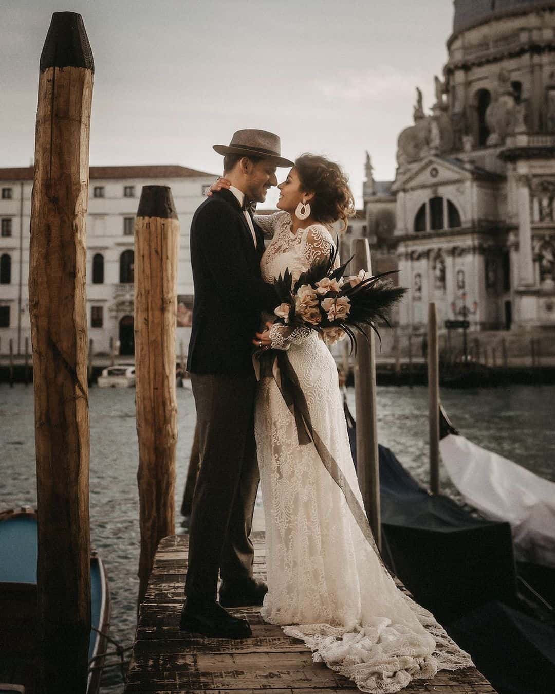
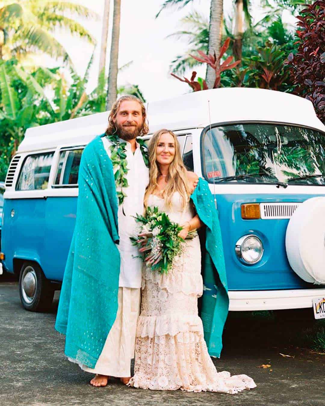
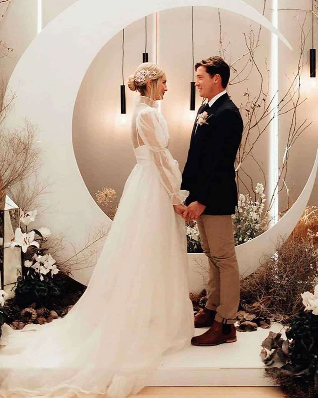
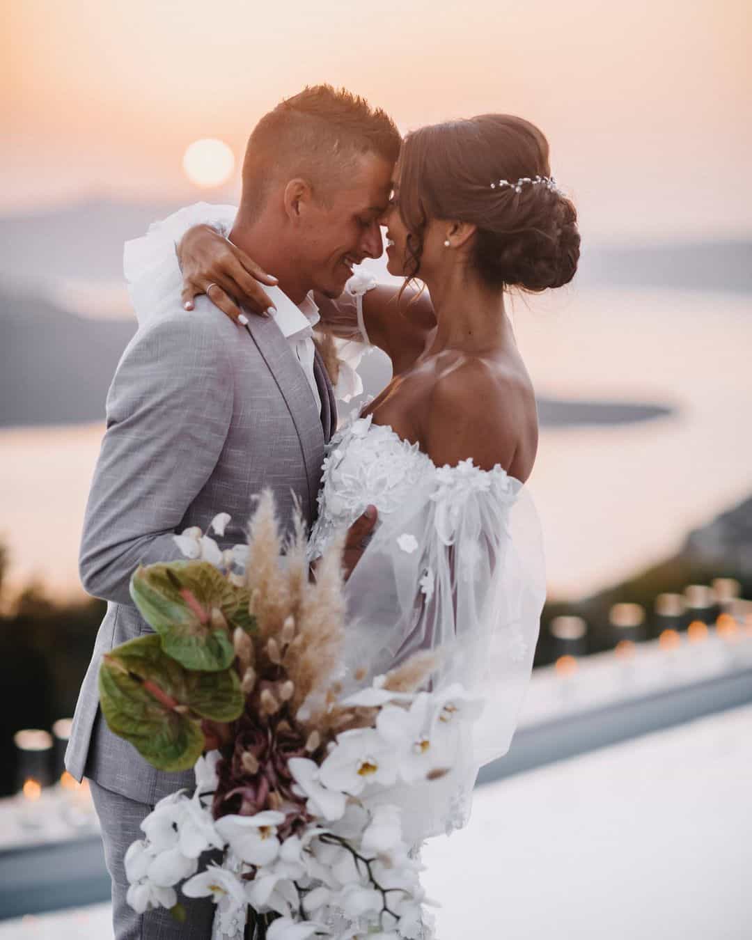
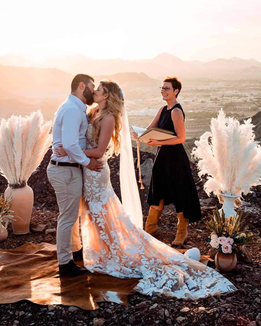
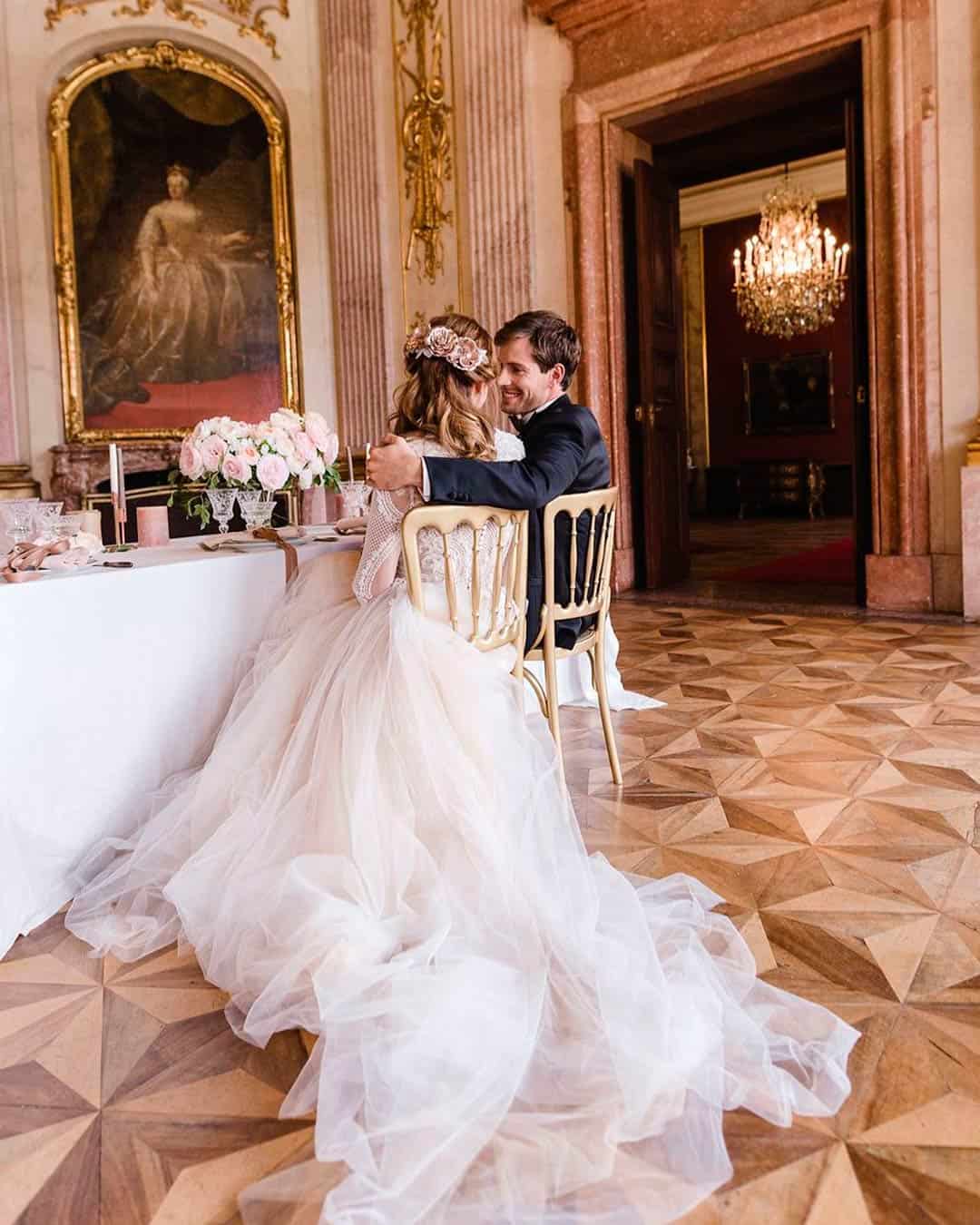
There’s no unbreakable rule stating you must purchase specific colors for any given wedding style. But certain wedding styles do need a touch of specific colors to fully come alive through the seasons.
Romantic Shades of pink, blue, and ivory.
Vintage Gold, turquoise, light blue, cantaloupe, apricot, moss, and honeydew.
Whimsical or Boho Yellow, blush, white, salmon, daffodil, mohair, and muted neutrals.
Modern Contemporary Shades of blue, red, green, neutrals, and metallic.
Rustic Country Jewel tones, greenery, grey, lavender, champagne, and hazelnut.
Garden Lavender, green, blush, coral, peach, yellow, and pastels.
Southern Golden pumpkin, navy blue, green, ivory, and gold.
Classic Formal Black, white, pink, blush, and grey.
Nautical Sea glass blue, coral, fuchsia, navy, and silver.
Eco-Natural Olive, mint, sage, emerald, and grayed jade.
Tropical Teal, Purple, Green, Silver, Beige, and orange.
Christmas Shades of red, brown, green, neutrals, and gold.
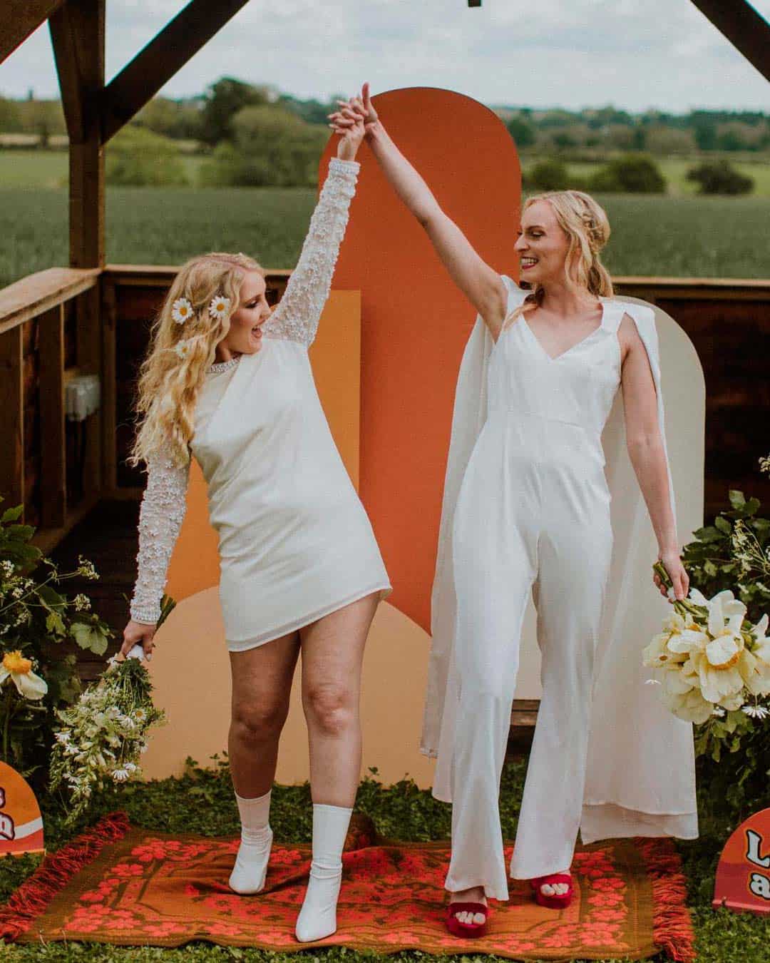
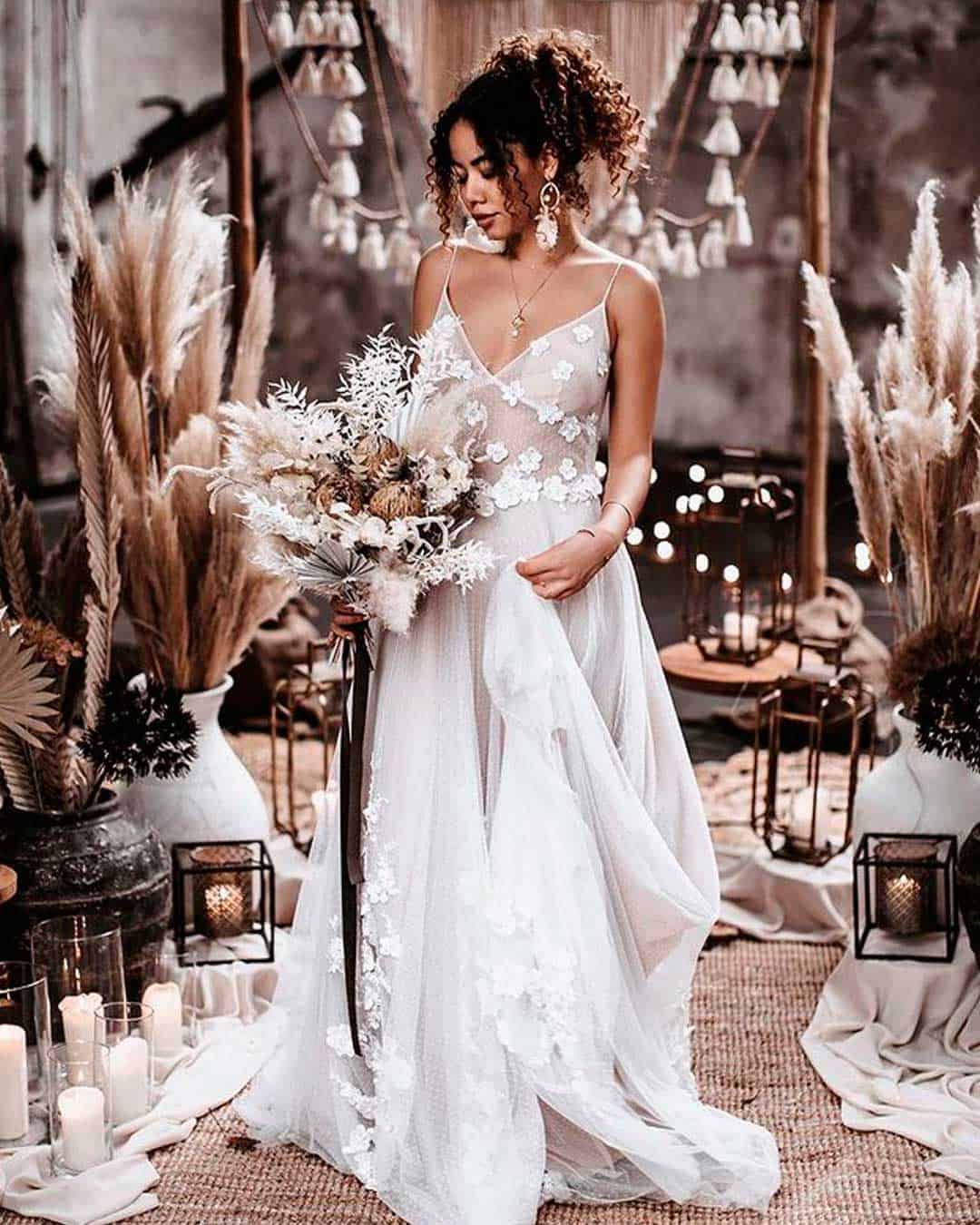
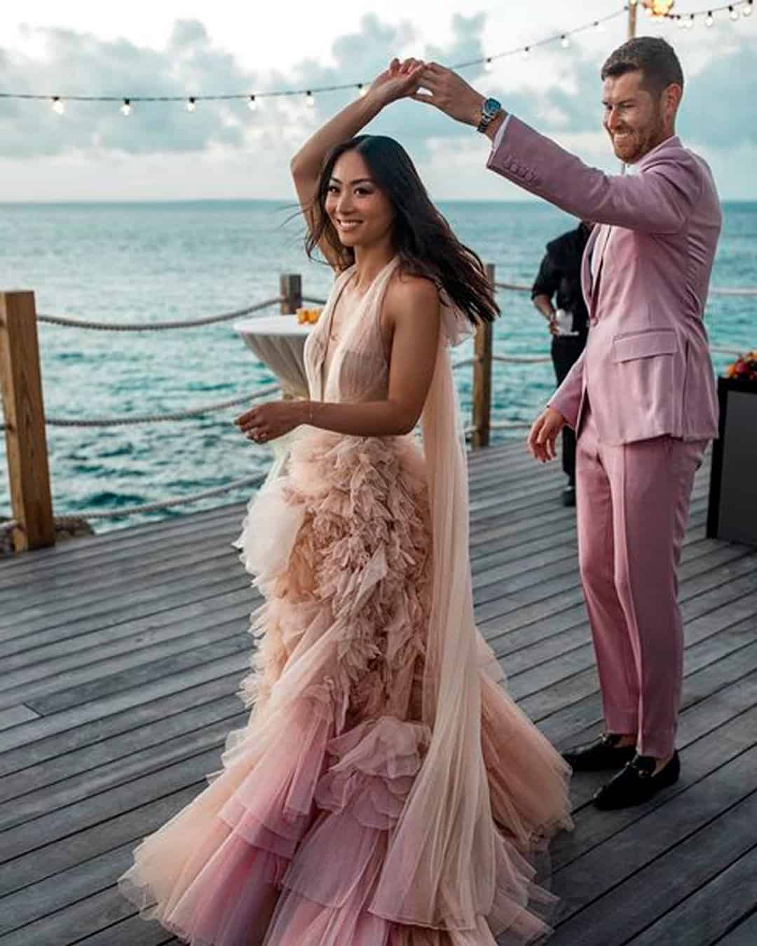
When picking wedding colors, think about how they complement your skin tone. Let’s break them down by category.
Light For light skinned beauties, ivory best complements your skin tone while other hues might leave you looking washed out. The best textiles for this color are lace and crepe.
Build around it by weaving in pastel metallic champagne, soft pink, and taupe. Add one vibrant accent color to inject some life.
Medium Beauties blessed with pink and gold undertones will look absolutely stunning in champagne and blush colors. Source these shades in lace, tulle, chiffon, and organza textiles.
Build around them with taupe, greyish green, greenery, and gold for an ultra romantic look.
Dark While paler skin tones tend to appear quite subdued, dark or olive skin tones shine brilliantly in diamond white. Find this color in satin and crepe, and go minimal on the accents.
Build around the color with bright coral, sorbet hues, blush pink, and buttercream yellow. Together, they read as effortlessly chic.
How/Where Do I Use Wedding Colors?
Whether you lean toward monochrome, ombre, or a whole collection of colors, moderation is what matters most. You can infuse your hues into the theme without going overboard, as we’ll explore.
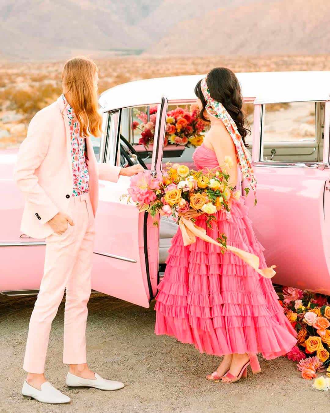
You can add colors as accents to your dress. Also, weave them into the shoes, jewelry, and hairpieces.
For the men, colors can show up through a shirt, pocket square, cummerbund, socks, or ties. For the bridesmaids, let it be a beautiful blend of dress, shoes, corsages, hair accessories, and body jewelry.
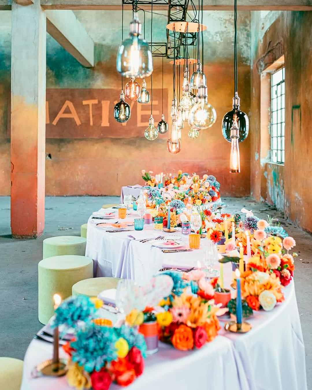
Work your colors into bouquets, bouquet wraps, corsages, venue floral arrangements, centerpieces, and decor throughout the space.
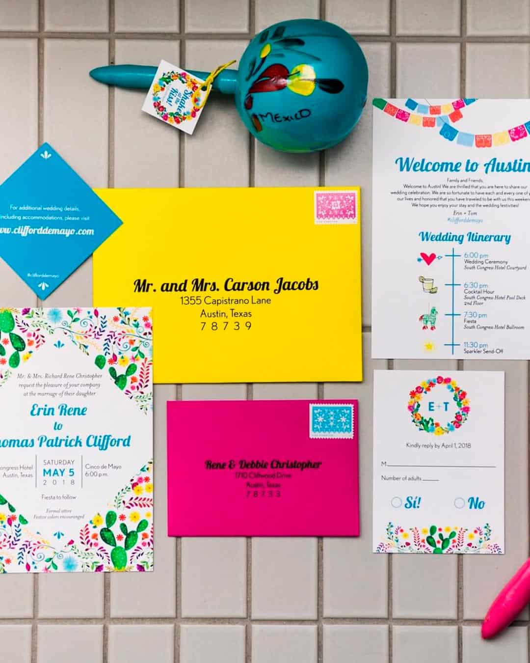
Distribute your colors through the entire invitation suite including the box, envelopes, save the date cards, invites, and RSVP cards. Take it a step further by creating cohesive program cards, place cards, menu cards, escort cards, and thank you cards.
Then scrawl across them with matching expert calligraphy for the complete effect.
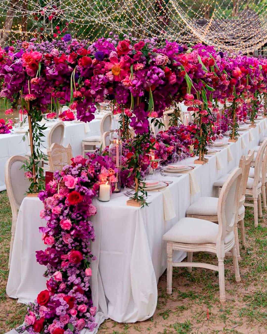
Incorporate your main color as a base for dinner napkins, dinner table linens, chair covers, drapes, or sashes. Extend it to cocktail linens, table runners, aisle runners, and pew or chair swags too.
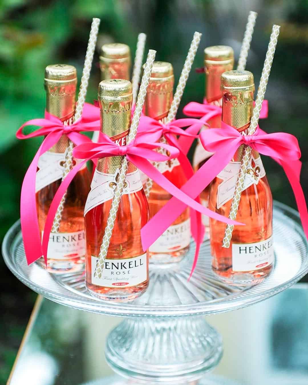
There are wonderfully unique ways to infuse your wedding colors at the bar. They include mugs, decanters, custom drinks, ice buckets, straws, and cocktail napkins.
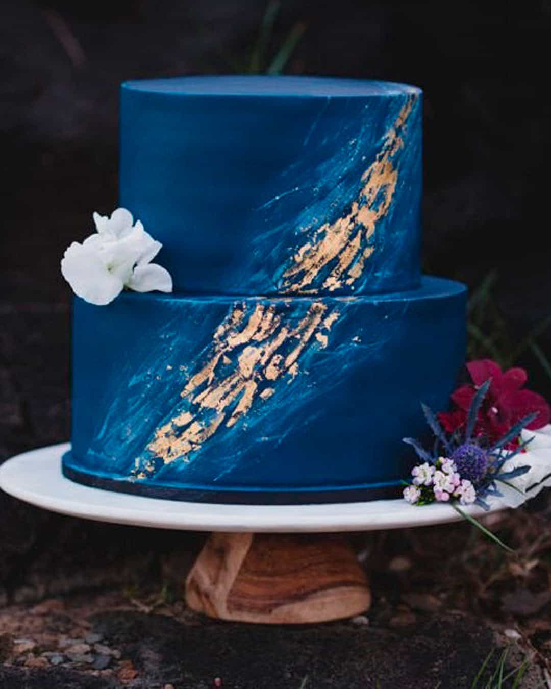
Feed your colors right into the cake aesthetics. This could mean the color of the icing, the toppers, and other decorative accents.
If you’re choosing cake alternatives, infuse your colors throughout the dessert spread. Alternatives actually give you even more creative surface area to play with.
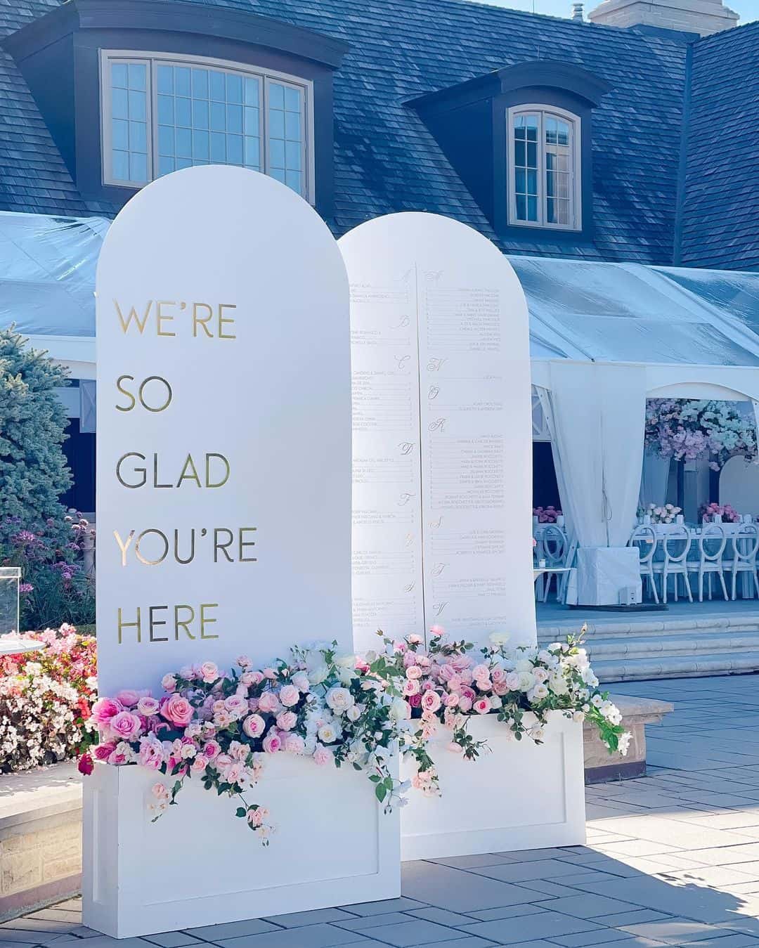
Look for lighting options that match your color palette. They range from torches to lamps, flameless lanterns to string lights, and elegant chandeliers.
Choose mismatched colorful vases and potted plants for your floral arrangements.
Opt for a seating chart, wreaths and garlands, favors, and candles all in your chosen palette. If there’s a need for blankets, shawls, parasols, and flip flops for guests, create a colorful, cohesive look throughout.
Mistakes to Avoid When Choosing Wedding Colors
Colors sit at the very core of every creative affair, weddings absolutely included. Here’s how to maintain a stunning yet sane color palette by sidestepping these common mistakes.
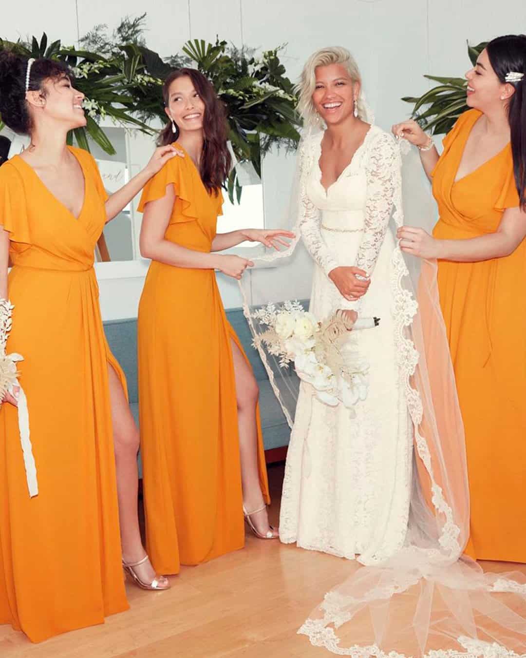
It’s a fact that new trending colors emerge every single year. But never let yourself feel forced into choosing trending colors if you’re not genuinely excited about them.
Trends fade into the background while you remain timeless. How to avoid: Opt for what actually defines you.
Choose your own “best colors.” The colors that feel like home. They don’t need to be in season.
It’s entirely about what you’ll always love. Toss in a neutral, pastel, or metallic accent depending on the overall style you’re chasing.
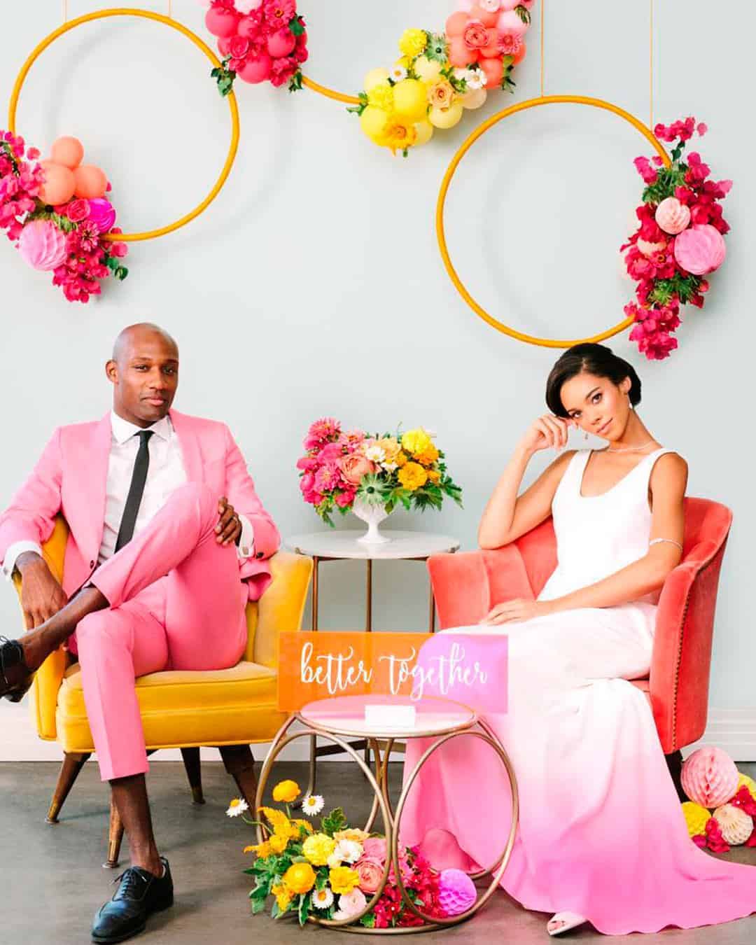
This might be the biggest stumble when choosing wedding colors. Everyone forgets that the eyes need a place to rest.
Every surface ends up lit up and blazing, turning the whole scene blinding and distracting.
How to avoid: Those might be your favorite colors but balance remains key. Pair a bright, bold color with a muted, softer one.
Also, reach for tones that live between the main colors.
Choose cranberry instead of true red, coral instead of bright orange, or plum in place of amethyst. With this approach, even the most blinding color combinations end up looking classic, sophisticated, and totally chic.
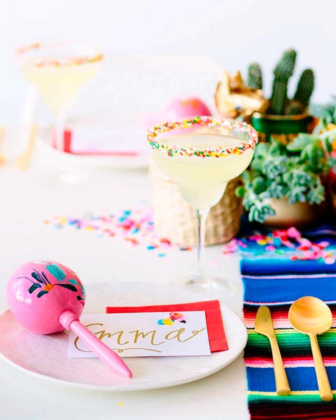
Unless you’re deliberately planning a circus themed celebration, picking too many colors is a disaster waiting to unfold. Your wedding will either end up looking chaotic or completely disjointed.
Guests could also feel unsettled trying to process so much visual activity happening at once.
How to avoid: If you genuinely feel the urge for many colors, keep them calm. Weave in pastels and neutrals, such as cream, ivory, whites, nudes, grays, and beiges.
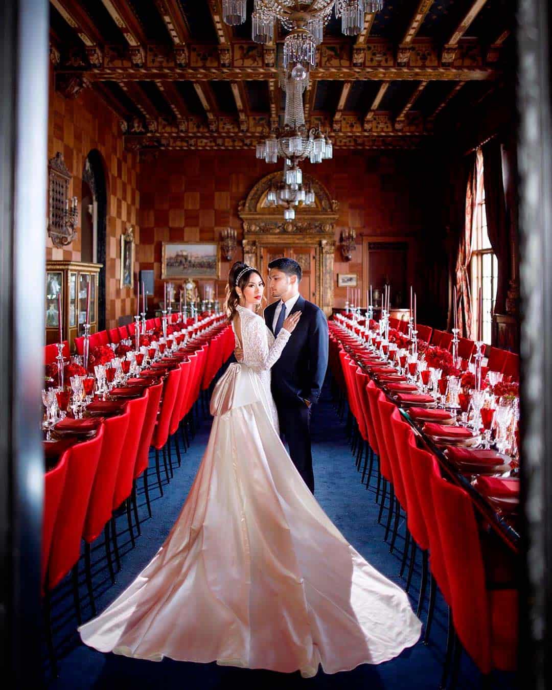
For natural and aesthetically rich venues, you absolutely must consider the existing colors they already bear. If you bring in your chosen colors without proper due diligence, they’ll clash terribly.
This will in turn give the venue a look that doesn’t match your wedding event at all.
How to avoid: Don’t try to scrape away the colors already present. Instead, work your colors thoughtfully into the venue.
Highlight the accents from the venue that you genuinely love rather than trying to hide them.
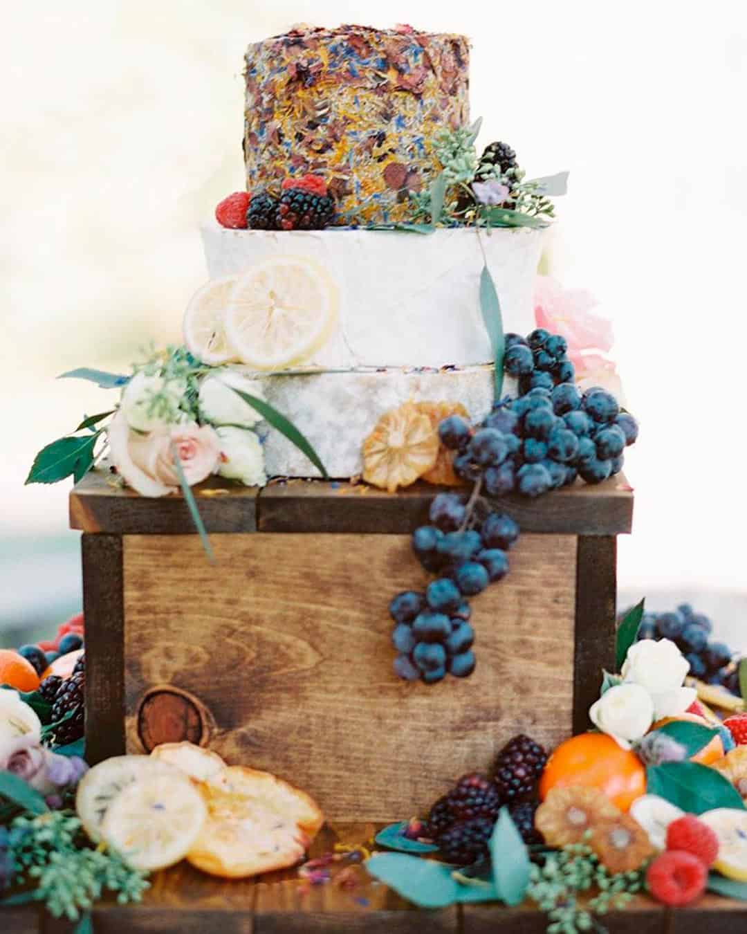
While we’re firmly against having a full blown color riot at your wedding, don’t play things too safe either. Picking just one or two colors will leave your wedding looking boring and drab.
How to avoid: If you naturally lean laid back, play with colors that feel serene yet lively. Cobalt, cerulean, peach, blush, lilac, emerald, Fuchsia, coral, teal, and violet are all great options.
Pick any three, toss in some pastels, neutrals, or a metallic touch, and you’re completely set!
Knowing how to choose wedding colors is essentially a “course” that every intending bride needs to take. This knowledge will help you tie all the wedding details together in a cohesive and efficient way.
We have put together a comprehensive guide to support you when choosing your wedding colors.
From FAQs to colorful seasons, skin tone considerations, how to apply them, and the mistakes to avoid, we’ve got you completely covered!