

Selecting your wedding colors stands as one of those truly defining choices that shapes the entire feeling of your celebration. The hues you land on steer the mood, the visual story, and the overall vibe of your big day.
This guide walks through why those color choices matter so much and offers seasoned guidance for landing on a palette that feels perfectly at home with your wedding vision and personal style.
Whether your heart leans toward enduring classics or fresh modern currents, you will find a spectrum of color pairings here that bridge the decades, so your wedding feels like a seamless dance between the elegance of the past and the spark of right now.
Newest Wedding Colors
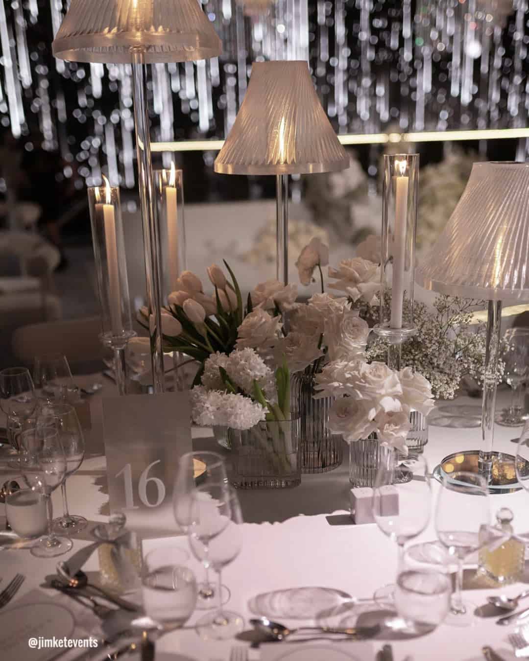
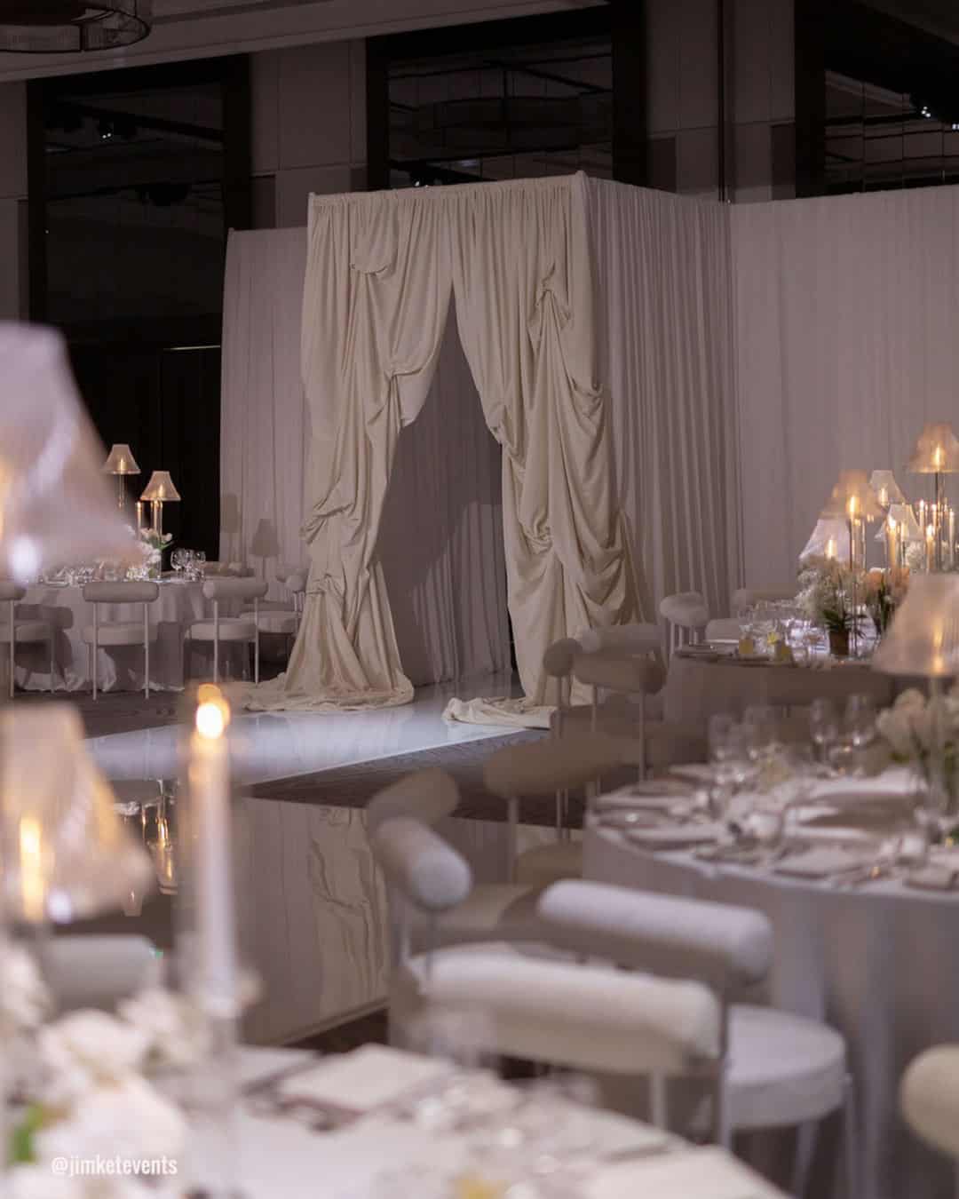
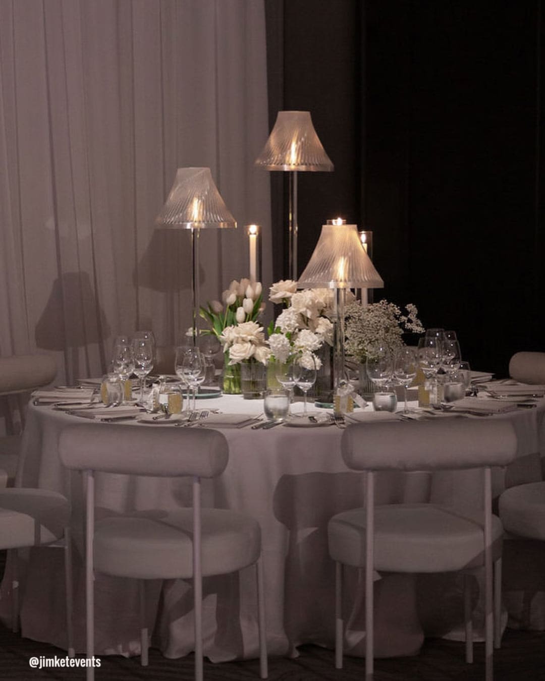
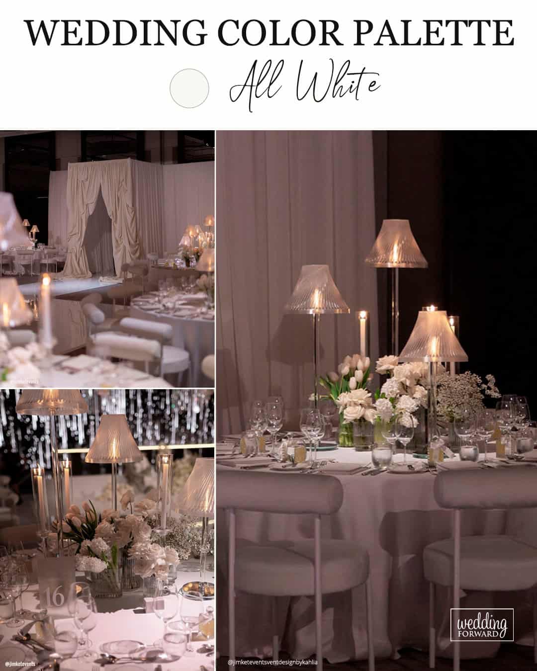
Through decorating over 100 weddings, a clear pattern emerges: white dominates roughly 70% of celebrations as the anchor color. It carries an eternal, refined, classic quality, and the white wave shows zero signs of fading. by Natalie, Giant Flowers Australia & Bali
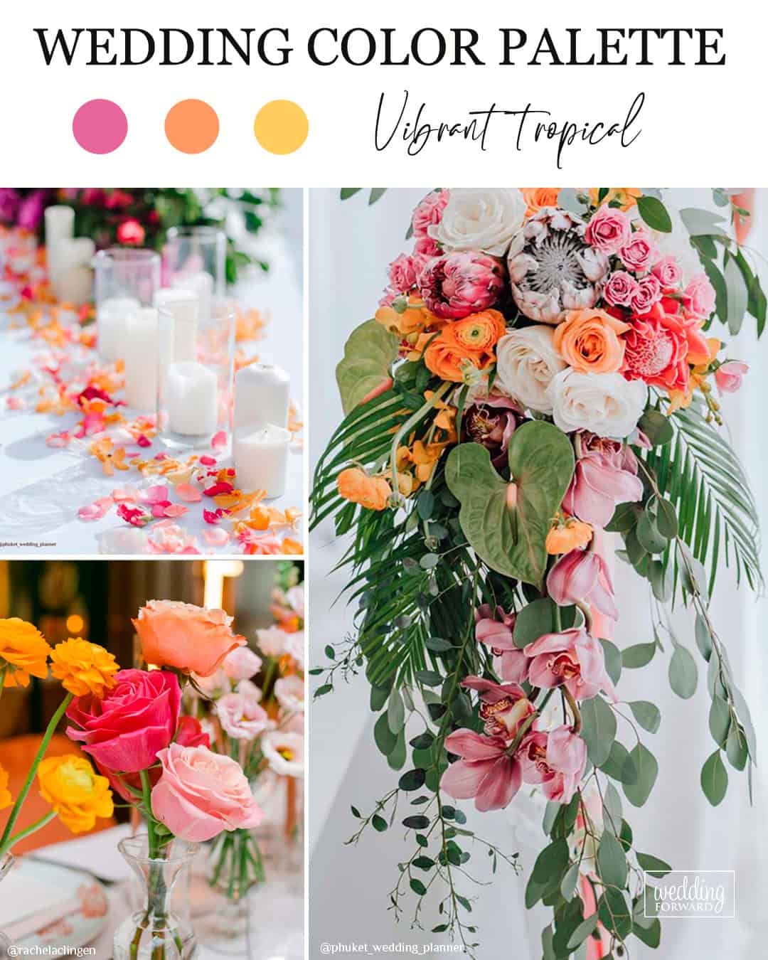
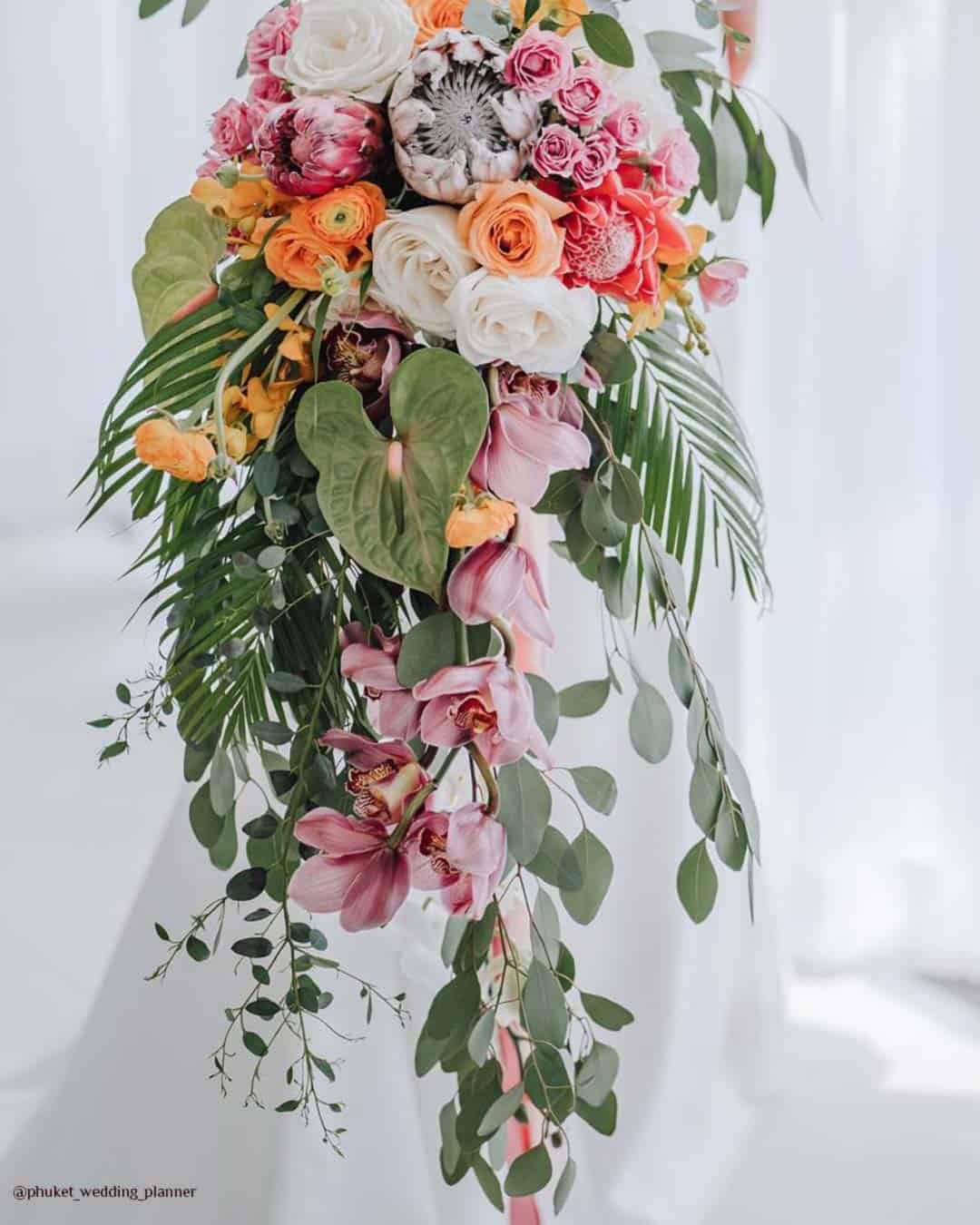
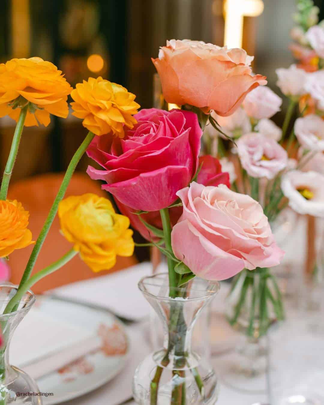
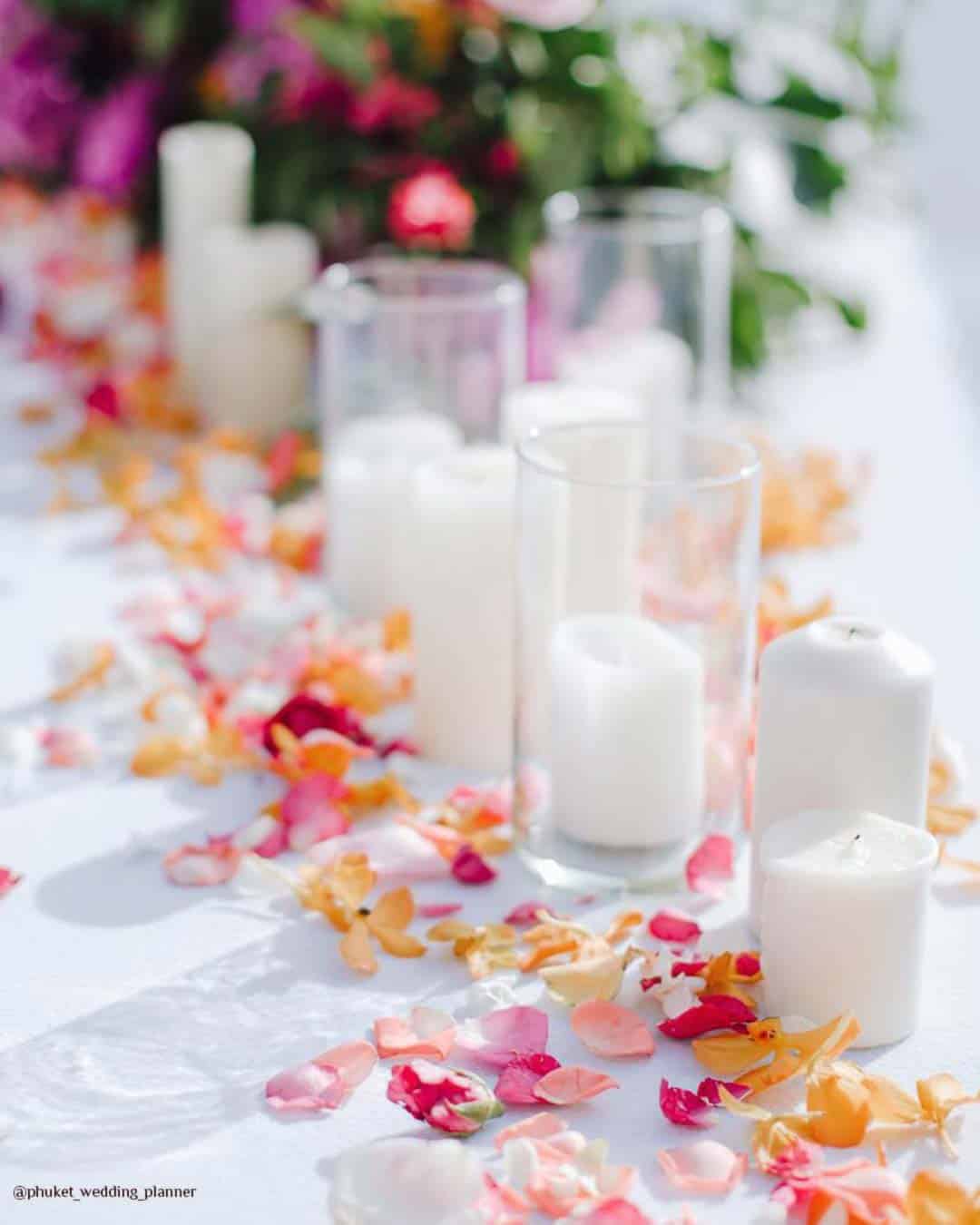
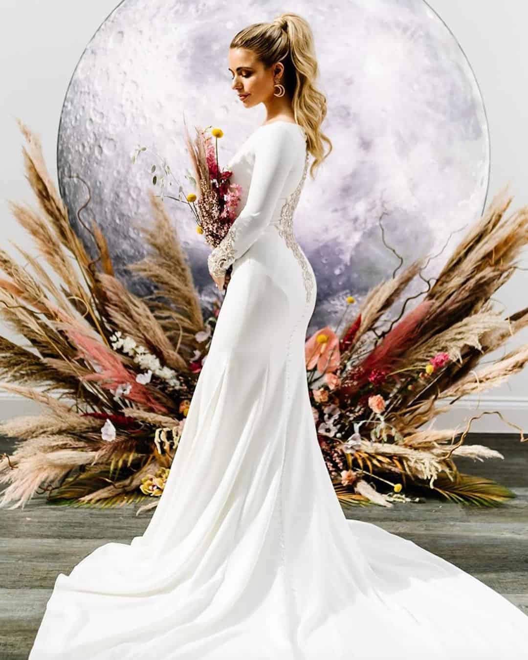
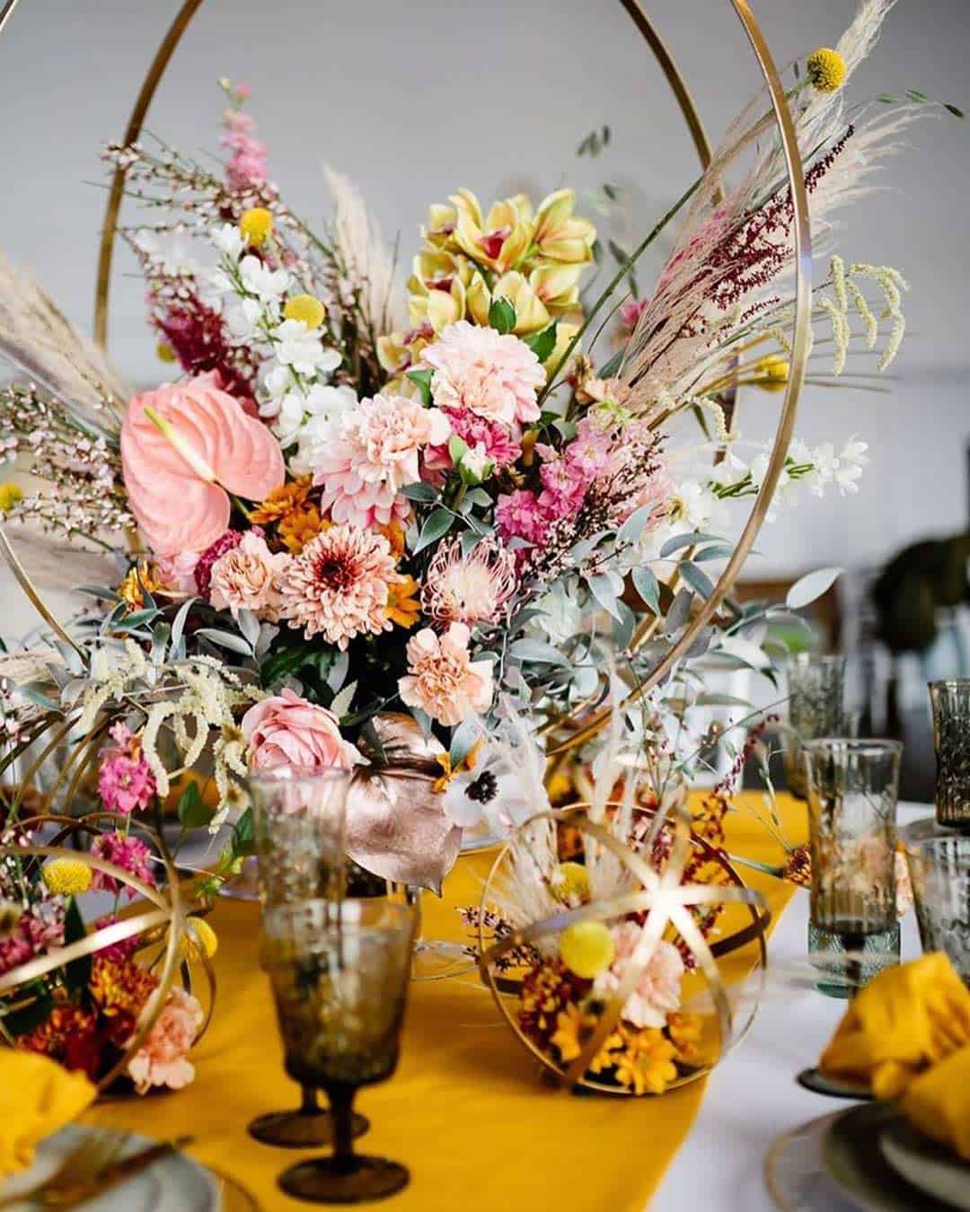
Natalie, from Giant Flowers Australia & Bali, points out that a thrilling swing toward bold tropical shades including pink, peach, and yellow is ushering in. These sun drenched, joyful hues feel tailor made for destination celebrations or peak summer gatherings.
Natalie has already locked in several weddings leaning into these tones, a clear signal that this wave is genuinely building momentum.
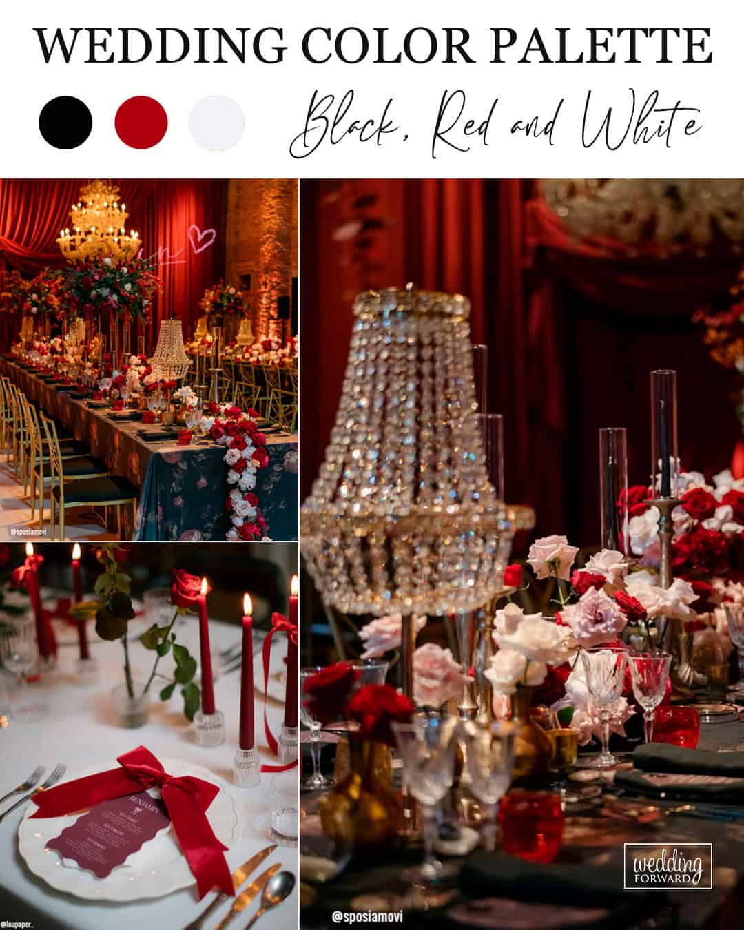
It’s A Match:
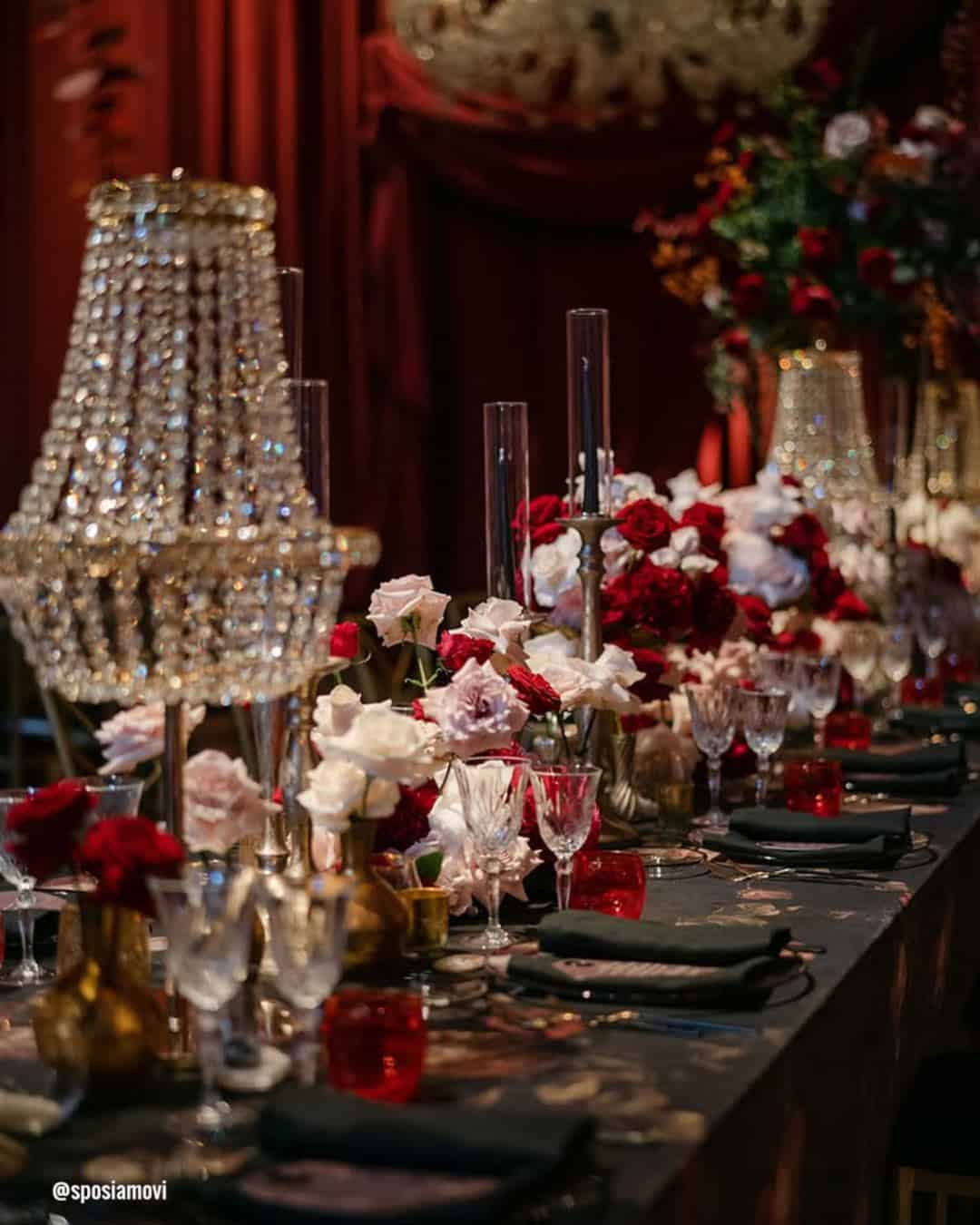
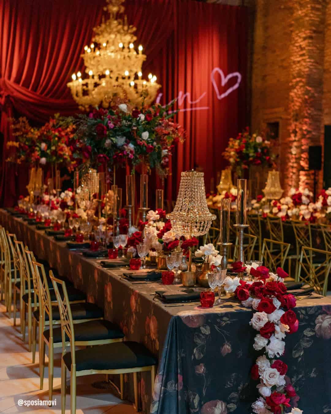
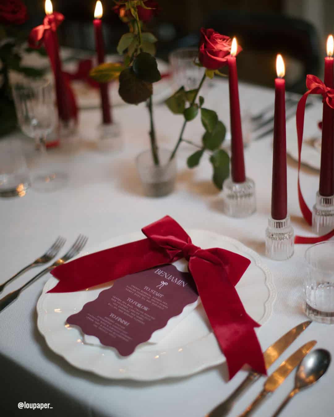
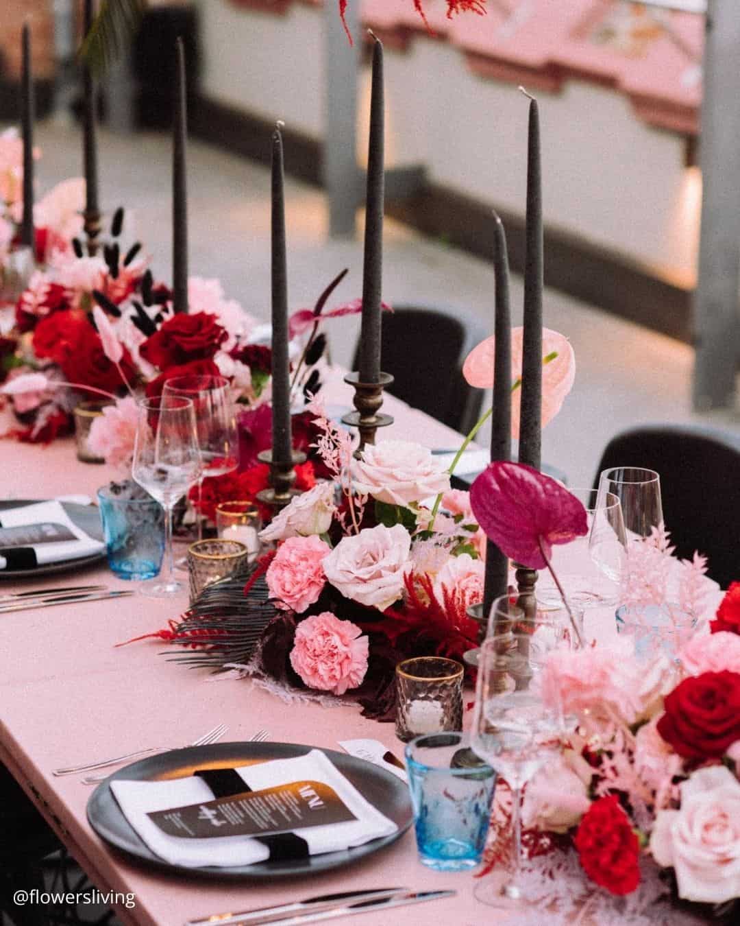
The enduring triad of Black, Red, and White delivers a commanding presence. Black lays down a sleek, refined foundation, Red surges with vitality and emotion, while White steadies the entire palette with crispness and grace.
This high impact mix belongs at Modern Glam or Luxury affair weddings, conjuring an atmosphere that is equal parts commanding and impossible to forget.
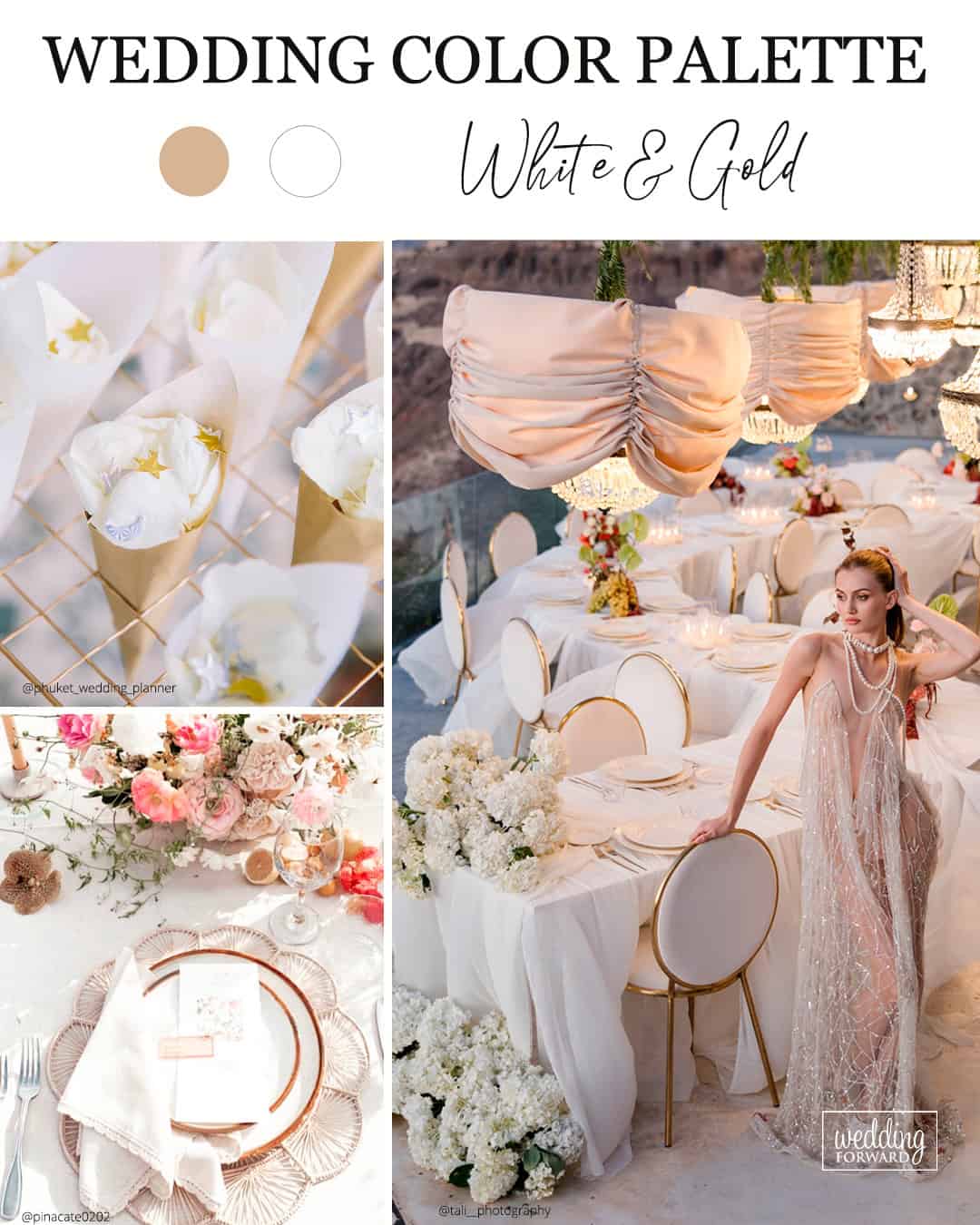
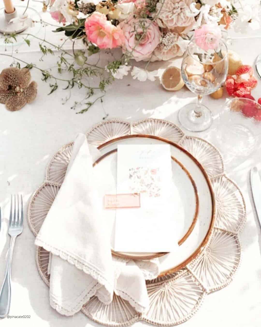
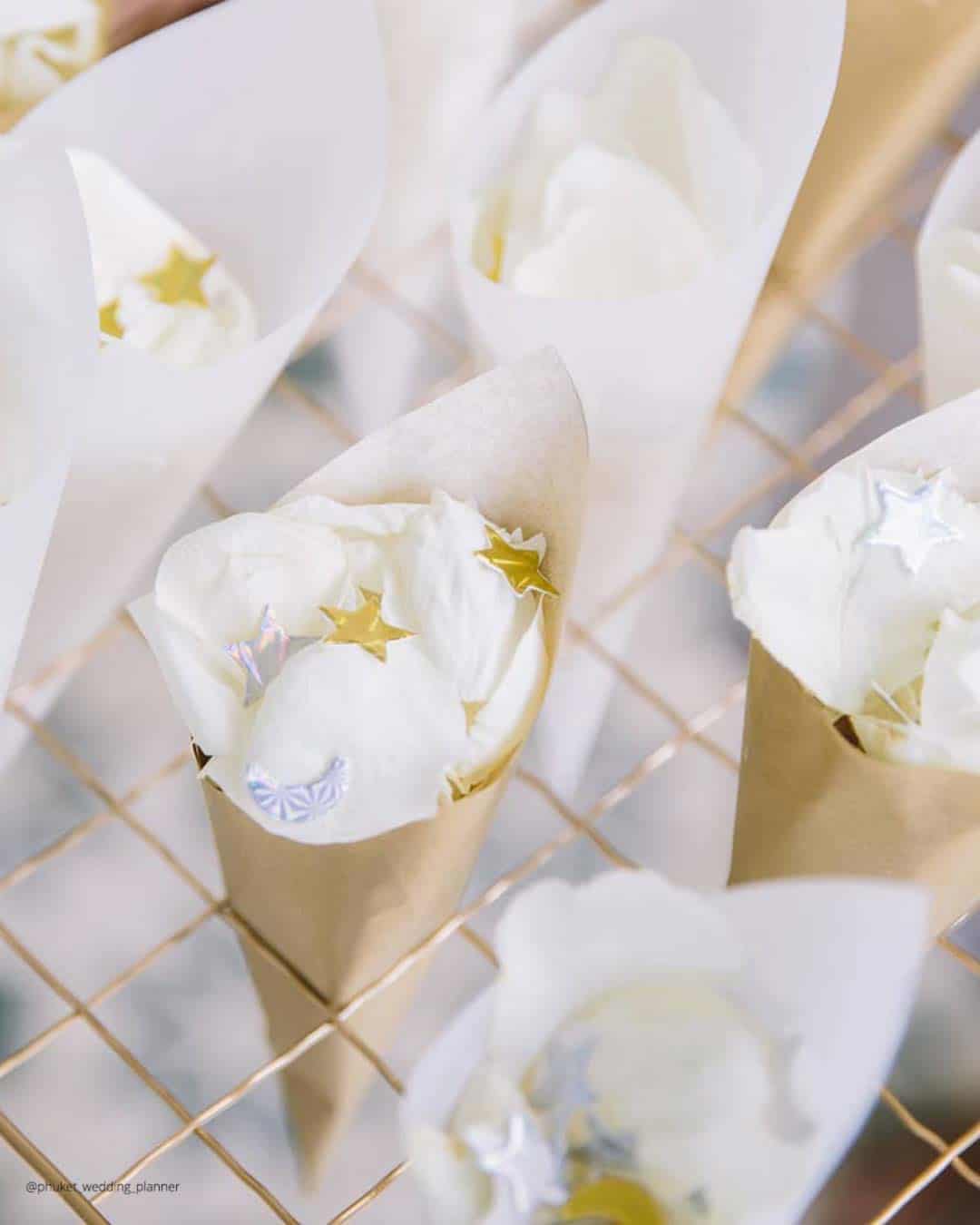
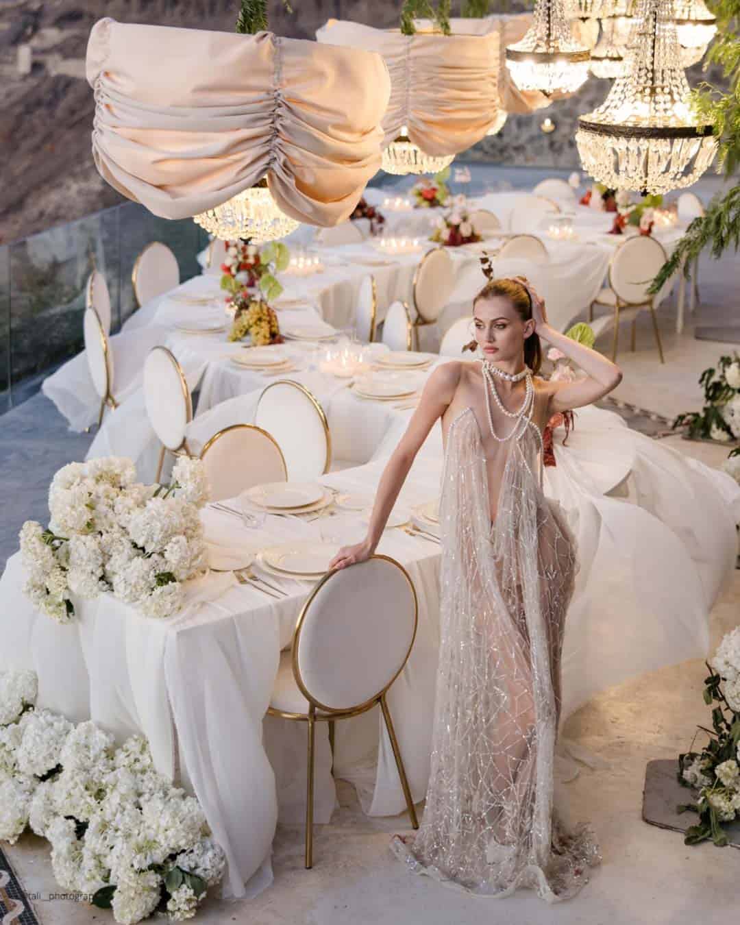
It’s A Match: Classic white paired with gold will keep its throne as a beloved option for couples chasing a plush, high wattage wedding look. Natalie, Giant Flowers Australia & Bali, observes, “White and gold continues to be popular for a luxurious, glamorous look.” This iconic duo radiates refinement and poise, securing its place as a natural pick for black tie receptions and richly appointed settings.
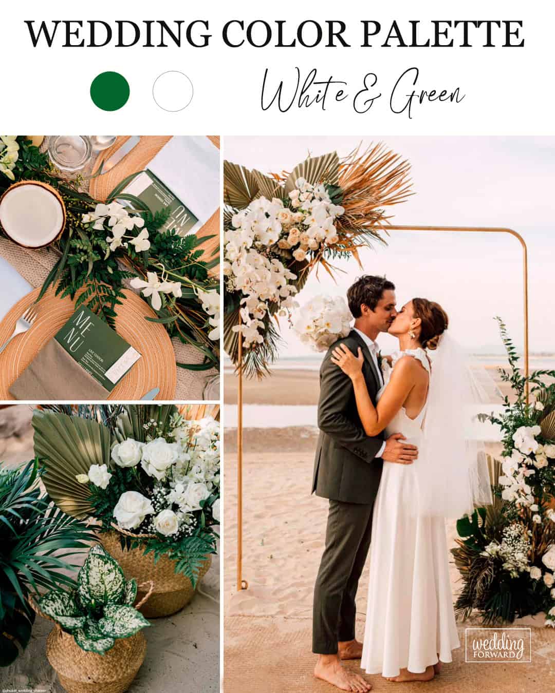
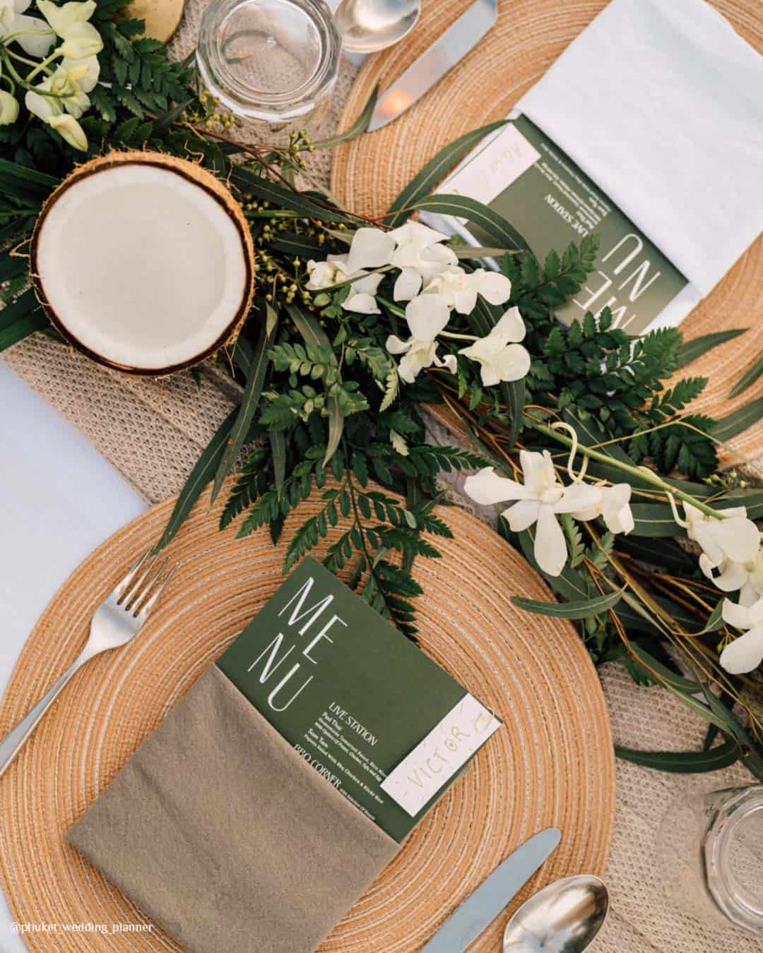

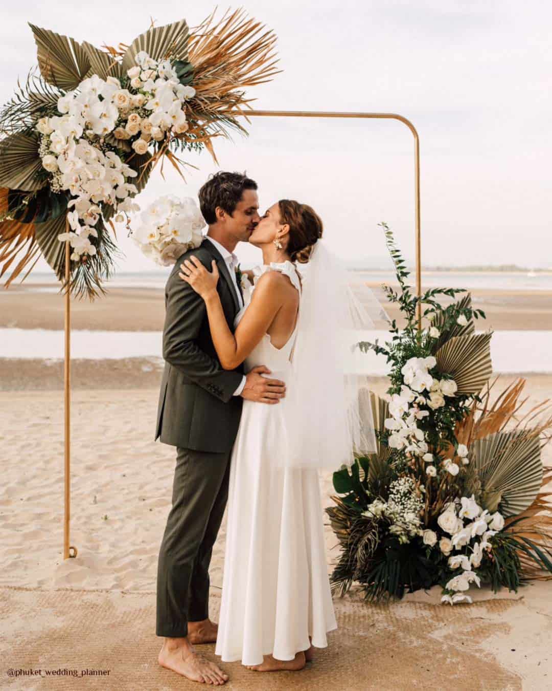
White paired with green delivers a crisp, nature steeped sensibility, ideally suited for alfresco ceremonies or garden infused celebrations. by Natalie, Giant Flowers Australia & Bali
It’s A Match: This duo bottles the very spirit of clean simplicity and quiet calm, equally at home under open skies or inside a polished indoor venue. Whether weaving in textured greenery, airy white blossoms, or refined tablescapes, green and white assemble a balanced, endlessly flexible palette that slides gracefully across countless wedding aesthetics.
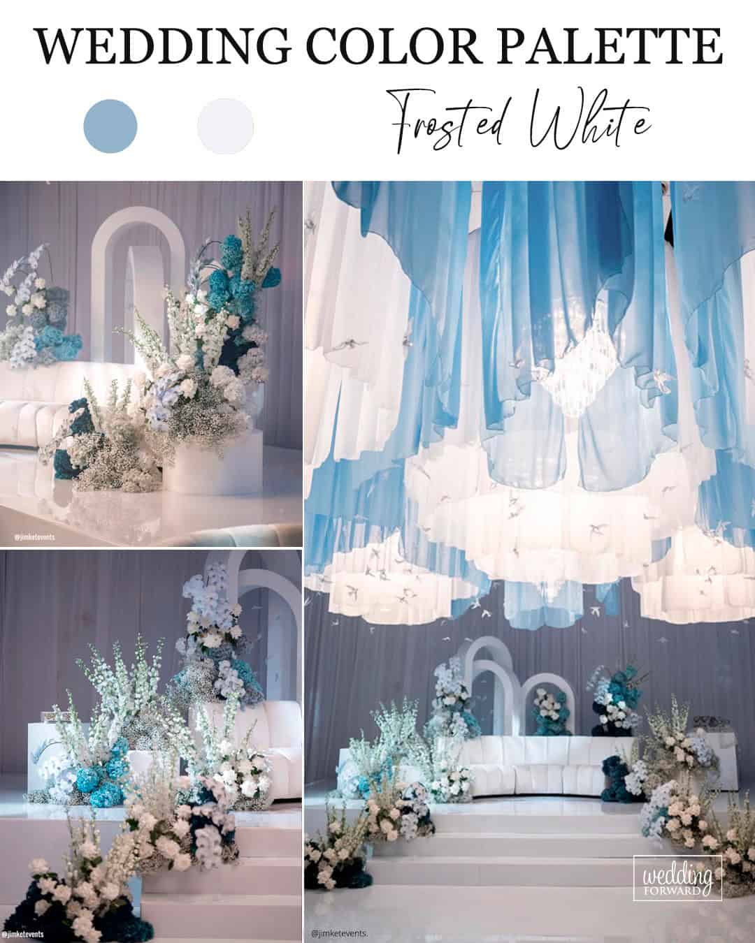
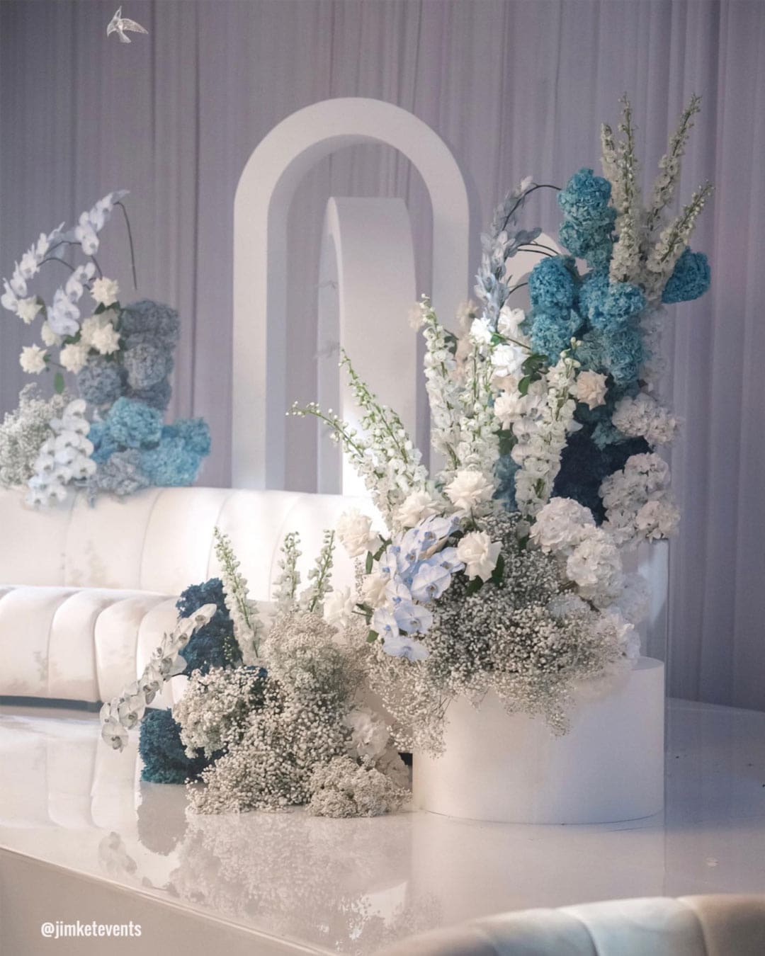
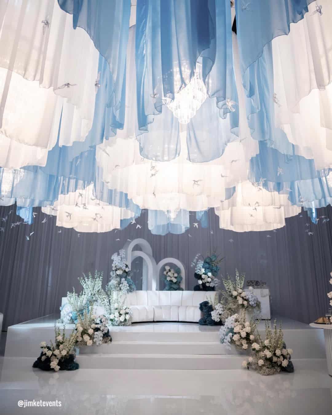
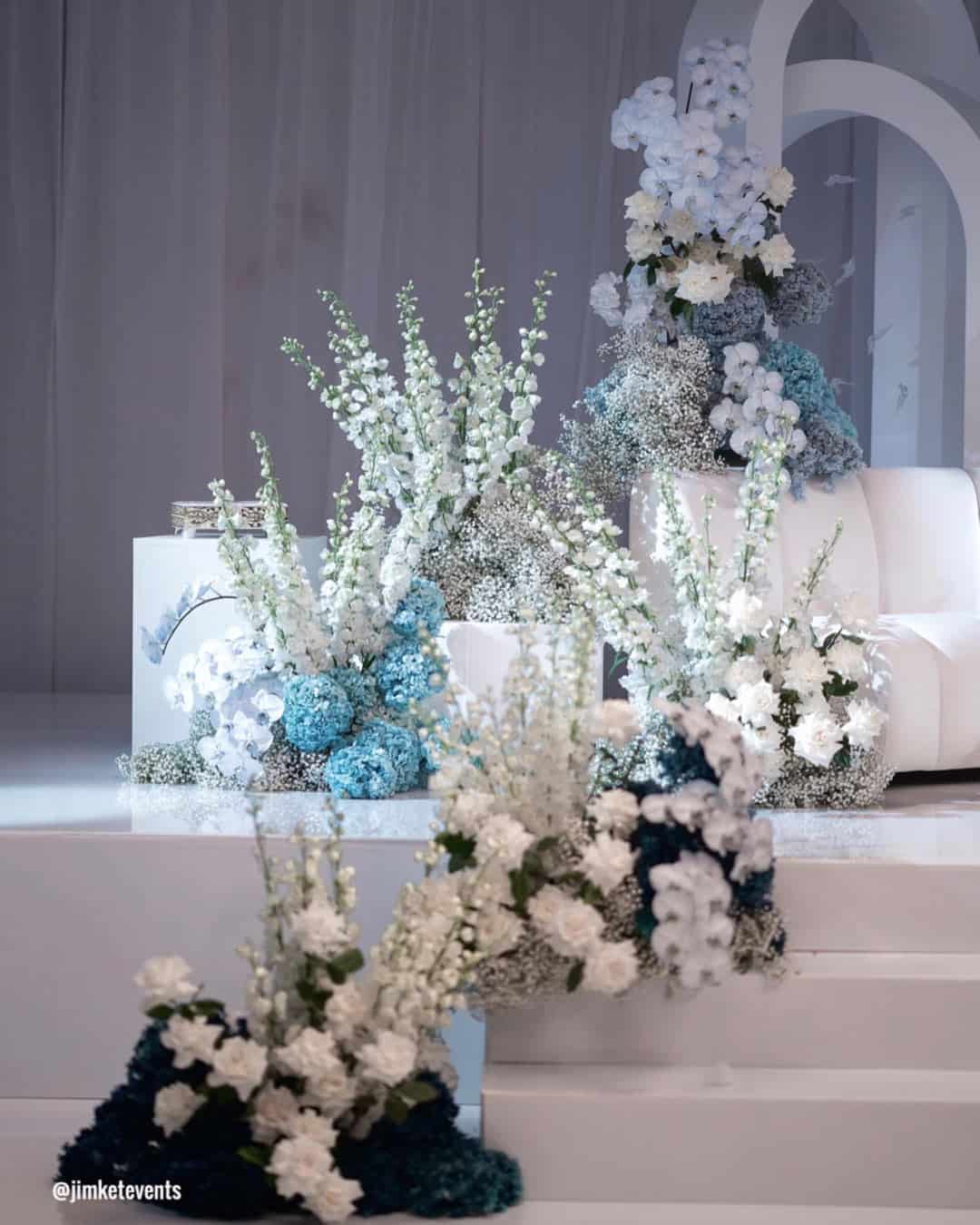
It’s A Match: Cool, frost kissed whites laced with faint blue or silver undertones will emerge as a sought after choice, gifting weddings a tranquil and pristine visual rhythm. This chilled hue injects a crisp, modern edge into your decor, particularly when positioned beside deeper shades to carve out contrast, polish, and a sleek, up to date mood.
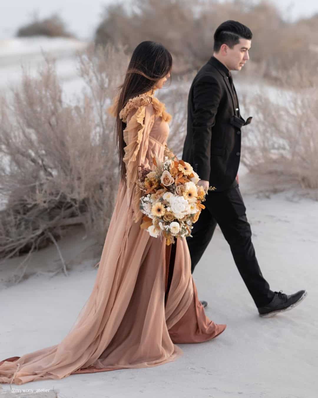
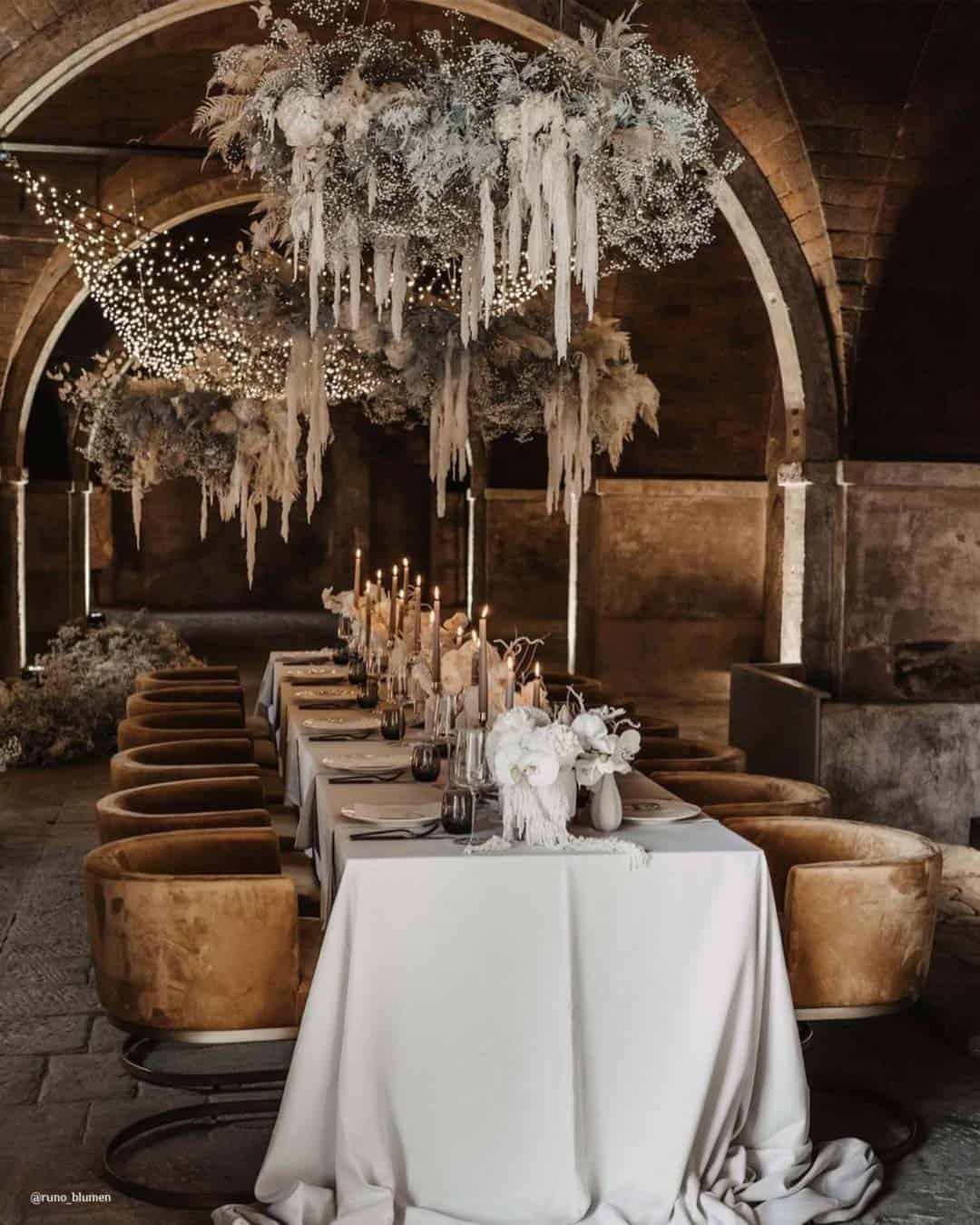
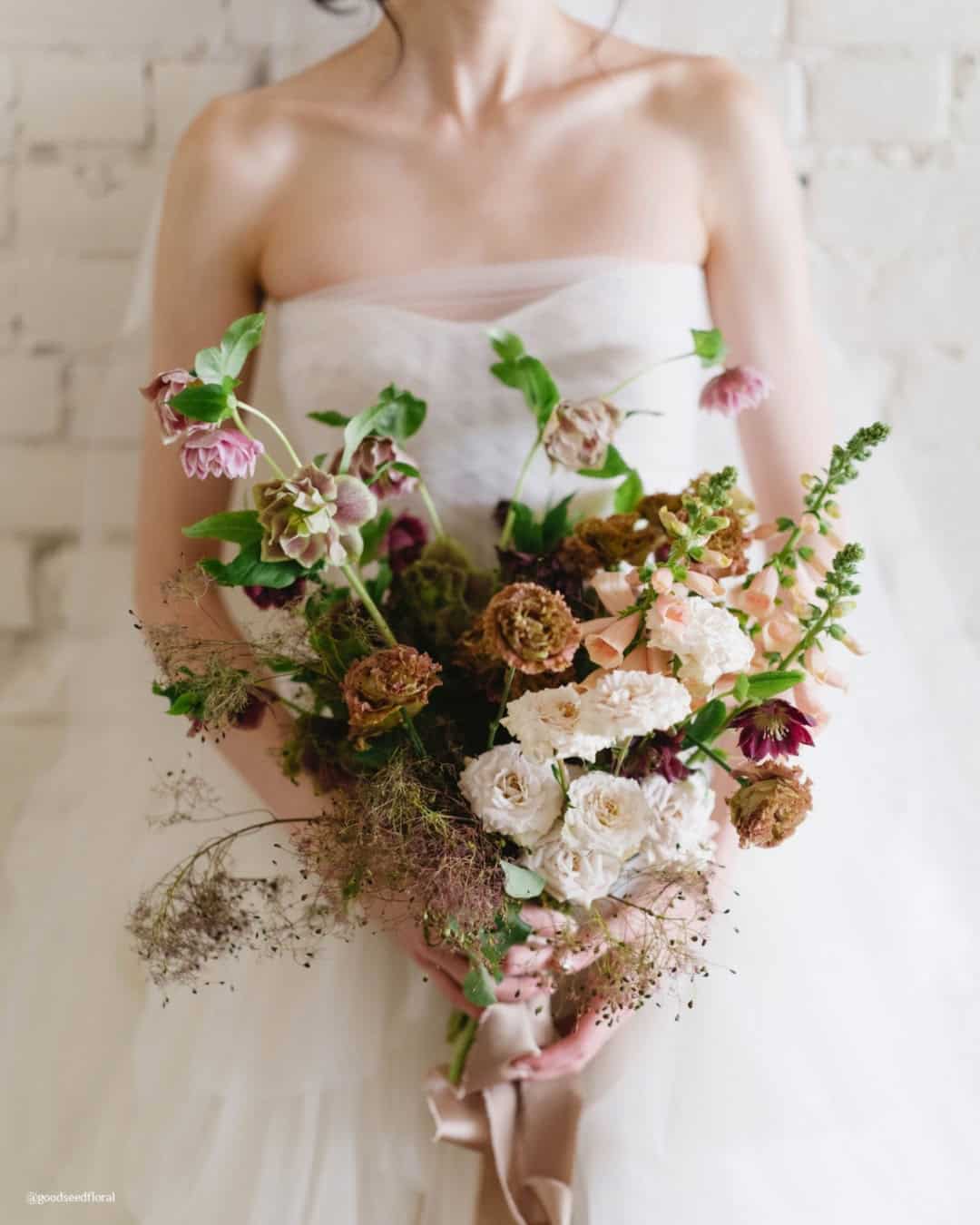
It’s A Match:
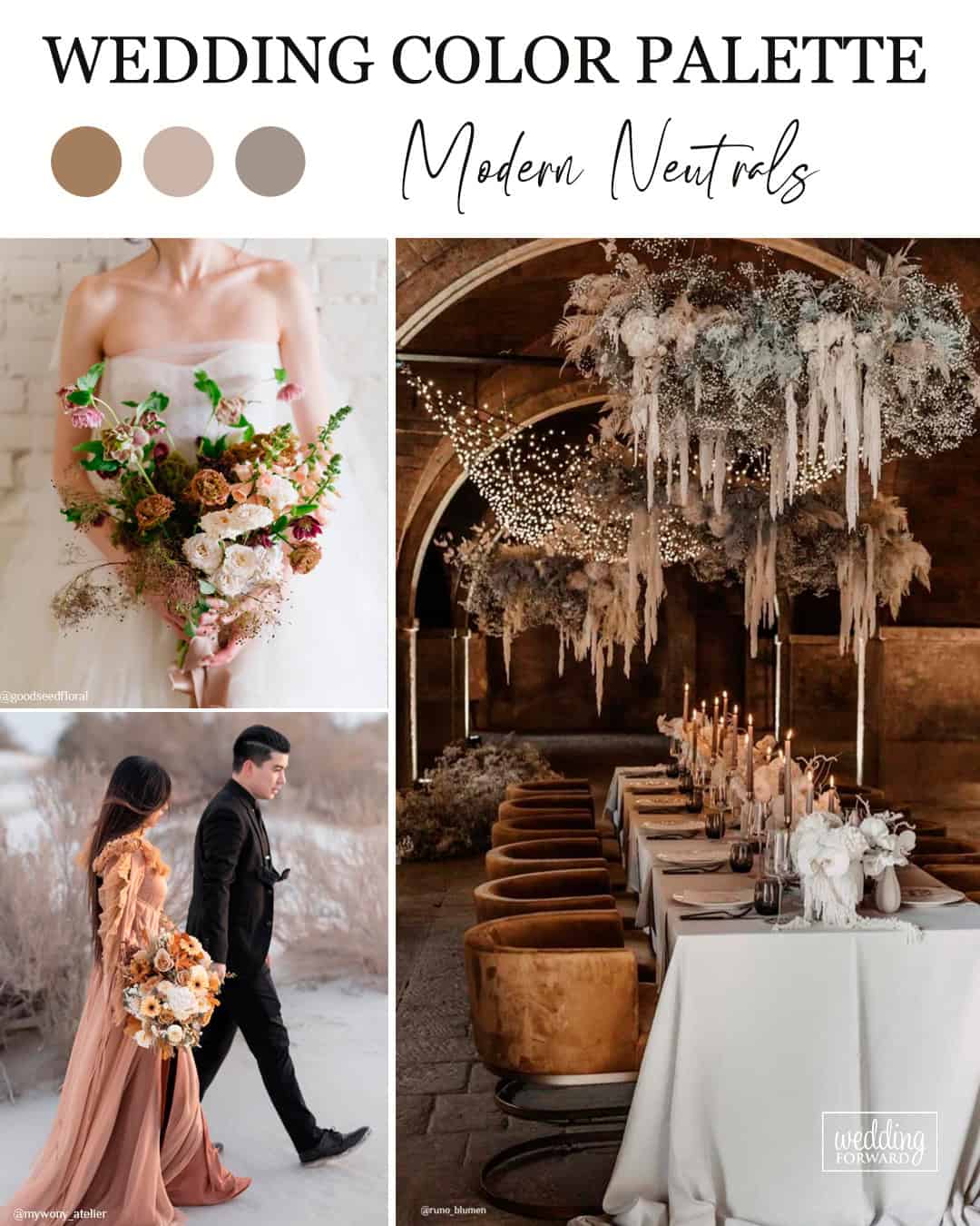
Earthy neutrals like soft beige, muted greys, and greige will become foundational for weddings, answering the call for enduring refinement and chameleon like adaptability. A defining Pantone selection, Pantone 18-1318 (“Mocha Mousse”), a cozy brown tinged with creamy warmth, dovetails with the expanding pull toward organic shades and mindful celebration choices.
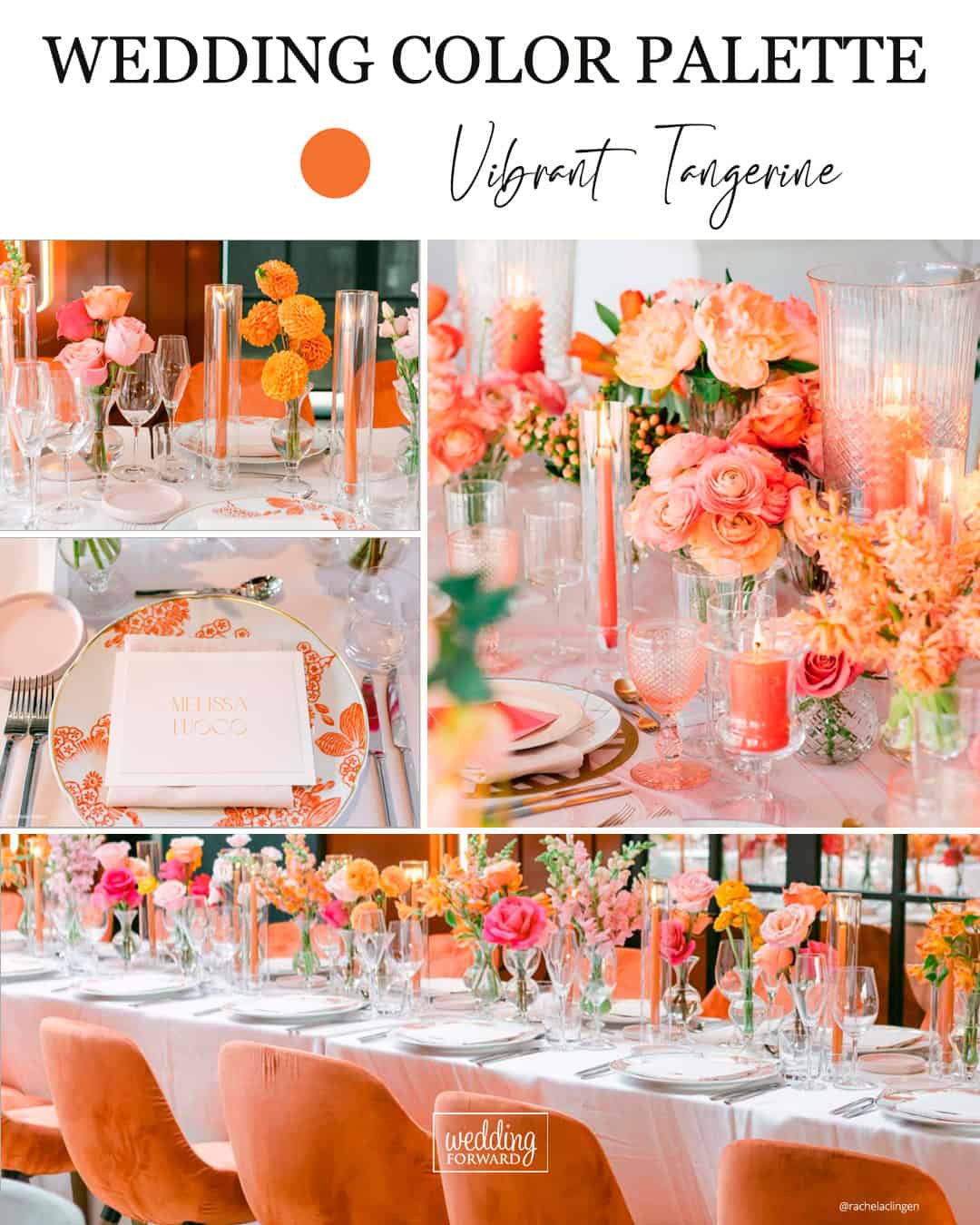
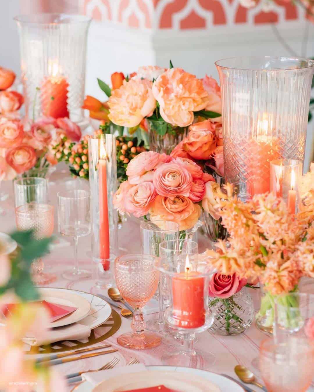
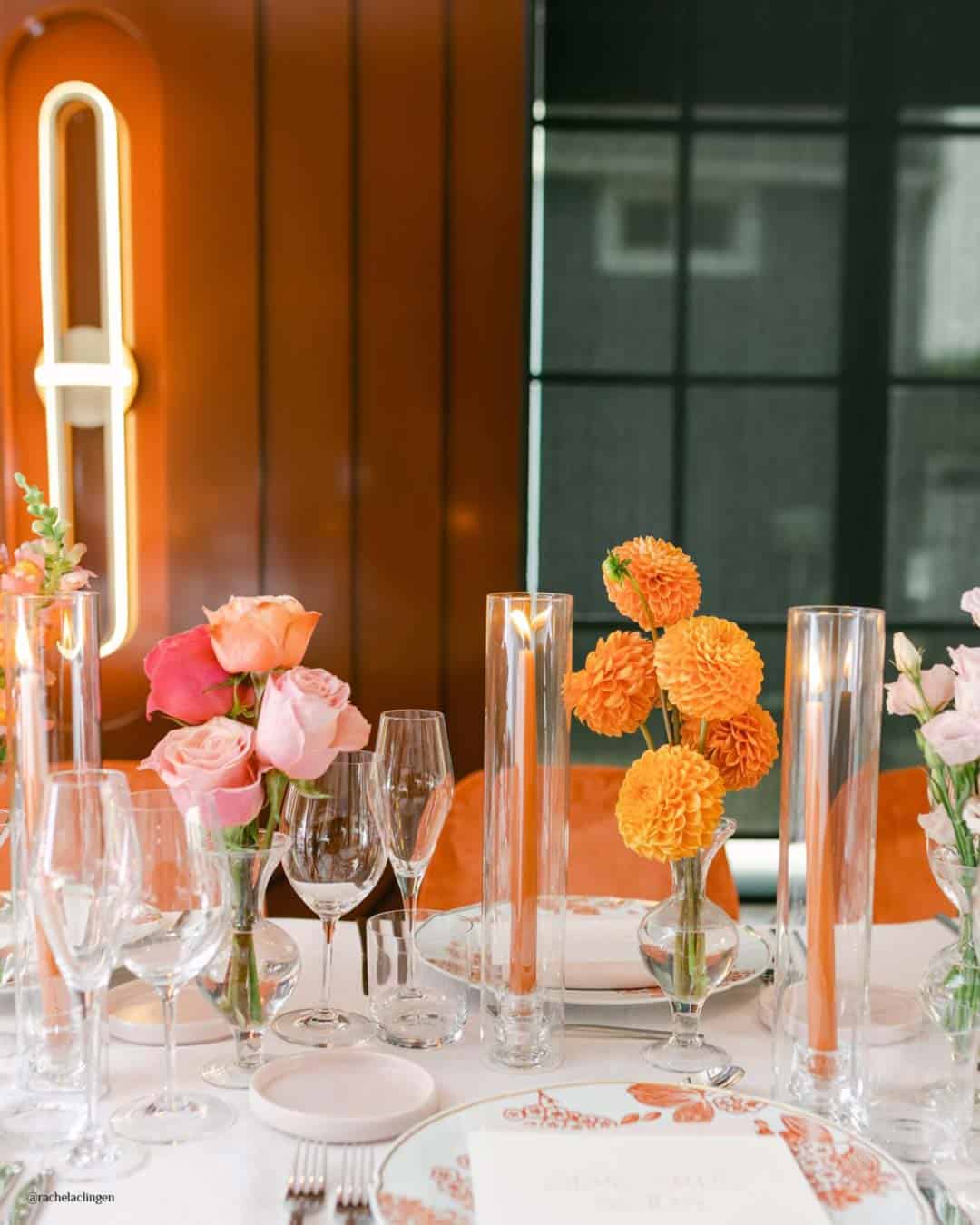
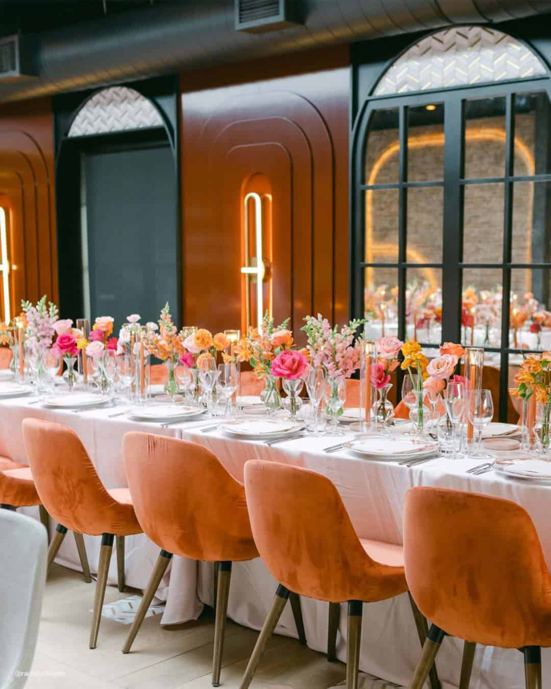
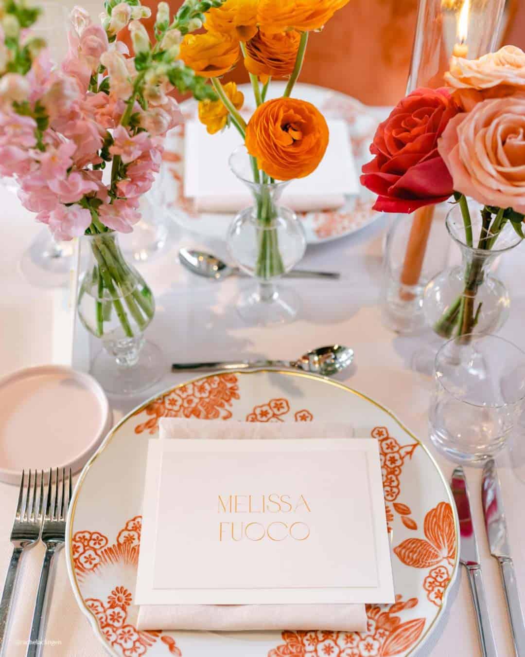
It’s A Match: Vivid, high voltage orange will step forward as a fearless direction for couples, injecting a shot of exhilaration and life into every corner of the party. This spirited shade demands attention across everything from ceremony bouquets to place settings.
Ideal for anyone orchestrating a fresh, pulse quickening atmosphere, orange wraps the day in warmth and pure delight.
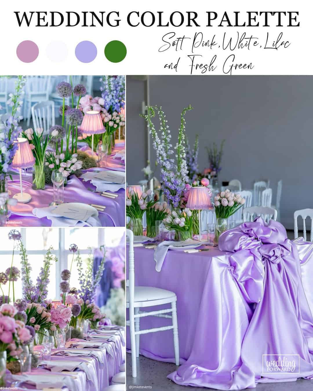
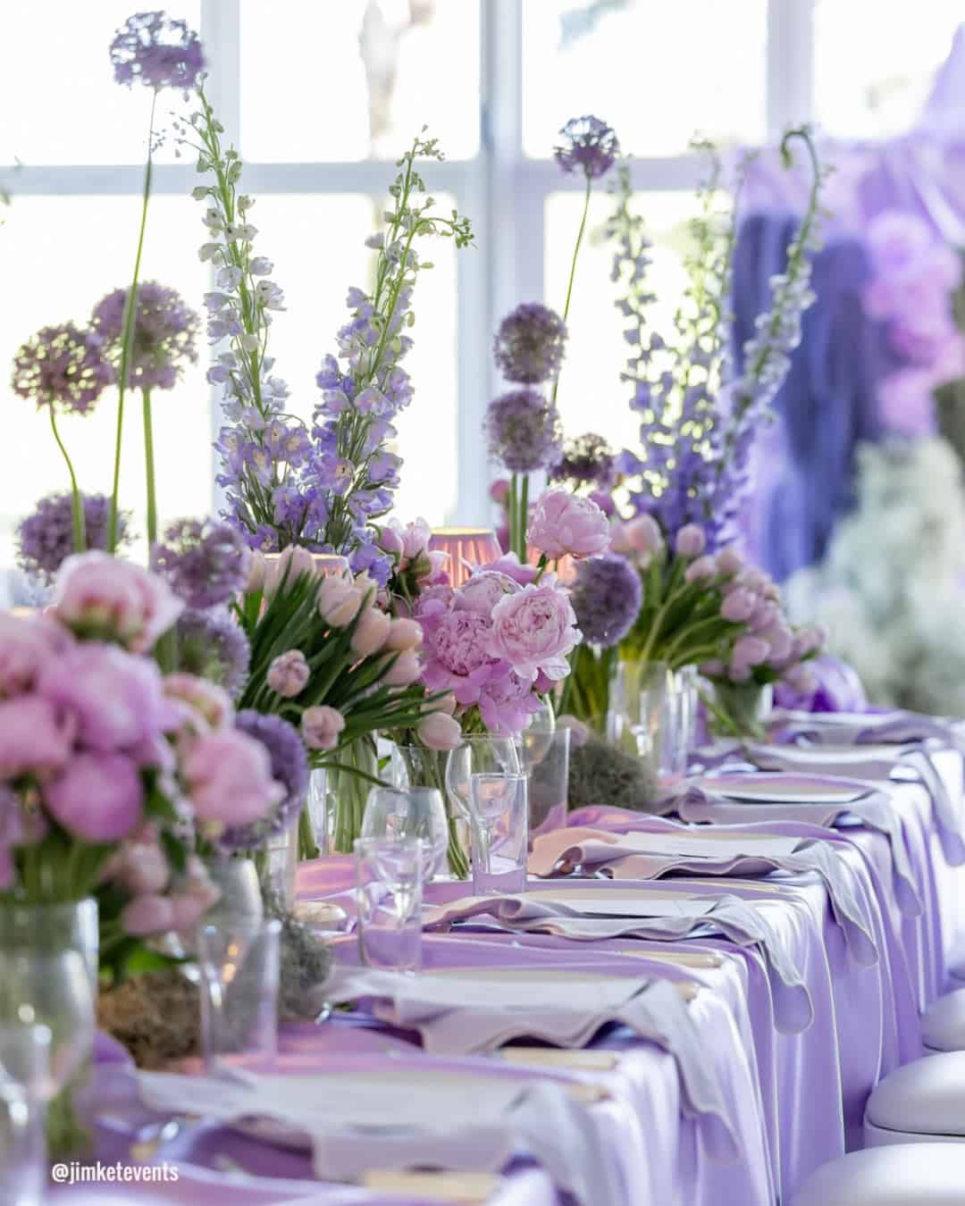
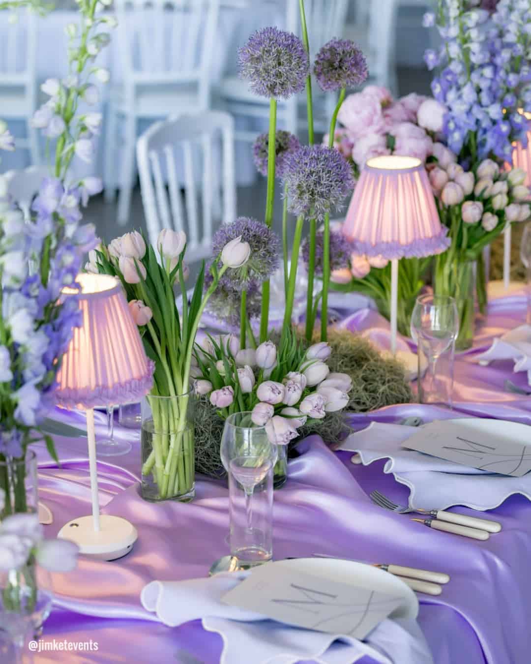
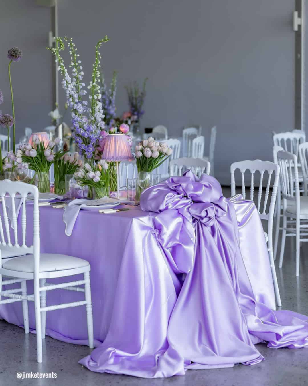
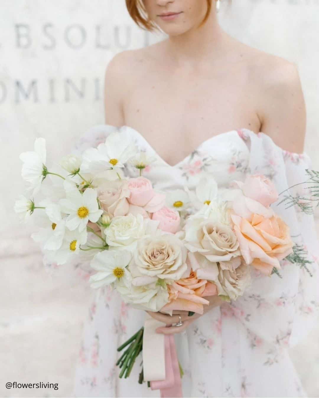
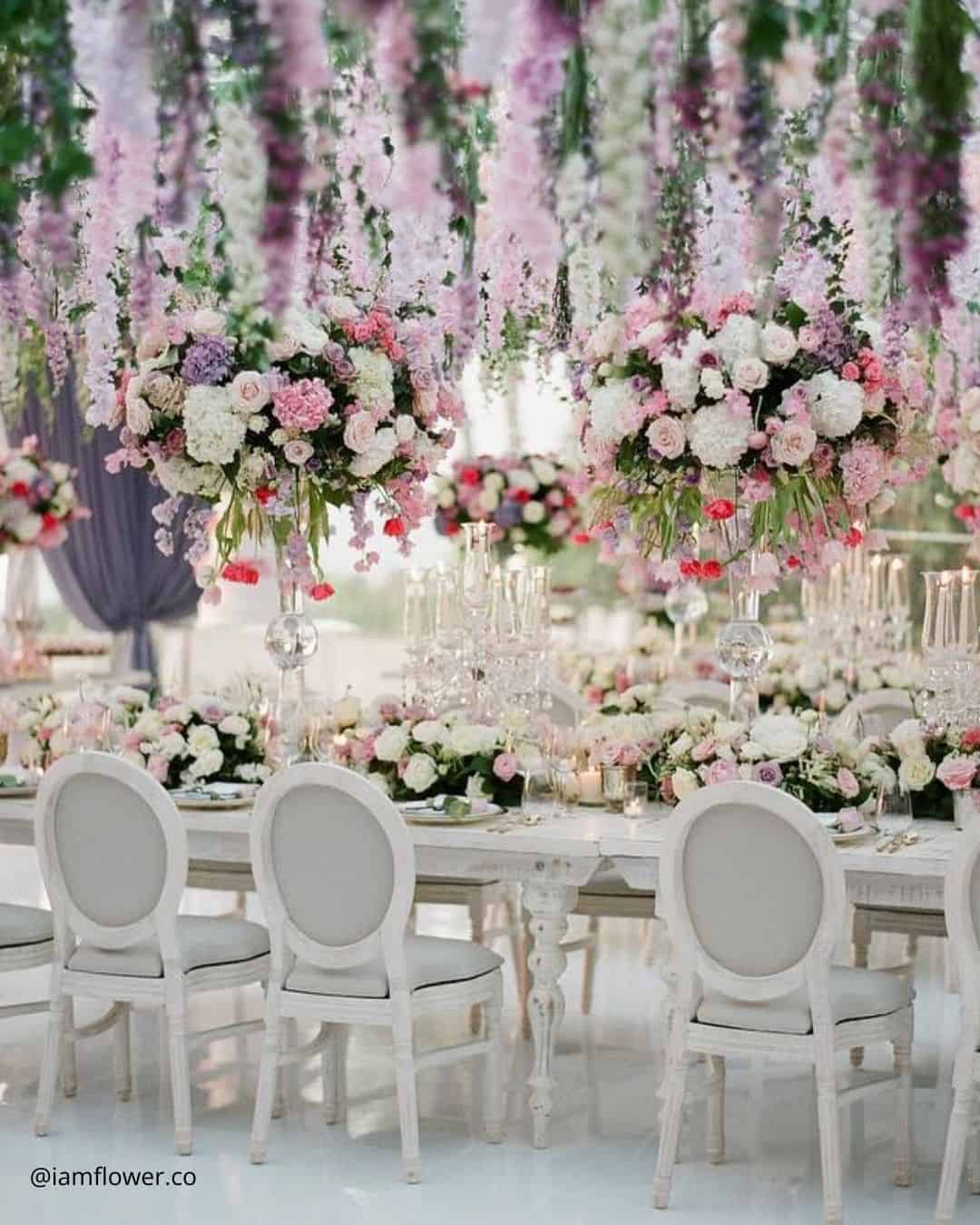
It’s A Match: A tender composition of Soft Pink, White, and Soft Lilac spins a hazy, otherworldly atmosphere. Soft Pink whispers romance, White bestows a crisp, enduring note, and Soft Lilac dusts a trace of playful fantasy over everything.
Built for Garden or Fairytale visions, this palette wraps your guests in a peaceful, spellbound experience.
It’s A Match:
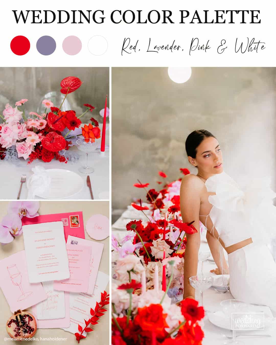
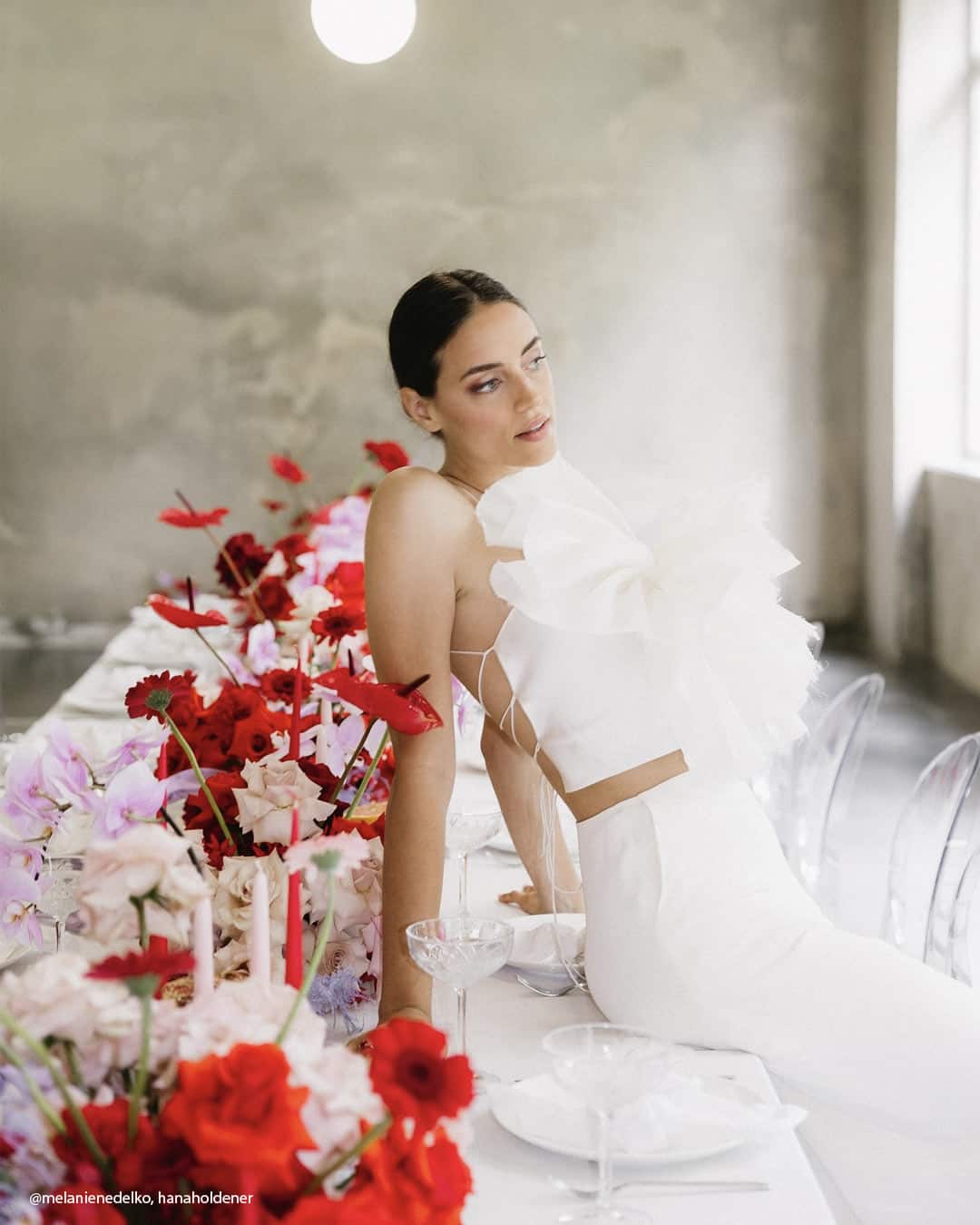
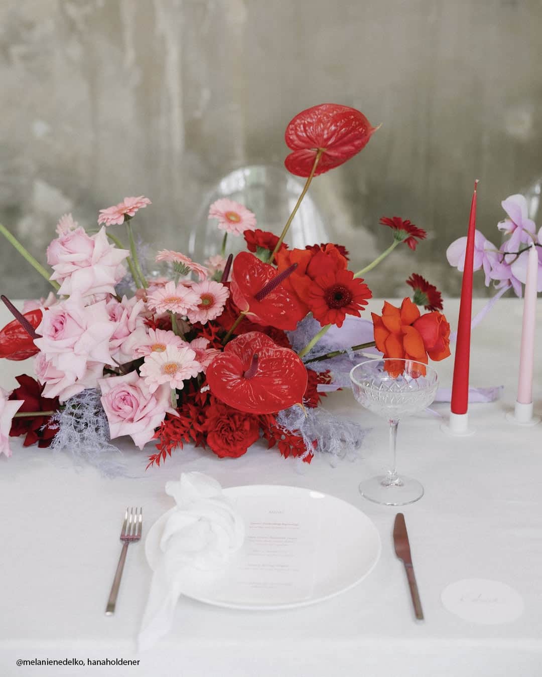
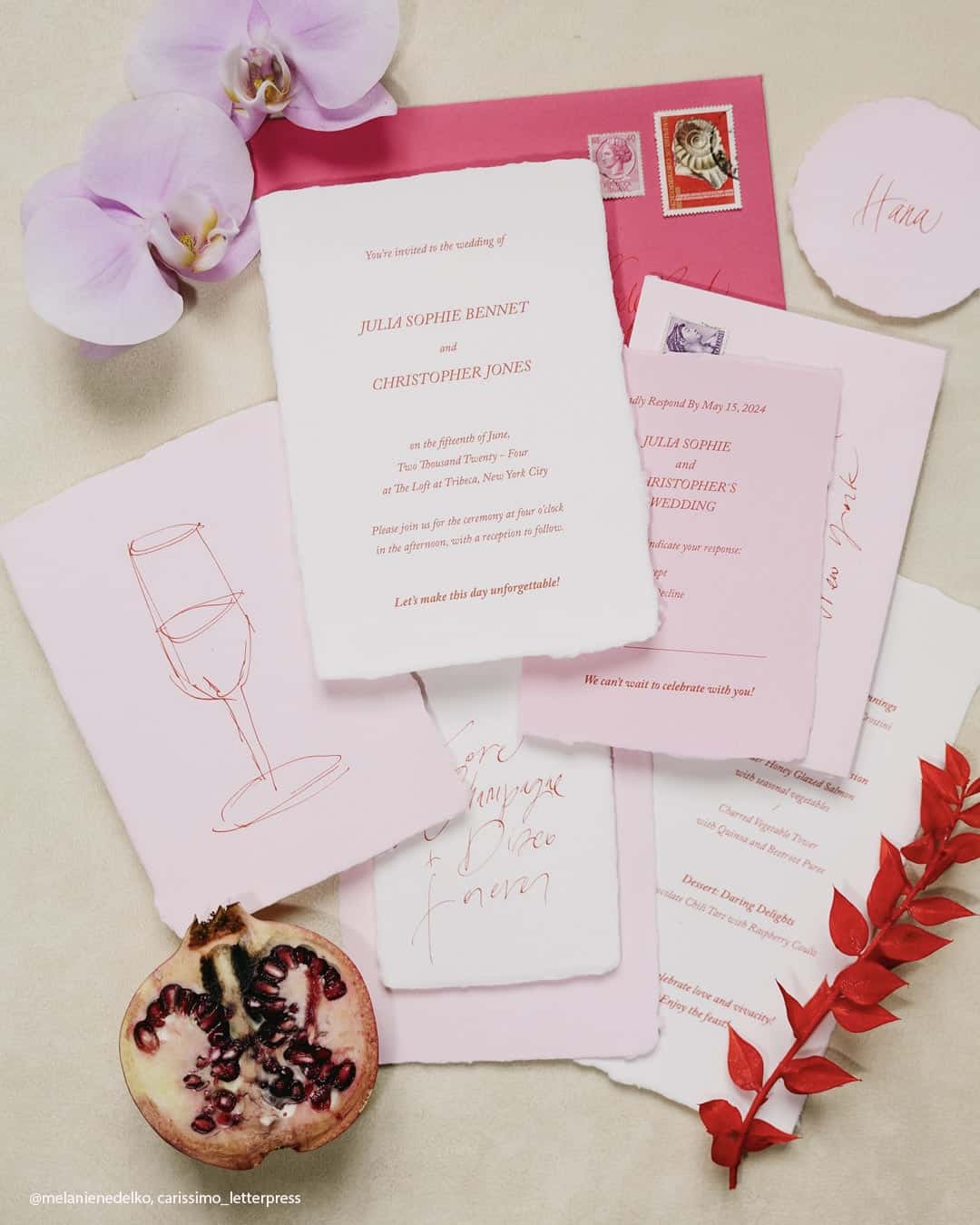
Submerge yourself in a realm of romance and grace with a color union of red, lavender, pink, and white. Red surges with fire and vitality, while lavender contributes a sense of gentility and stillness.
Pink amplifies the tender atmosphere, and white extends clarity and equilibrium. Side by side, these hues weave a stunning, fluid palette that spills over with allure and distinction.
Tailor made for a Romantic or Garden inspired celebration, this blend cultivates a magical ambiance, transforming each fleeting moment into a breathtaking portrait of affection and happiness.
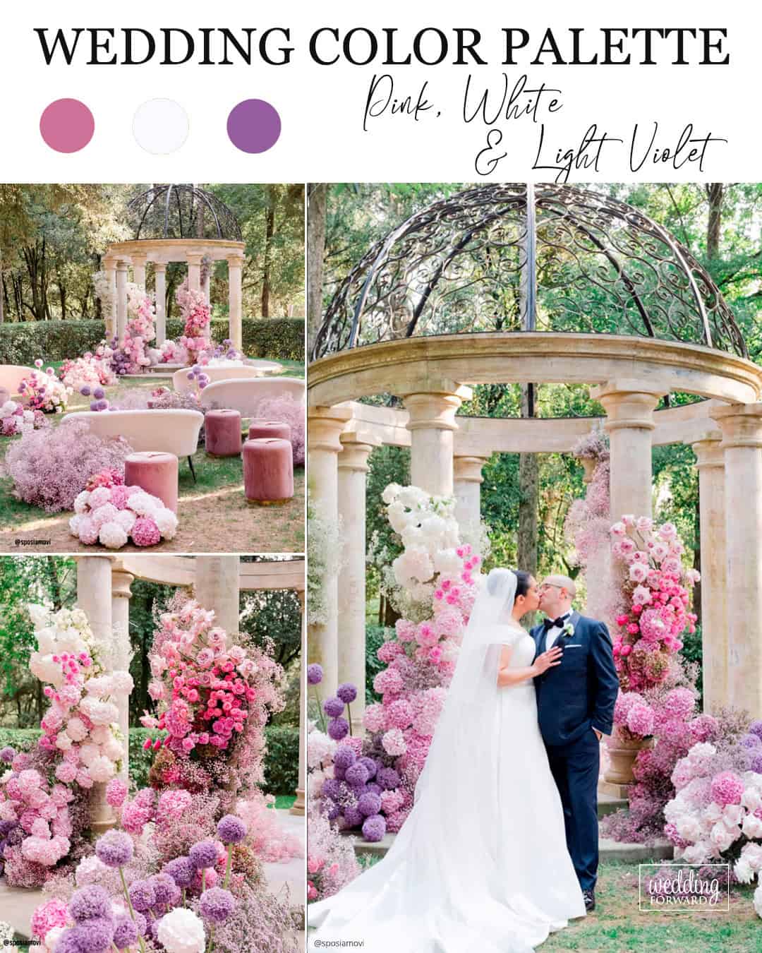
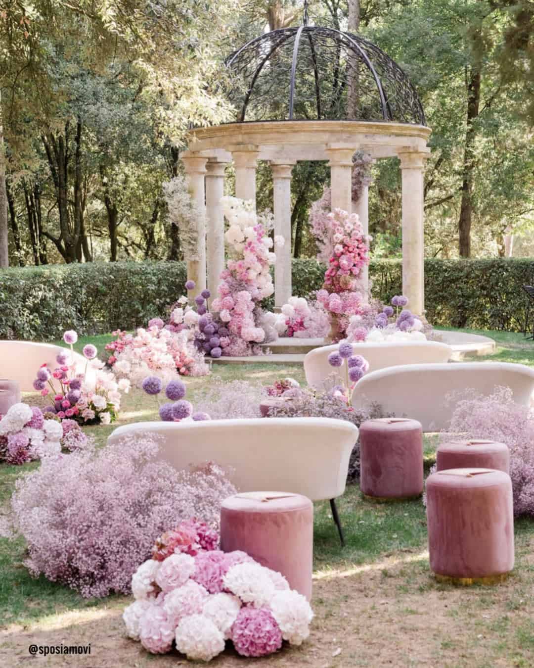
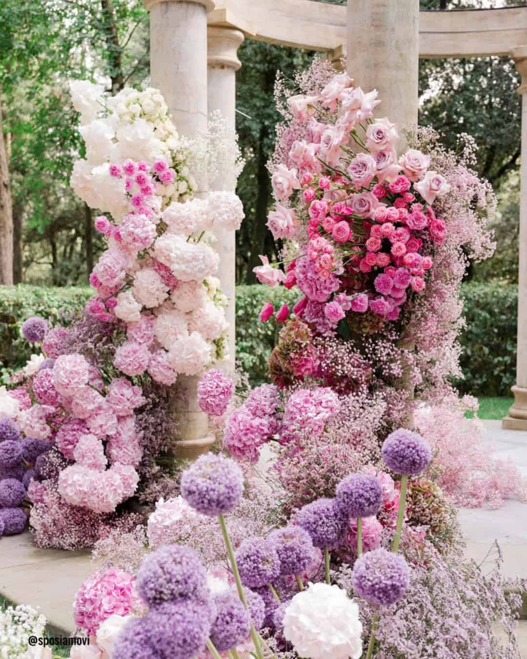
It’s A Match: The pairing of Pink, White, and Light Violet arrives as effortlessly polished. Pink bestows warmth and tenderness, White preserves a crisp, everlasting freshness, while Light Violet layers on a gentle layer of refinement.
Ideal for Romantic or blossom filled spring weddings, this palette presents as airy, graceful, and gorgeously harmonious.
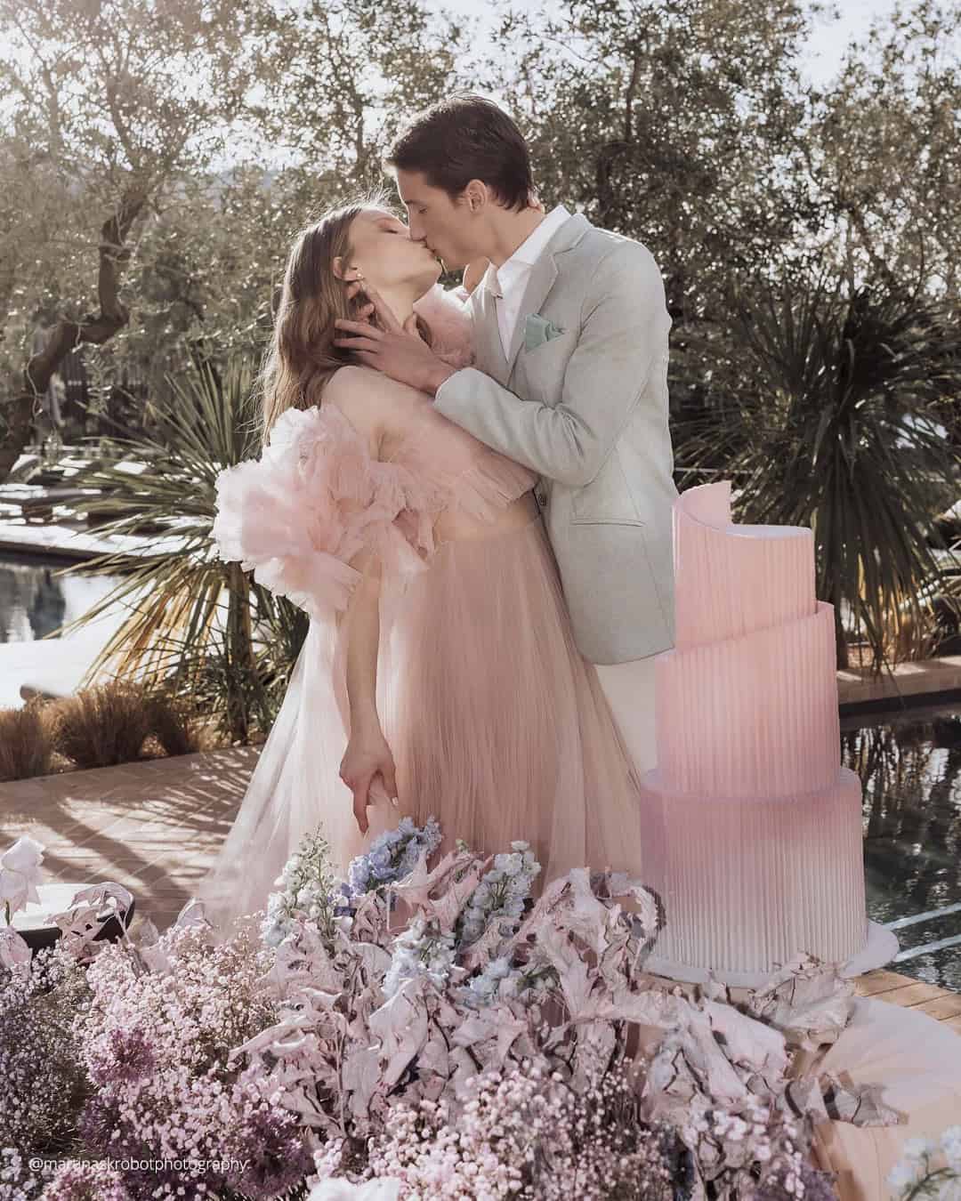
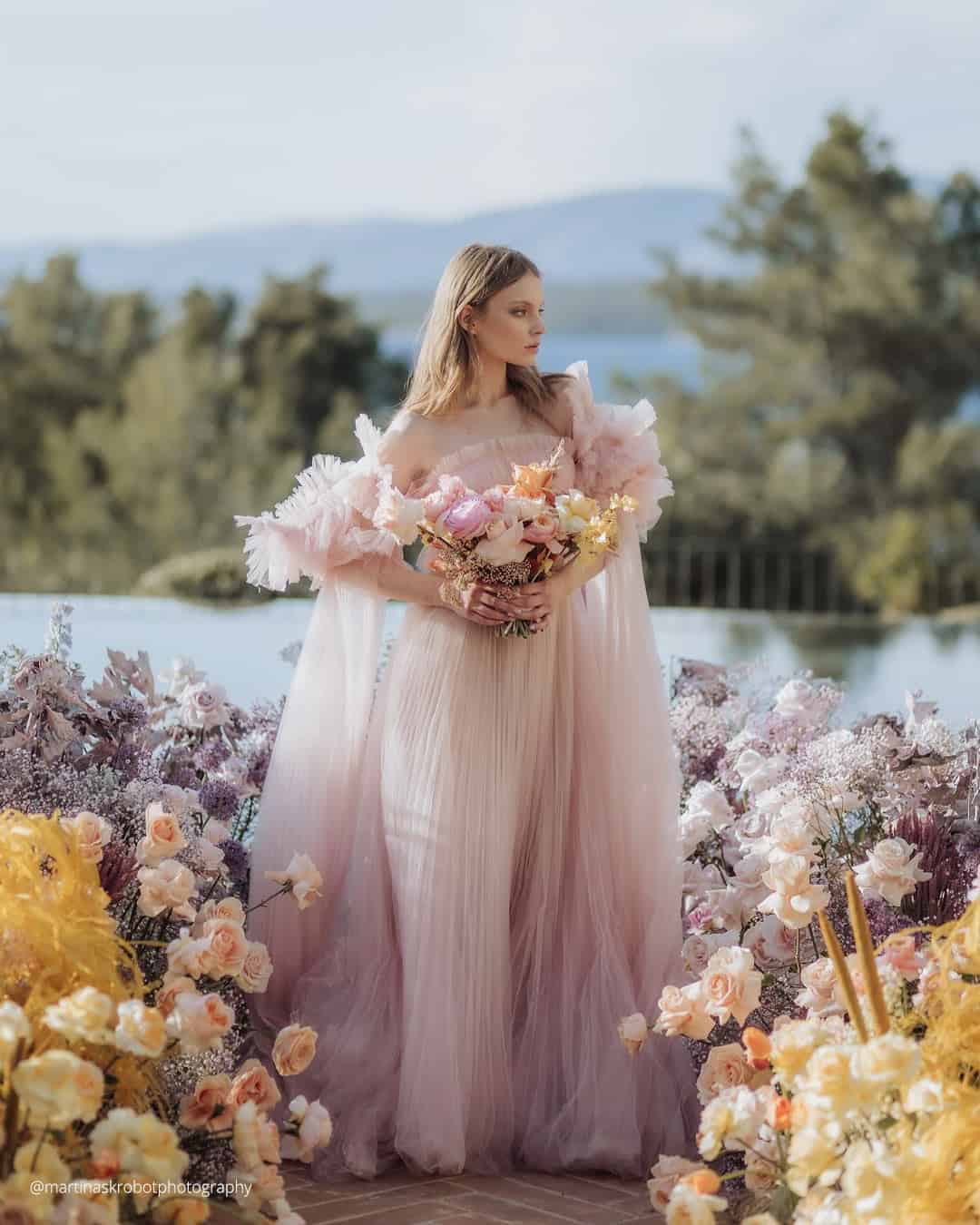
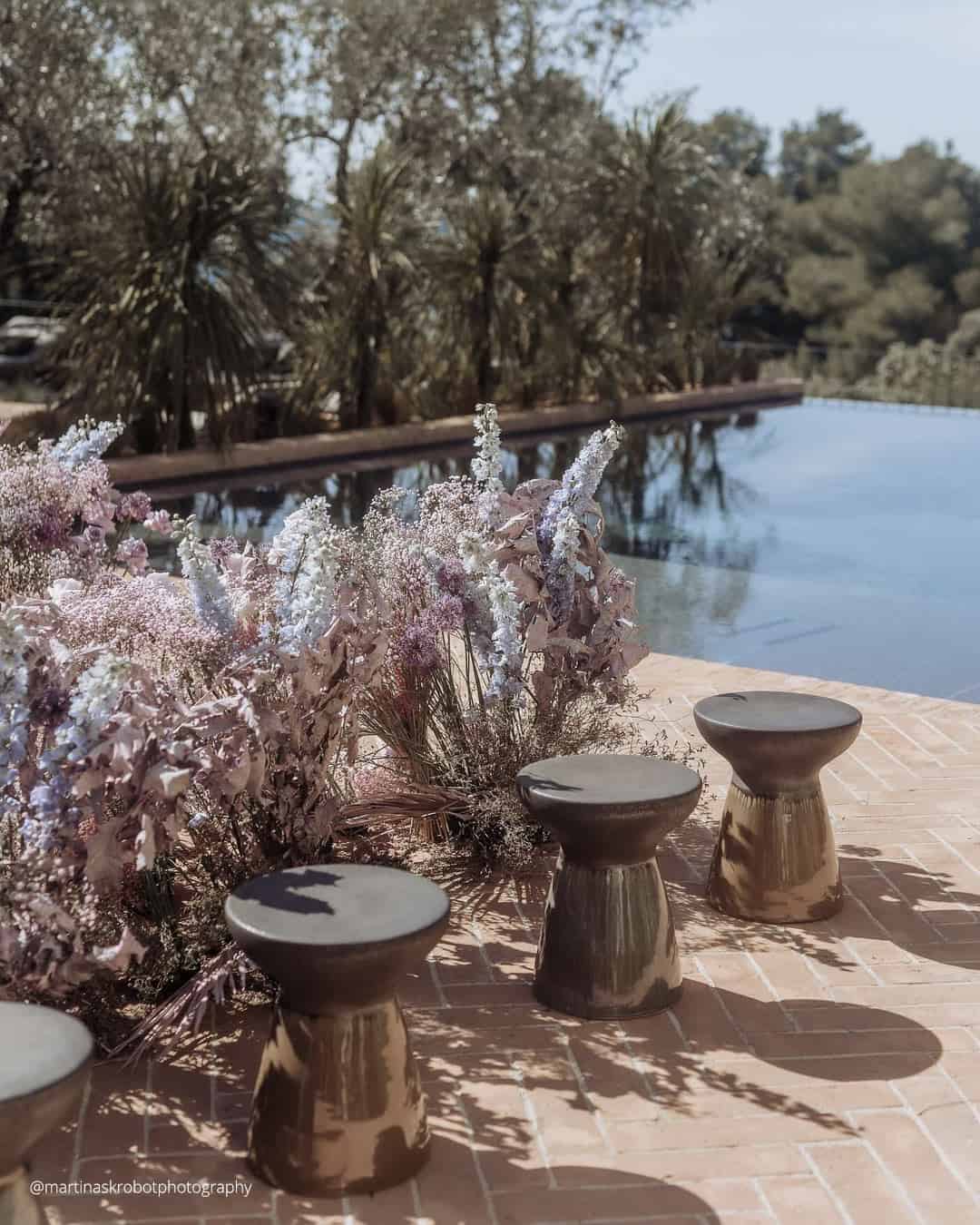
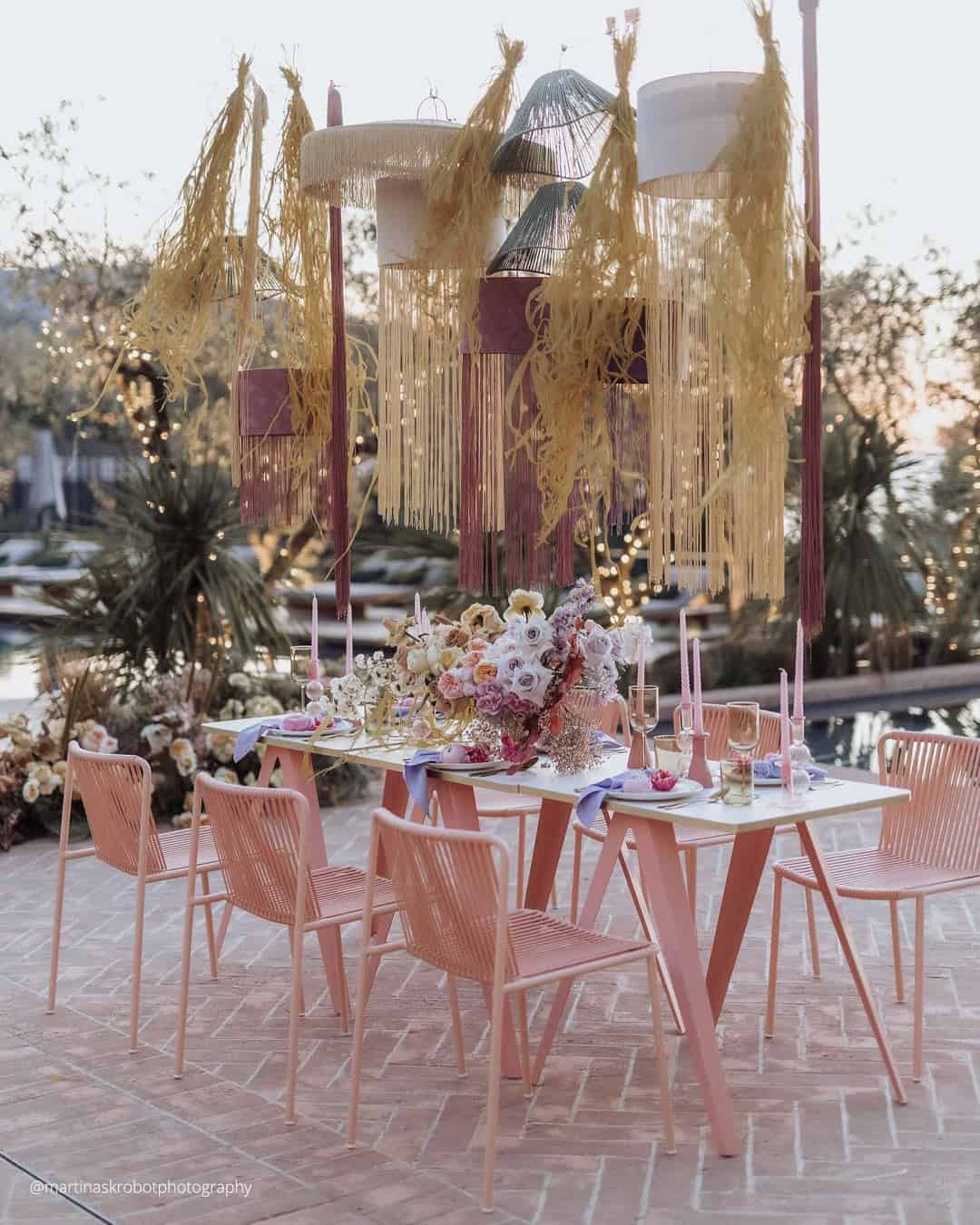
It’s A Match:
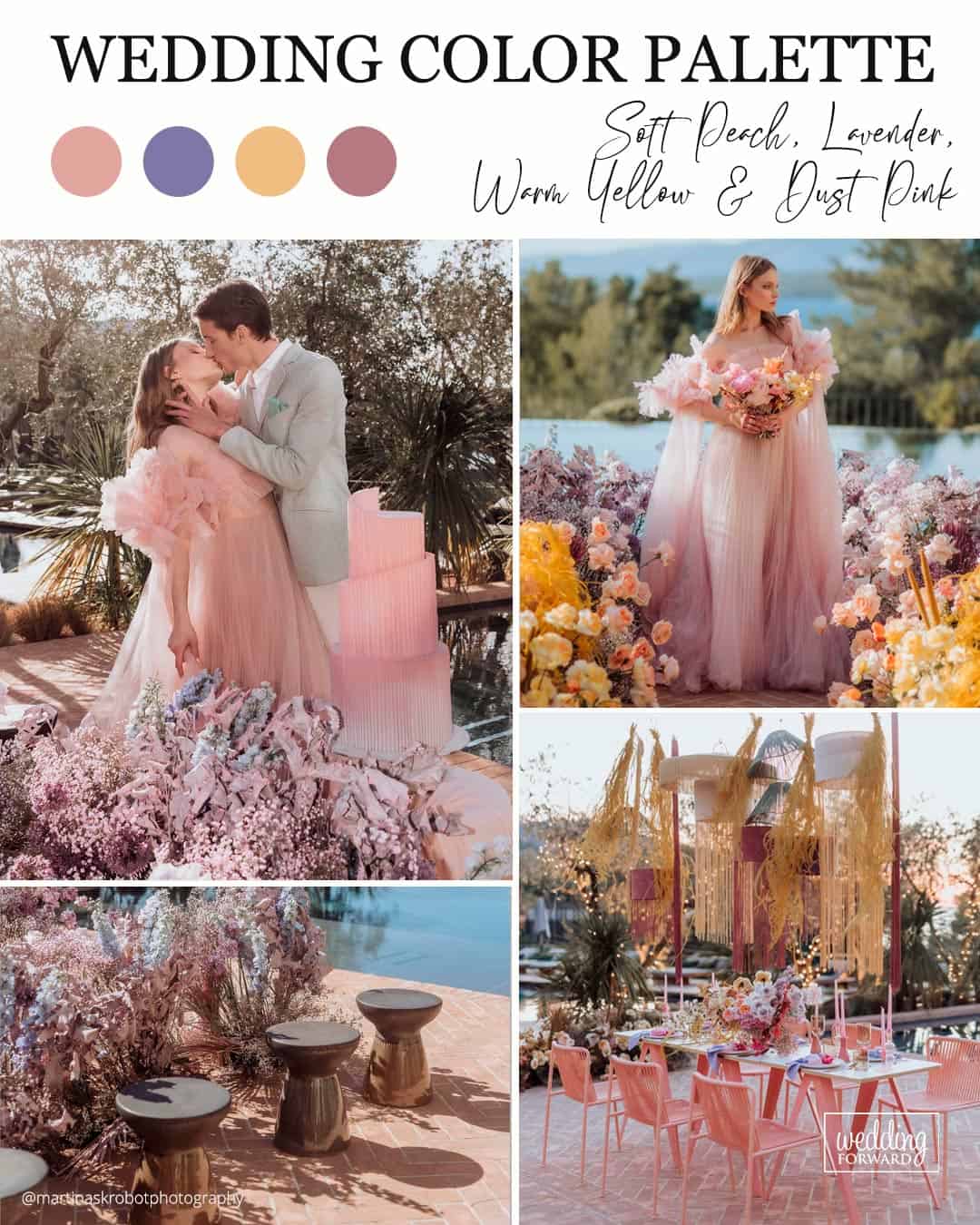
As weddings continue exploring distinctive palettes, the blend of Soft Peach, Lavender, Warm Yellow, and Dust Pink will stand out brilliantly. Soft Peach alongside Dust Pink radiates a tender cozy warmth, Lavender drapes the scene in elegance, and Warm Yellow floods the palette with luminous, buoyant energy, shaping a refined yet inviting mood.
This arrangement thrives at a Romantic or Vintage leaning wedding, setting a polished and welcoming stage that draws guests into its captivating golden hour glow.
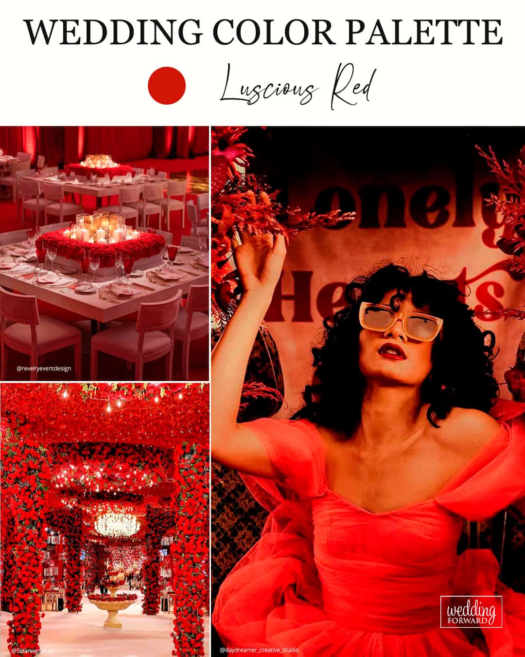
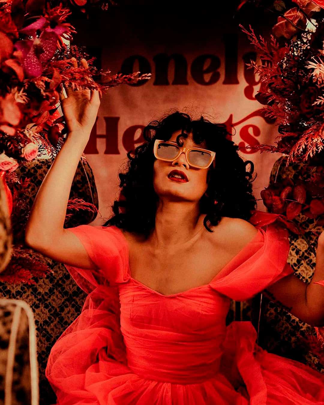
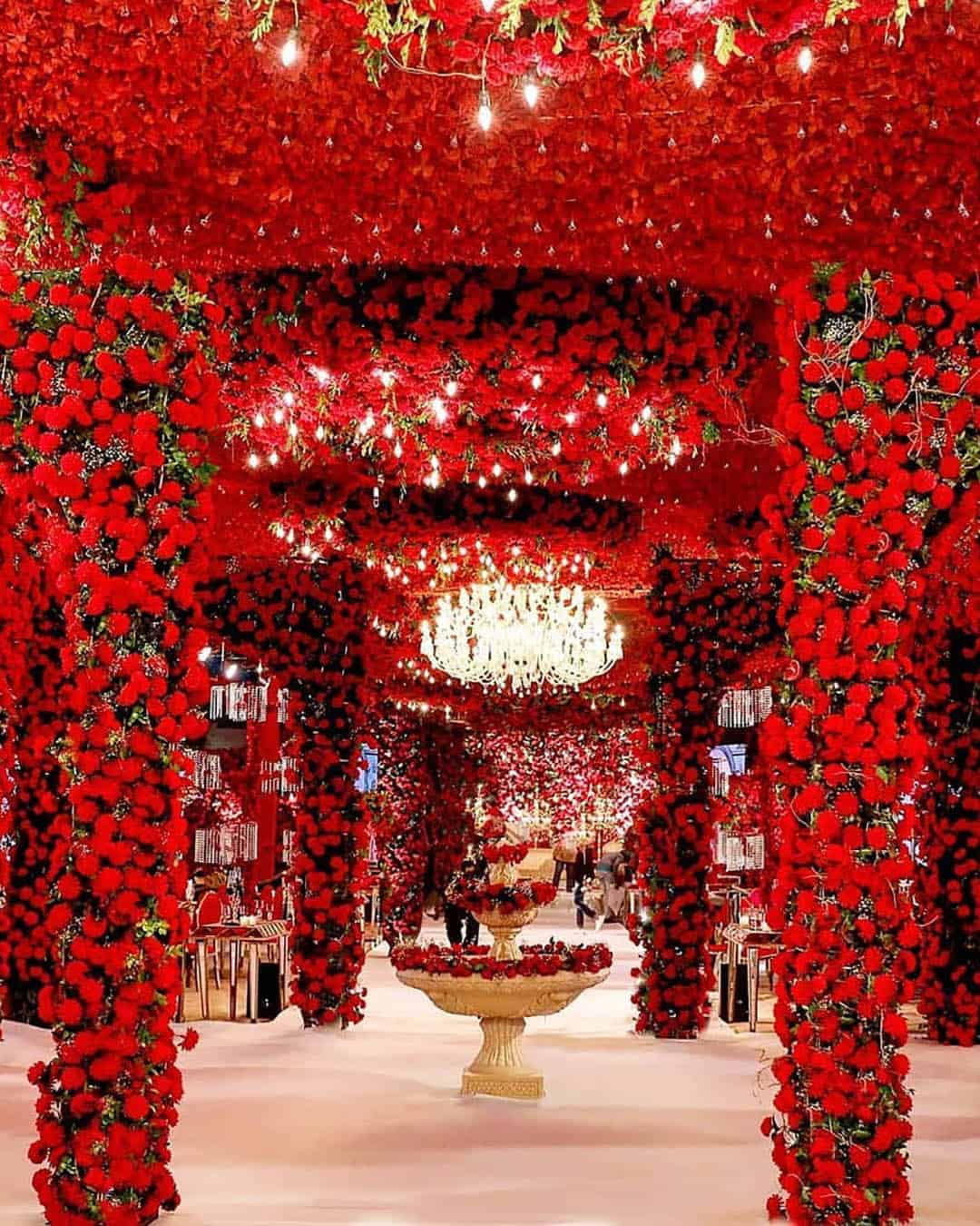
It’s A Match: Sumptuous red ranks among the sharpest wedding color concepts couples can deploy as a vivid accent thread running through the whole celebration. You might weave rich reds with soft blue touches across select corners of your venue styling, think the dessert display or floral installations.
Other strong companions for luscious red include yellow and pink tones. Aim to anchor portions of the decor in neutrals to preserve an uncluttered visual story.
Summer Wedding Colors
Basking in rising temperatures and golden sunshine makes nearly every shade feel radiant, so the top colors for a summer celebration mirror all the details we adore about the season. Ranging from featherlight airy blues through to vivid jolts of pink and green, warm weather ceremonies present an embarrassment of riches for wedding palette possibilities.
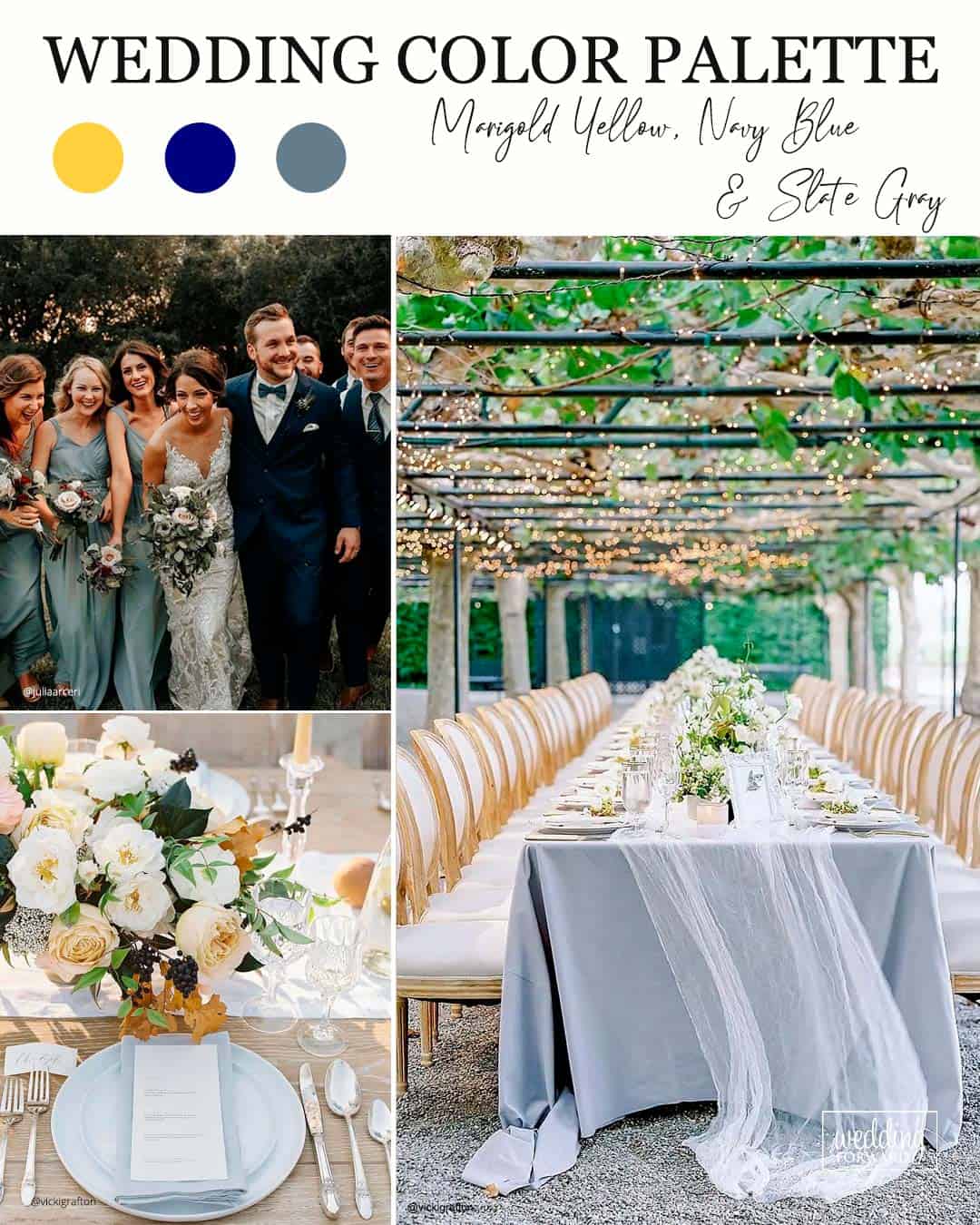
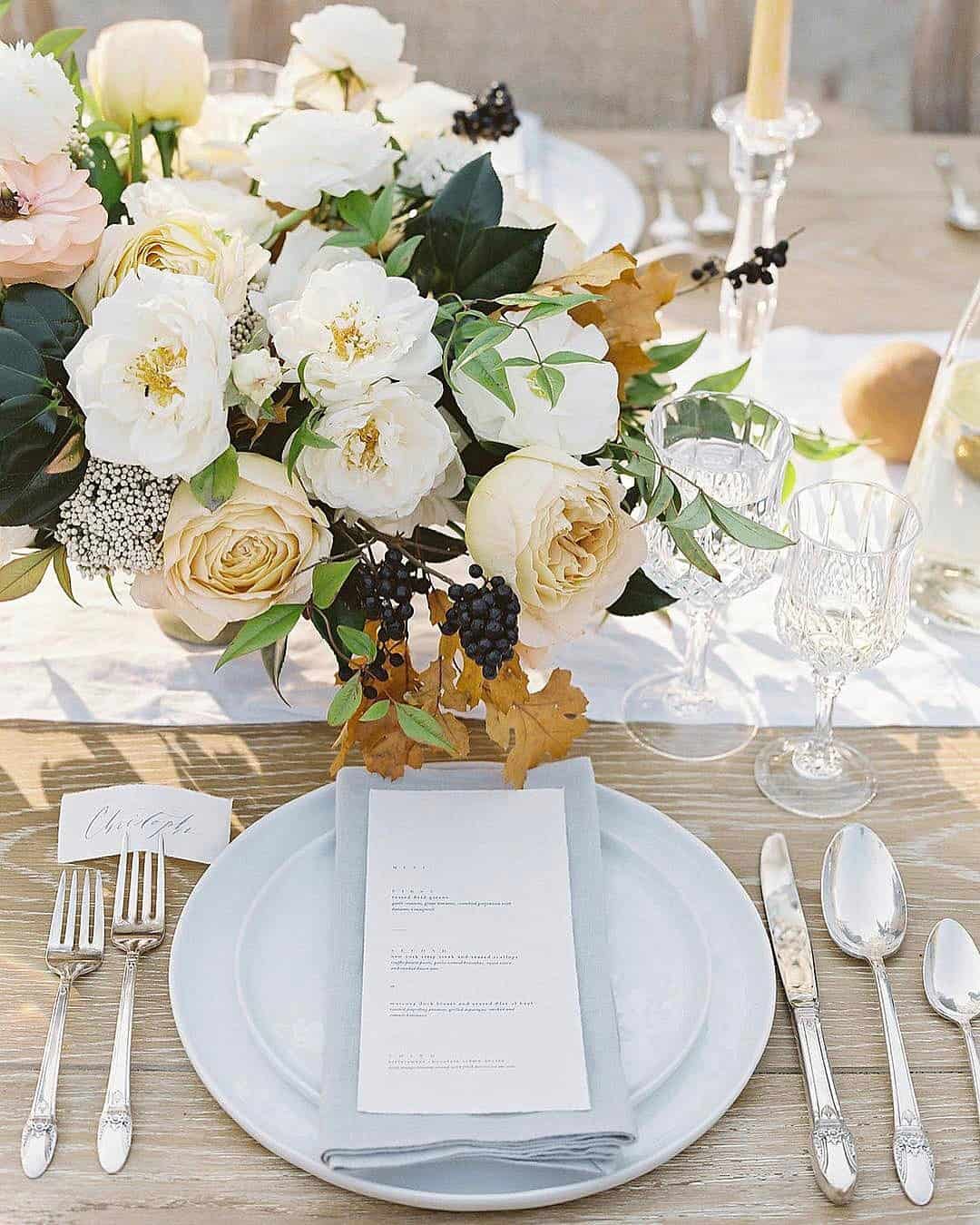
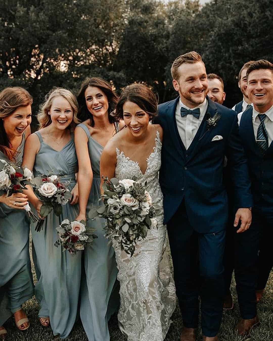
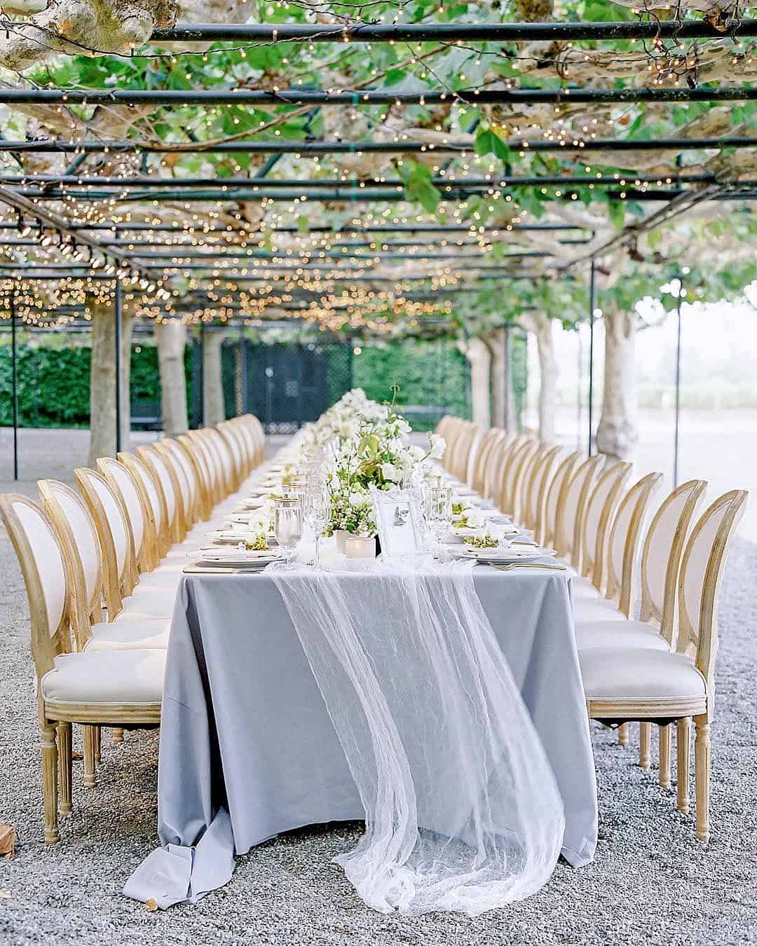
It’s A Match: This fusion sings at a timeless outdoor reception decked out with sunny yellow arrangements, navy attendant gowns, and graceful table linens. If this color narrative resonates, it proves a reliable choice since it glides effortlessly across varied venues particularly vineyards, private clubs, or storied estate homes.
A major reason couples gravitate toward this scheme is how both bridesmaids and groomsmen shine in deep navy attire accented with yellow or grey touches, pulling those charming wedding hues into sharp focus.
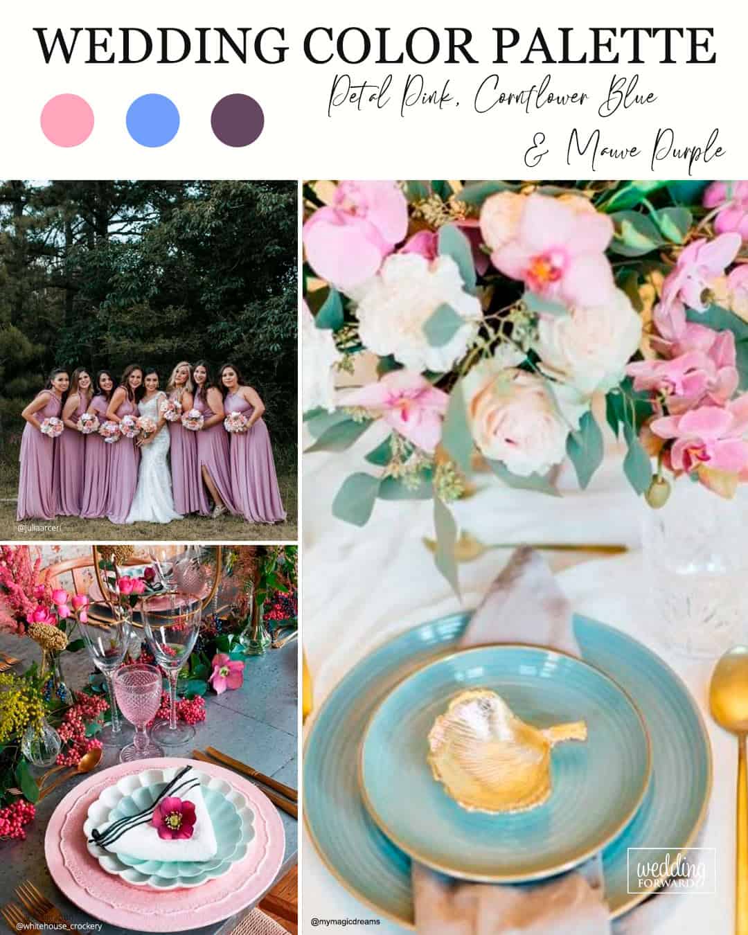
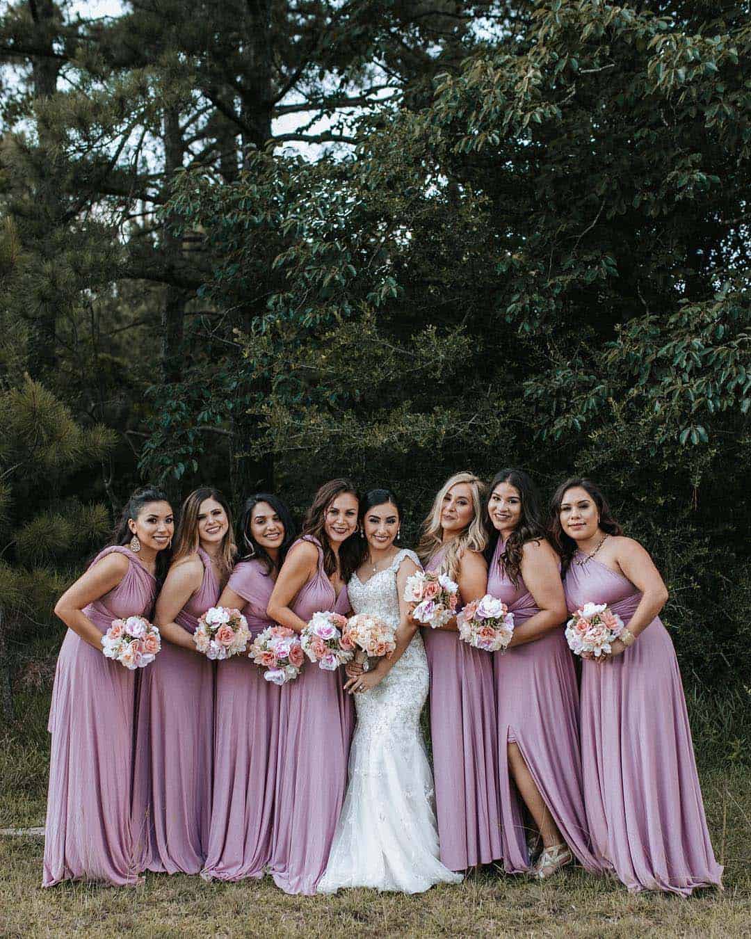
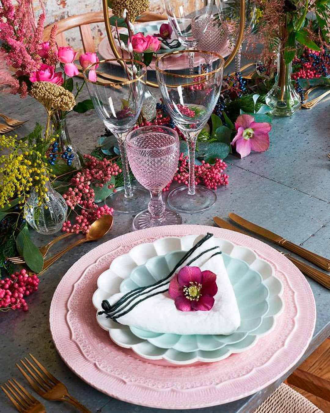
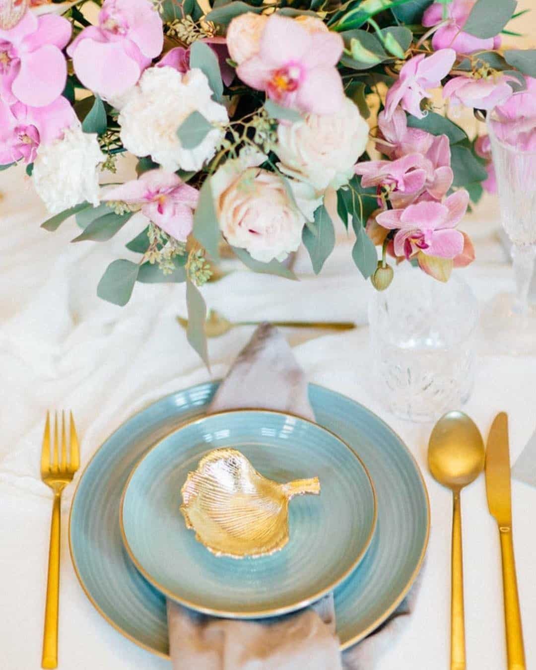
It’s A Match: If a calm and impeccably stylish color narrative for your summer wedding is the goal, this sets the standard. The interplay of petal pink, cornflower blue, and mauve purple conjures a high end botanical ambiance and flows naturally for a sunlit afternoon affair.
While petal pink and mauve purple impart a gentle softness, cornflower blue delivers a joyful burst of color while echoing the brilliance of a cloudless summer sky. Hydrangea clusters and garden roses become the signature florals here, with flowing bridesmaid silhouettes envisioned in shades of petal pink or mauve purple.
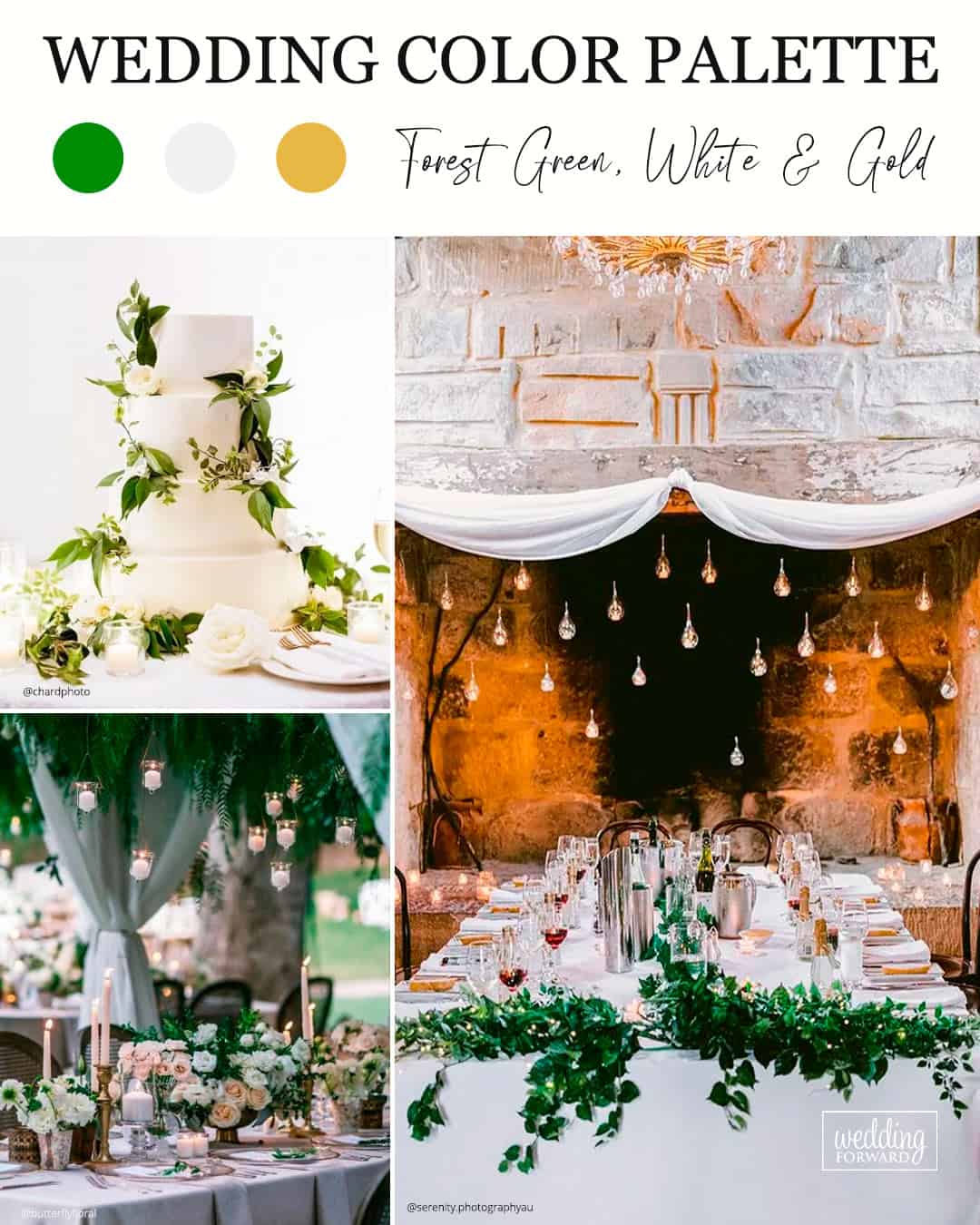
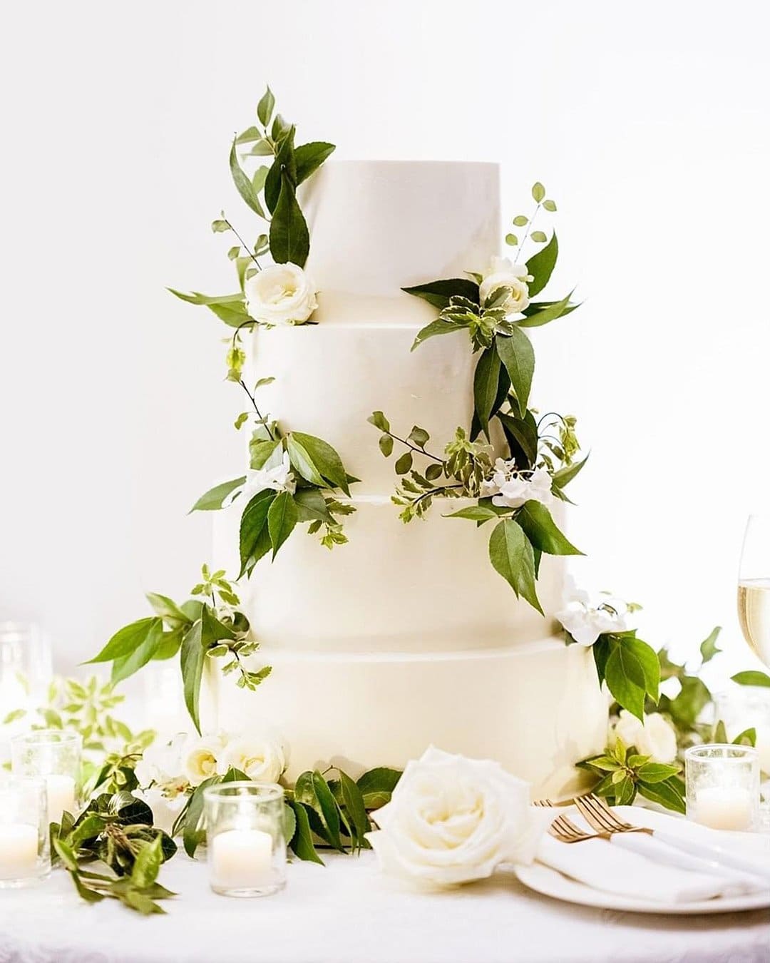
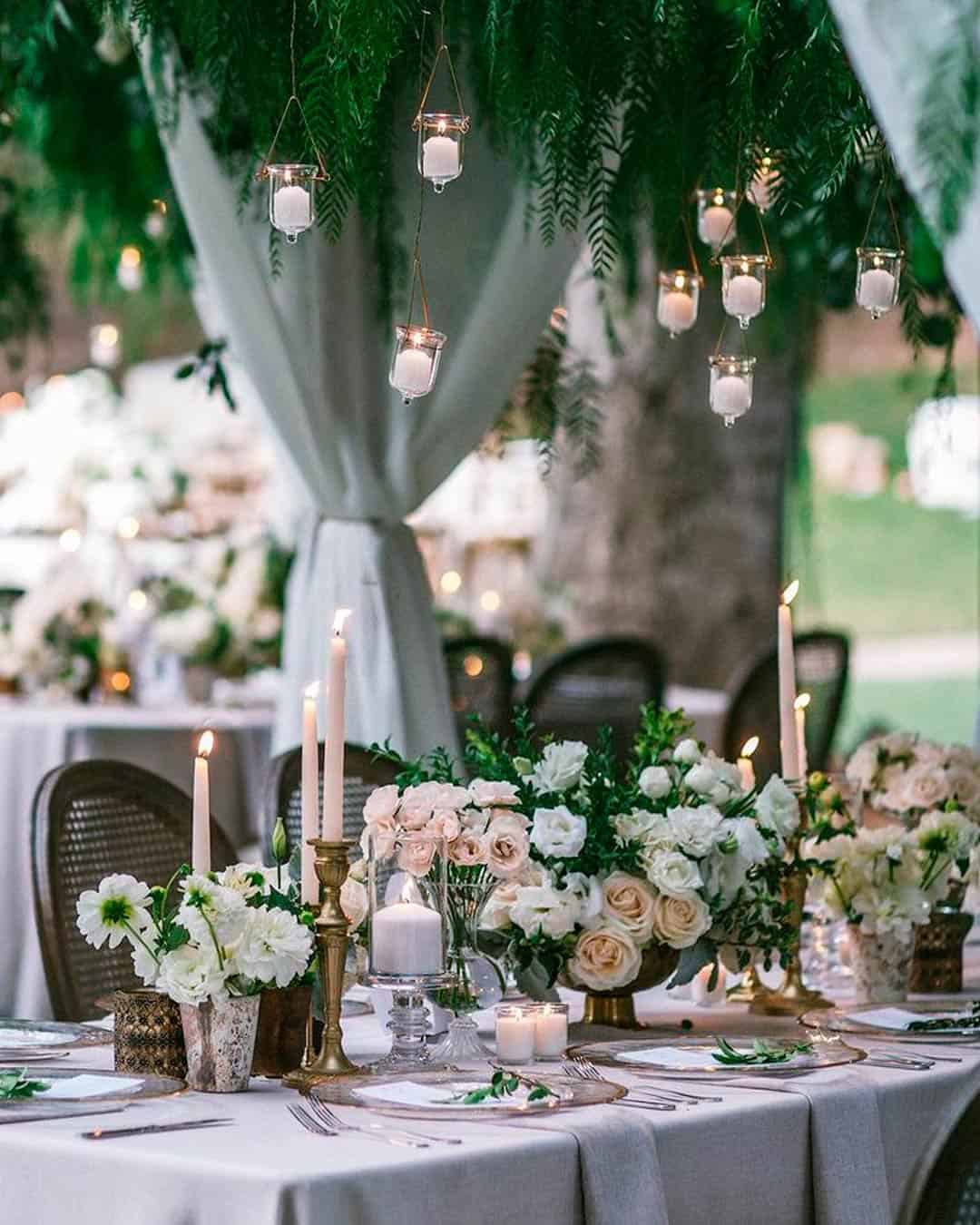
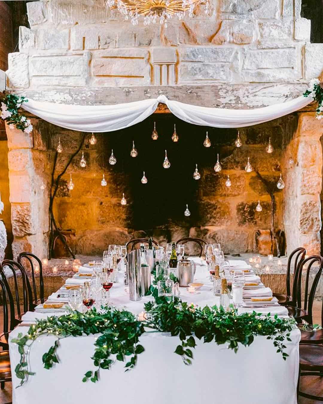
It’s A Match: When the desire to thread an organic, nature focused motif through your day meets the need for an ultra polished execution, turn toward the steadfast trio of forest green, classic white & gold. Wedding backdrops including barn venues, working farms, or rustic inspired spaces feel particularly aligned with this palette since it amplifies the raw beauty of the natural setting while infusing the elevated, sophisticated finish couples dream of showcasing.
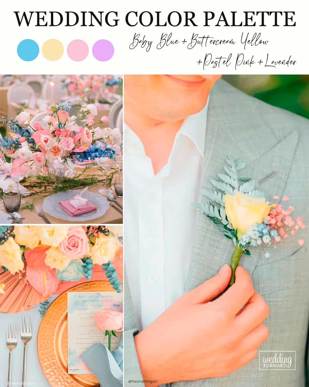
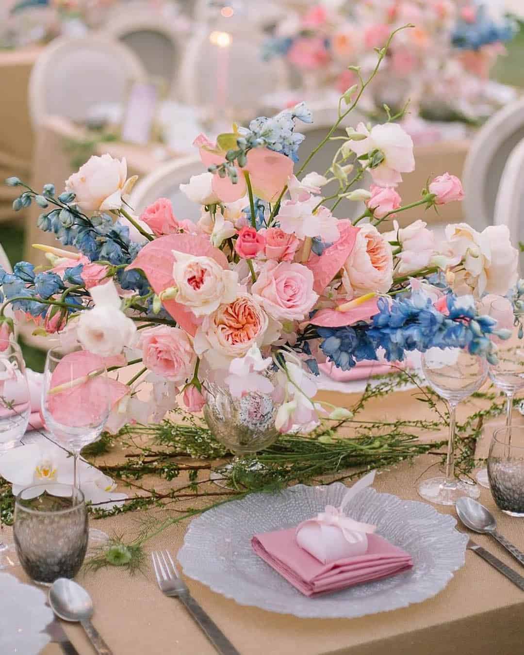
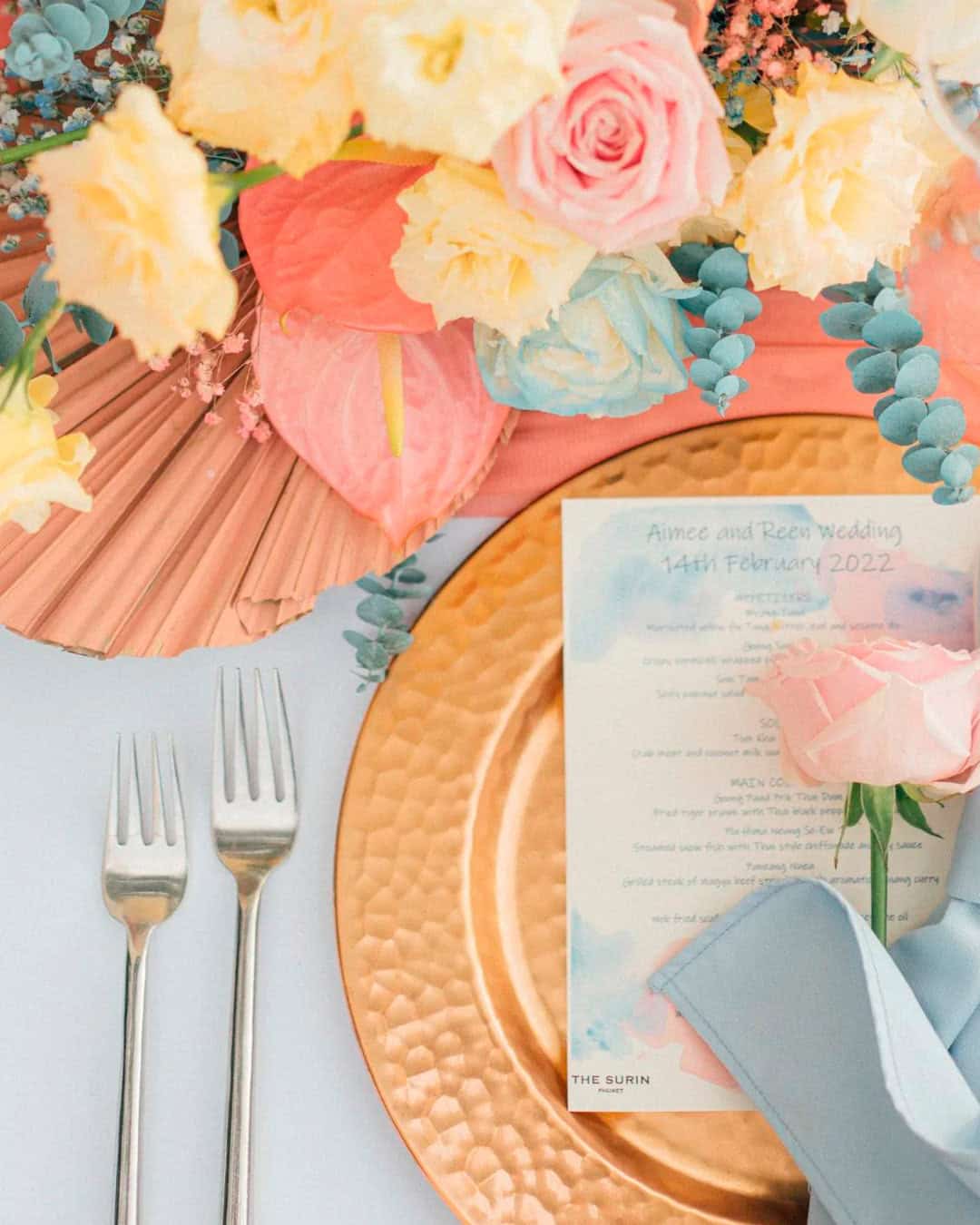
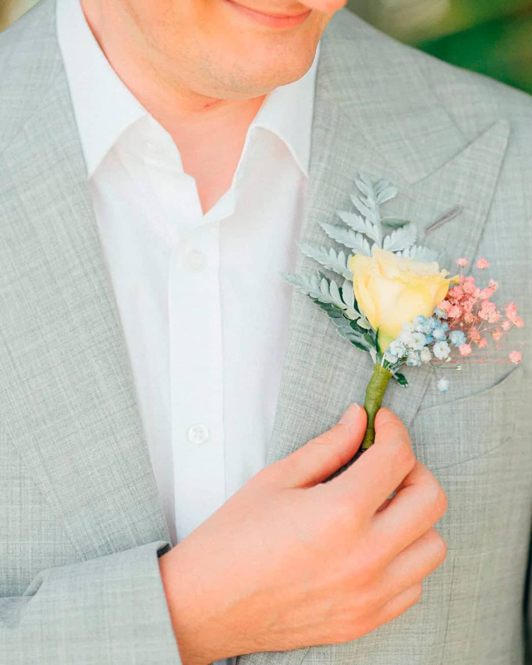
It’s A Match:
This evolution of previous seasons’ muted pastel palettes stirs a spirited primary color arrangement into the mix. Whether arranged in blocks alongside each other or melting in a smooth ombre gradient, this grouping sparks a feeling of joyful exuberance and carefree wonder.
Serve up this color marriage in late spring when regional blossoms peak, as they possess a remarkable ability to echo and amplify one another.
Fall Wedding Colors
The arrival of autumn delivers that signature snap of cool air, spectacular shifts in foliage, and sweeping natural panoramas, all perfectly staged as a wedding day backdrop. When imagining this wildly popular season, the mind naturally drifts to familiar vivid wedding tones in the amber, crimson, and forest family, yet true autumn enchantment reveals itself through countless distinct expressions for a fall wedding color story.
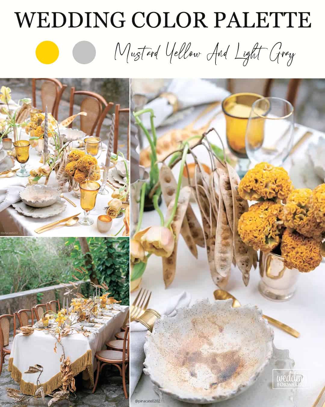
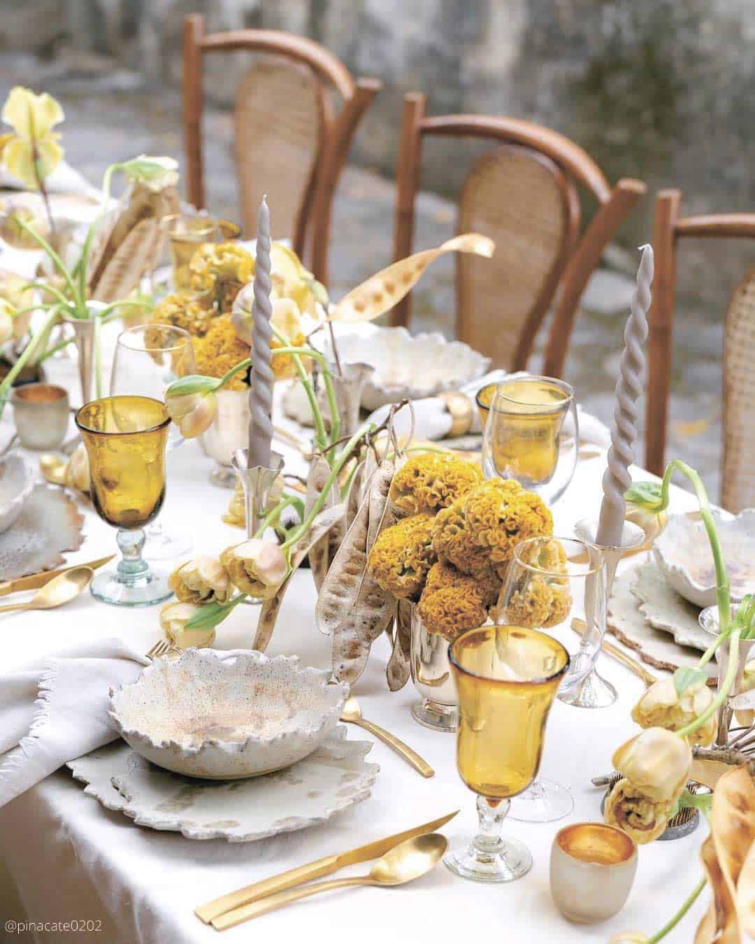
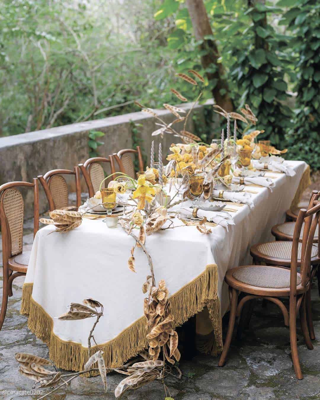
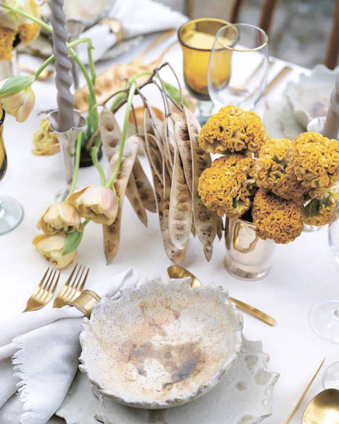
It’s A Match: Unite the magnetism of mustard yellow with the crisp, current touch of light gray. Gray’s quiet, grounding presence intensifies mustard yellow’s radiance, yielding a balanced and unified wedding palette.
Tailored for metropolitan venues or storied landmark spaces, this arrangement reinterprets timeless elegance through a distinctly modern lens.
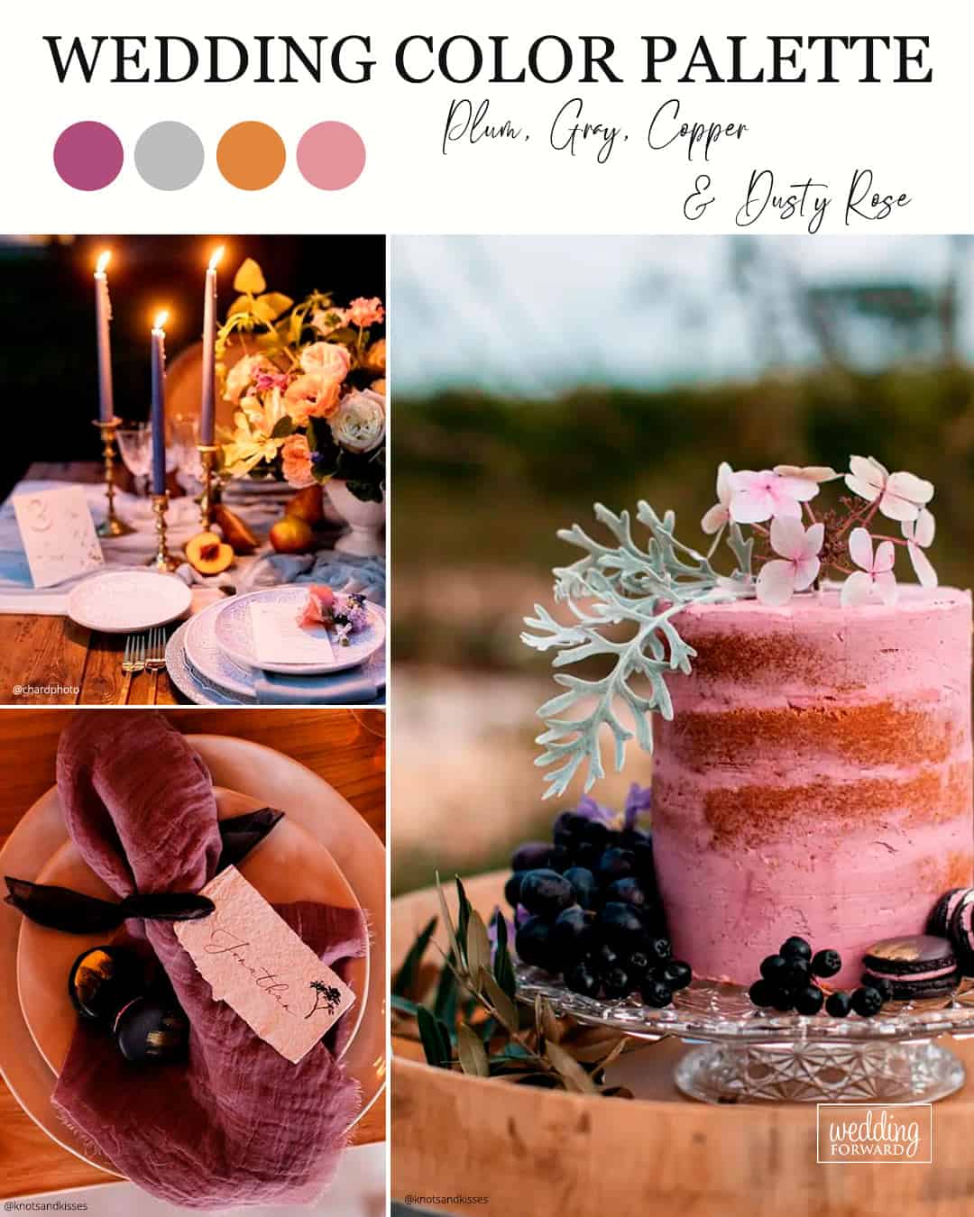
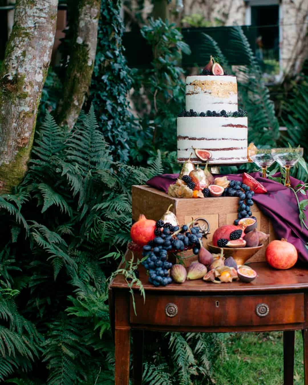
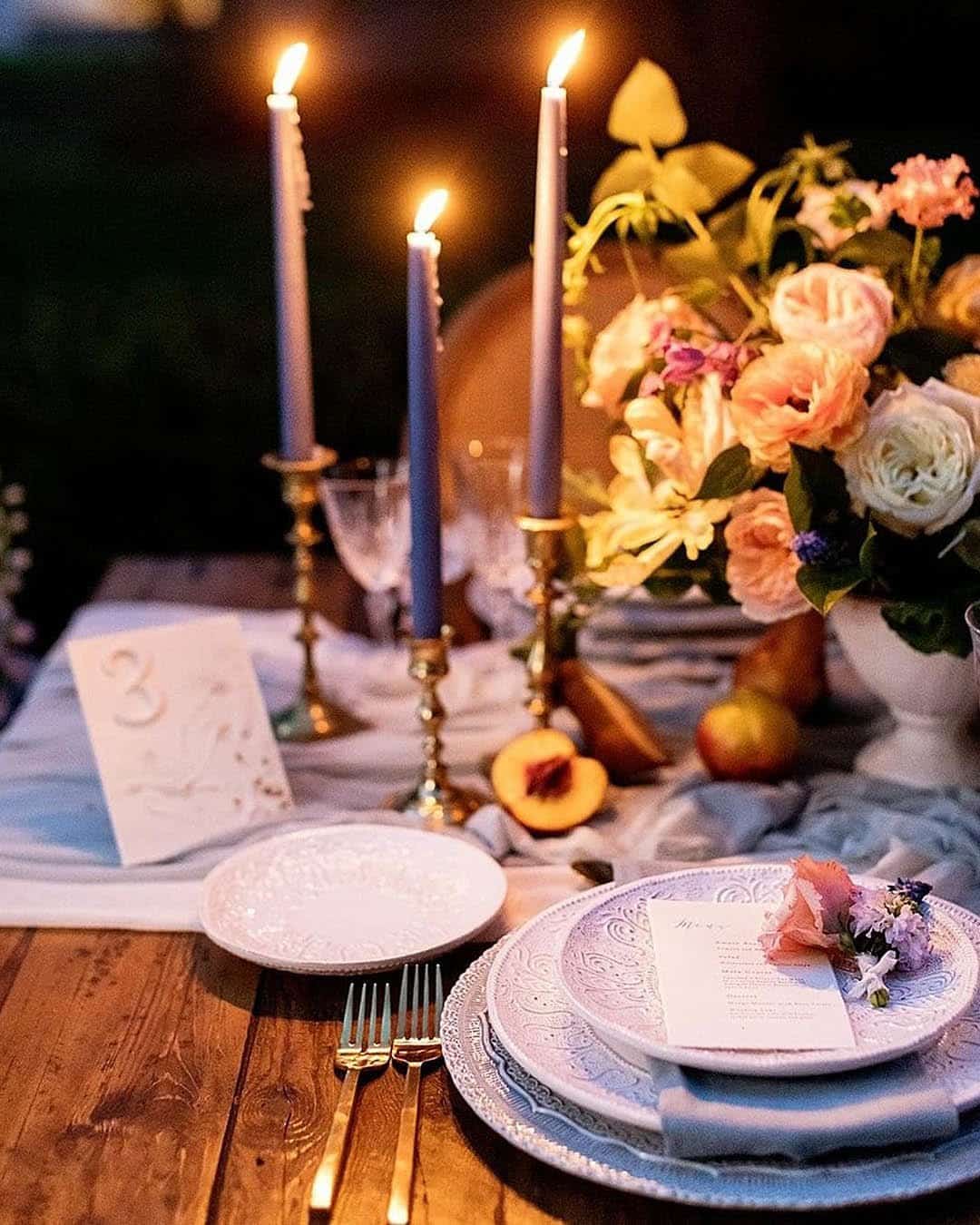
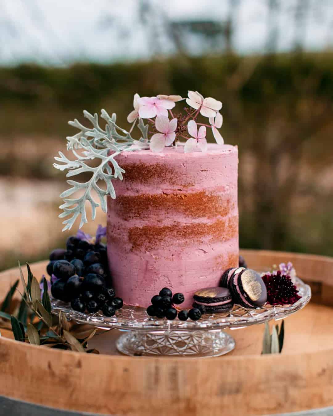
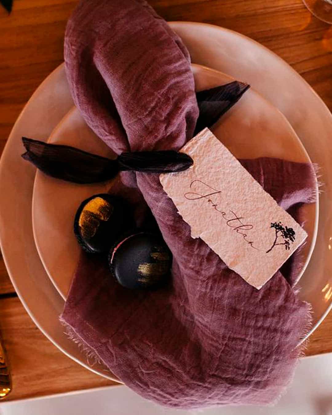
It’s A Match: Blending a heritage vintage shade like dusty rose and copper with current notes of gray and plum generates this show stopping September wedding color fusion. The depth of the plum injects a theatrical flourish, while the gray and copper supply dimension, and weaving in dusty rose gently counterbalances the composition with an airy delicacy.
Whether staging a vintage inspired celebration atop a city rooftop or within a landmark estate, this palette breathes life into a modern heirloom aesthetic.
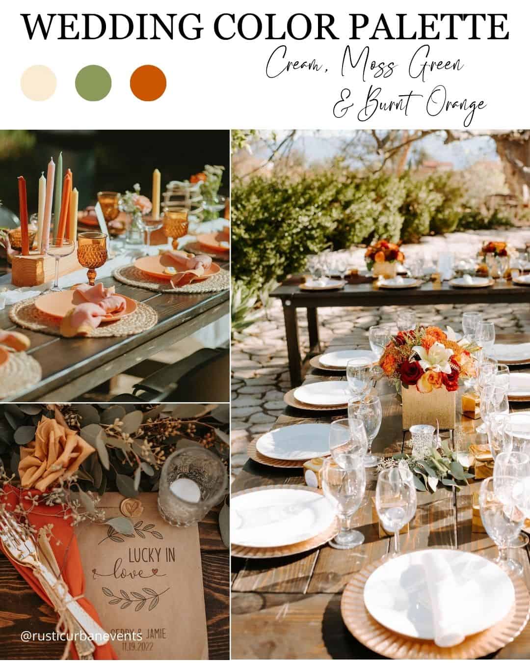
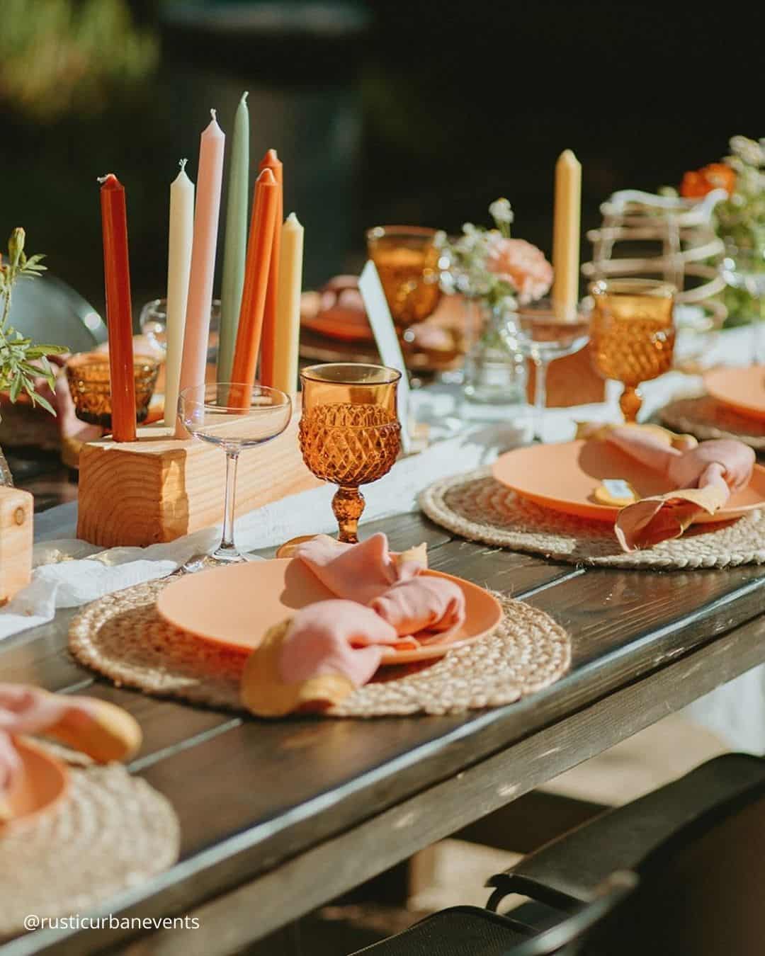
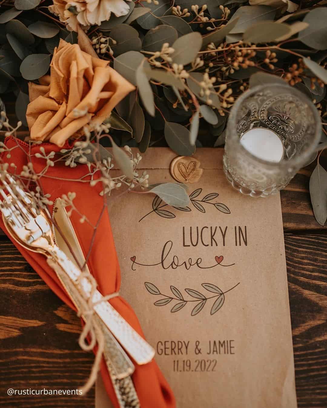
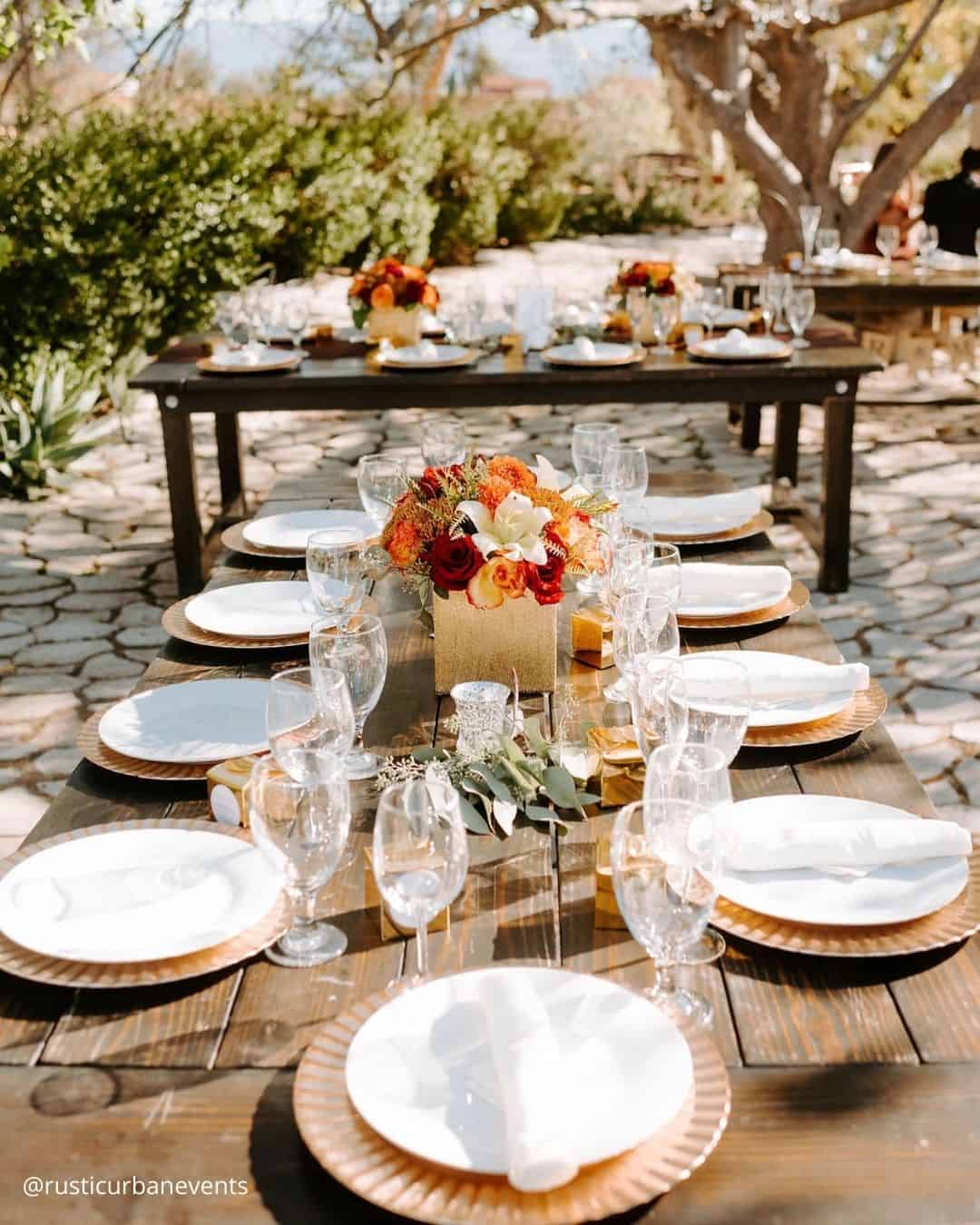
It’s A Match: Drawing inspiration from the magnificent palette of turning leaves, this October wedding color arrangement feels polished yet carries a rustic, countryside edge, making it a natural companion for a breathtaking outdoor ceremony that moves into a barn, farmstead, or vineyard reception. This toasted orange wedding palette practically begs for welcoming guests with steaming cups of spiced cider and weaving the outdoors directly into centerpieces by layering in gathered foliage, velvety moss, and tiny decorative pumpkins.
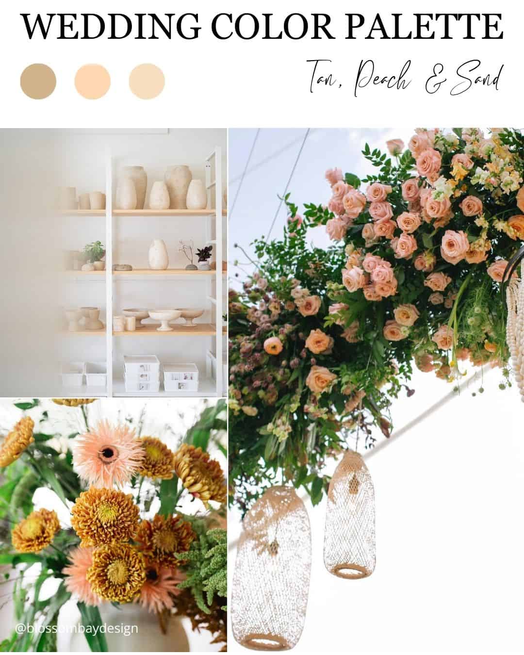
It’s A Match:
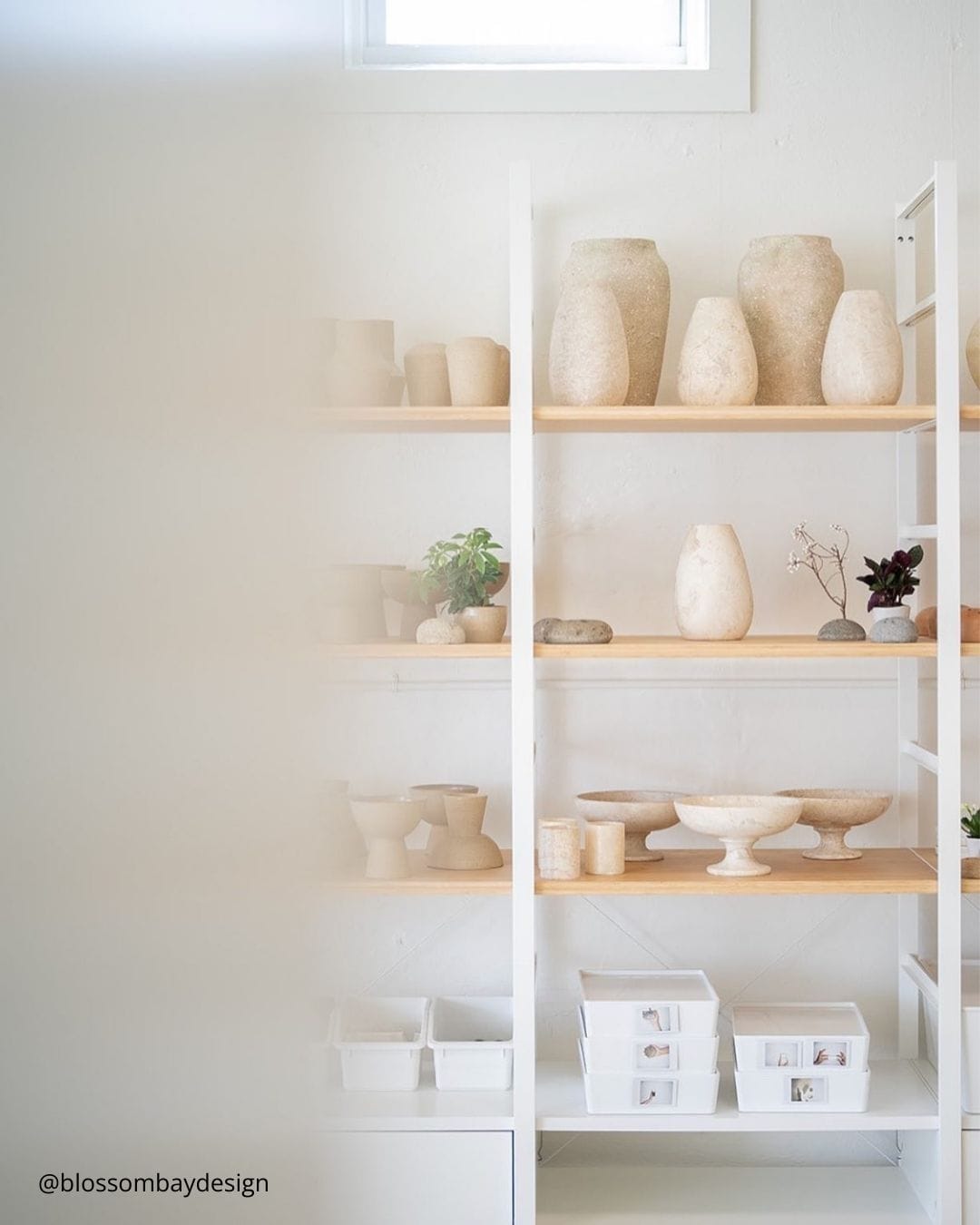
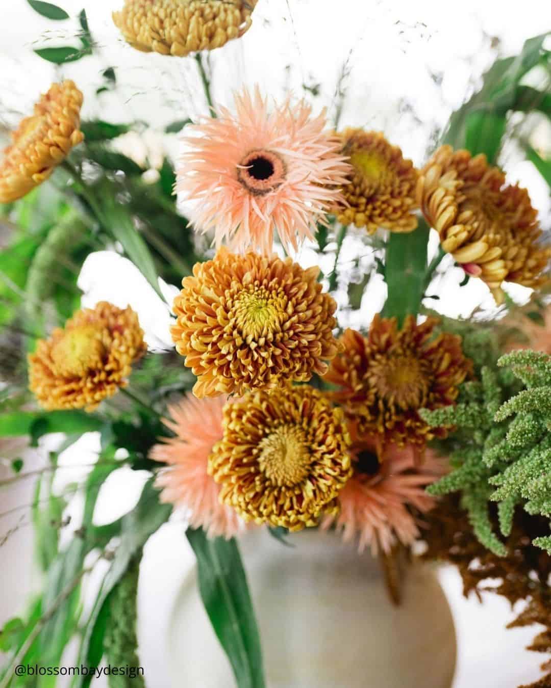
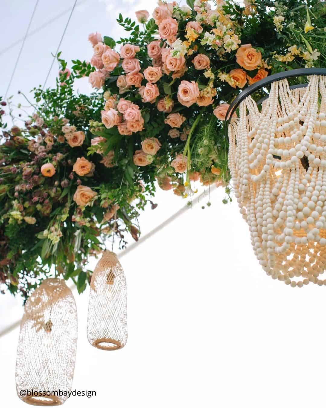
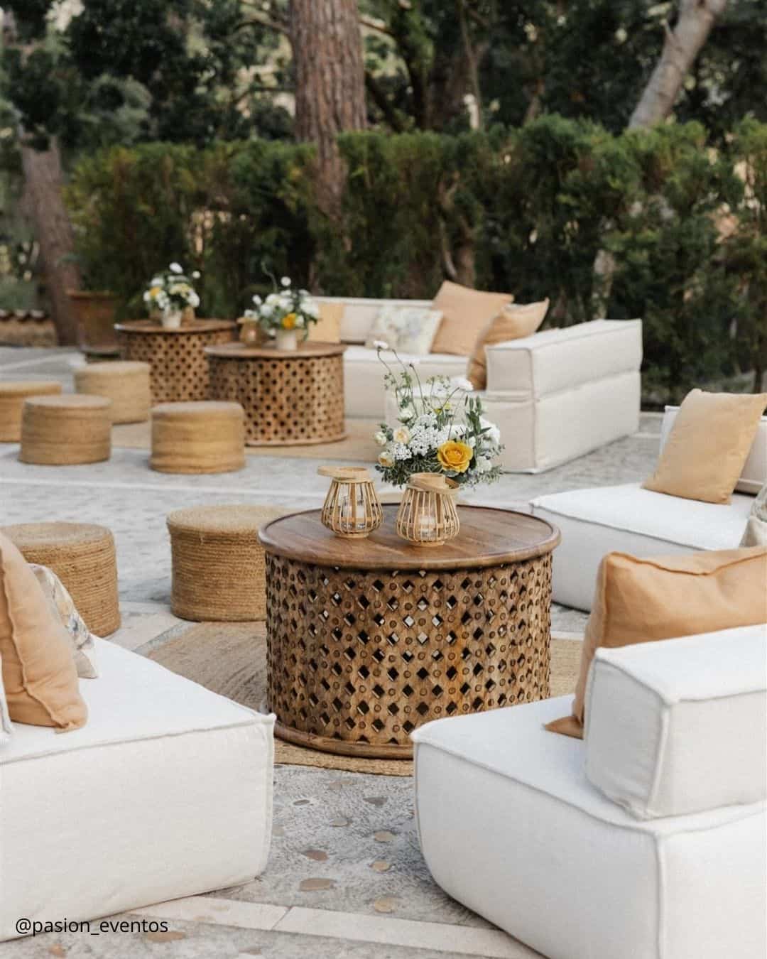
Tan, peach, and sand operate as effortlessly relaxed wedding hues seemingly crafted for open air settings. Beachfront and botanical ceremonies call for airy textiles and softer tones that keep everyone at ease.
Just as crucially, the visual impression of being serene and wholly content mirrors emotions intrinsically tied to partnership. This single hue spectrum option shapes an appealing, cohesive aesthetic that perfectly channels the grounded, sensible color currents.
Winter Wedding Colors
If you are planning to celebrate during the cooler chapter of the year, a trove of stunning wedding palette options awaits. Pulling visual inspiration from themes like crystalline blues, passionate berry reds, and deep evergreen hues, this season dishes up so many indelible combinations.
Whether your vision leans toward a cozy mountain lodge feel, a crisp snow draped alpine look, or a spirited yuletide atmosphere, weaving the magic of the winter landscape into your planning is non negotiable.
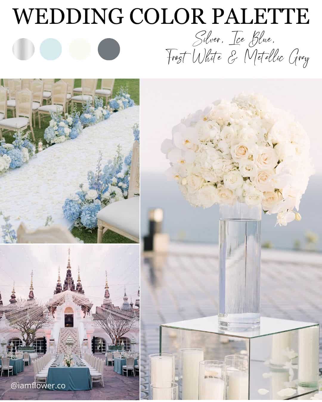
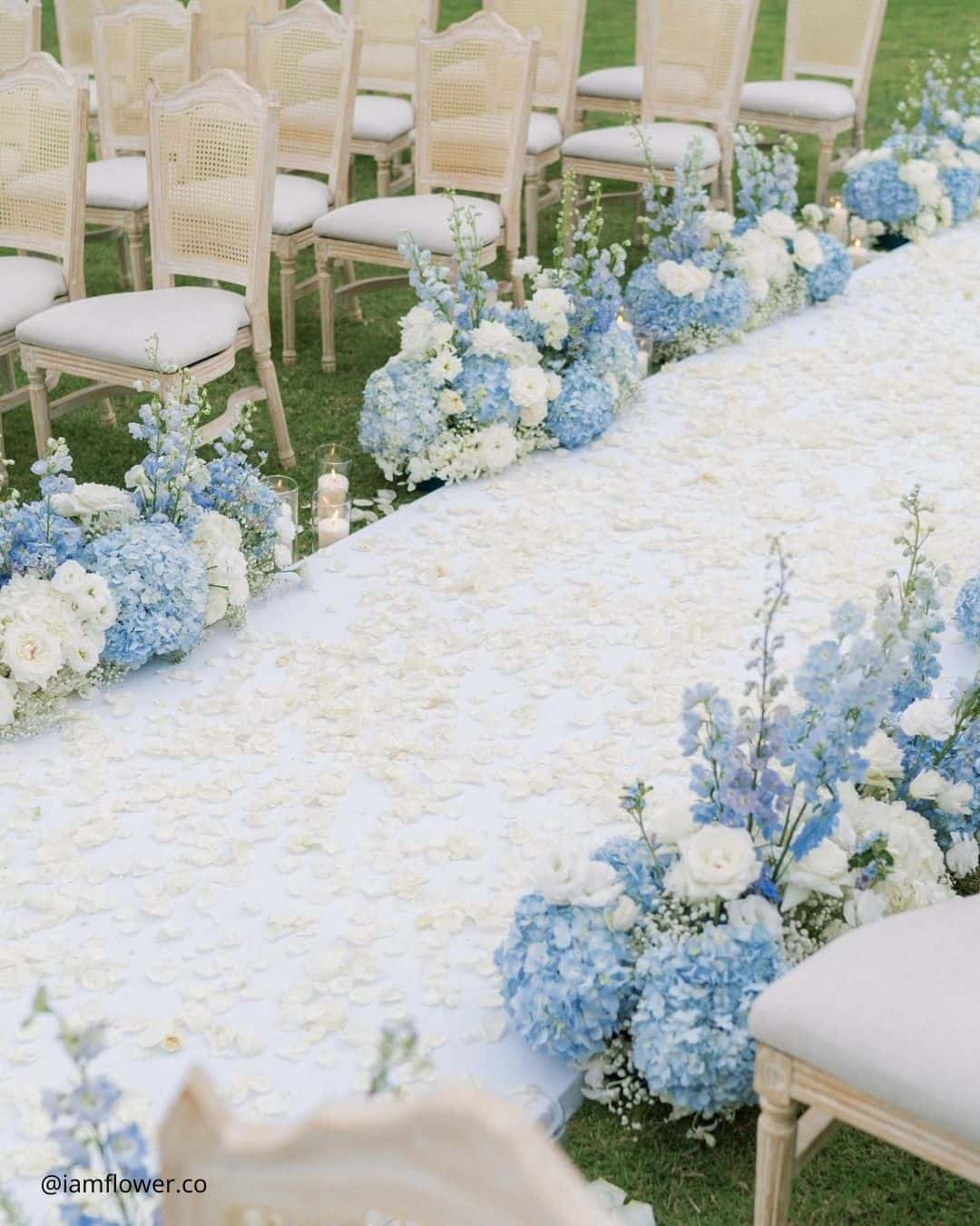
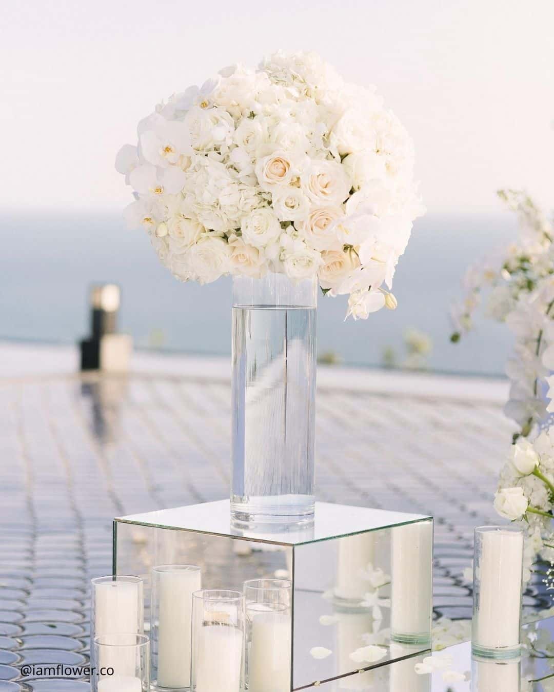
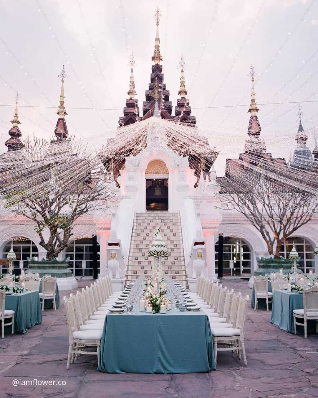
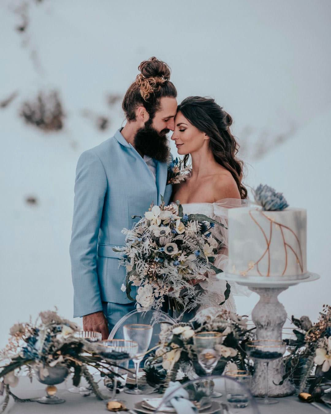
It’s A Match: The winter stretch brings a singular beauty to a wedding scene, and so often couples who are enchanted by the thought of a cold season celebration want to capture the glisten of frost and ice in their design, making a palette that mirrors that wintry splendor a natural choice. The lustrous silver hue echoes the sparkle of a fresh frost, while the ice blue, white, and gray layer in a snowy stillness.
Ideal for an alpine resort or a storied grand hotel venue, this winter wedding theme feels refreshingly crisp yet enveloping all at once.
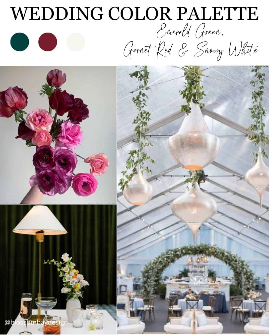
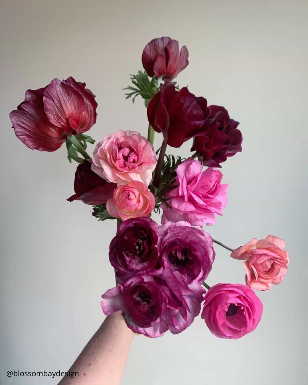
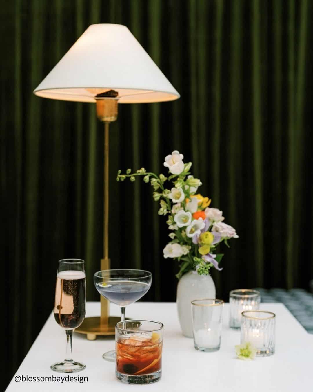
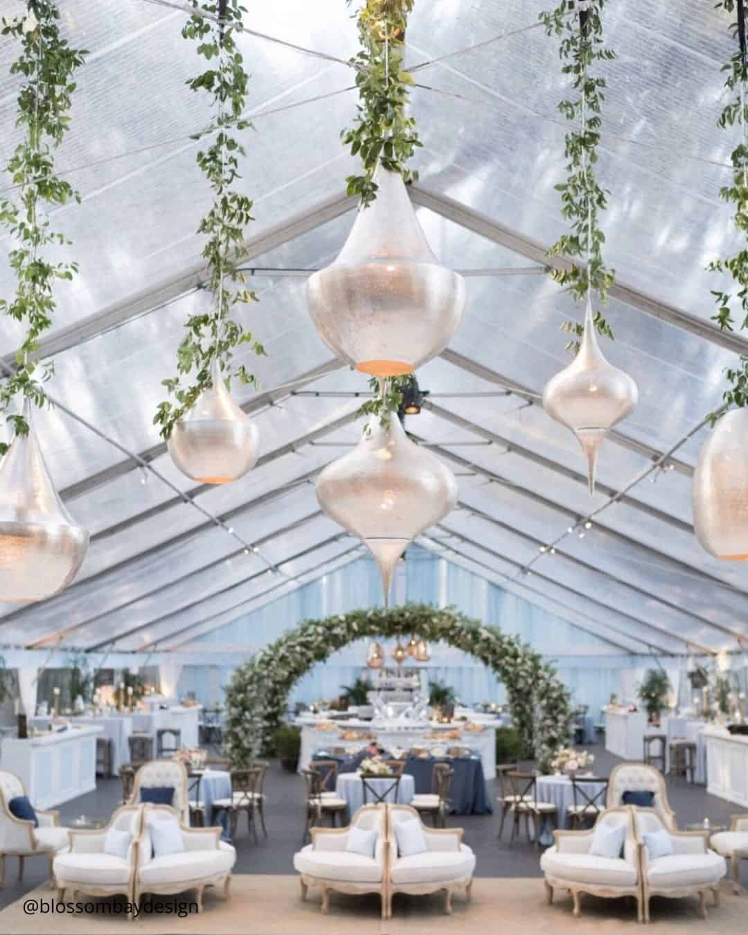
It’s A Match: Borrowing its rhythm from the Christmas season, there is something entirely right about leaning into an emerald green and red color story. So many cold weather receptions embrace a festive pulse, so why not welcome the traditional palette and amplify the celebratory spirit?
This motif glides effortlessly across almost any wedding venue or geographic location, proving the lasting power of its classic appeal.
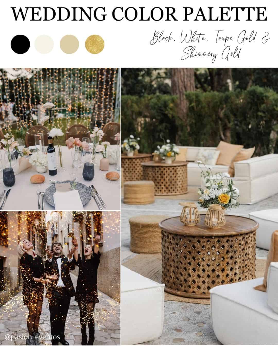
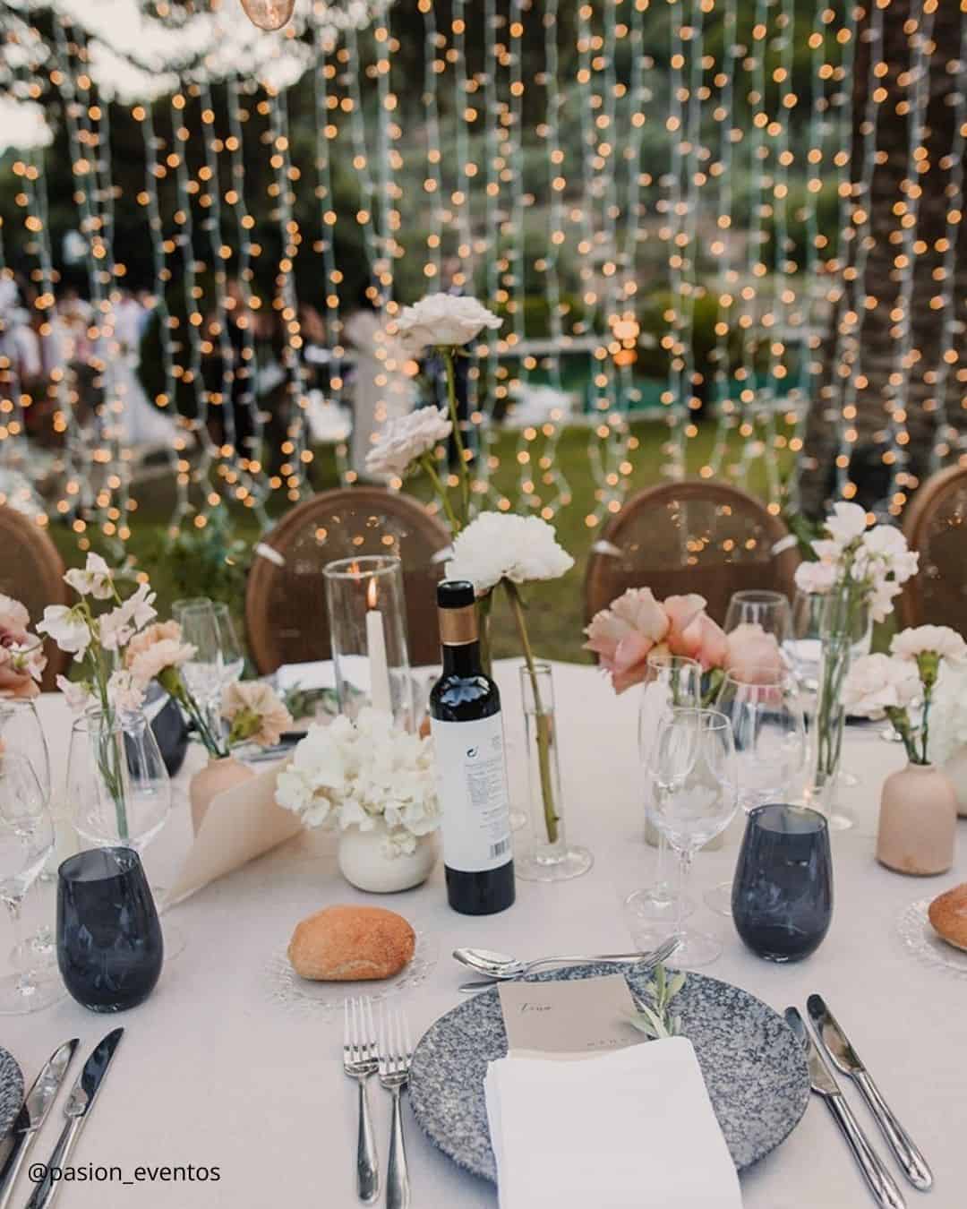
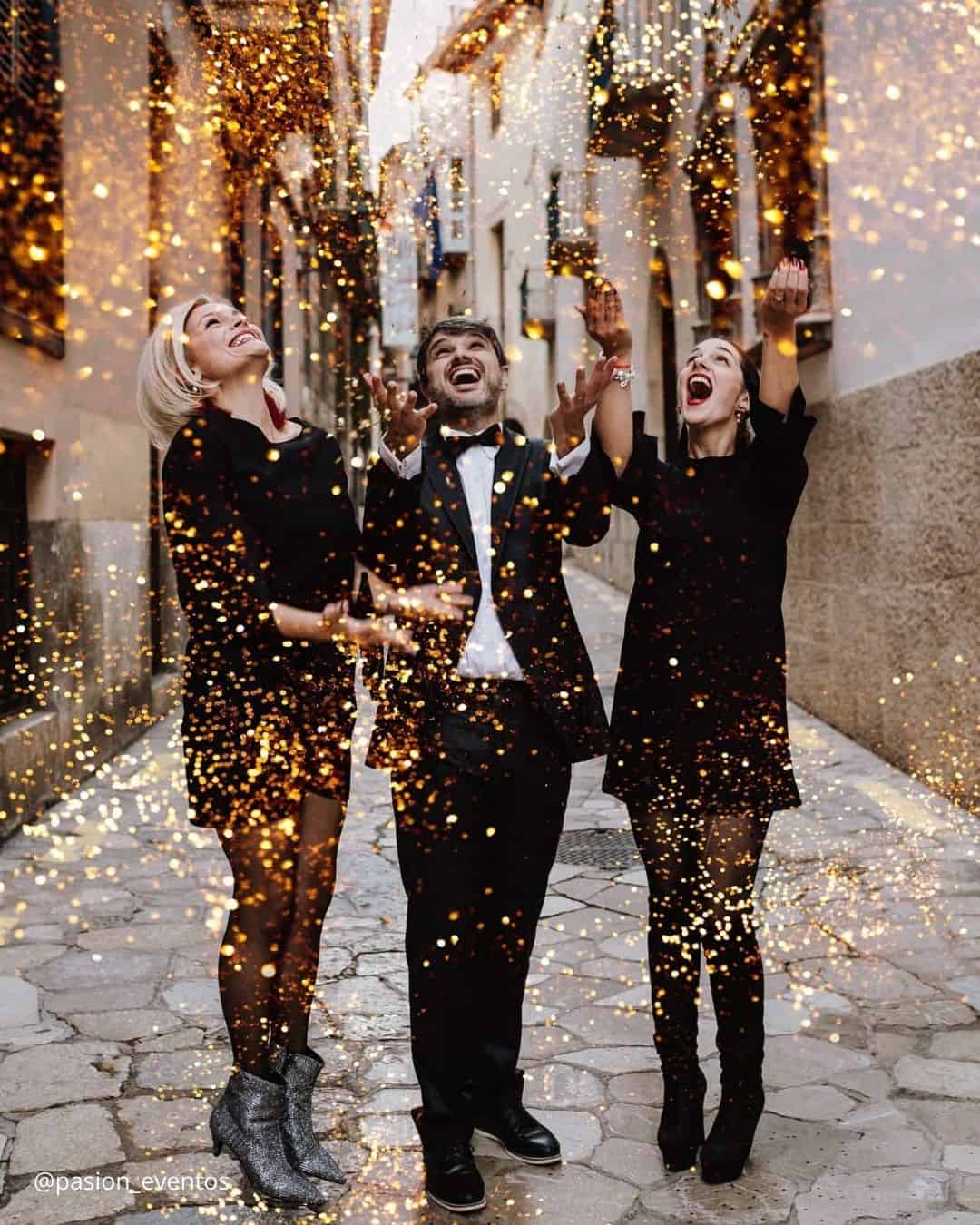
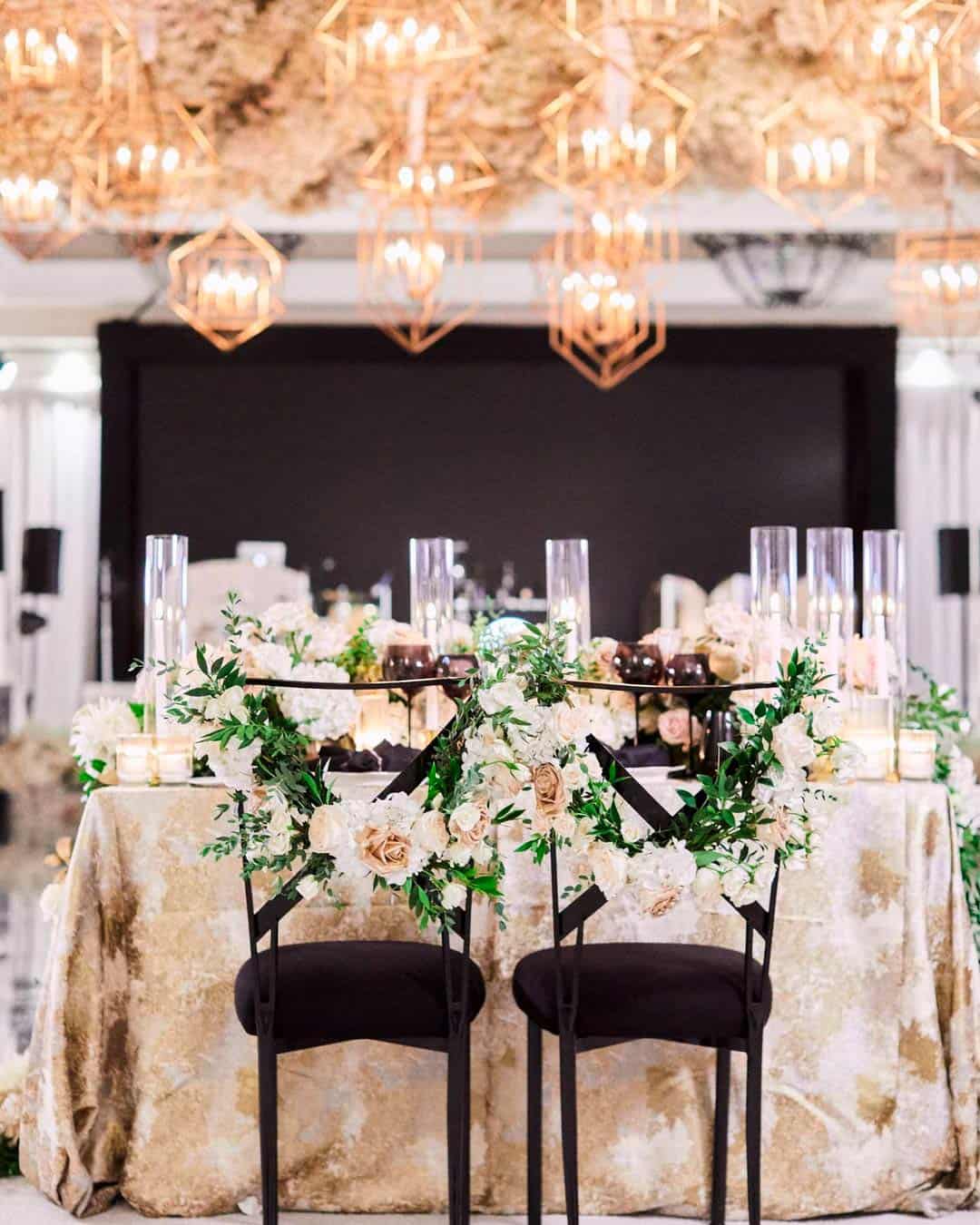
It’s A Match: Ready to lift your winter wedding palette from simply pleasant to utterly magnificent? Black, White, Taupe Gold, and Shimmery Gold honor the holiday spirit while sprinkling a dose of pure magic across the entire aesthetic.
Picture a storied hotel ballroom dressed with towering gilded candelabras, crisp white draping, and an artful floral centerpiece, this is the visual reality you achieve by leaning into this palette.
Spring Wedding Colors
Few things rival the feeling of spring when nature erupts into full bloom and color comes alive in every direction. Spring stands as the season of fresh starts and renewal, and keeping that energy close, couples who commit to a springtime ceremony discover singularly lovely and inventive color duos waiting in the wings.
Polished spring wedding shades typically orbit around blush pinks, airy blues, soft creams, and buttery yellow families.
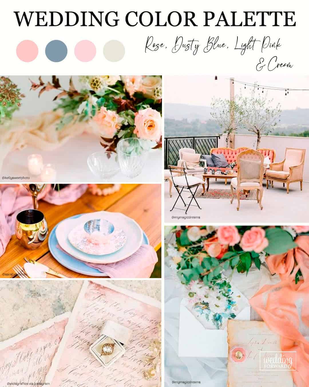
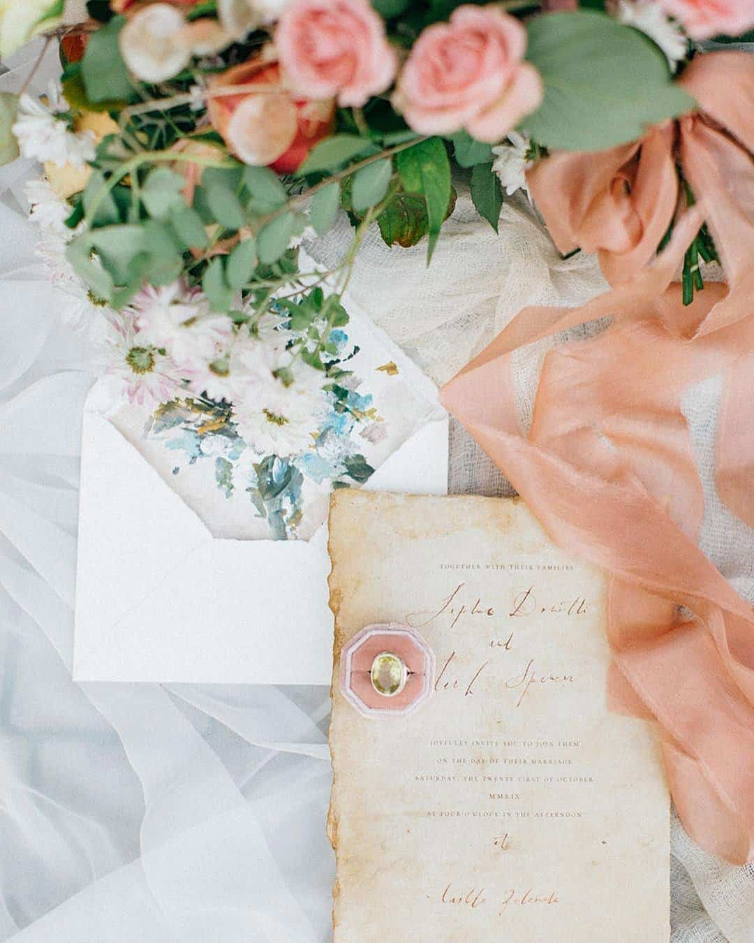
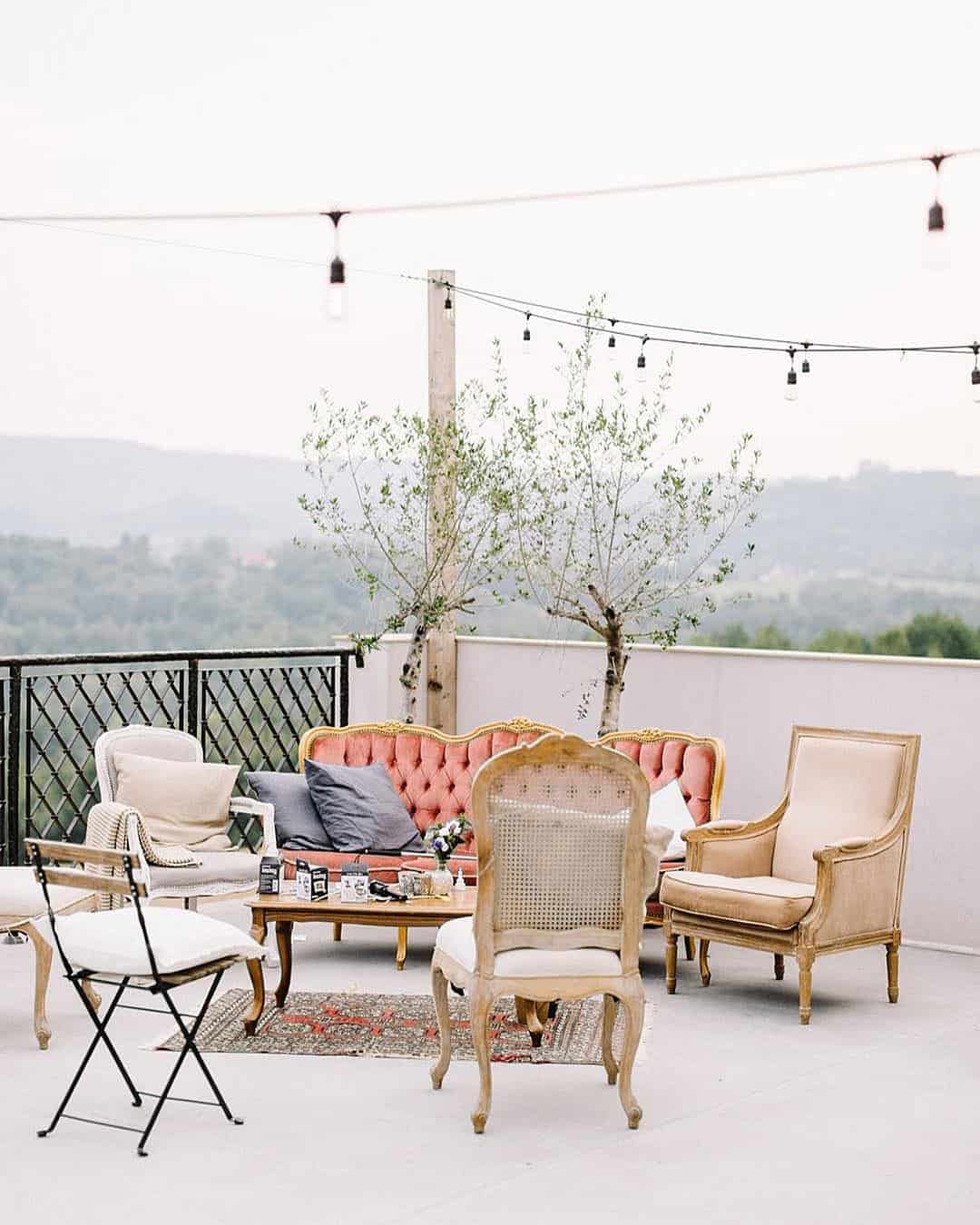
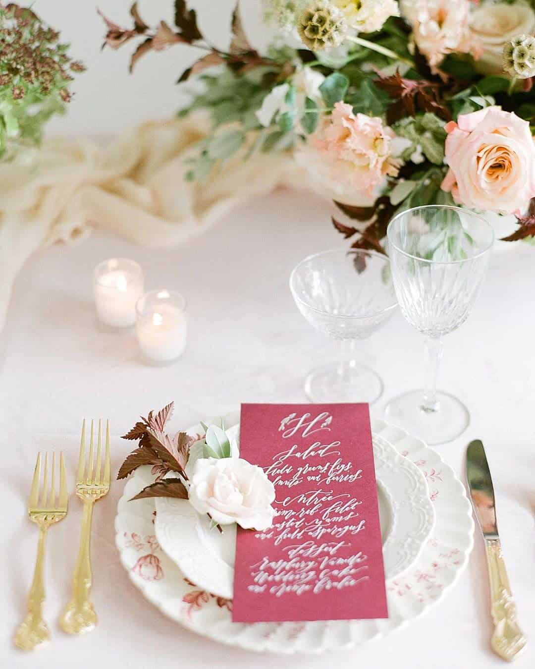
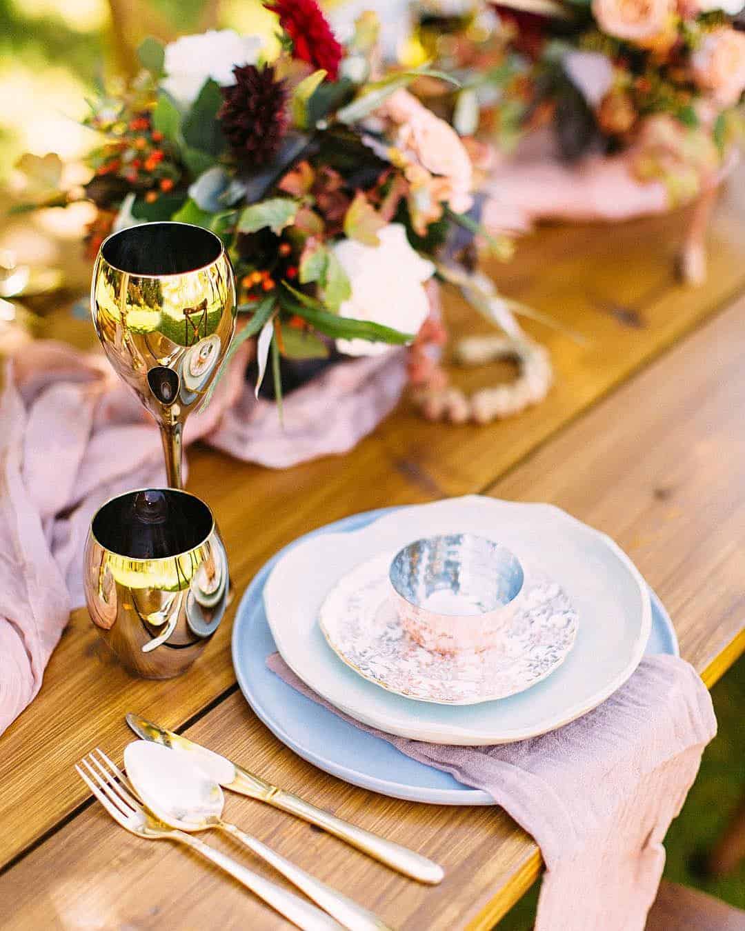
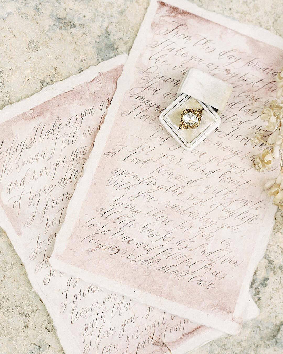
It’s A Match: The search for a hushed, gentle palette that marries a whisper of bygone romance with wedding day polish leads straight to this distinctive assembly. The blend of muted, airy colors brings a profound sense of stillness to the overarching design, flowing naturally with the soft, clear light of the spring months.
If a garden venue or a draped tent celebration is in the works, a dusty blue wedding palette rises as the undeniable perfect match.
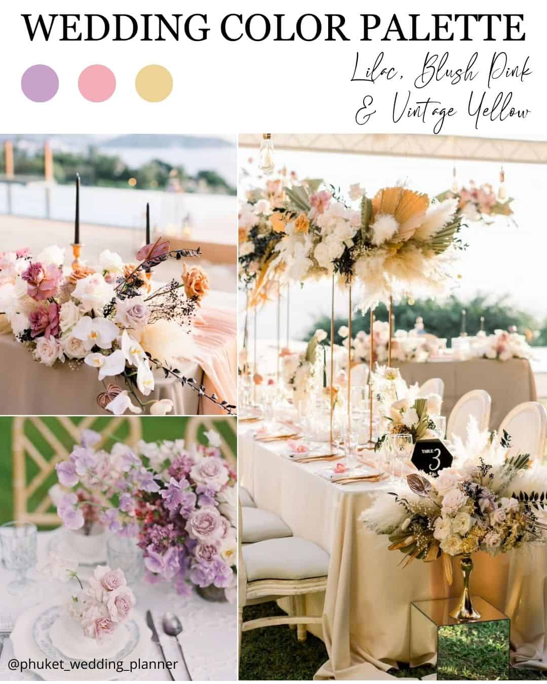
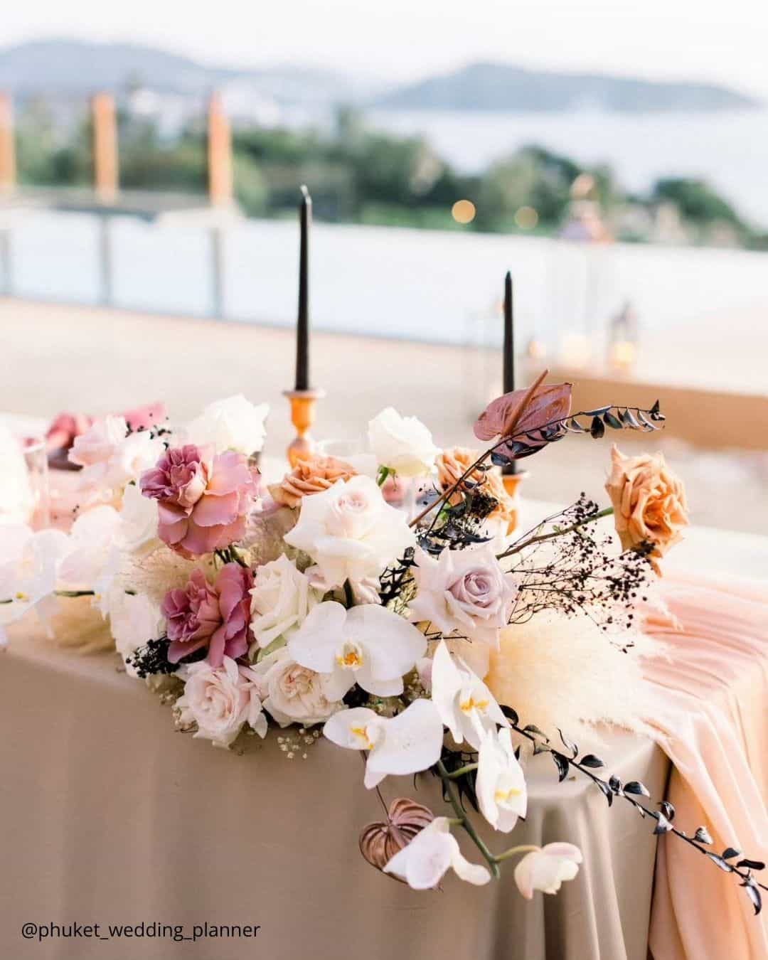
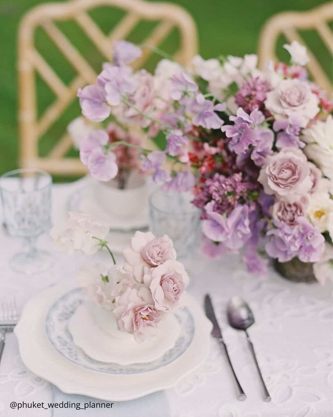
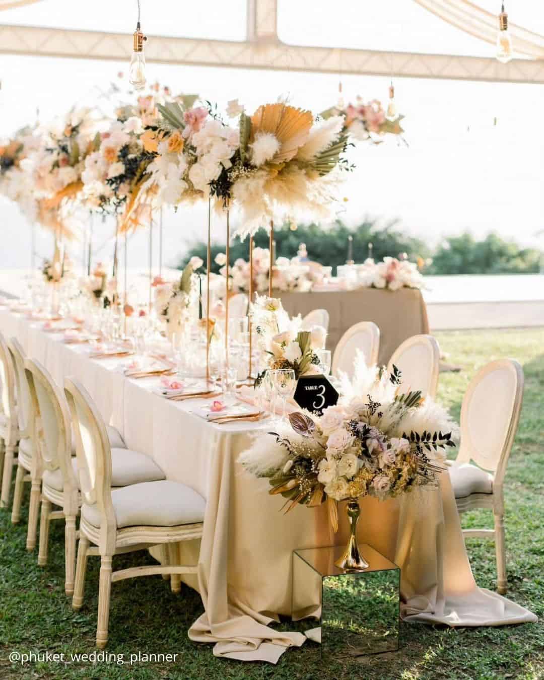
It’s A Match: A quintessential spring wedding palette built around beloved seasonal blossoms, this trifecta operates as the ideal ally for any couple picturing an alfresco exchange of vows. These three candy hued tones pair flawlessly with nearly any bloom, decor element, or wedding direction, owing entirely to their chameleon like nature and clean, unfussy charm.
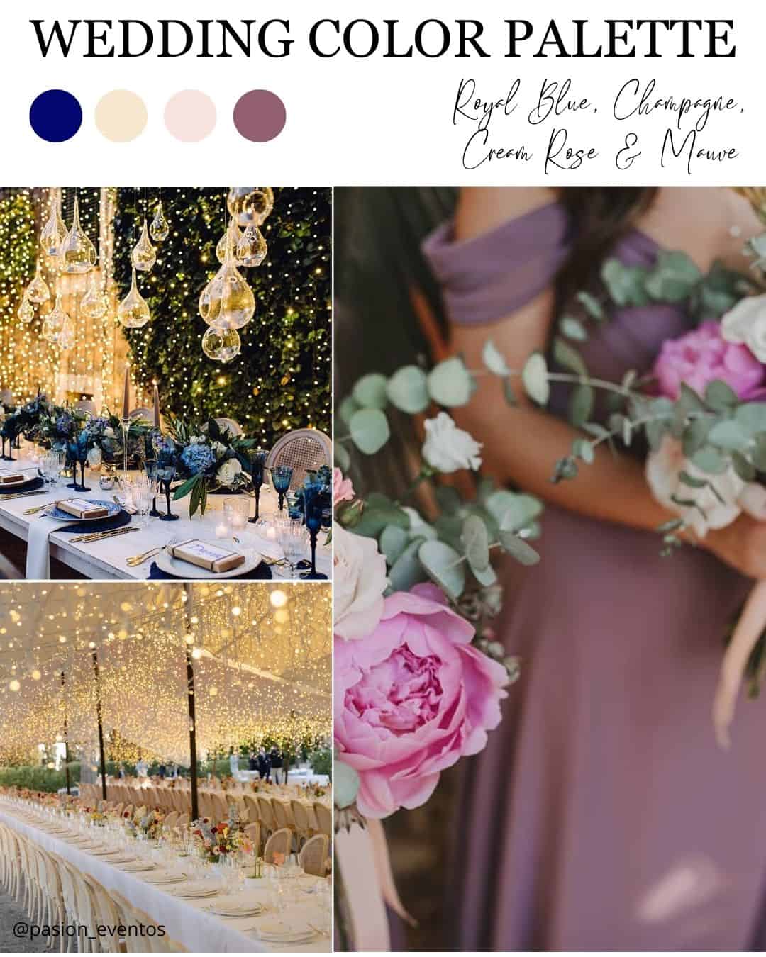
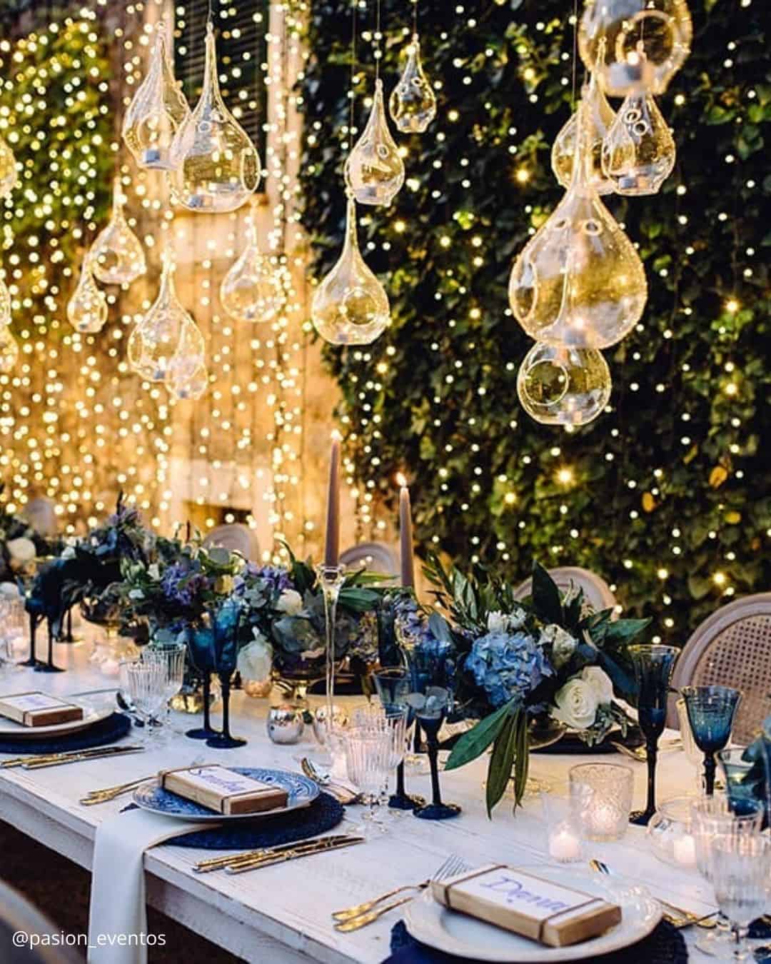
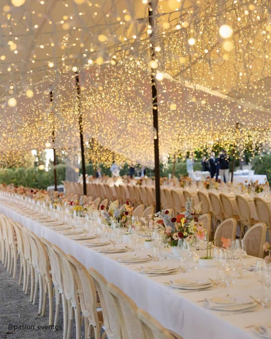
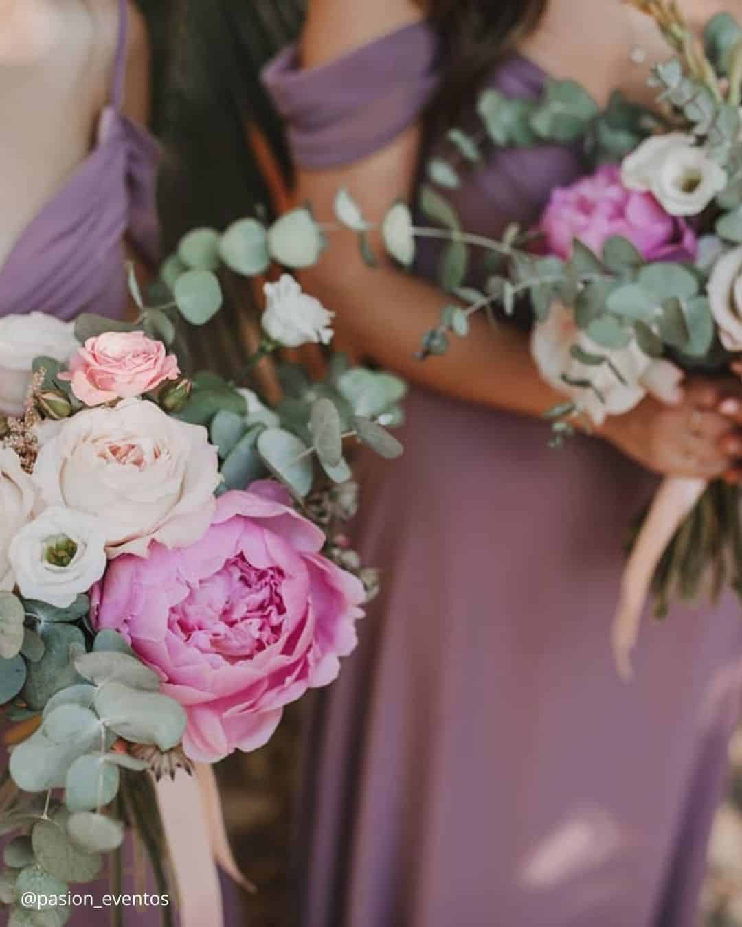
It’s A Match: A genuine crossover of tonal families, this quartet of spring wedding shades appears purpose built for the style driven bride. It lands beautifully when orchestrating a country club fete or hosting a destination resort weekend, as the royal blue and mauve channel a heritage sophistication while the champagne and cream rose introduce a stabilizing sense of proportion and calm.
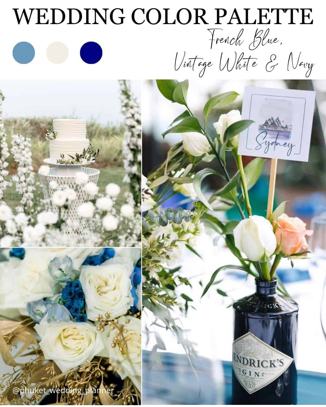
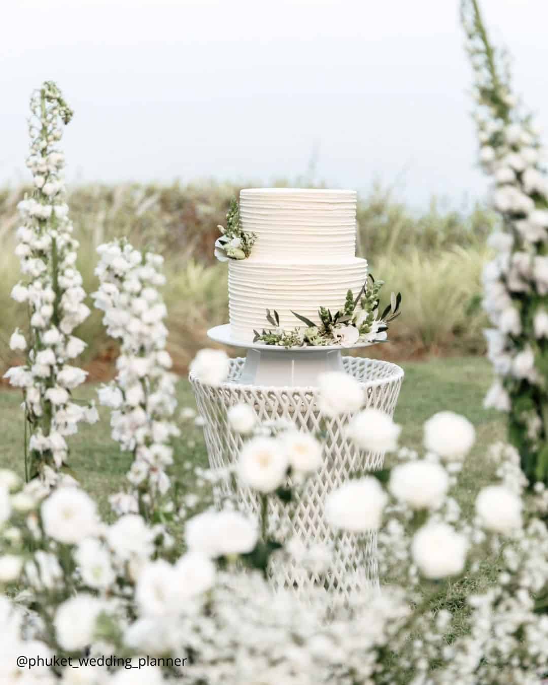
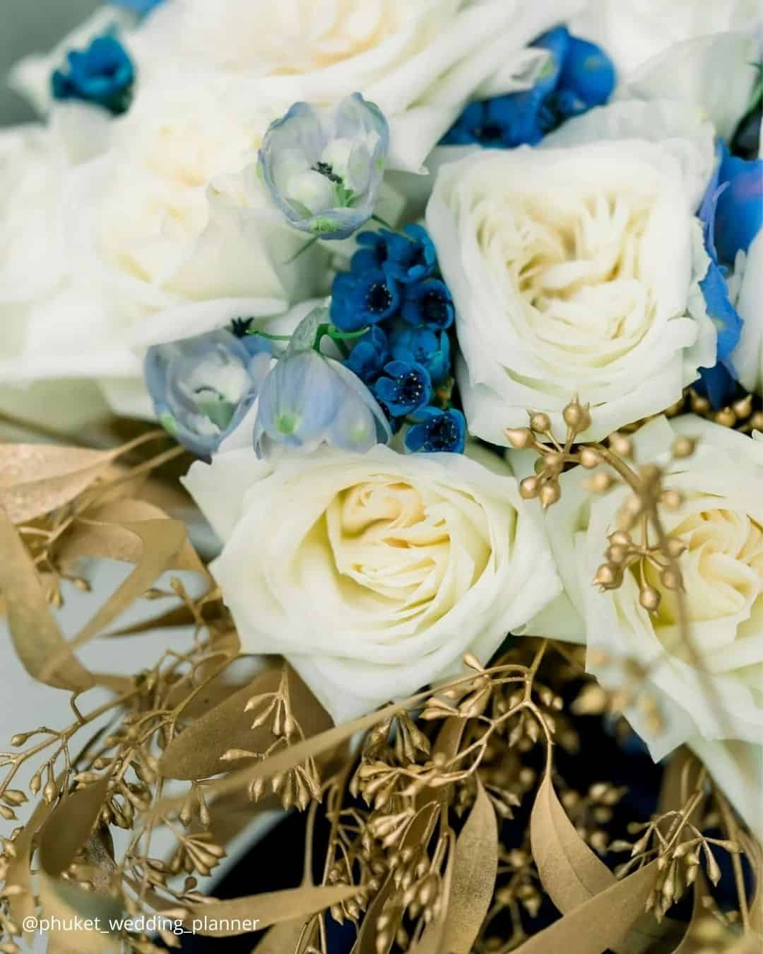
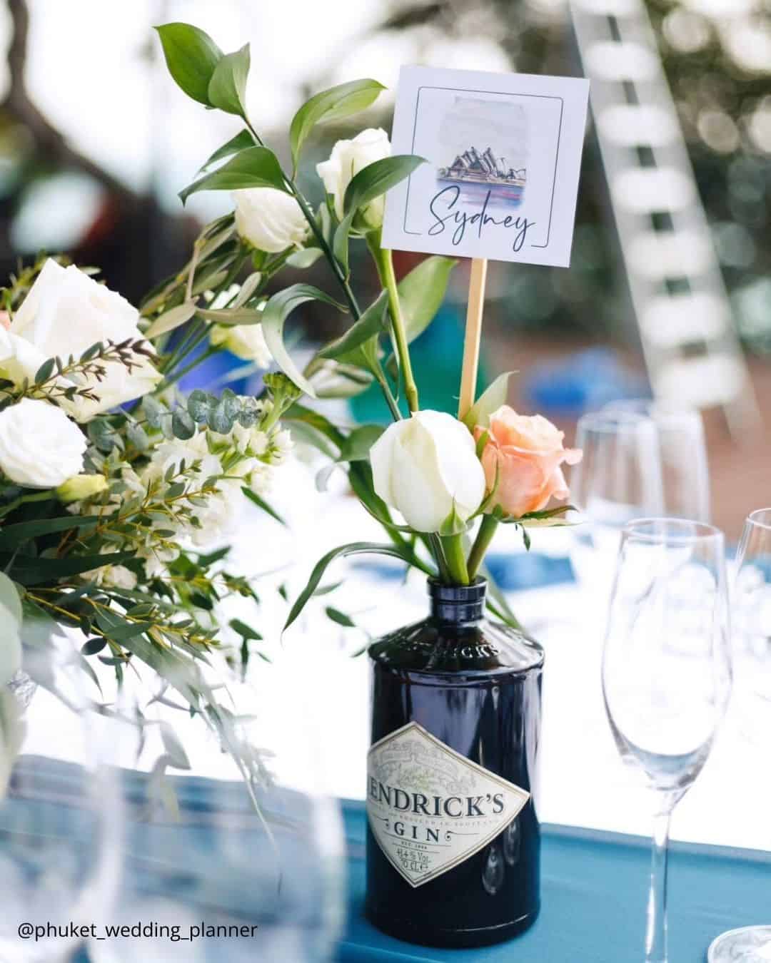
It’s A Match: This striking three note color chord tips its hat to a vintage European sophistication yet crackles with contemporary energy when paired with a coastal shoreline or a venue featuring sprawling water views. French blue arrives as a shade that practically vibrates, injecting a buoyant, spirited pulse into the wedding styling, and when you temper it with antique white and accents in deep navy, the result is one genuinely breathtaking composition.
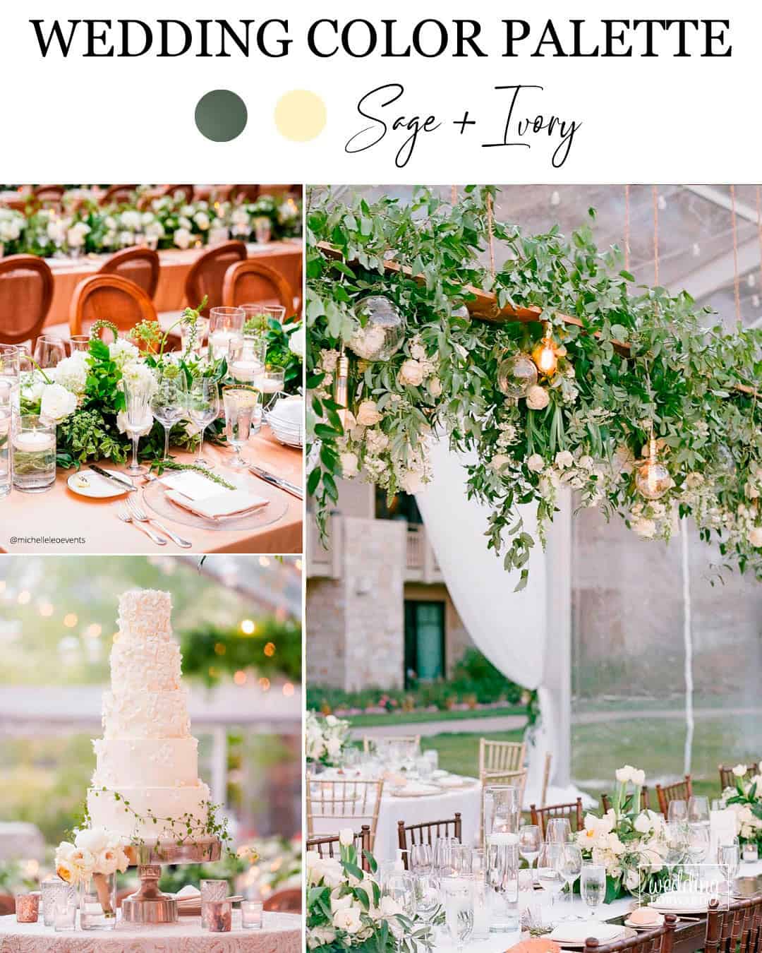
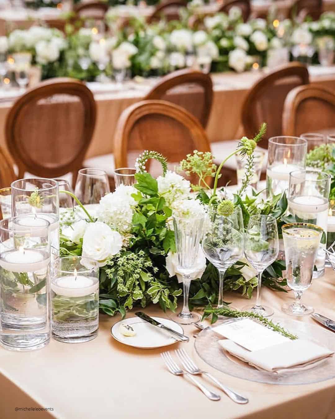
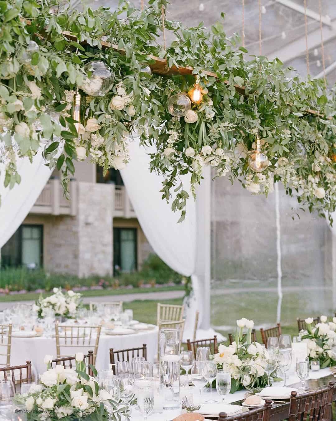
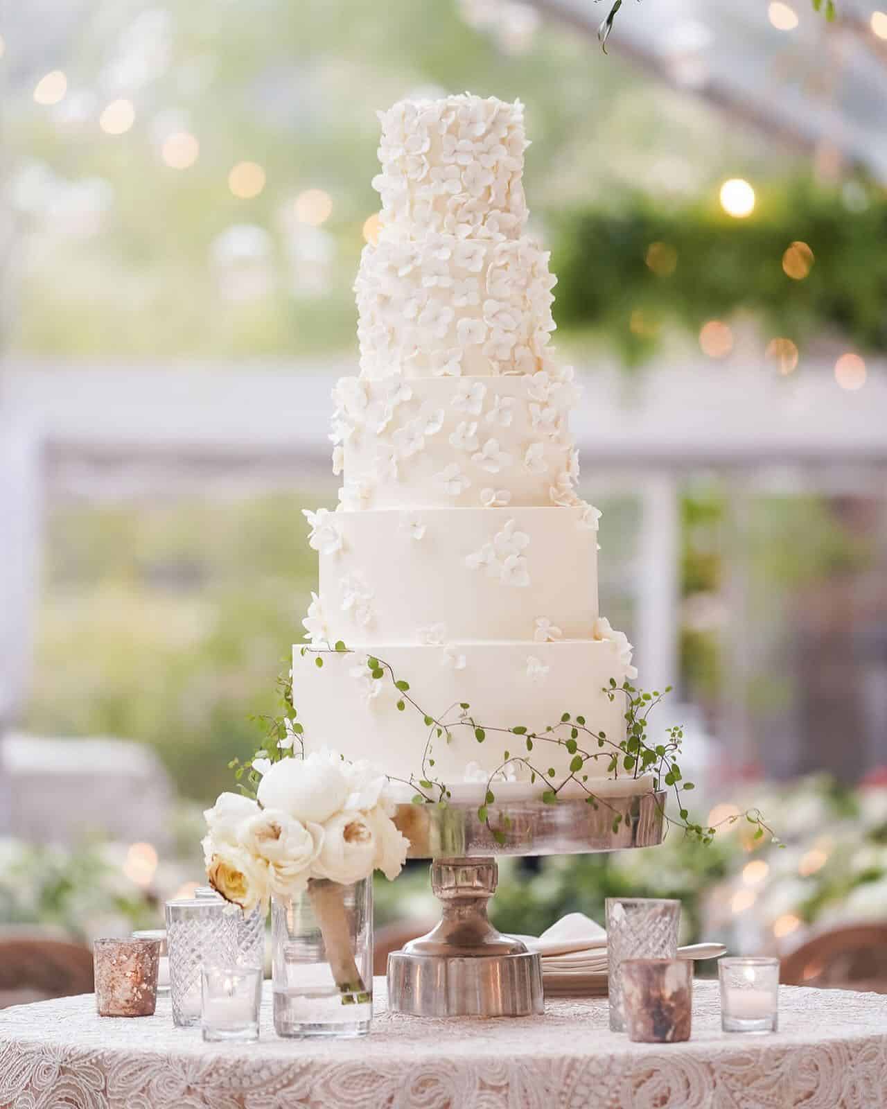
It’s A Match:
Color directions for weddings zero in on clarity and understated restraint. This sage and ivory pairing achieves exactly that by quietly referencing enduring themes drawn from the natural world.
Couples can scatter touches of these wedding hues through their decor and paper goods without ever visually overpowering the couple or the overall guest experience.
This palette feels perfectly placed at a chic early spring classic wedding or within the grounded, organic ease of boho and rustic leaning celebrations.
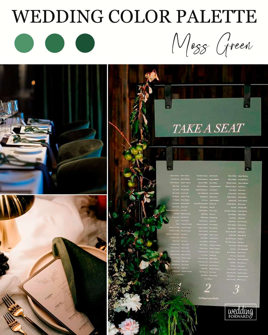
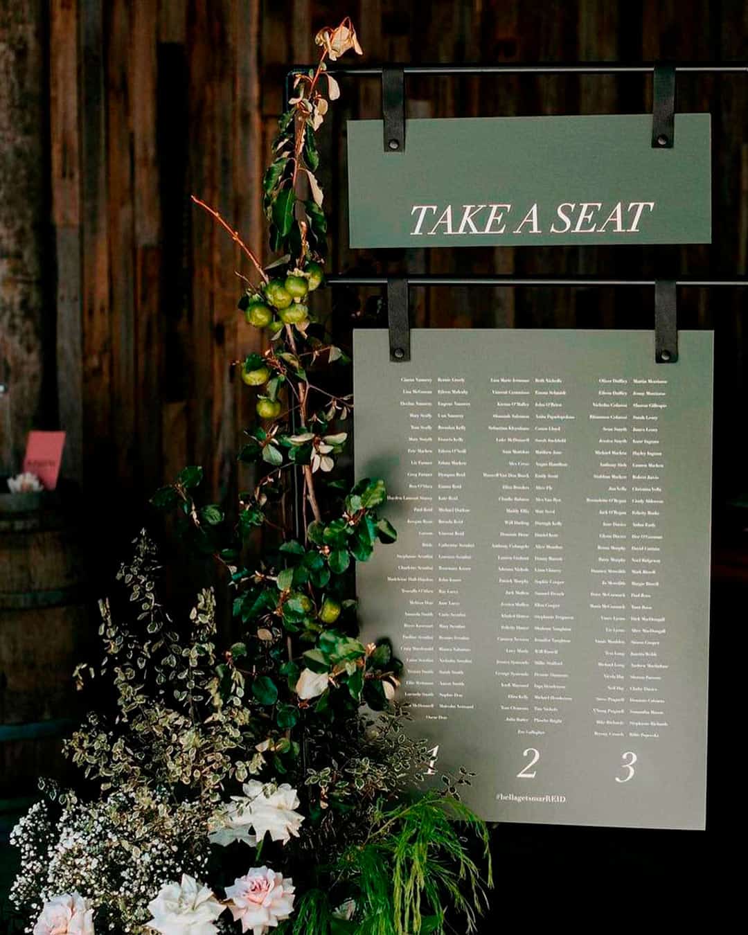
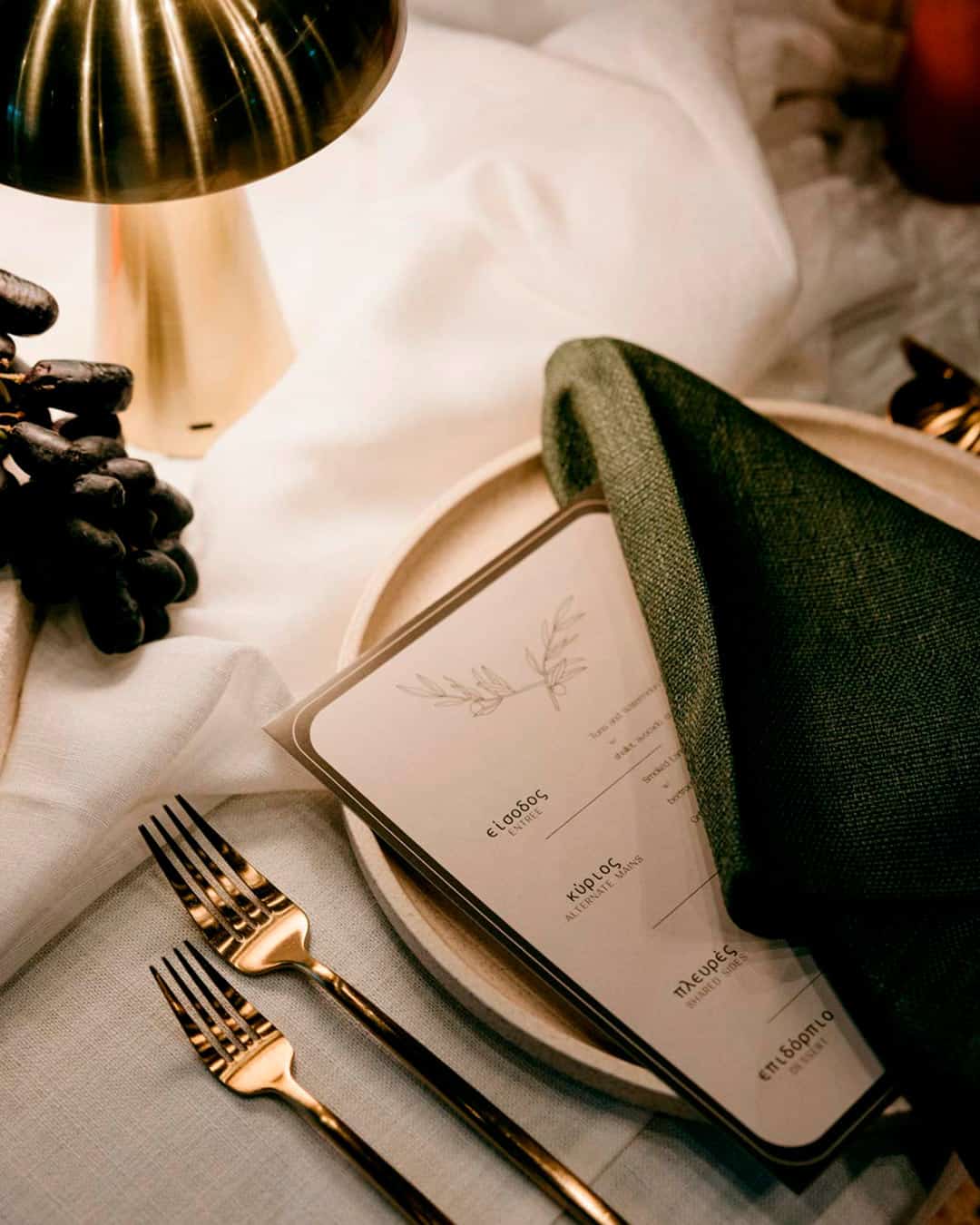
It’s A Match: Moss green stands as a shade frequently linked to the natural landscape. If your hope is to wrap your wedding day in a welcoming, comfortable glow, look toward moss green.
When incorporating this specific tone, remember that it should function as your grounding, neutral foundation.
A highly saturated, neon moss green would feel jarring within a wedding context. A smart approach for folding moss green wedding tones into your day involves setting it as the base canvas.
From there, layer in white floral accents, textural greenery, and cool silver details to give your total presentation lift while keeping the look grounded and organic.
What Are The Most Popular Wedding Colors?
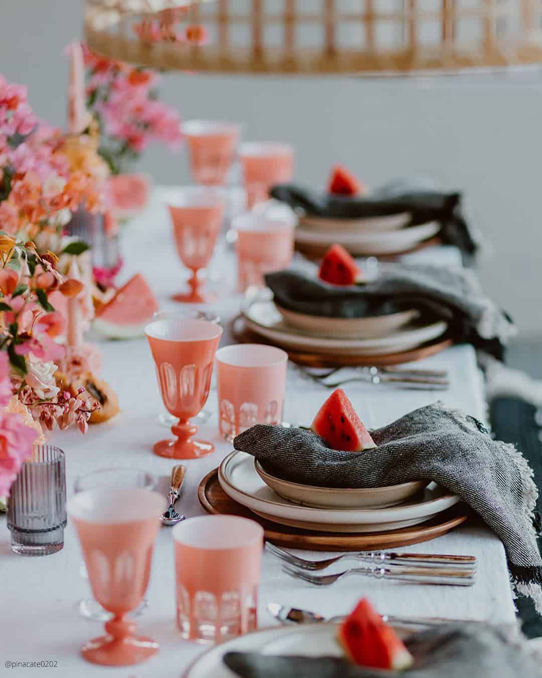
Here are the most popular wedding colors:
- Peach Fuzz – Pantone color of the year
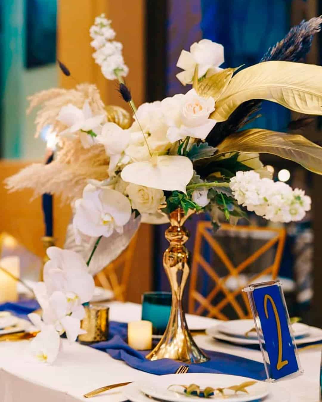
- Navy, White, and Gold
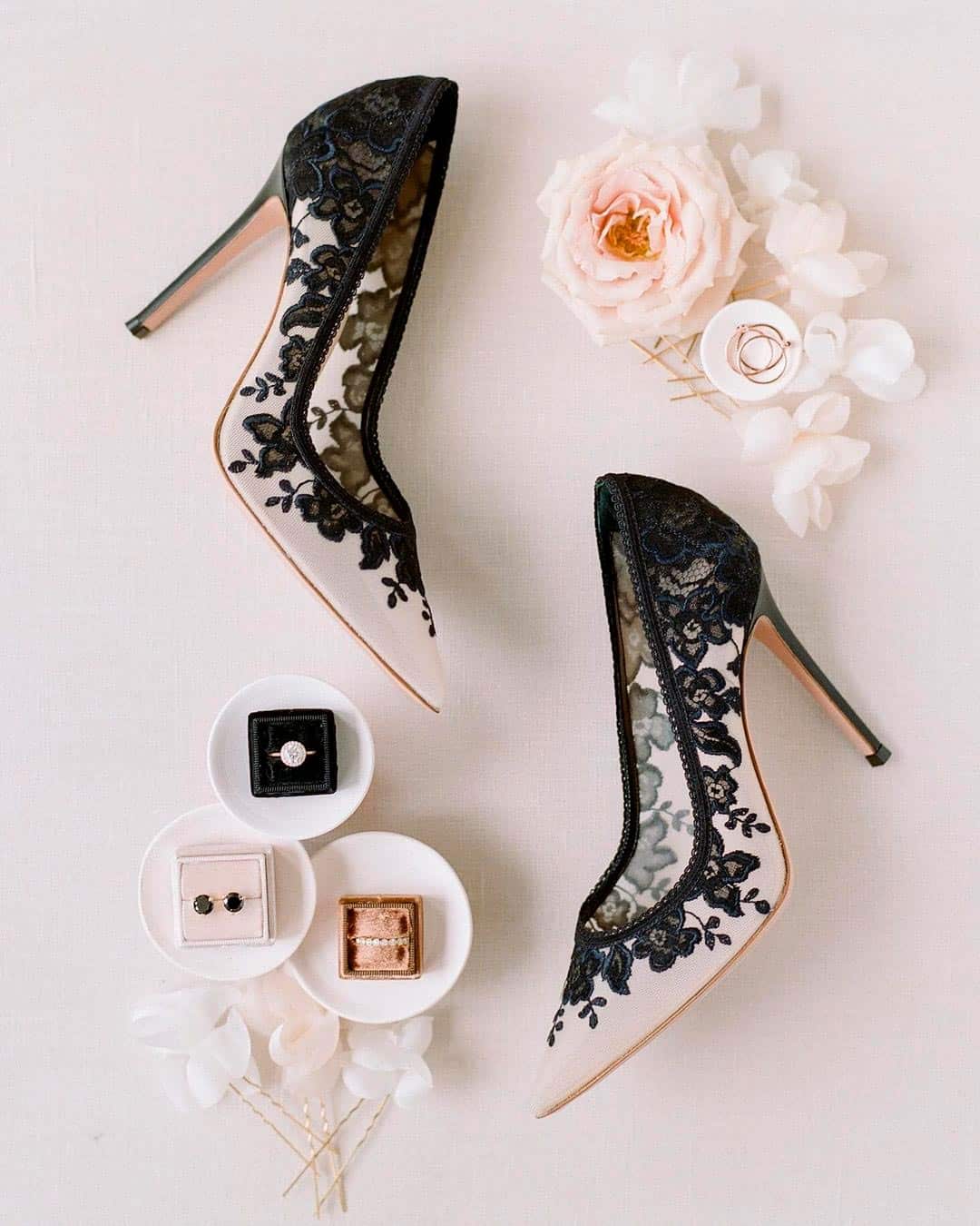
- Black and White Combination
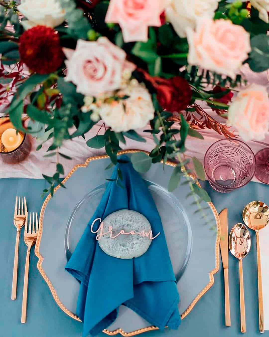
- Petal Pink, Cornflower Blue & Mauve Purple
Peach Fuzz was deliberately selected to capture our collective yearning for gentle self care and nurturing bonds with those around us. This plush, muted peach tone radiates a spirit that tenderly envelops the mind, body, and soul in a full embrace.
Jimmy Choo OBE, design director and creative director of The Atelier Couture, notes that the fresh Pantone Peach Fuzz alongside soft washes of pink and blue, finished with silver and gold detailing, will define the most sought after wedding color images.
One palette we encounter nearly every season as a top wedding color theme is Navy and White, with Gold often entering the picture for added richness. Navy operates as such an inherently refined shade that it instantly elevates any setting into something graceful, and weaving in Gold amplifies that formal, polished register even further.
Another time tested and deeply trusted combination is the classic White and Black pairing. Drawing its power from the iconic men’s formal wedding uniform, the tuxedo, black and white functions beautifully in every season and slips seamlessly into venues of every stripe.
If something with a more of the moment feel is what you are after, a massively adored color direction is the Petal Pink, Cornflower Blue & Mauve Purple aesthetic. This chic color alliance has carefree bohemian couples, open air romantics, and modern soft hearted brides eagerly populating their inspiration boards.
Unique Wedding Colors
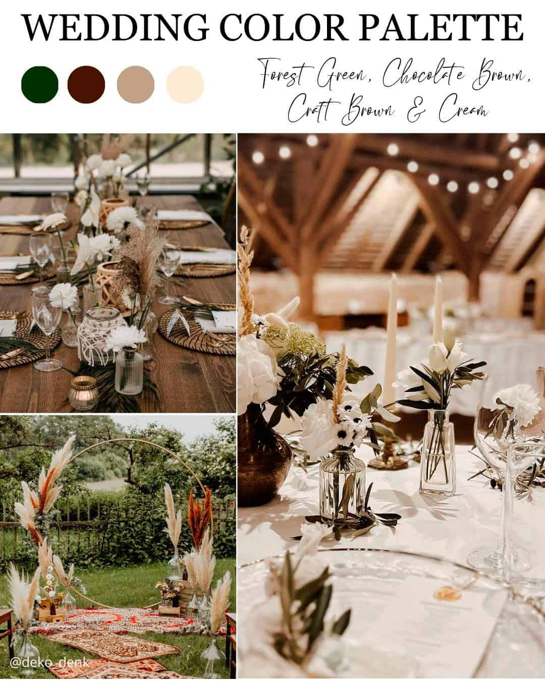
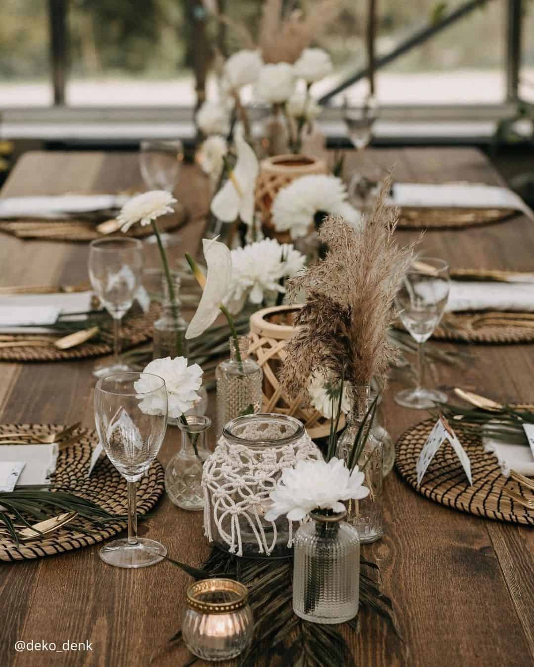
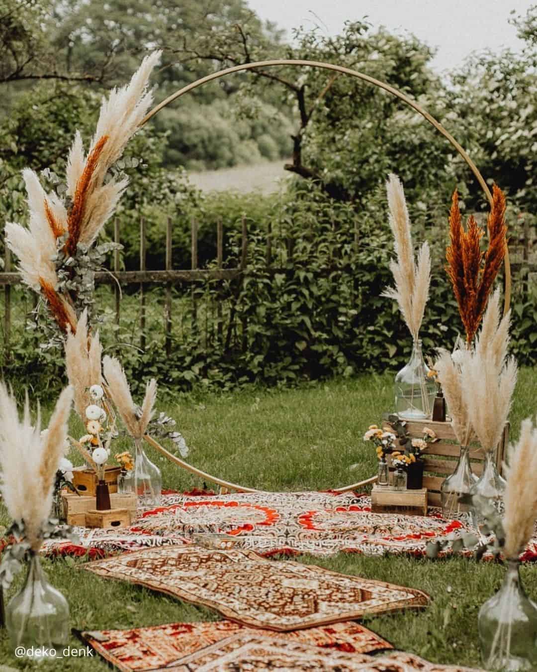
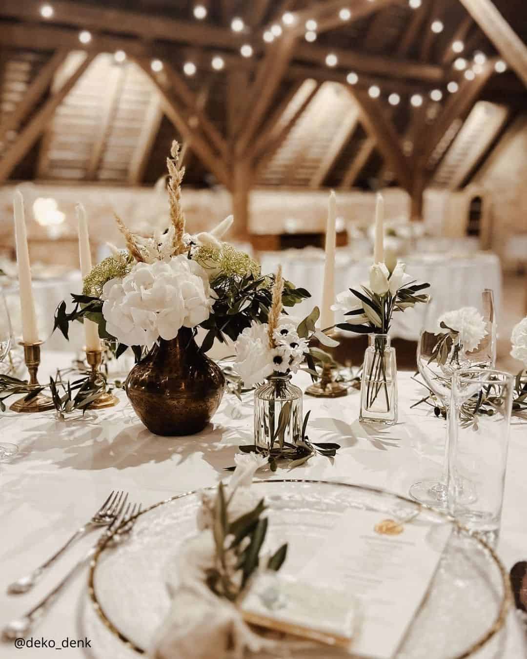
It’s A Match: Organic, countryside inspired celebrations have surged in popularity across recent years, and a glance at this palette makes the reason abundantly clear. Ideally situated for a timber framed barn venue or a sprawling farm or vineyard location, this lush and elevated wedding color marriage pulls the raw, honest beauty of natural style weddings directly into the spotlight.
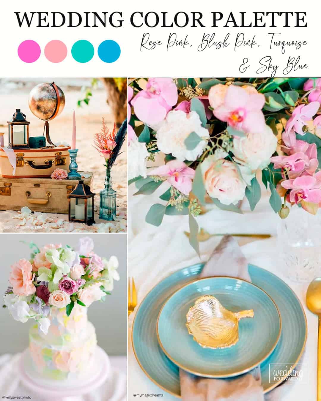
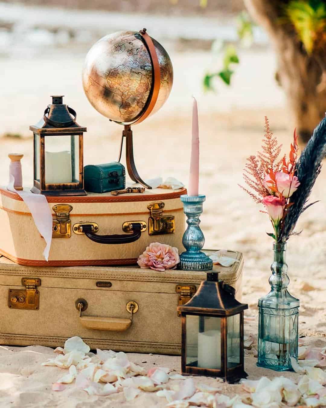
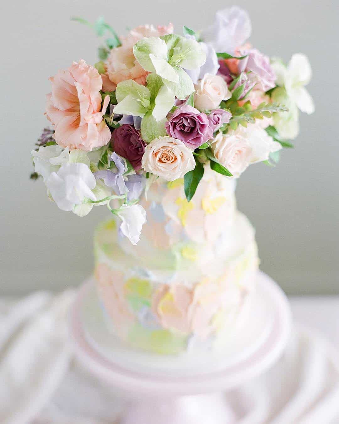
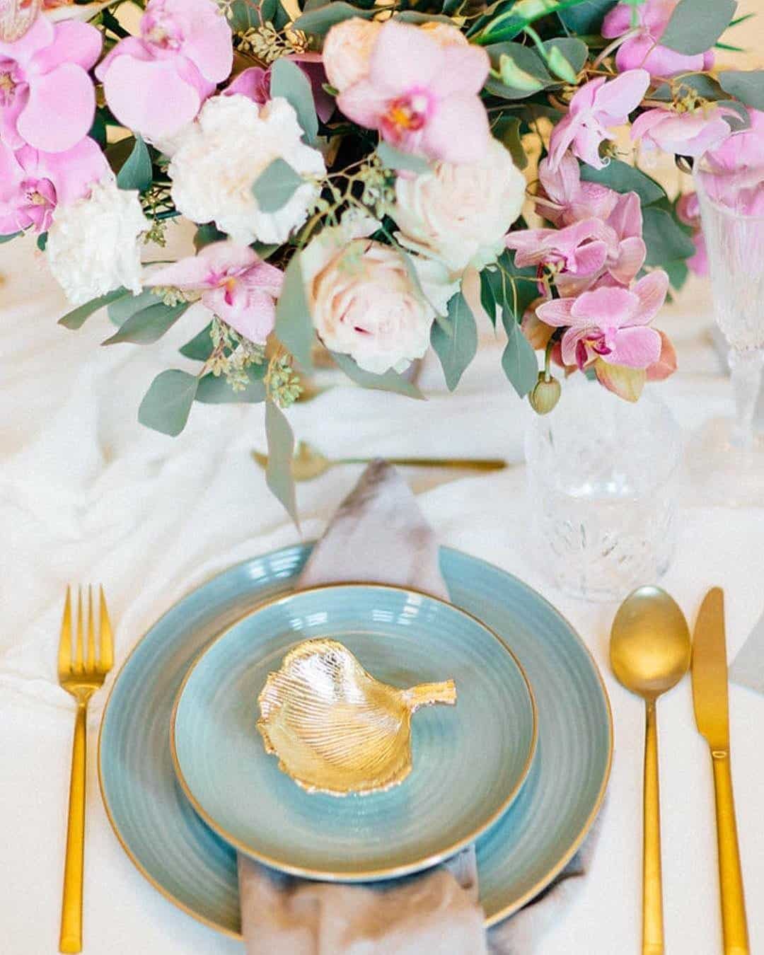
It’s A Match: Rolling surf, fronds swaying softly in the ocean breeze, and a sky painted with the colors of a sinking sun all form the framework of a dream beach ceremony, along with the shades in this seaside inspired lineup. By featuring two pink tones that riff off one another and pulling in turquoise alongside sky blue mirroring the ocean’s many moods, you end up holding what might be the definitive beach wedding palette.
If your knot is being tied at a tropical hideaway or a shoreline resort, let this palette lead your sandy ever after.
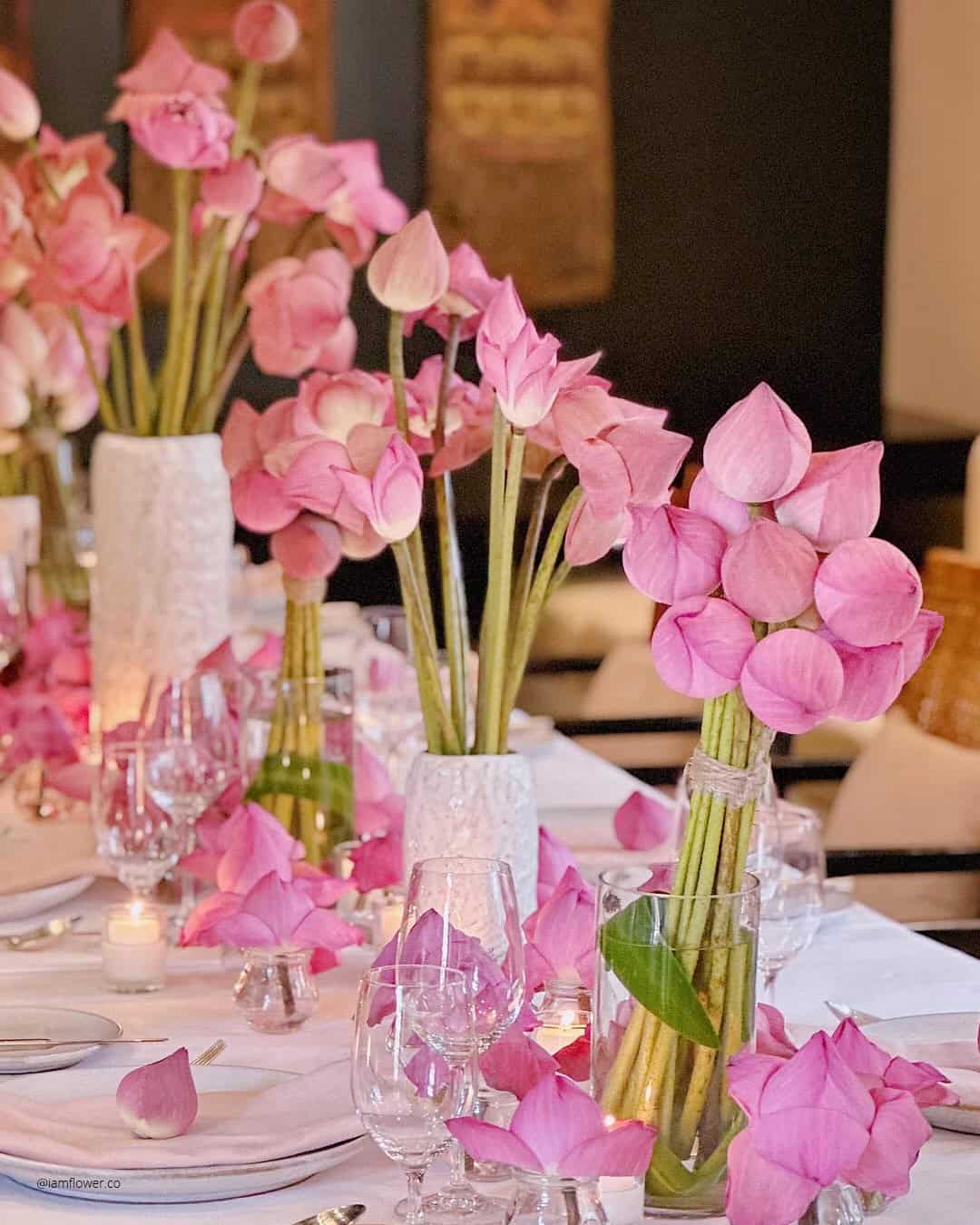
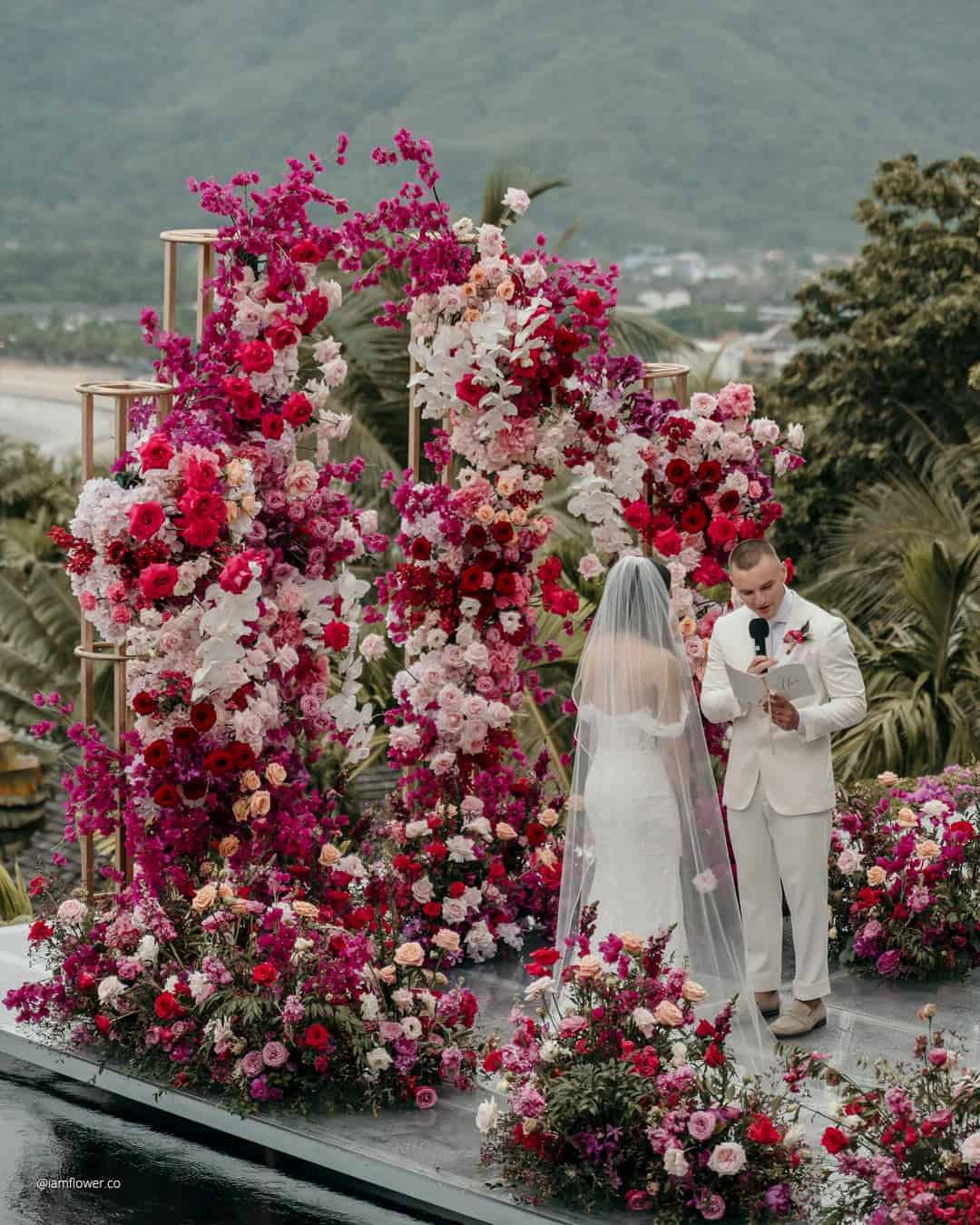
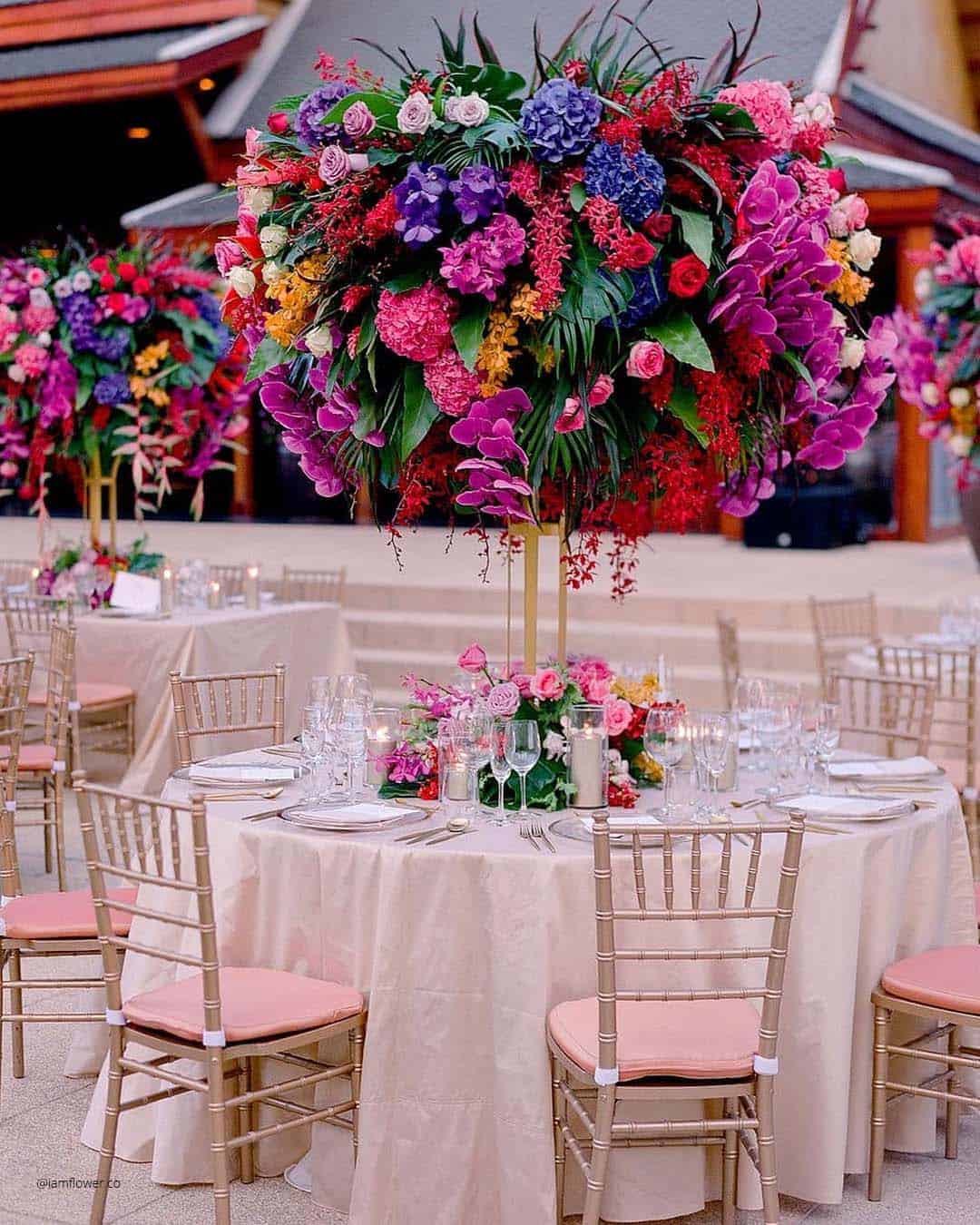
It’s A Match:
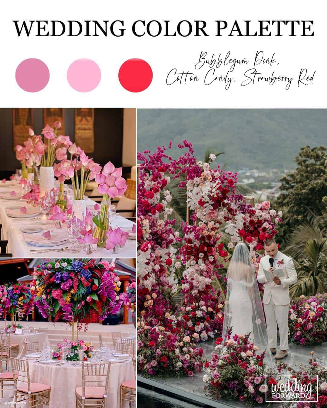
If playful, buoyant wedding color pairings have been dancing through your imagination, this pink and red classic deserves your full attention. This sunny, spirited palette thrives in the warmer chapter of the year, think spring or summer, and unfurls beautifully across open air venues, draped tent receptions, or lush garden style affairs.
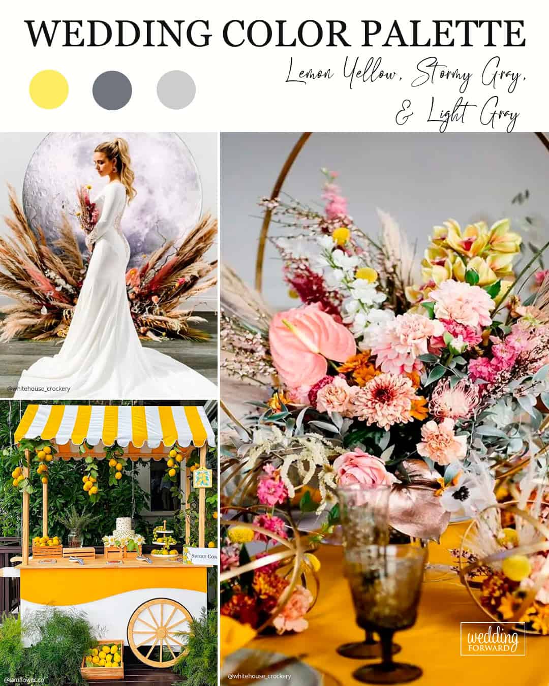
It’s A Match:
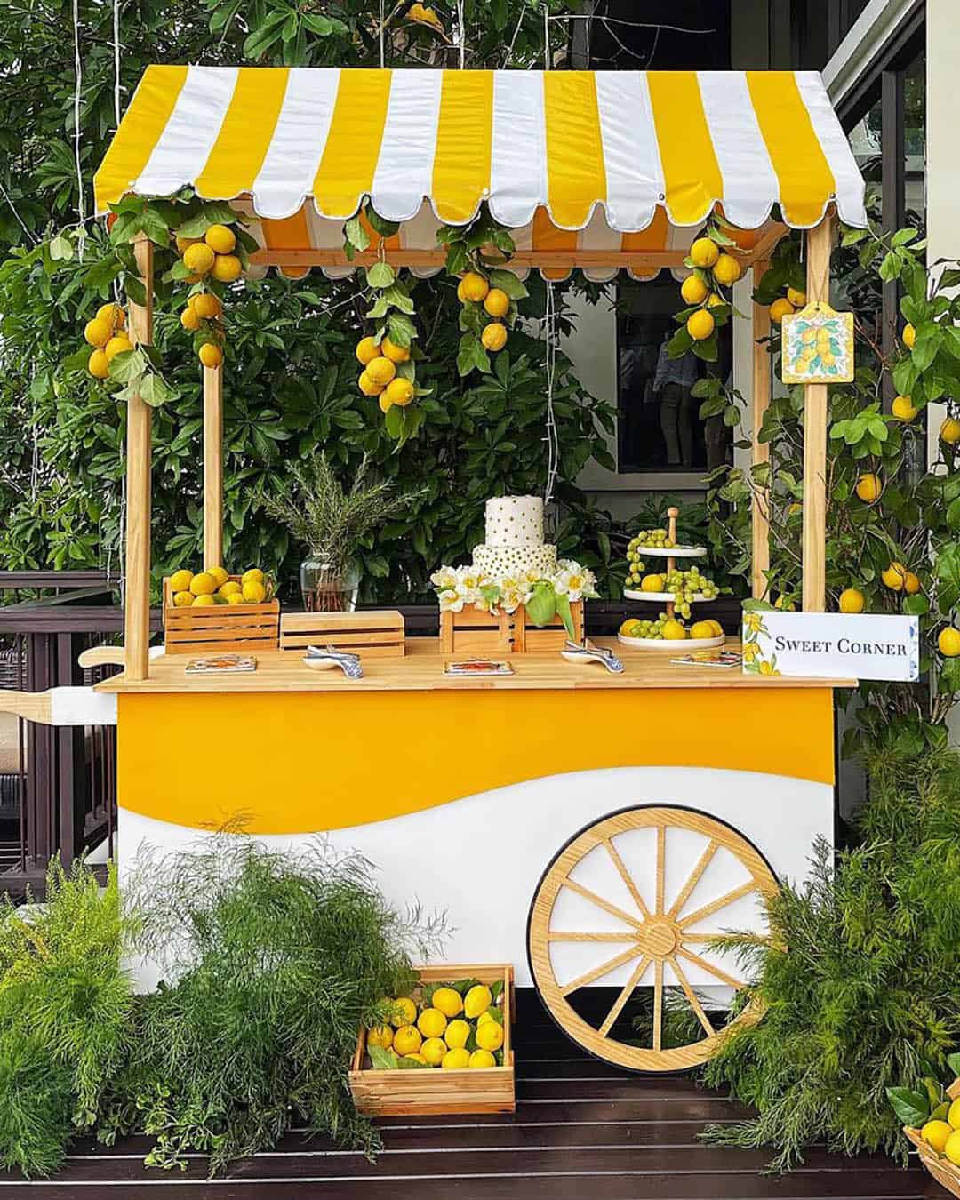
A growing number of couples are chasing a totally singular, kaleidoscopic and high energy wedding direction, and if that rings true for you, take a hard look at the trio of lemon yellow, story gray, and light gray. This arrangement hands the yellow shade the full stage as the headlining performance piece, while the two separate depths of gray contribute a subtle interplay of shadow and dimension.
Popular Color Combinations Of All-time
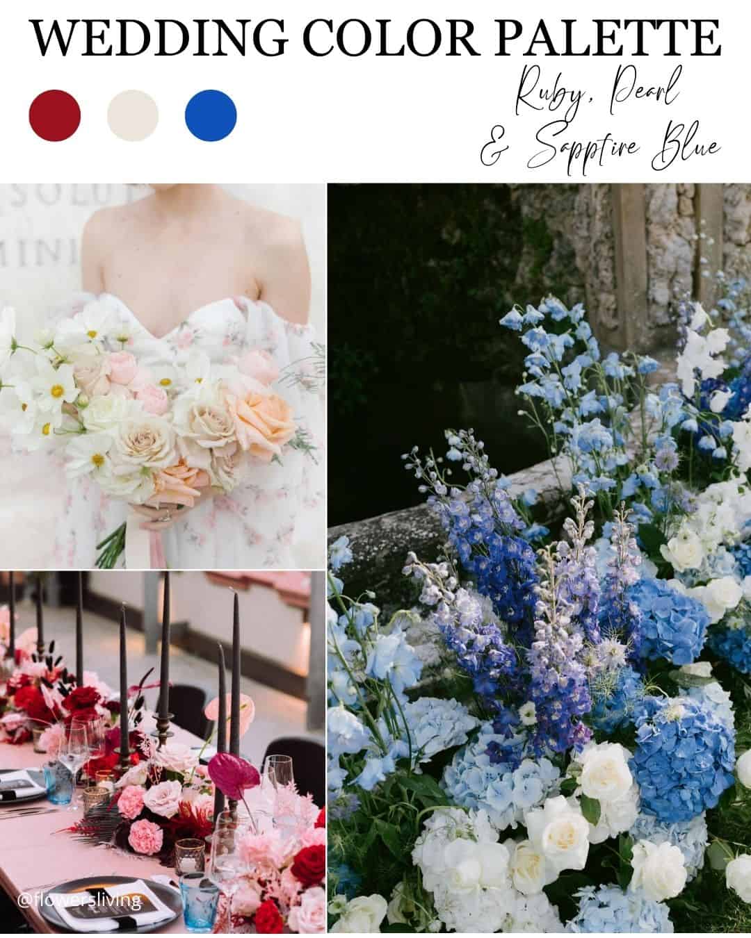
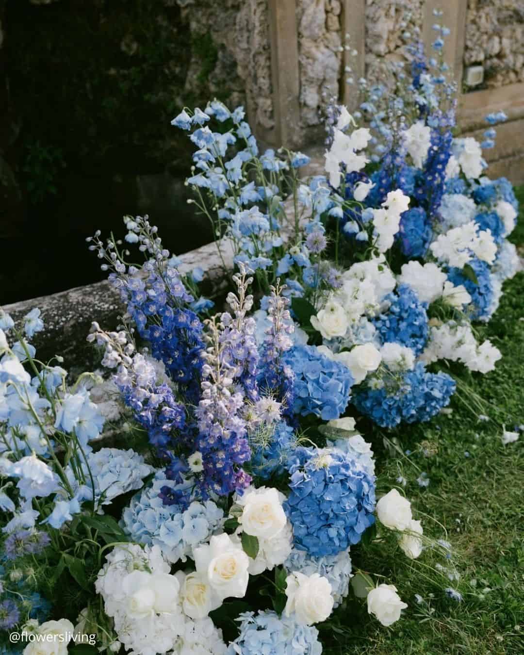
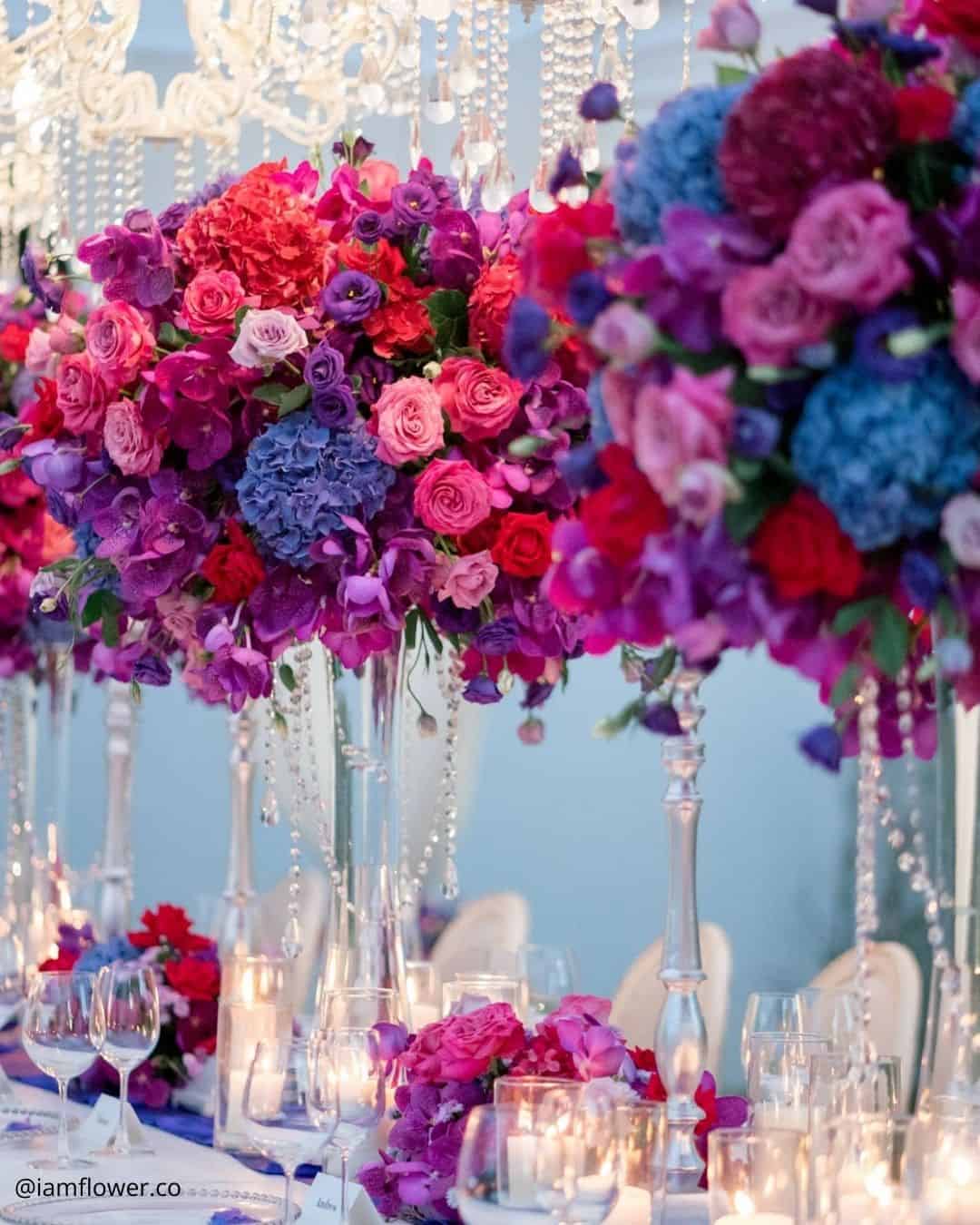
It’s A Match: If your quest centers on a deeply refined wedding narrative that moves fluidly through any season and settles effortlessly into nearly any backdrop, this is your answer. Jewel tone colors are those heavily saturated shades borrowed from precious stones, covering amethyst, citrine yellow, sapphire blue, ruby red, deep purple, and emerald green.
There exists a powerful explanation for why this storied jewel toned wedding palette has remained a forever favorite: its enduring sophistication and quiet, soulful glamour. Couples mapping out a black tie evening can channel this direction to sculpt a celebration that defines the very idea of elegance.
It’s A Match:
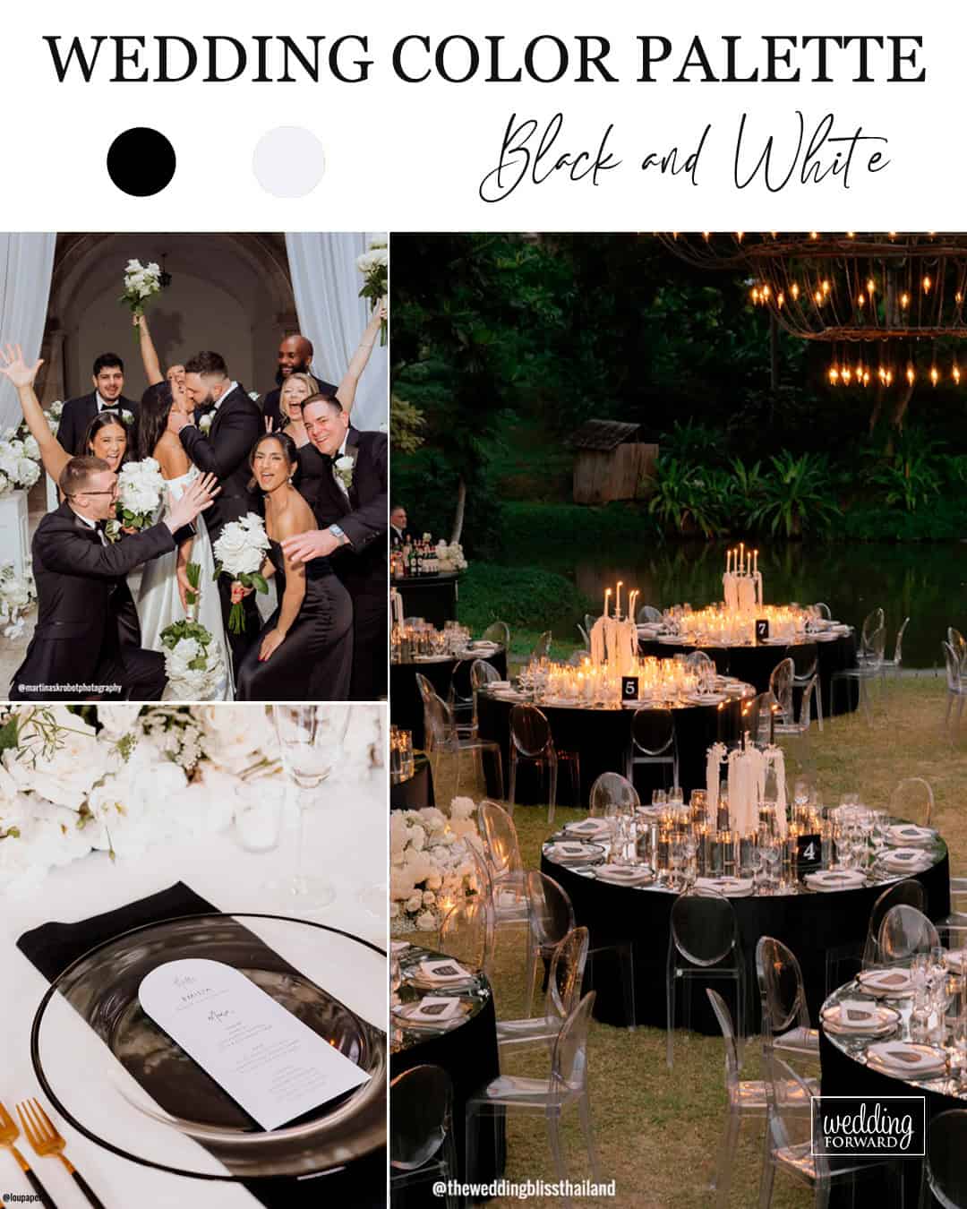
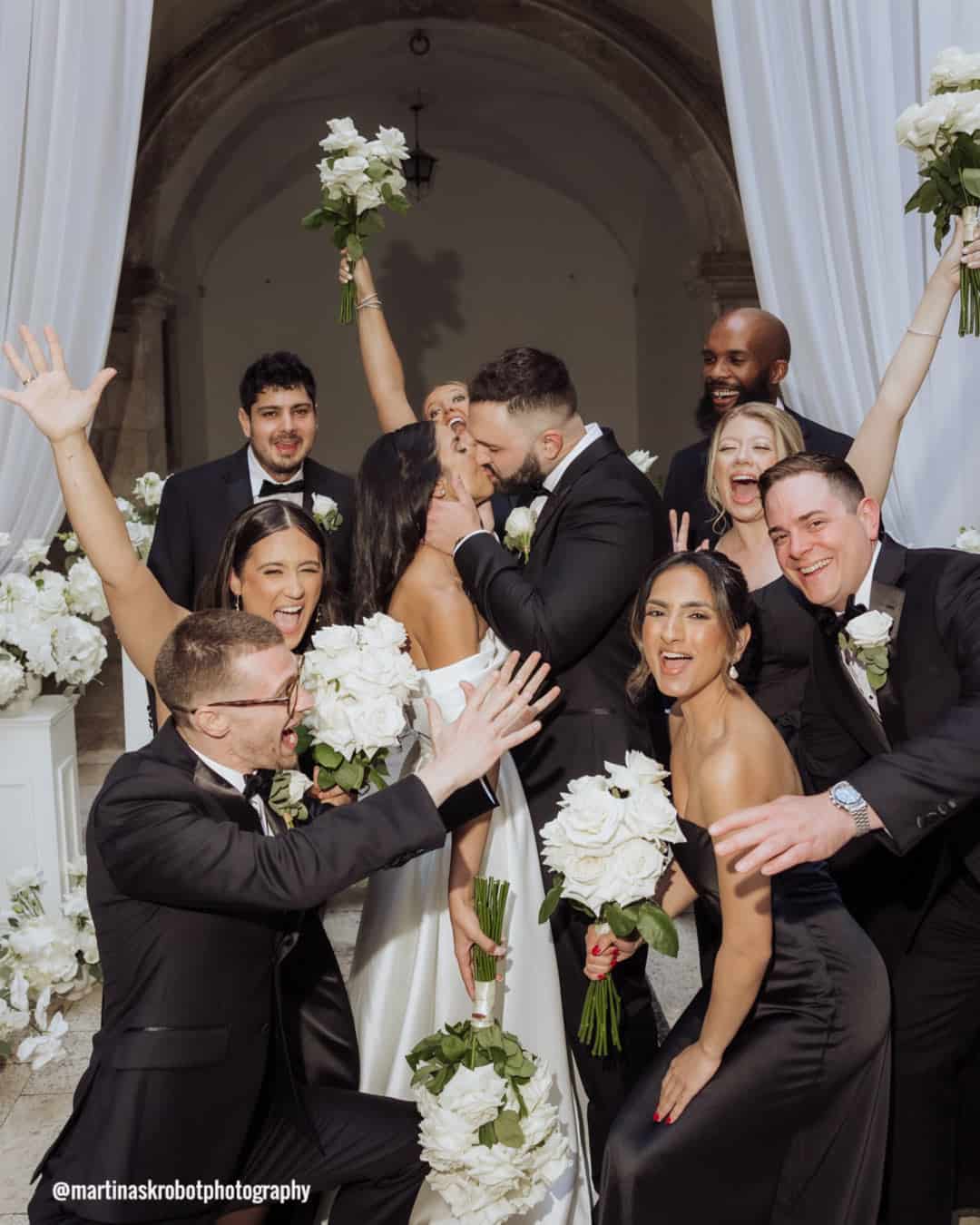
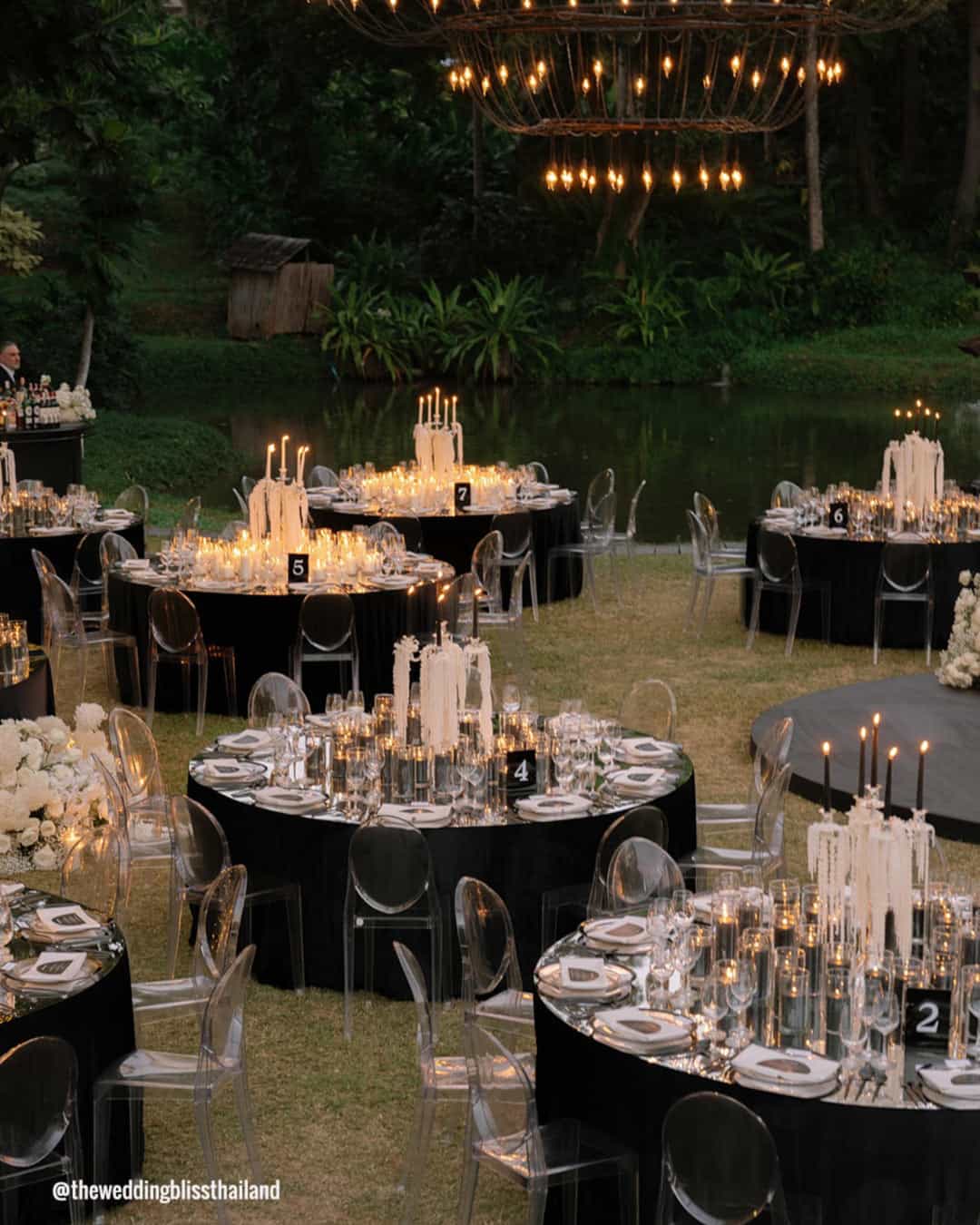
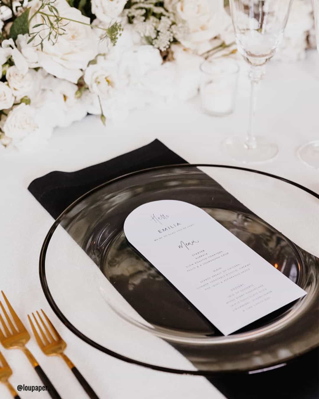
Black and white, a union both ageless and iconic, builds a visually arresting and impeccably polished foundation for any wedding. The stark, opposing shades carry symbolic weight: grace, equilibrium, and the beautiful merging of contrasts.
Spanning from the crisp lines of the wedding party attire through to the polished table assemblies and decorative landscape, the black and white spectrum infuses a layer of cultured glamour throughout the entire festivity. This endlessly adaptable palette opens the door to boundless imagination and individual expression, securing its place as an impeccable choice for couples whose hearts are set on a chic, visually magnetic atmosphere.
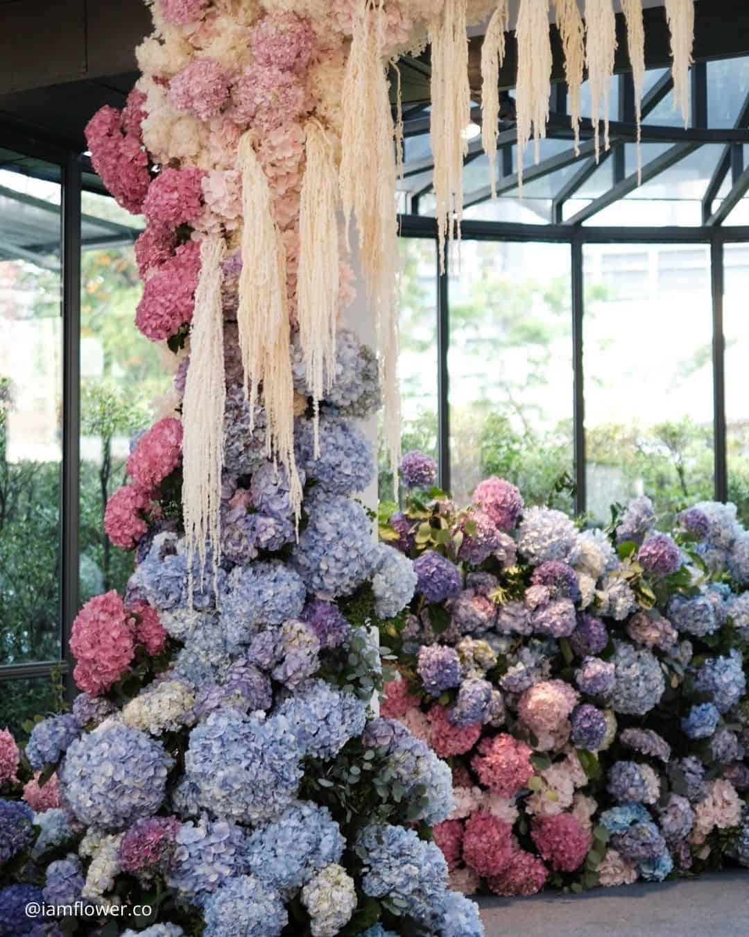
It’s A Match:
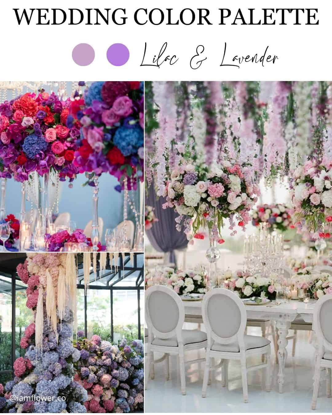
Lilac and lavender, a pair of airy and captivating shades, blend together with extraordinary grace, composing a hazy, deeply romantic wedding color story. The muted, pastel notes stir feelings of stillness, refinement, and softness.
Unfolding across lavish floral installations, attendant gowns, and decorative flourishes, the lilac and lavender alignment casts an air of fanciful elegance and dreamlike wonder over your celebration.
This bewitching partnership produces a serene, floating, otherworldly ambiance, purpose built for couples longing for a romantic, spellbound wedding experience. Allow lilac and lavender to spin their quiet enchantment, shaping a celebration that lingers vividly in the memory of every guest.
Wedding Color Pitfalls to Avoid
Stay alert to these hidden traps when navigating your wedding color selections so you can shape a celebration that feels both fluid and welcoming for every person in attendance.
- Overwhelming Color Schemes: Steer clear of stacking so many tones that they begin to war with one another or produce a frenzied, disjointed visual effect. Aim instead for a thoughtfully edited palette where each hue supports the others, preserving a sense of visual unity.
- Neglecting the Practicality of Certain Colors: Pause to think through the real world side of your chosen shades. This includes their seasonal availability within floral sourcing or rental catalogs, plus how they might shift in personality under varying light conditions or translate on camera.
- Disregarding Cultural or Religious Significance: Treat the cultural or spiritual weight that certain colors carry with genuine care, ensuring your selections sit comfortably within any meaningful traditions or customs, honoring the couple’s roots and nurturing an environment that feels inclusive to all.
- Failing to Consider Color Accessibility for Guests: Hold space for the possible color related sensitivities or visual differences among your guests, including color vision variations or sight limitations, so that each person can fully soak in and share in the wedding experience.
Settling on a wedding color union carries weight equal to locking in the venue, the overall design theme, and the layered decorative details. The job the palette performs throughout the planning journey reaches far beyond merely deciding on one or two spot shades and how they will be displayed.
Couples invest countless hours, long weeks, and whole months meticulously shaping their perfect wedding day, and by landing on a color narrative that harmonizes with their chosen season, physical setting, and overarching vision, that day is destined to become something unforgettable.