

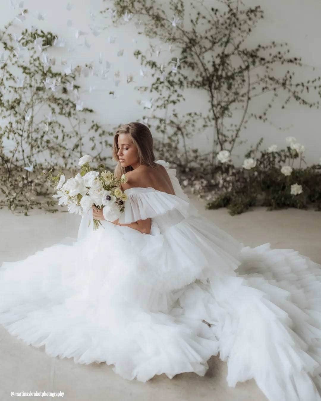
There’s a special buzz in the air this time of year. Artists, designers, and anyone with a love for visual culture eagerly anticipates the big reveal of the Pantone color of the year.
The wedding world is no different. Our entire visual landscape, including the celebrations we craft, gets shaped profoundly by color.
A subtle shift in tone can nudge a mood from somber to joyful or a space from cool detachment into cozy warmth.
No single announcement ripples through the creative world quite like this one. For this year, the prestigious institute has unveiled Cloud Dancer.
“At this time of transformation, when we are reimagining our future and our place in the world, PANTONE 11-4201 Cloud Dancer is a discrete white hue offering a promise of clarity,” shares Leatrice Eiseman, Executive Director of the Pantone Color Institute.
What Is The Pantone Color Of The Year?
The Pantone Color Institute selects PANTONE 11-4201 Cloud Dancer, a billowy white imbued with a feeling of serenity. An ethereal white hue, PANTONE 11-4201 Cloud Dancer acts as a calming influence in a frenetic society rediscovering the value of measured consideration and quiet reflection.
A breath of color whose vaporized and aerated presence gently illuminates and enlightens, PANTONE 11-4201 Cloud Dancer is a whisper of calm in a noisy world.
Pantone Color In Wedding Attire
Bridal Dresses
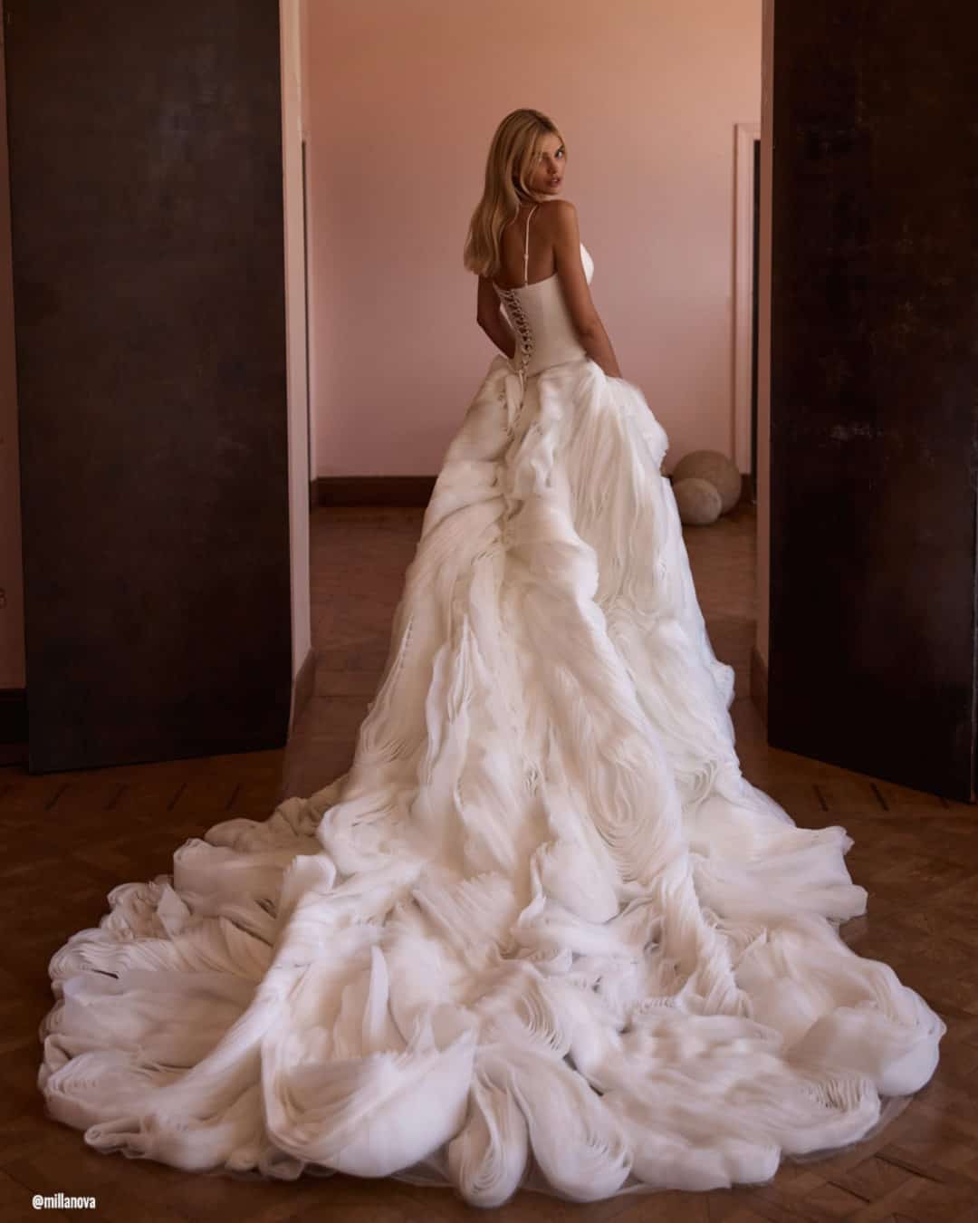
Choosing a gown in Pantone 11-4201 Cloud Dancer gives your celebration an easy grace and a classic feel. This gentle, nuanced white projects a crisp silhouette that flatters every body type.
Cloud Dancer amplifies a gown’s inherent lightness and purity, whether your heart is set on a timeless A-line, a dramatic ball gown, or a sculptural modern sheath.
Finish your look with subtle pieces in silver, pearl, or soft champagne shades to keep that cloud like sophistication. Crystal jewelry, pearl accents, or delicate metallic touches pair seamlessly with the shade’s whisper soft tone.
For your footwear, think ivory, nude, or shimmering metallics that complete the outfit without drawing focus from the gown’s tranquil beauty.
Bridesmaids Dresses
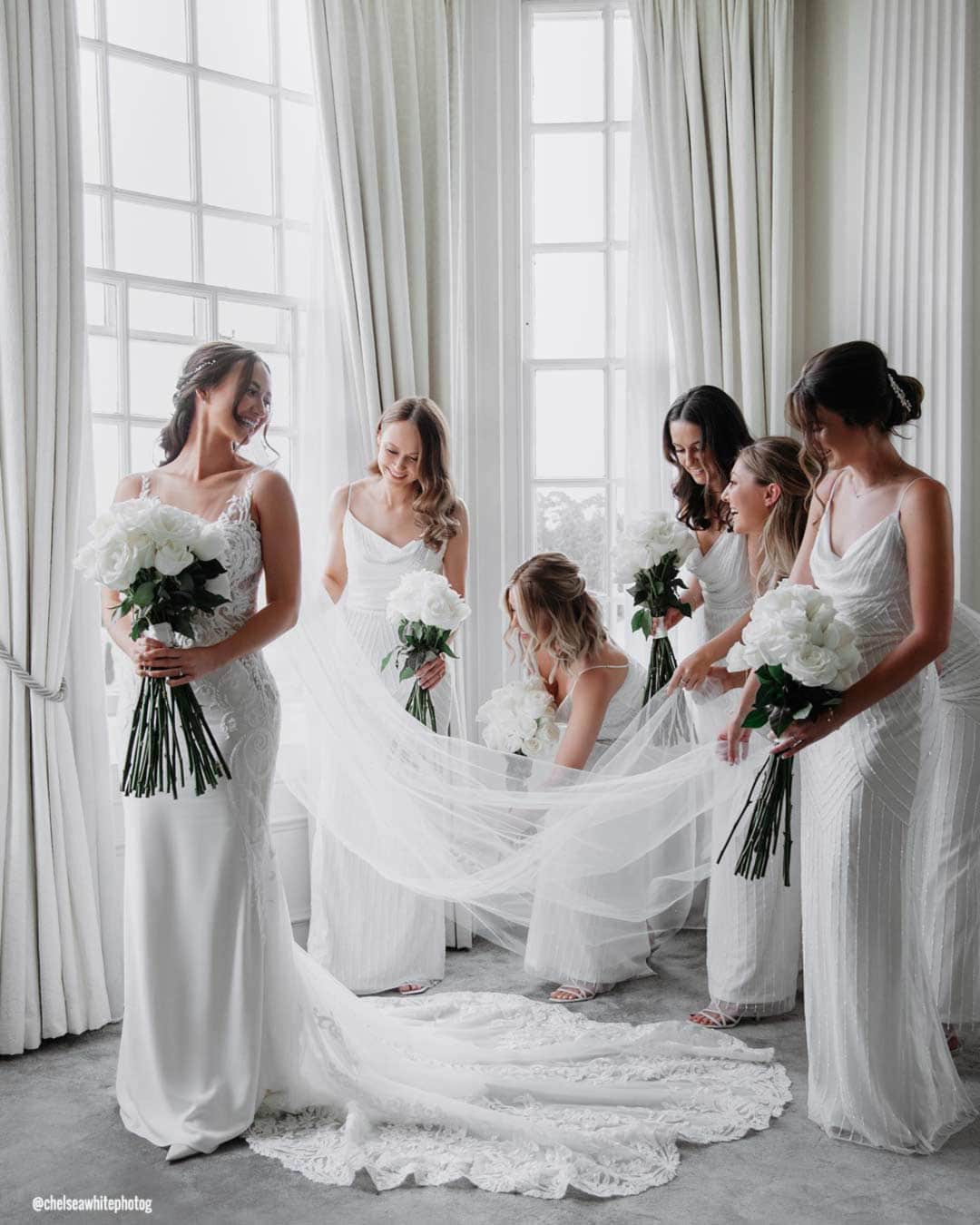
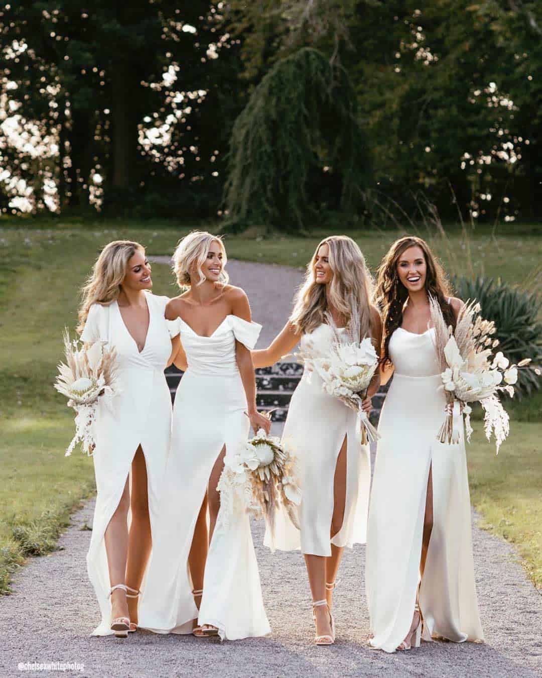
Dressing your bridal party in Cloud Dancer cultivates a look that feels luminous and perfectly balanced beside you. This airy white tone produces a picture perfect group aesthetic that captures beautifully on camera across any backdrop.
The shade also shines within mixed palette groupings, letting your crew combine whisper soft neutrals or muted pastels for a look that feels balanced and utterly romantic.
This color pairs impeccably with silver, pearl, nude, or blush accessories, giving each member of your party room to express her own taste while the overall vision stays seamless.
Flower Girl Dresses
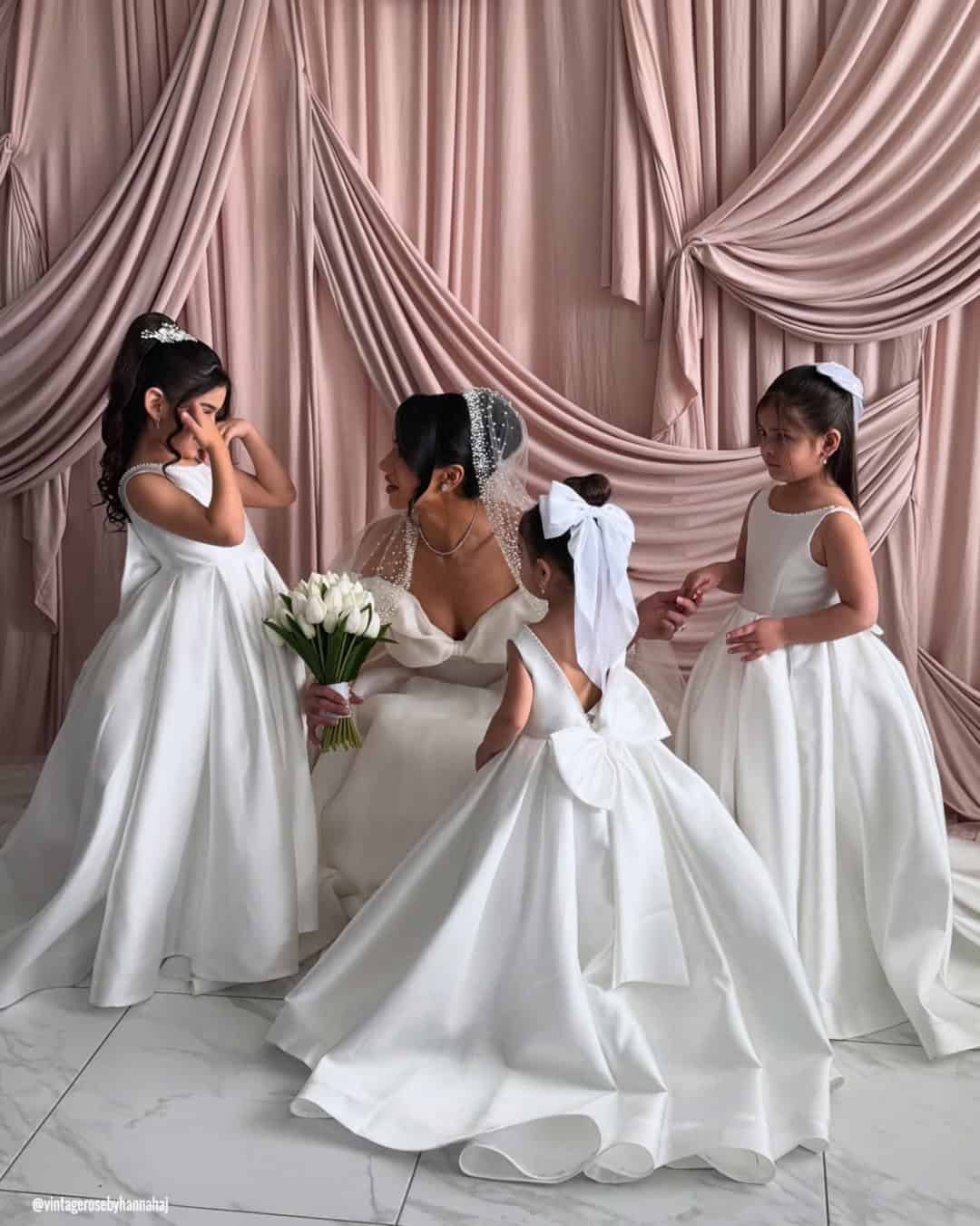
Cloud Dancer on your tiniest attendants brings a honeyed, angelic charm right down the aisle. This whispery white tone lands with a purity and timelessness that feels perfect for floral crowns, intricate lace touches, or simple satin ribbon details.
The soothing hue flatters every age and skin tone, layering a tender, heart swelling detail into your day’s aesthetic.
Pantone Wedding Decor
Wedding Arches
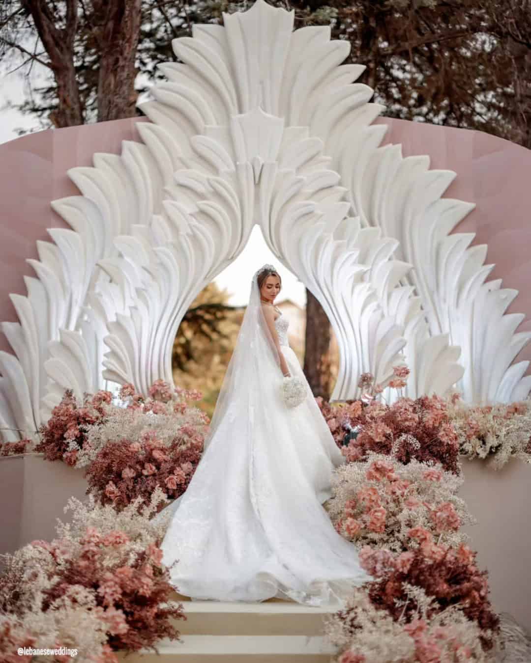
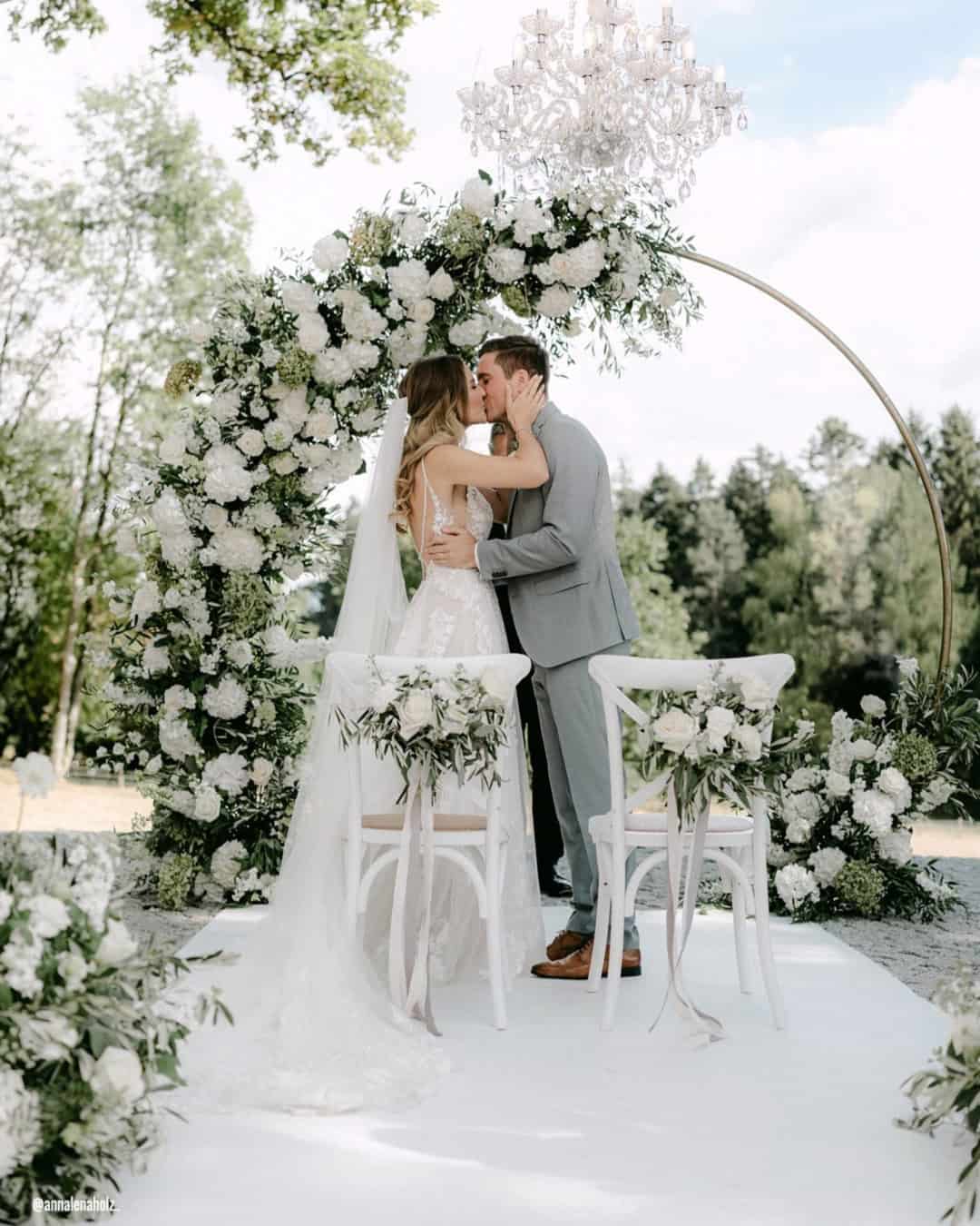
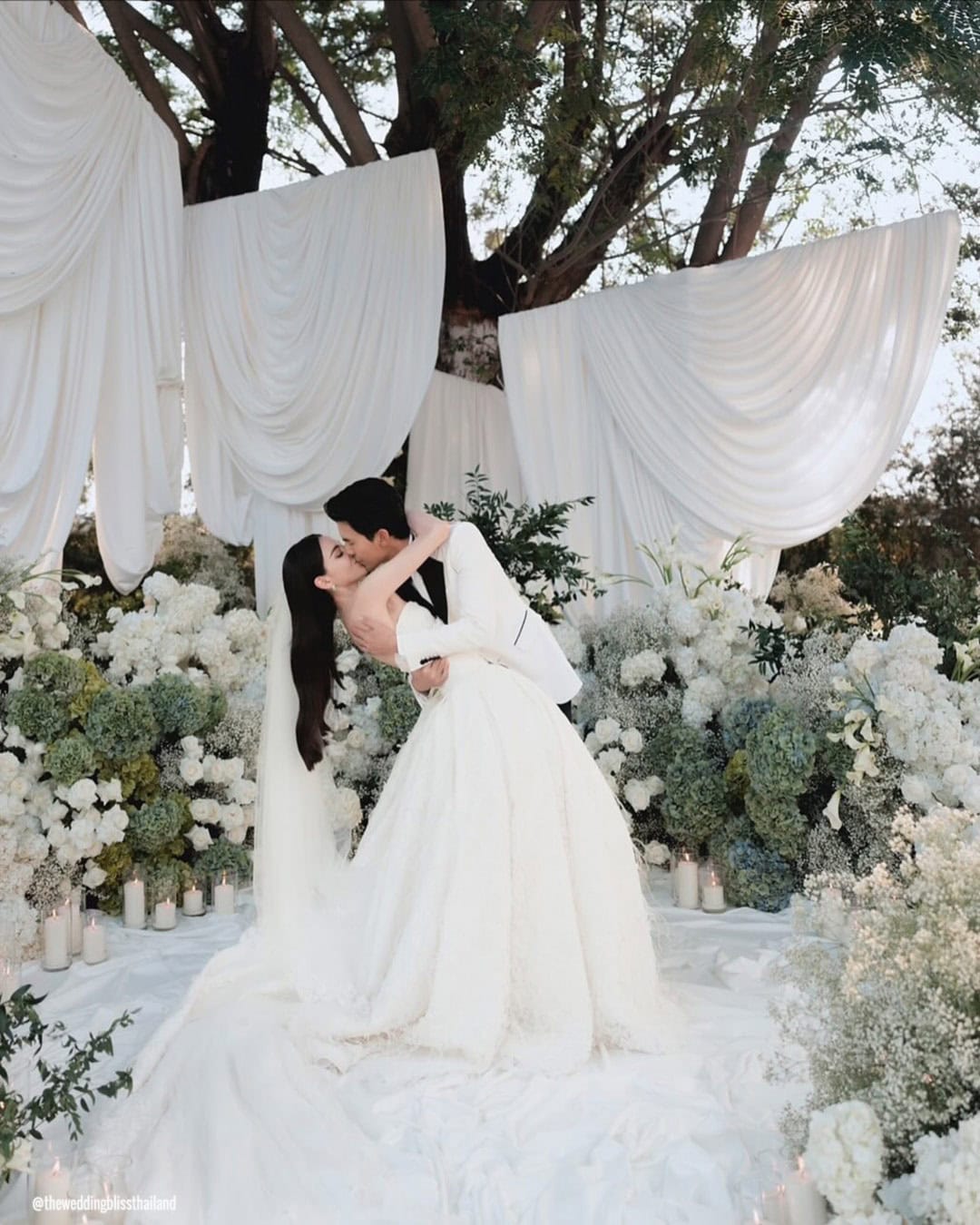
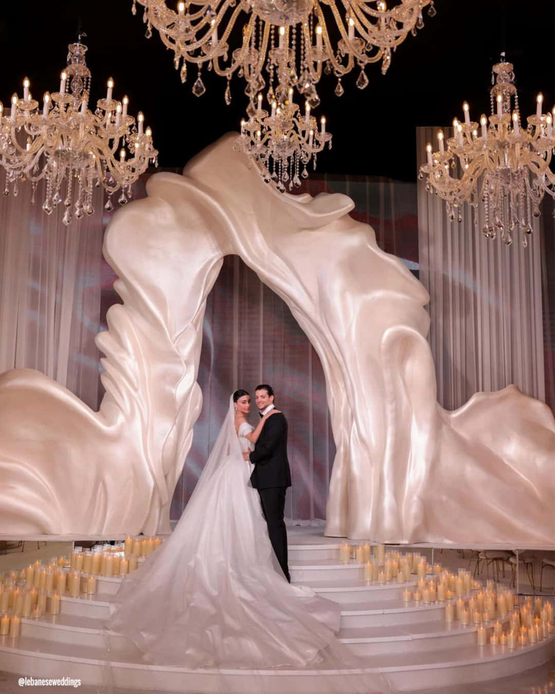
Ceremony arches inspired by Cloud Dancer build a buoyant, romantic anchor point for your vows. Swathed in soft, flowing fabrics or clustered with blooms, this airy white shade stands for purity, peaceful unity, and fresh starts.
Cloud Dancer plays beautifully alongside lush greenery, blush blossoms, champagne florals, or metallic details, giving you a focal point that radiates effortless elegance.
Wedding Table Decor
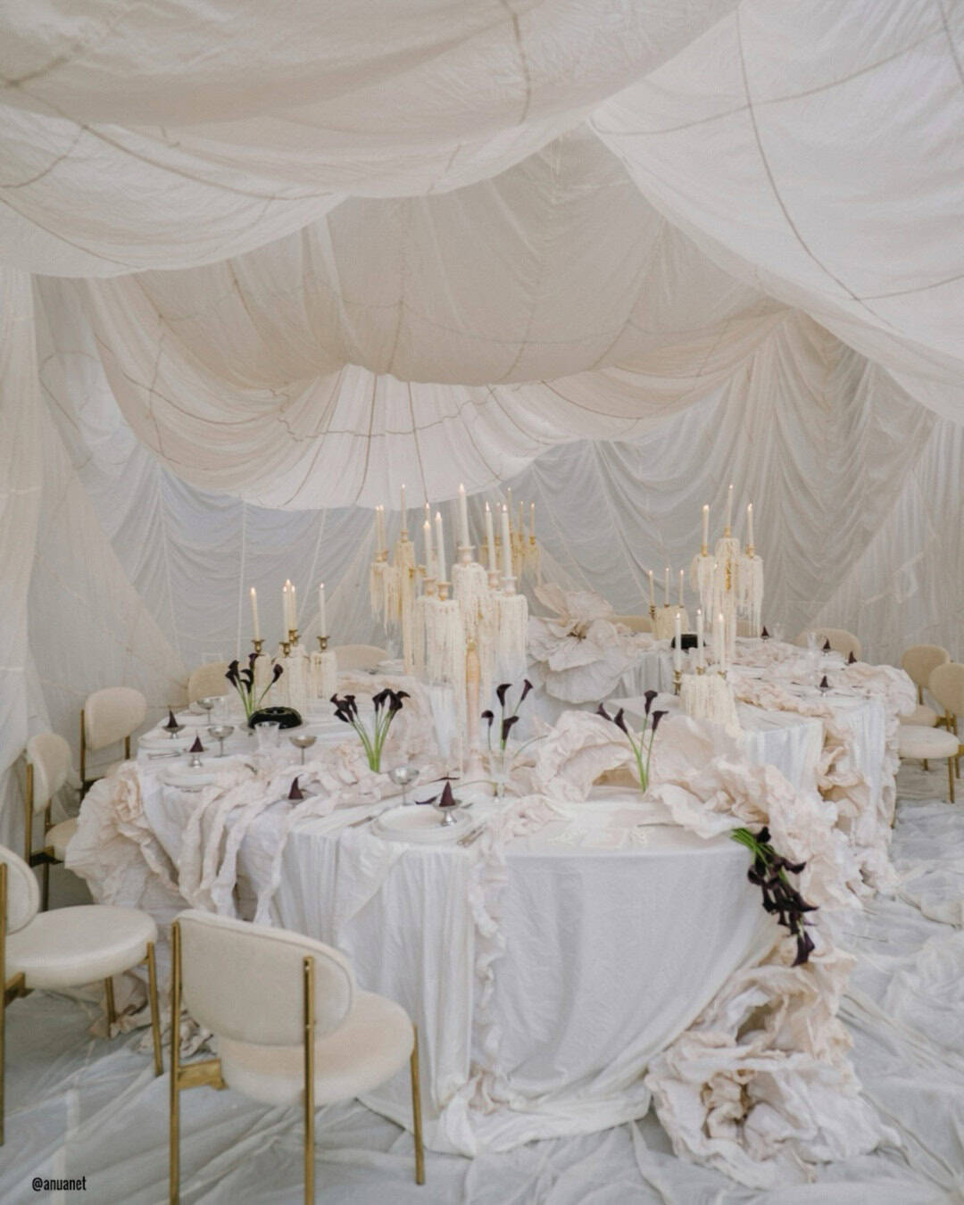
Layering your tables with Cloud Dancer linens or runners sets a crisp, calm groundwork for the entire reception look. Combine them with soft florals in ivory, blush, sage, or champagne to introduce gentle depth and contrast.
Gold, silver, or neutral toned place settings refine the palette, while candles in tender warm whites cast a truly romantic glow.
Wedding Signs
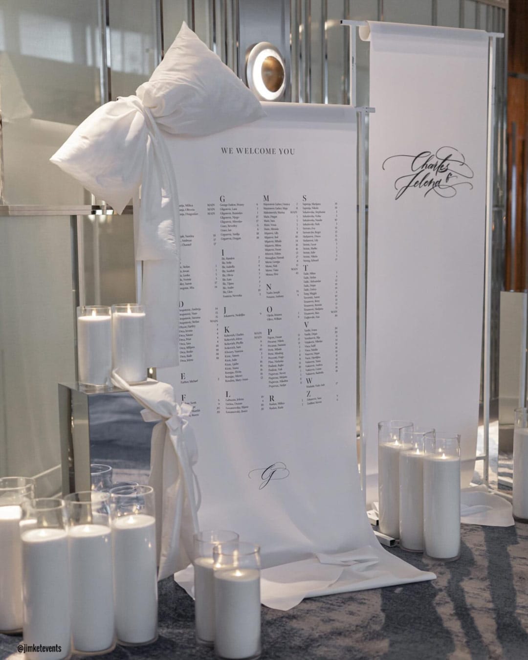
Signage washed in Cloud Dancer offers a clean surface for graceful lettering. Reach for calligraphy in gold, silver, charcoal, or champagne, the contrast reads clearly while feeling entirely luxurious.
These accents blend right into a gentle, polished palette, holding the whole decorative vision together with style.
Hanging Decorations
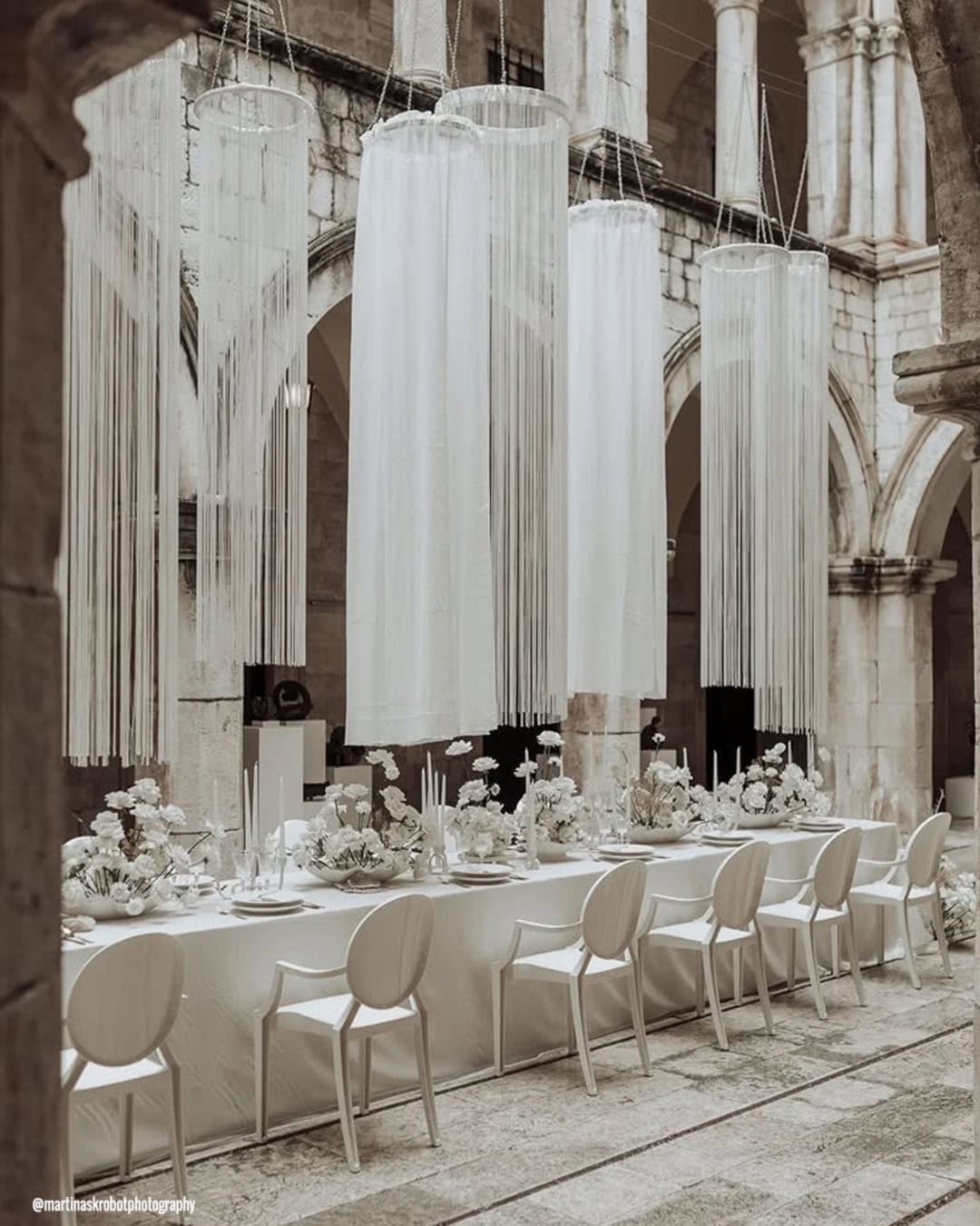
Choose Cloud Dancer lanterns, billows of fabric, or suspended floral pieces to bring lift and breathability to your venue. Folding in subtle pastel or metallic notes adds layered dimension.
These weightless hanging details create an elevated, peaceful mood that deepens the romantic heartbeat of your entire celebration.
Wedding Centerpieces
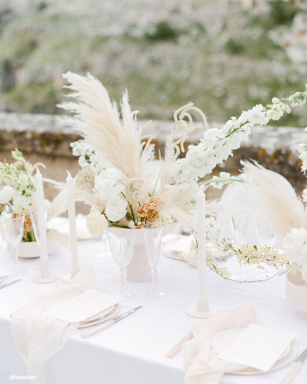
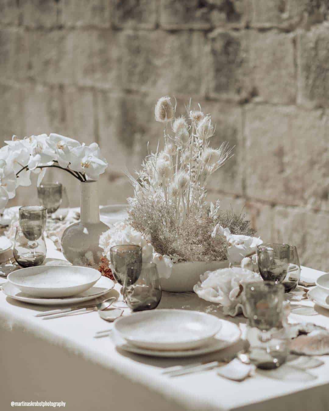
Arrangements grounded in Cloud Dancer tones gift every table with crisp, natural elegance. Turn to white and ivory blooms like roses, peonies, ranunculus, or hydrangeas, and weave in soft greenery or champagne whispers.
Nestle them inside clear glass, pearl finished, or metallic vessels for an enduring, polished feel. The resulting palette sends out a luminous, graceful warmth suited to both classic and modern visions.
Pantone Wedding Bouquets
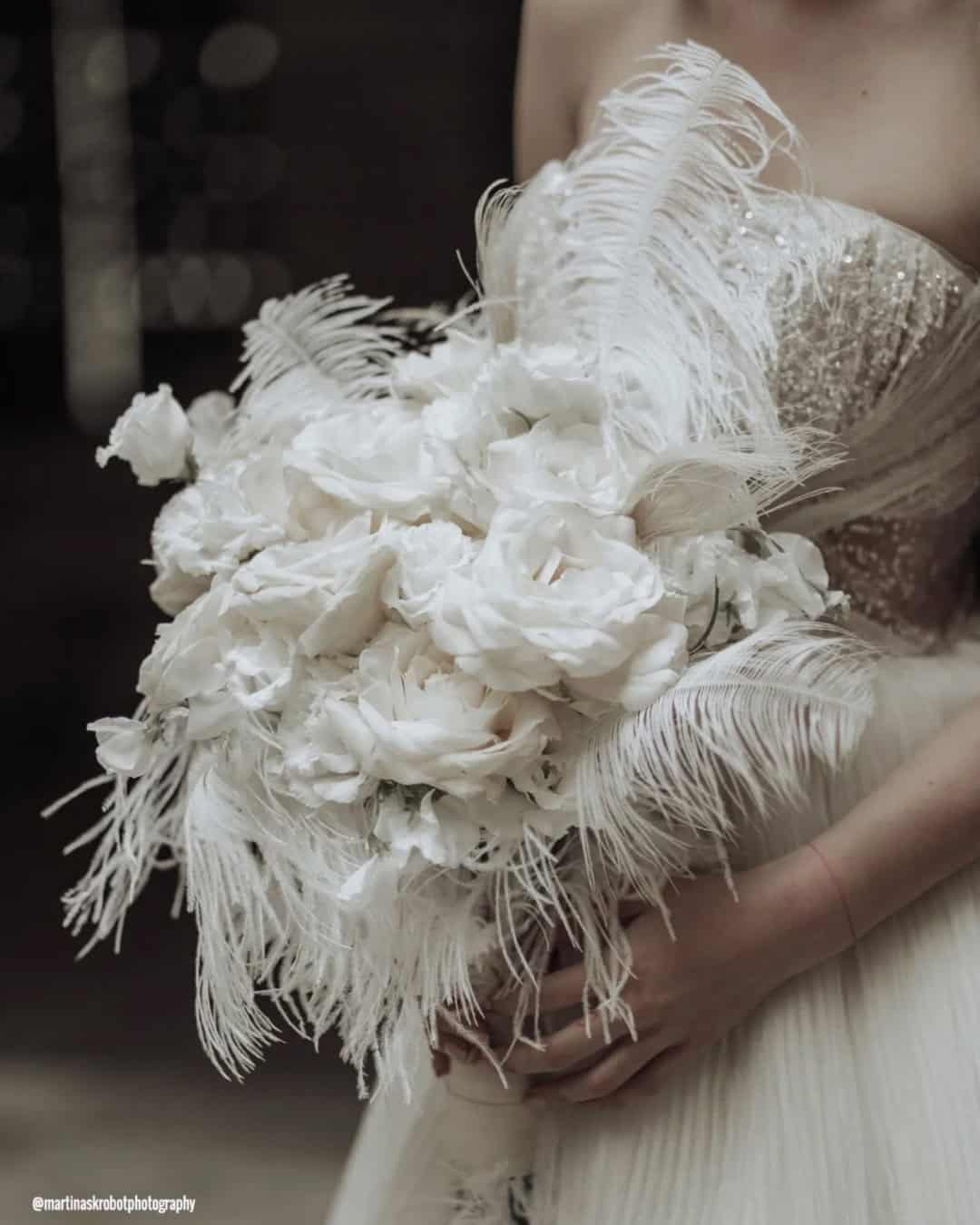
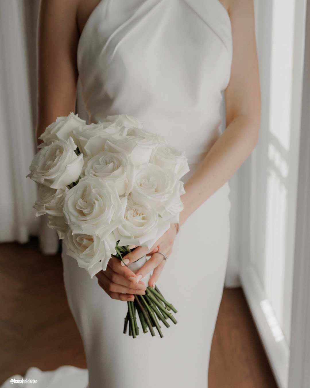
When crafting Cloud Dancer bouquets, gather gentle white florals including garden roses, peonies, calla lilies, or ranunculus. Tuck in touches of greenery or the faintest blush blooms for a whisper of contrast.
Bind the stems with Cloud Dancer ribbon or a pearlescent fabric wrap. Think about adding a glint of sparkle through pearls, crystals, or subtle threads of gold.
Pantone Wedding Stationery
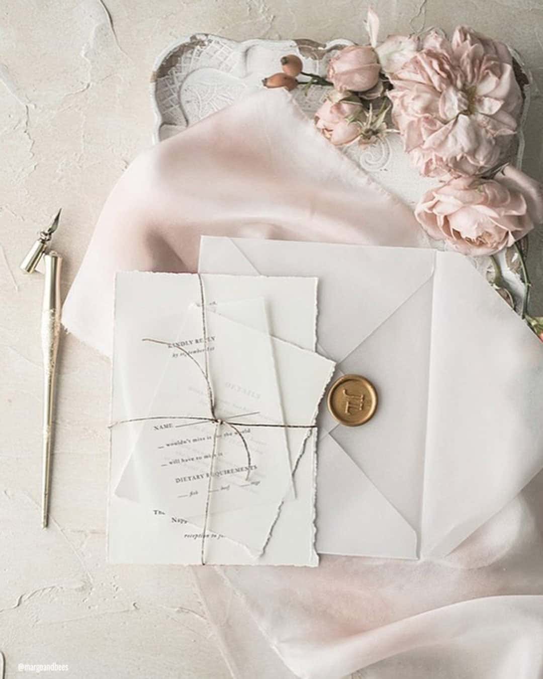
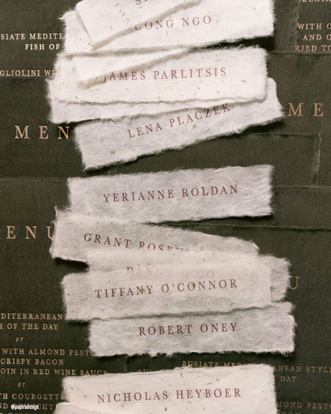
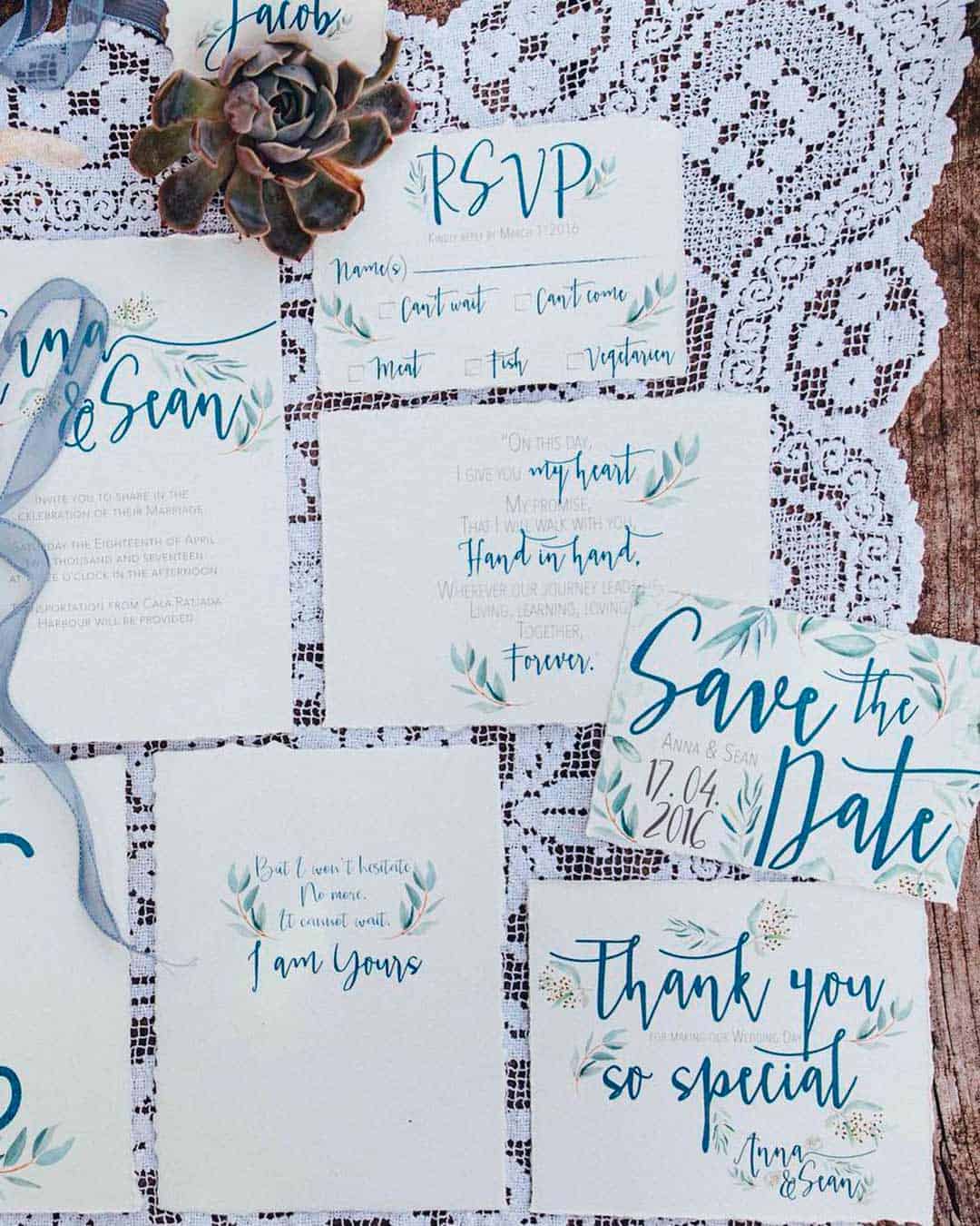
Paper goods in Cloud Dancer establish a crisp, pristine foundation for your entire design narrative. Bring invitations to life with calligraphy in gold, silver, charcoal, or soft blush tones.
Introduce botanical illustrations or clean minimalist patterns in complementary neutral shades to carry a polished, unified thread through your complete wedding suite.
Pantone Wedding Cakes
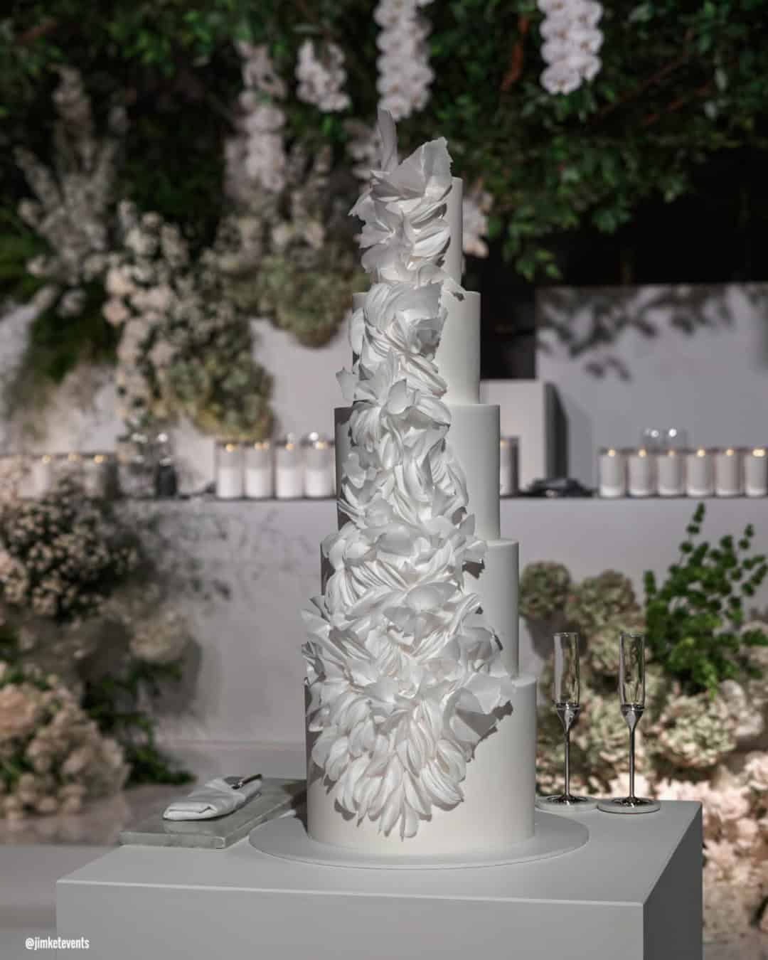
A Cloud Dancer inspired wedding cake delivers a look of quiet, sculptural beauty. Choose smooth white frosting, fragile sugar blossoms, or soft dimensional details like gentle ruffles and lace piping.
Weave in metallic gold, silver, or barely there pastel accents for an extra layer of refinement. This enduring aesthetic feels equally at home anchoring a timeless ballroom reception or a clean, contemporary gathering.
Pantone Color Of The Previous Years
For twenty years, the Pantone Color Institute has unveiled a total of twenty-four colors of the year. Both featured dual colors, each forecasting the global direction of color trends.
Mocha Mousse
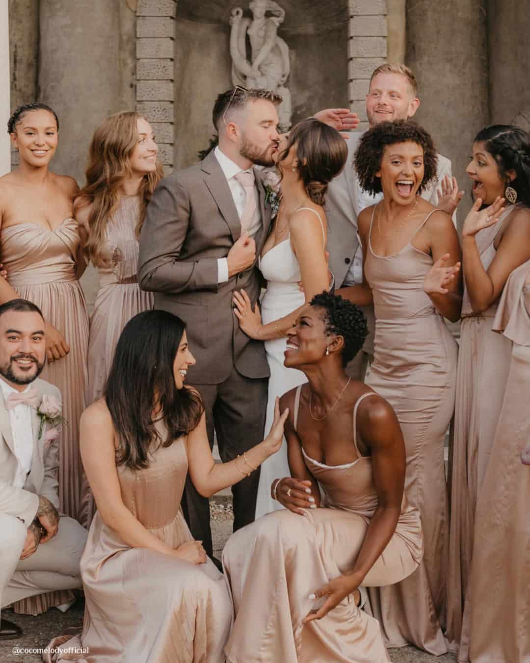
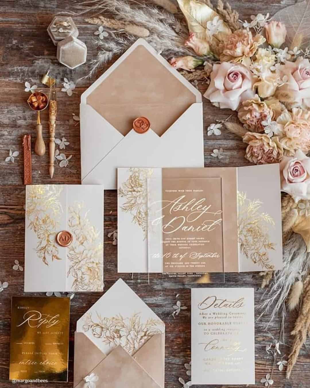
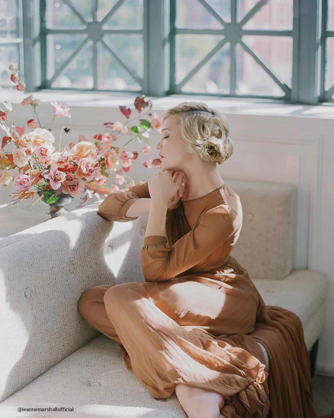
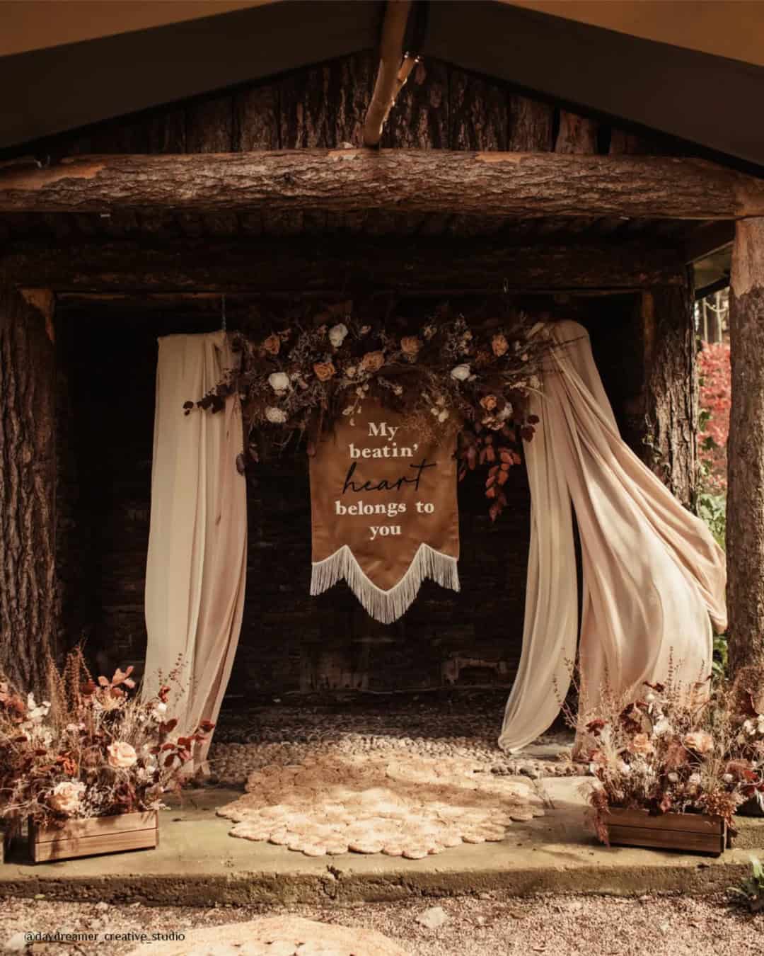
Pantone Mocha Mousse radiates warmth, richness, and lasting appeal, a lush, reassuring hue that injects any space with stability and refinement. This velvety, grounded brown shapes an environment that feels both intimate and elevated, gorgeous for weddings, milestone parties, and everyday design alike.
Perfectly suited for every wedding season, its cozy undertones feel enveloping in winter, effortlessly rustic in autumn, and naturally organic when spring and summer roll around. Pairs beautifully with ivory, blush, champagne, gold, sage, and soft neutrals, complementing both warm and cool palettes.
Versatile and beautifully balanced, allowing for creative styling while maintaining a luxurious and harmonious look.
Pantone Color
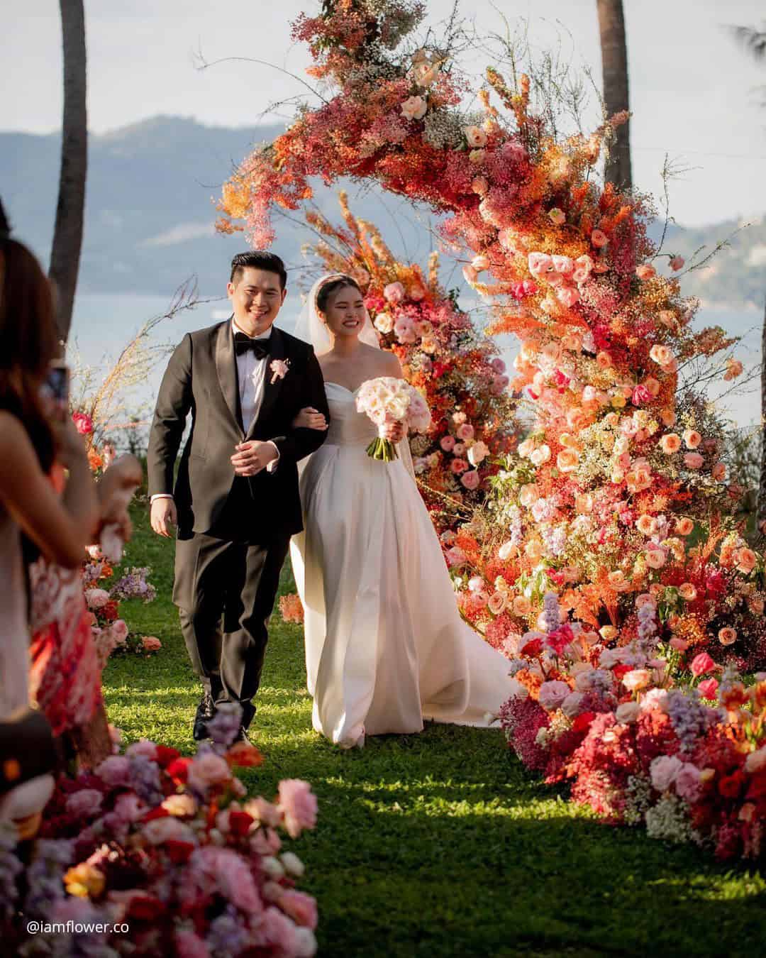
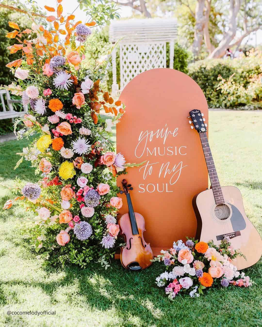
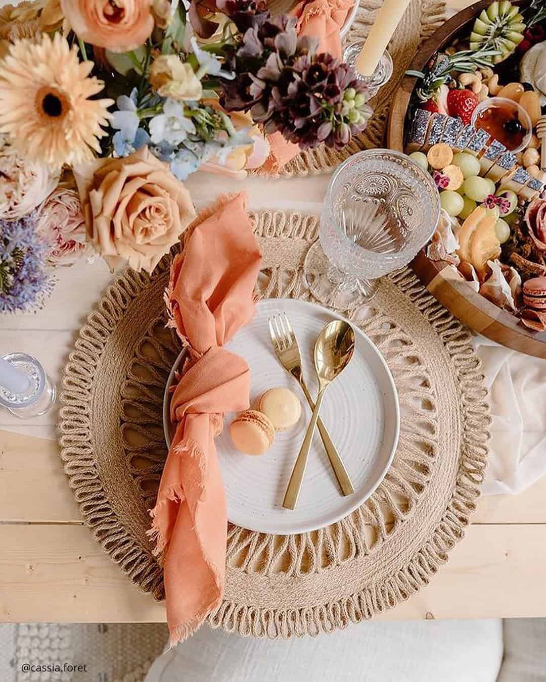
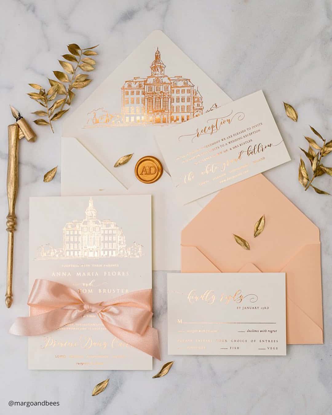
Peach Fuzz embodies warmth and self-care, offering a soft, nurturing tone that uplifts both the spirit and the surroundings. This gentle peach hue creates a soothing and harmonious atmosphere, perfect for any occasion.
Complements all wedding seasons: spring, summer, fall, and winter. Pairs beautifully with whites, greens, pinks, and golds.
Versatile and balanced, allowing for creativity without overpowering other colors.
Pantone Color
Viva Magenta is highly symbolic of the times. Meant to capture newfound strength and vitality rising from challenging periods.
It simultaneously honors the present moment and our shared hope for what lies ahead. The shade feels electric, rooted in the potency and reconnection to the natural world.
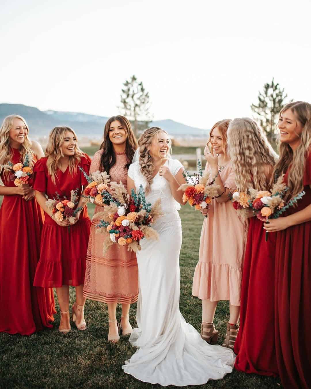
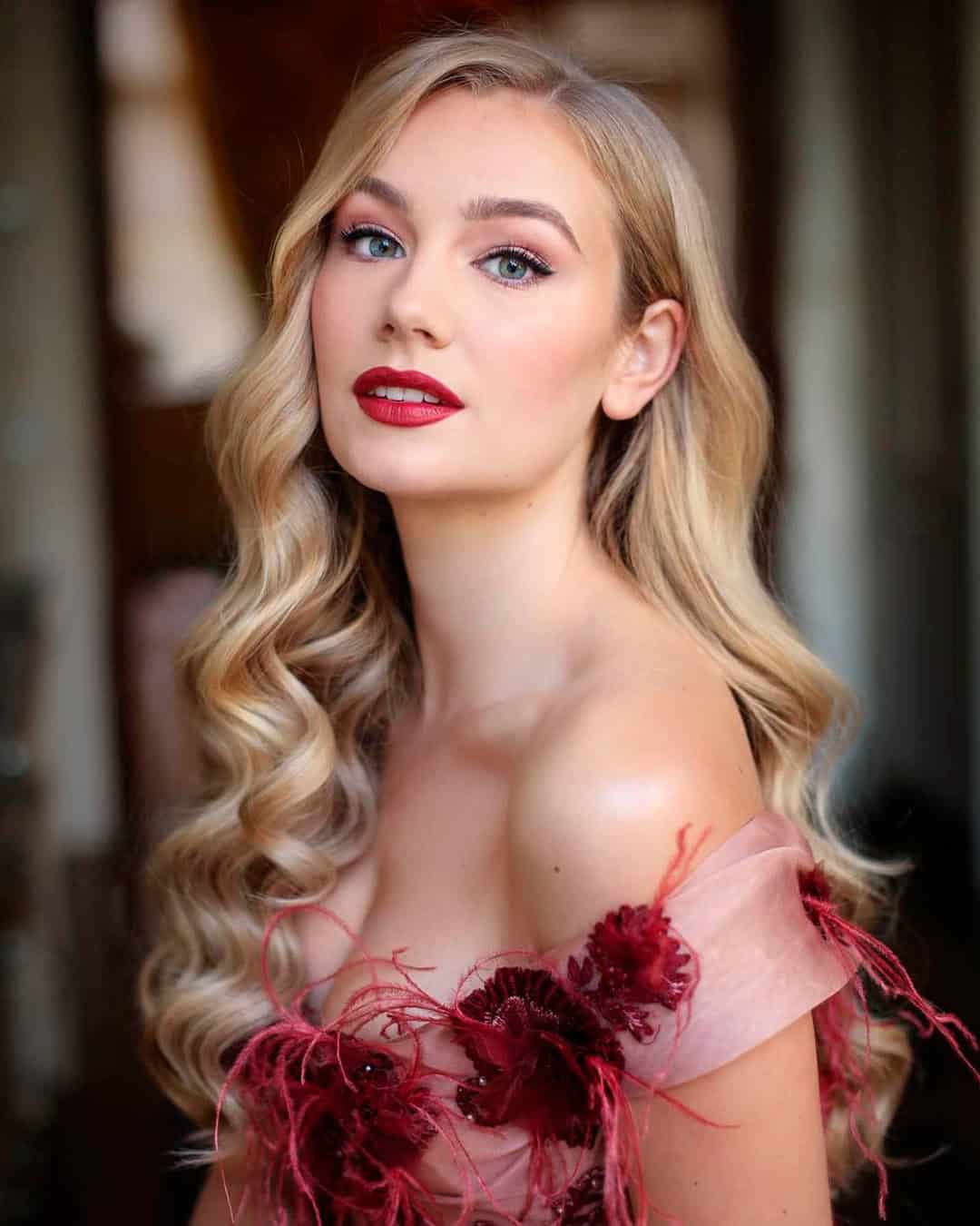
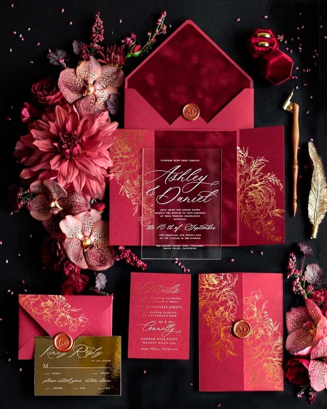
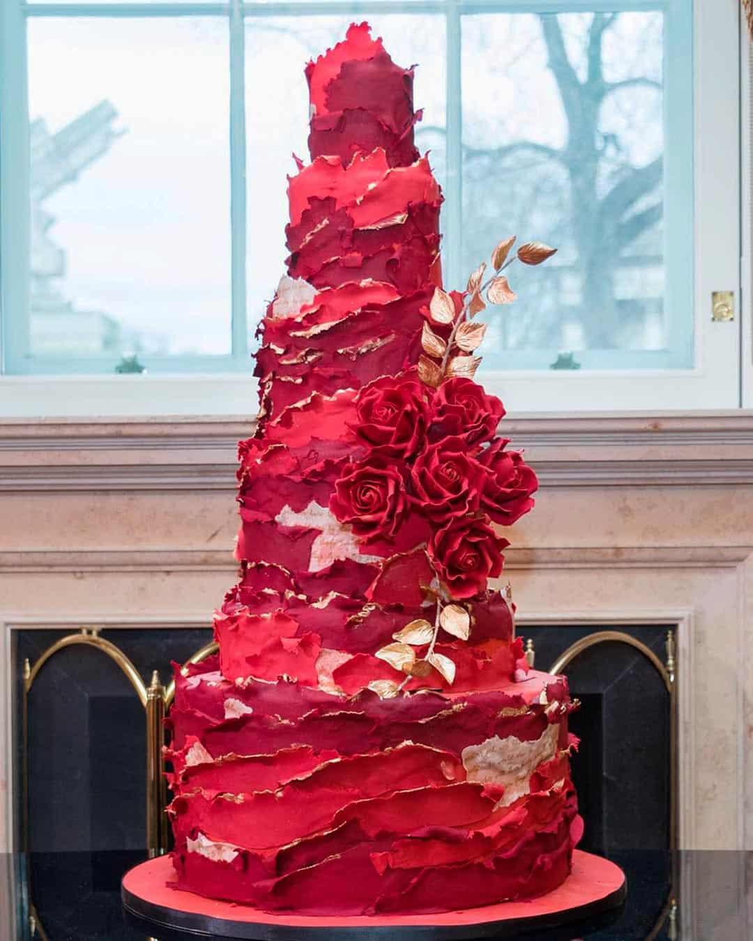
Viva Magenta slips effortlessly into nearly any wedding vision. Guests wearing this shade will complement the harvest hues of autumn celebrations, the blossom filled tables of summer, the steadfast spirit of winter, and the vibrant energy of spring.
Viva Magenta unlocks endless bouquet combinations.
Pair with white blossoms and lush greens for a classic path. Depending on the season, you can also mix other pinks, reds, purples, and pale blues into the arrangement.
Although the color speaks boldly, Viva Magenta surprisingly doesn’t battle with other bright tones.
This Pantone selection doesn’t scream for attention either. You’re free to play with every shade in the rainbow without sliding into visual clutter.
Pantone Color
Thematically, Very Peri is very forward-looking. It attempts to represent the emotions we all share about the near future.
Simultaneously, the color represents how we all got here and harnesses those emotions as well
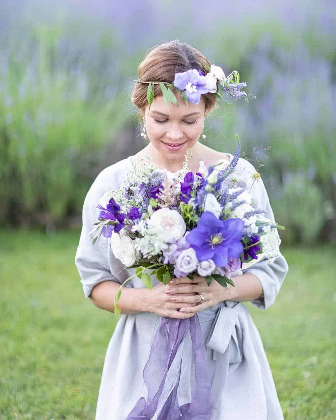
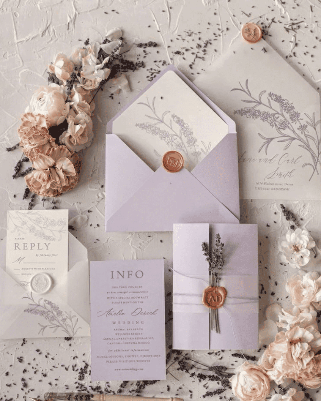
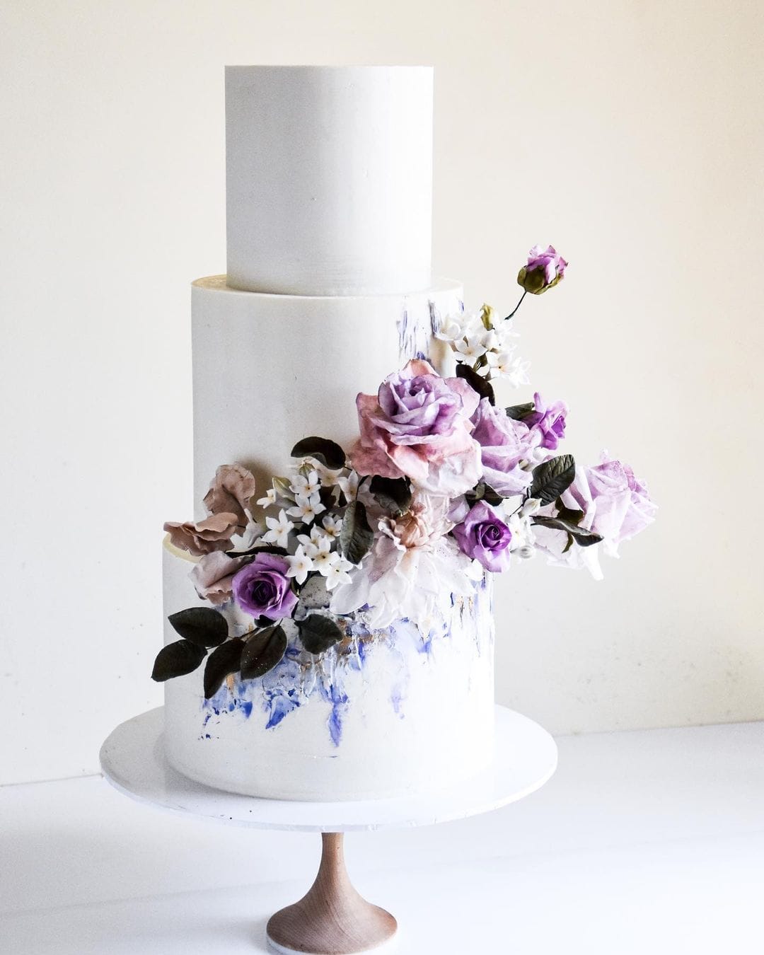
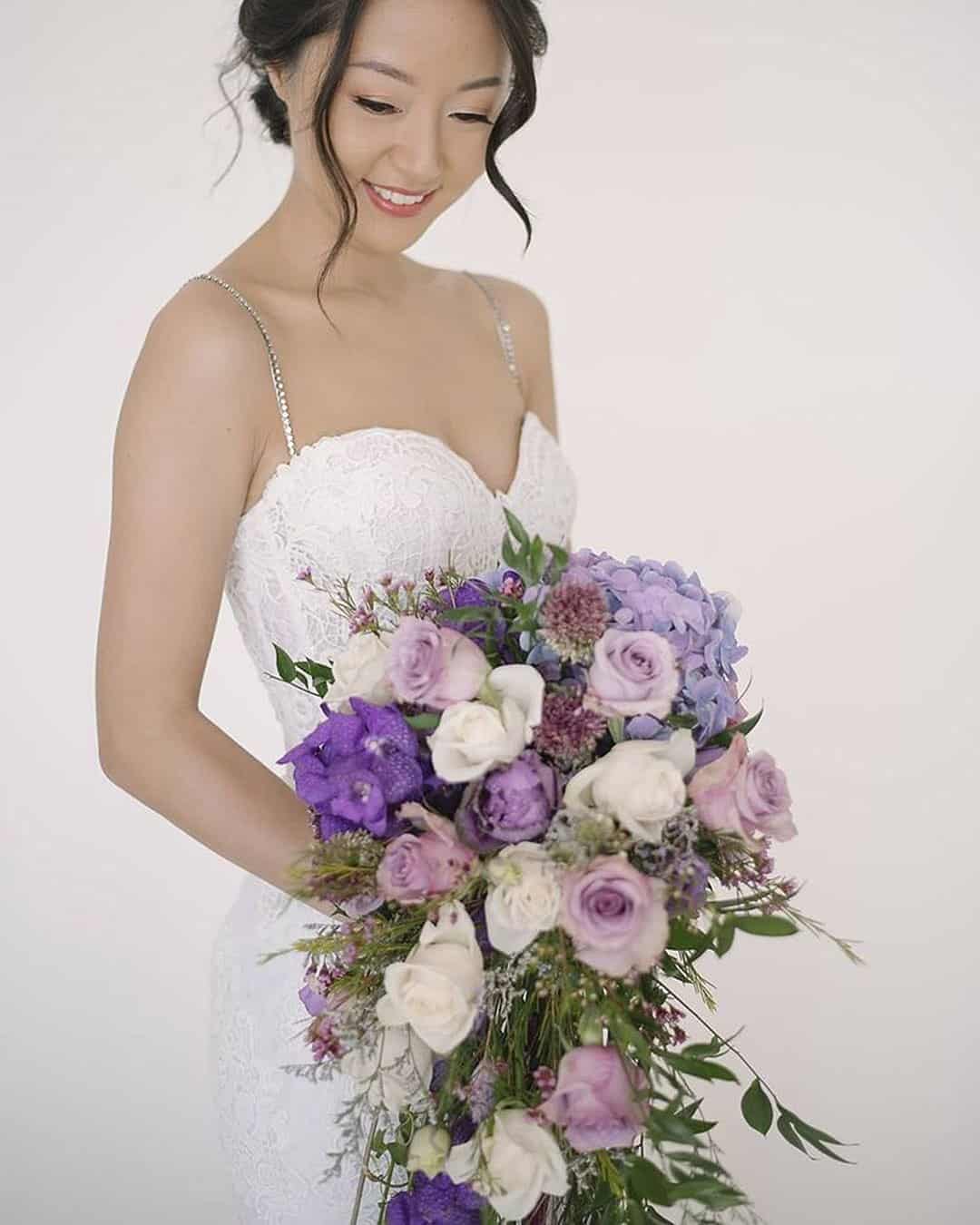
Choosing Very Peri as the dominant thread in your wedding palette would be a brave, confident move. Most couples will lean toward a more classic path, enhancing sharp black tuxedos and white bridal gowns with carefully placed pops of the celebrated tone.
For grooms, this shows up in boutonnieres, neckwear, vests, footwear, pocket squares, and small accents.
Exercise a little caution with this tone. A light purple text over white can prove tricky to decipher.
If you follow this design direction, ensure the lettering is sized amply enough for every guest, including the oldest ones present, to read easily.
Very Peri translates into a frosting shade that looks downright delicious. Use it as an accent detail over a classic white cake, finishing with dried purple petals for extra texture.
Locating an exact Very Peri match straight from nature poses a real challenge.
However, several close cousins will carry the vision beautifully. Lavender, bellflower, balloon flower, and allium represent just a handful of available options.
Pair the purple tones with an assortment of greens, whites, and varied textures for the most exquisite results.
Pantone Colors
Two shades share the spotlight, combining the steadfast Ultimate Gray with an illuminating, spirited yellow. Ultimate Gray 17-5104 signals strength, steadiness, stability, resilience, and deep comfort.
A glow emerges at the end of the passage, and that is where Illuminating 13-0647 enters. Carried by the vibrant yellow, it stands for positivity, forward movement, hope, and the natural world.
Its bright character forms a pleasing counterpoint to the solidity of Ultimate Gray.
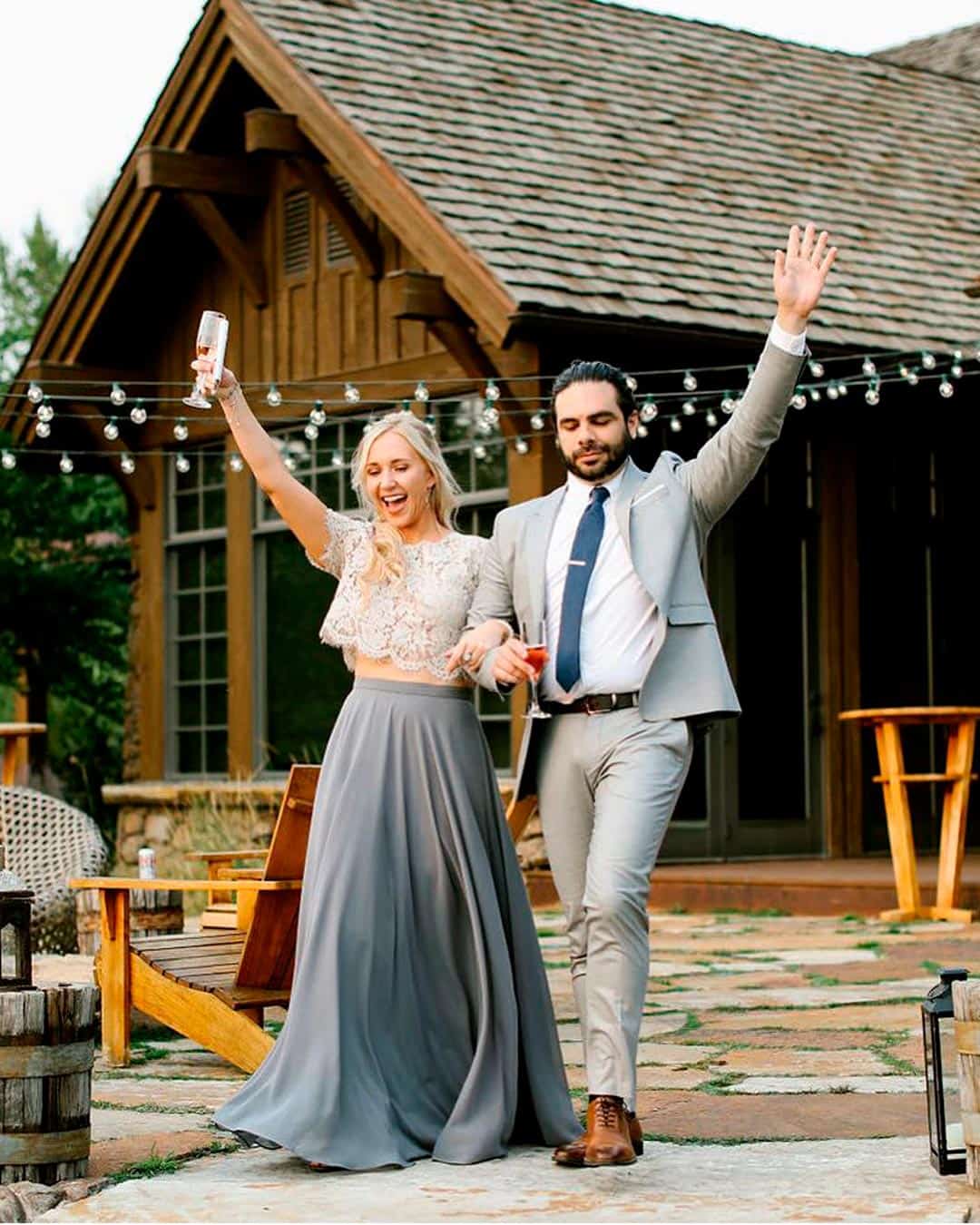
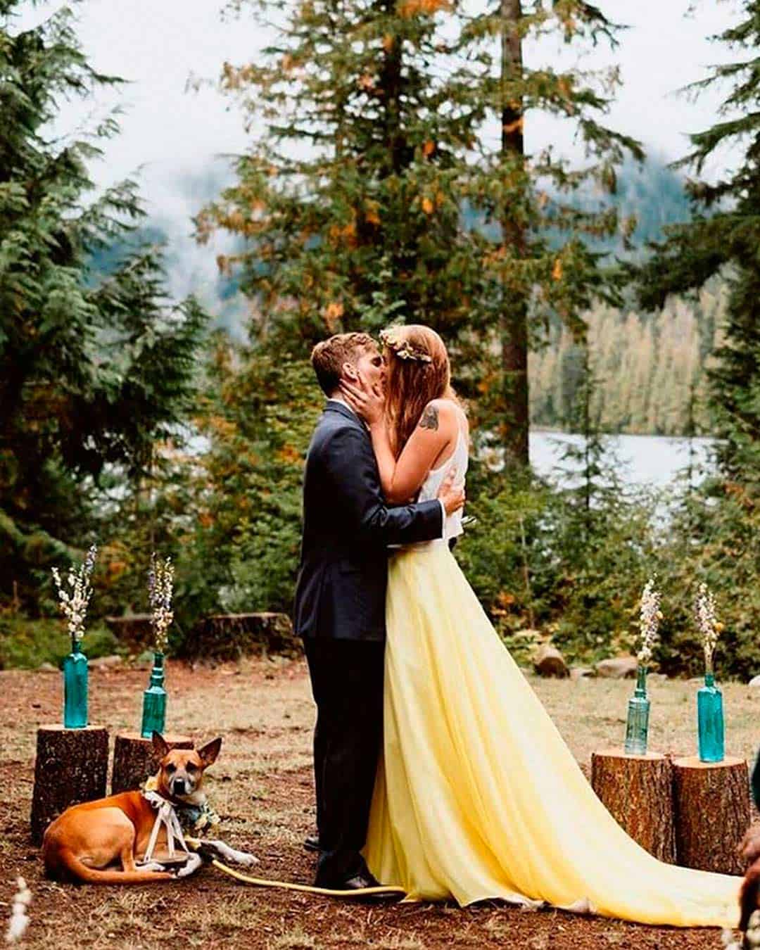
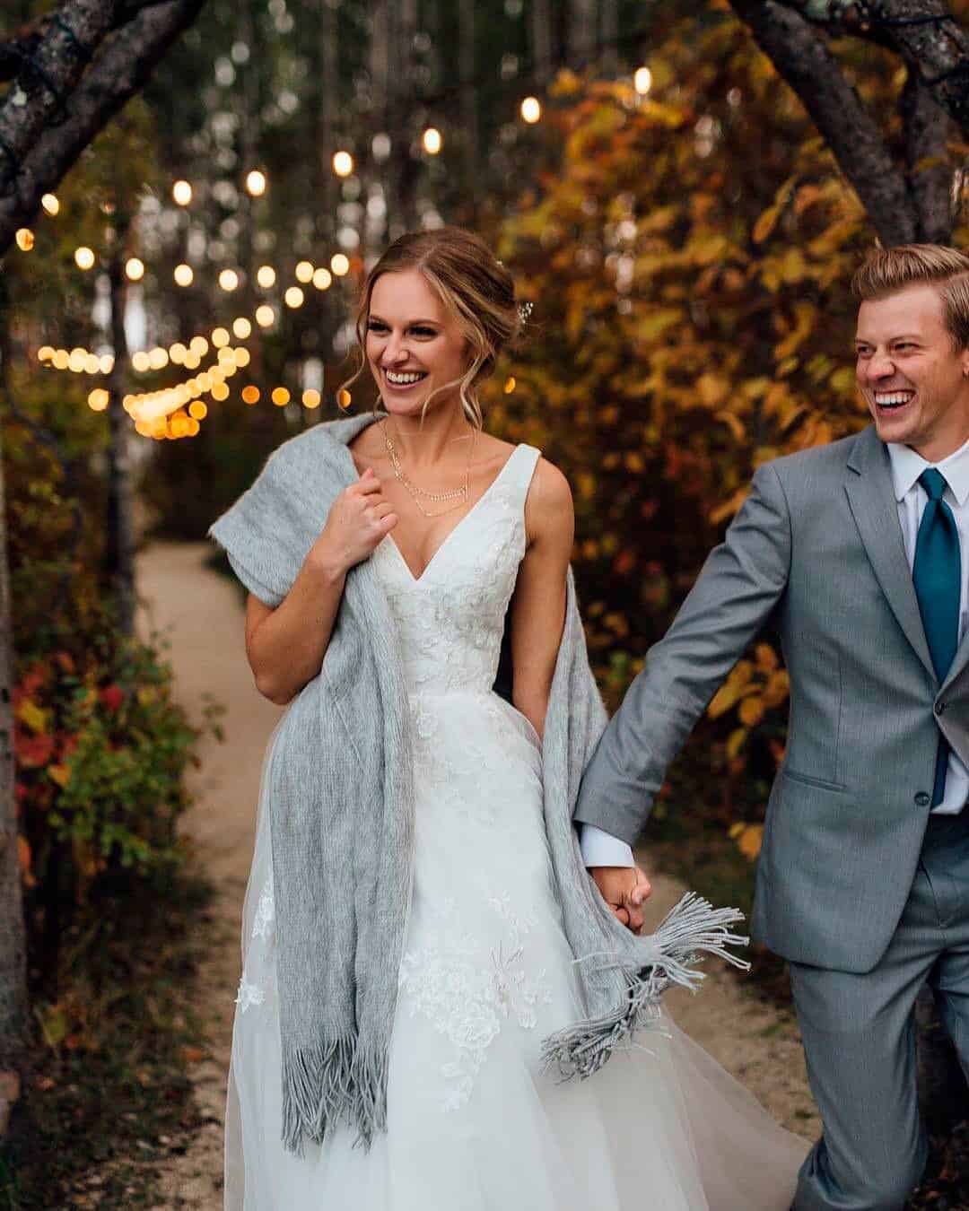
The groom’s wedding look doesn’t need to mirror the bride’s or the groomsmen’s precisely. Still, to craft a unified visual story, a shared thread should run throughout.
Illuminating will appear as embroidery, waistband detailing, or floral motifs.
A bride might pair these accents with Ultimate Gray shoes and illuminating jewelry plus hair adornments. These details and accessories can read either understated or lavishly embellished.
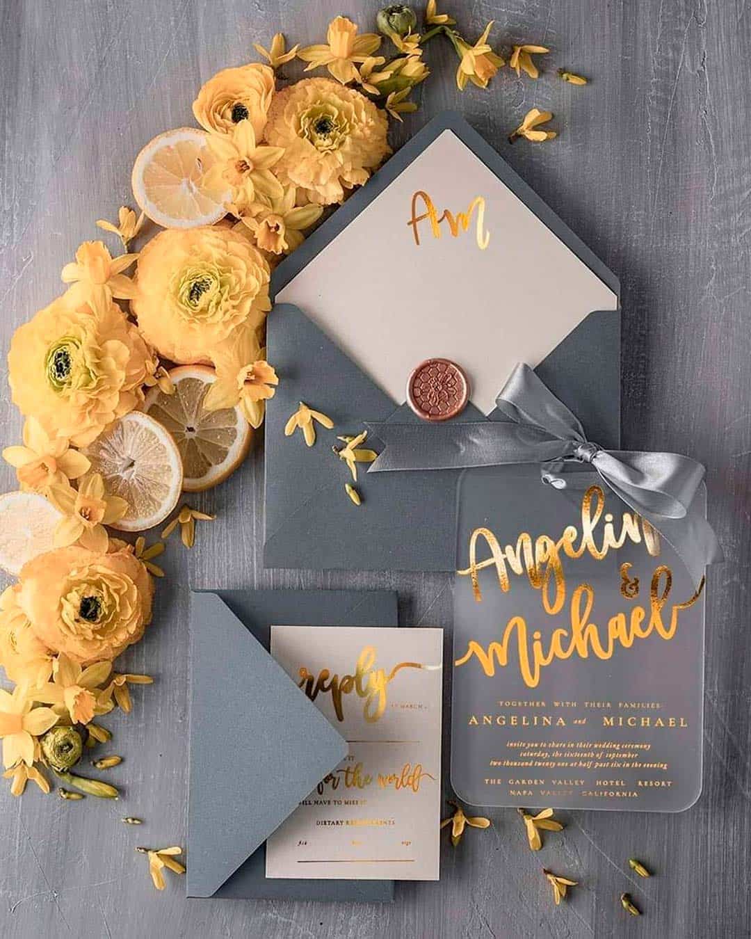
Your wedding paper suite gives you a playground to explore your color story.
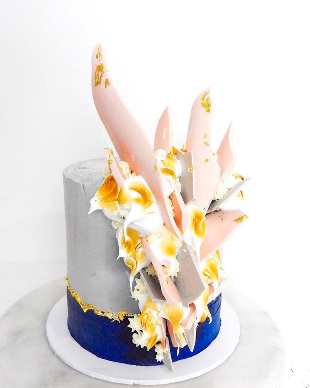
Things get even better because the illuminating and Ultimate Gray Pantone shades adapt perfectly to varied wedding themes. The Pantone selections redefine wedding cake artistry through their blend of serenity and vibrant energy.
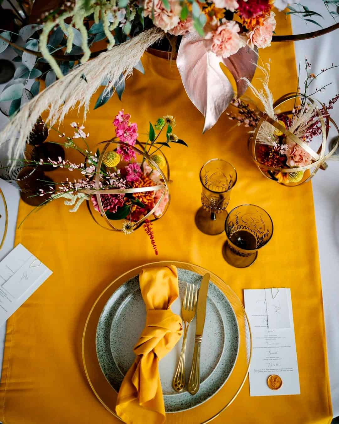
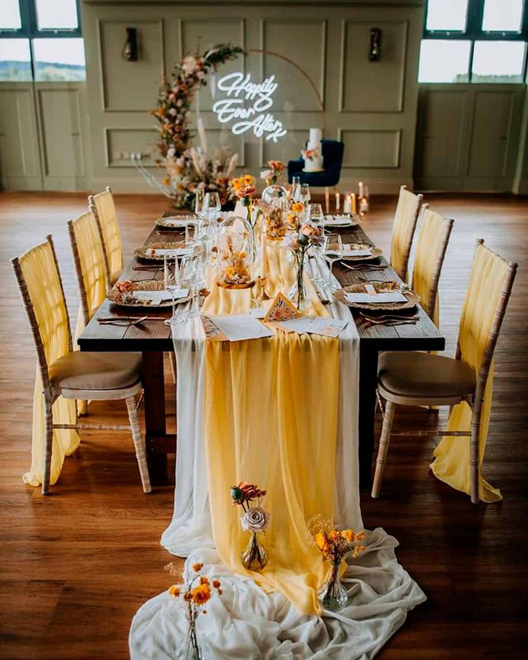
Make your tablescape more compelling by embracing a colorful concept.
Use unconventionally shaped illuminating place cards and menu cards. Alternate between gray and vibrant yellow plates alongside matching glassware.
Coordinate napkins and centerpieces with this setup, then anchor it all with white chargers.
Pantone Color
The Pantone color of the year is classic blue, looking like the sky and synonymous with the return of a new day. It signifies dependability, trustworthiness, constancy, and credibility.
These traits are very much needed in the current high-stress situation we are in. It’s also deep and calm, making it resonate with so many people.
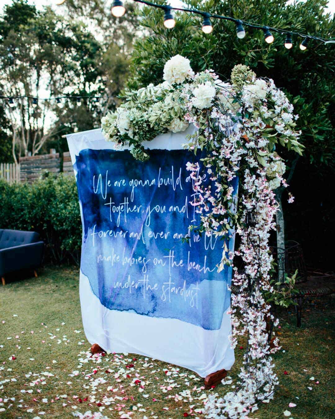
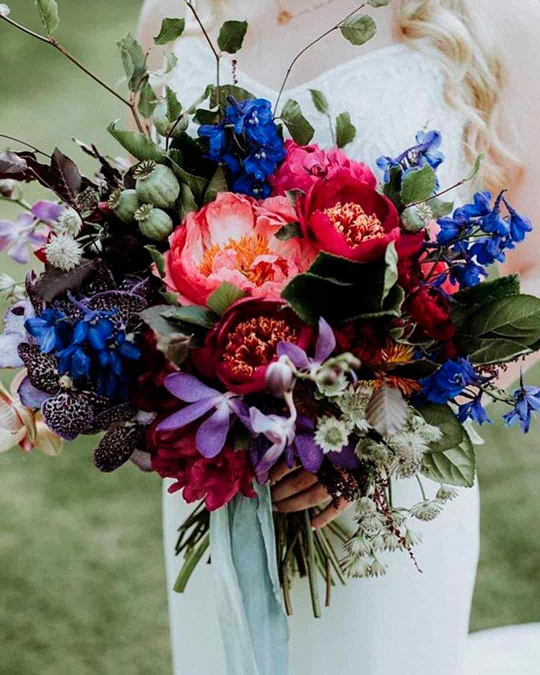
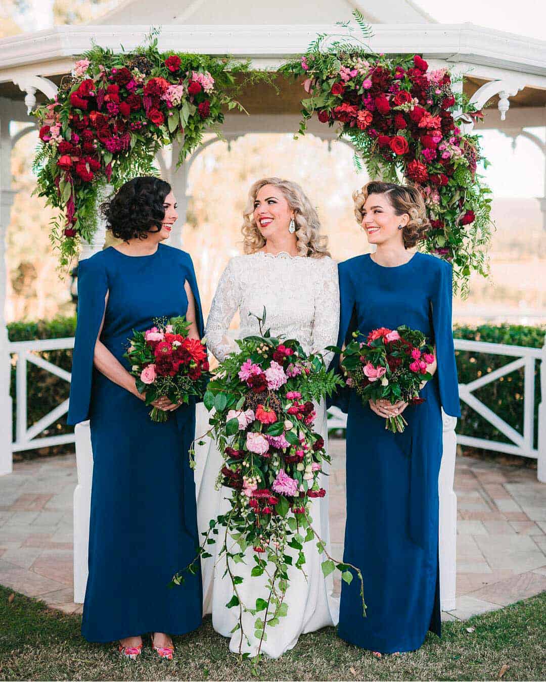
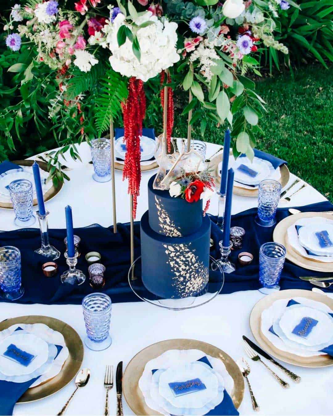
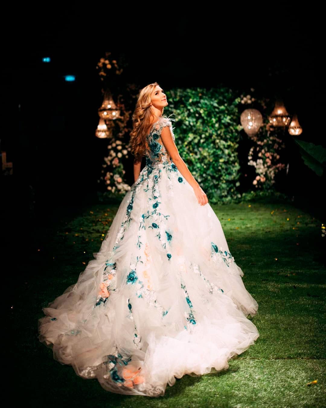
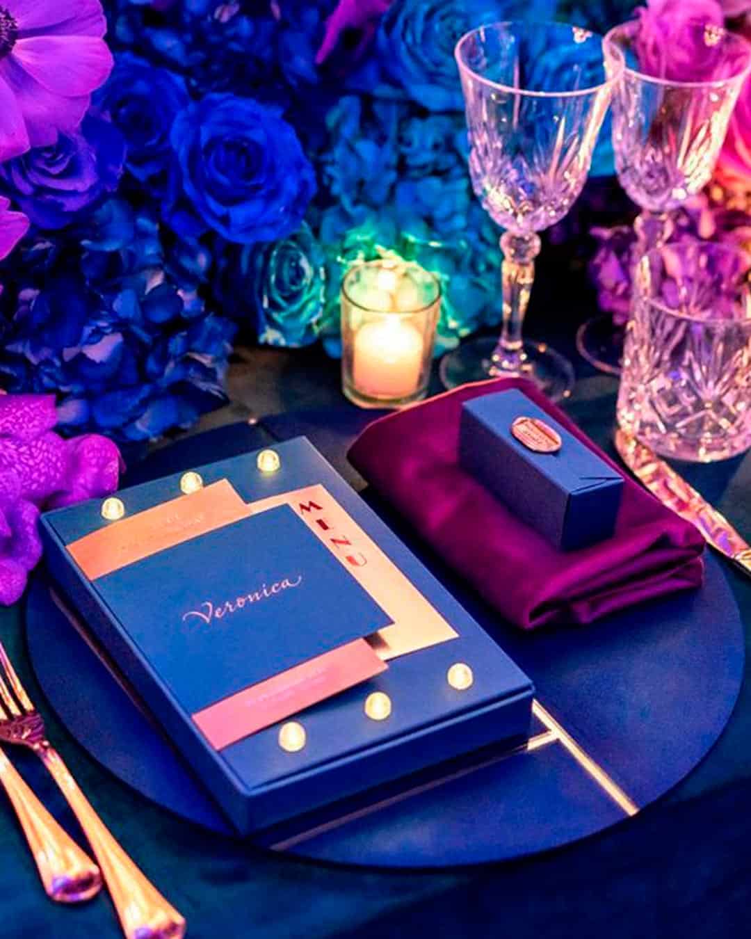
Classic blue is a versatile color that can stand on its own and also blend with other colors. To use…
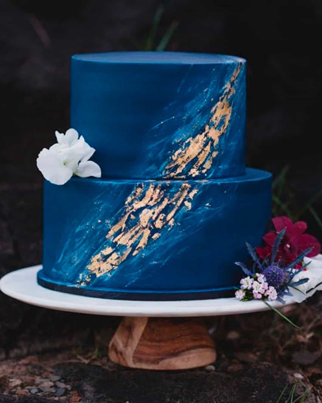
Classic Blue functions like a work of art itself, so whether a subtle touch or a full commitment, both approaches work beautifully for cakes. Apply it as crystal geodes, adorned colored flowers, ombré icing accents, or watercolor artwork.
If you’re stepping away from an all-blue bouquet, use it as thoughtful accents.
These range from classic blue ribbons, a sprig of thistles tucked into your bouquet or buttonholes. Have the bridesmaids wear classic blue dresses or get them matching classic blue swatches.
As the bride, take something classic blue to your wedding.
For example, it could be a touch on your dress, bouquet, or hair. To avoid overwhelming the eyes at the wedding, set the table with minimal classic blue.
Incorporate it strategically at different heights.
Like the plate, the goblets, the candles and, the candelabra. Switch up your venue from formal reception to disco ready in a heartbeat.
For example, fix up a mix of classic blue and neon heart-shaped lights in the background at the reception.
Create a cozy atmosphere at your lounge with classic blue throw pillows on muted tone couches. At the ceremony, design your altar with classic blue drapes and asymmetrical greenery.
The Pantone color of the year did not disappoint! Viva Magenta is a powerful yet gentle color that perfectly captures the sentiment of today and our collective aspirations for the future.
The wedding industry is sure to have a lot of fun with the possibilities this color brings, and we look forward to seeing it absolutely everywhere.